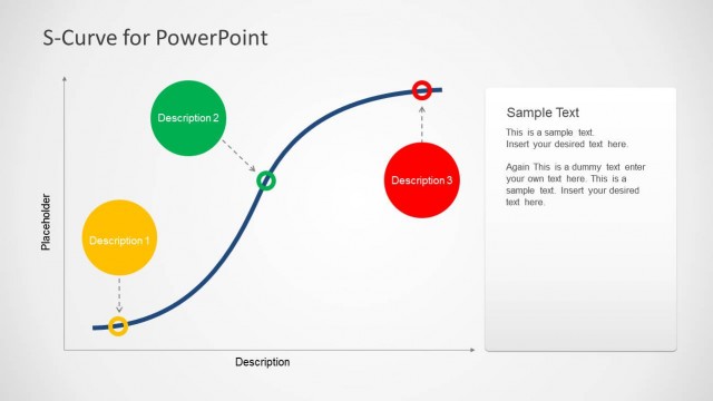
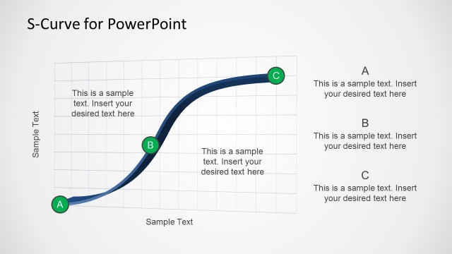
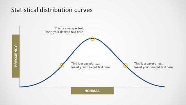
S-Curve for PowerPoint is an editable diagram template which makes it easy to create a custom S-Curve for PowerPoint presentations.
With this template you can easily and accurately display an S-Curve diagram for depicting a growth of a variable, by simply editing the existing model with little effort.
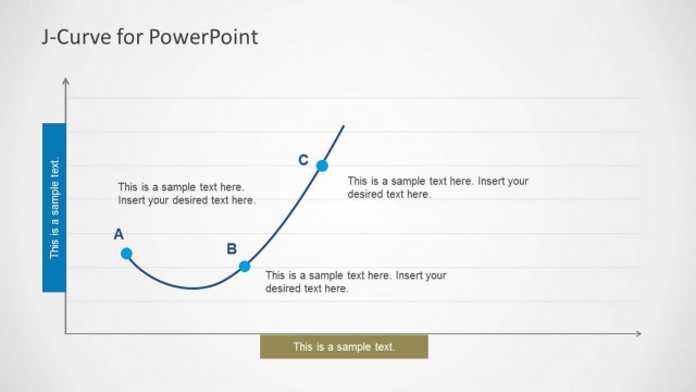
For making curves and diagrams for other data and analysis based models, see our Curve Diagram Templates for PowerPoint.
What’s inside this template
Example presentation scenarios
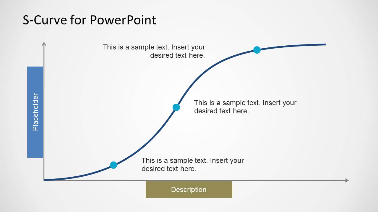
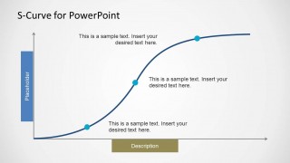
- A product manager can use the milestone S-curve to explain where a product sits in its adoption lifecycle and what signals indicate acceleration or maturity.
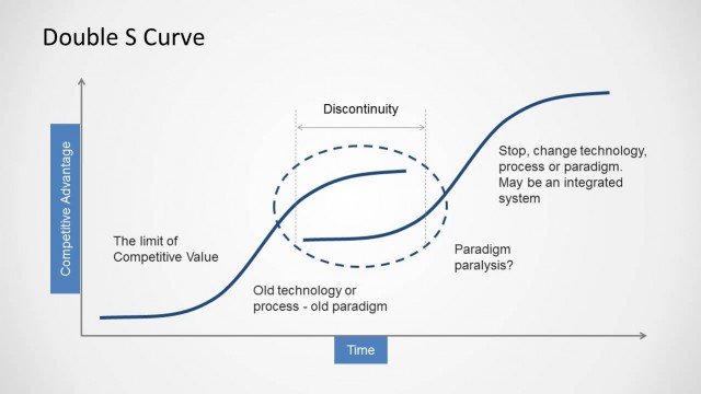
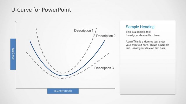
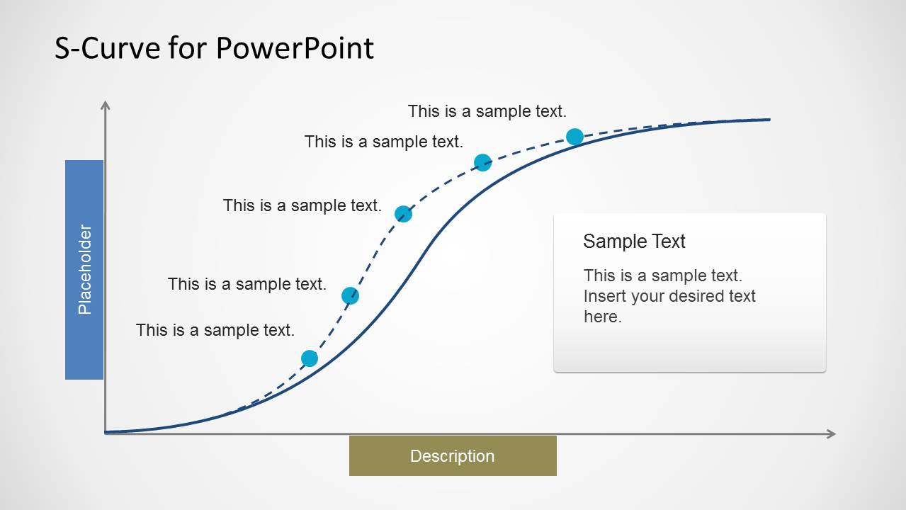
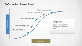
- An innovation manager can use the dashed comparison curve to contrast an expected diffusion path with the current trajectory during a portfolio review.
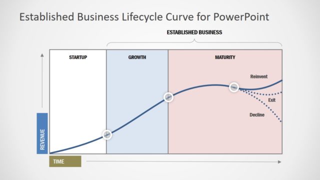
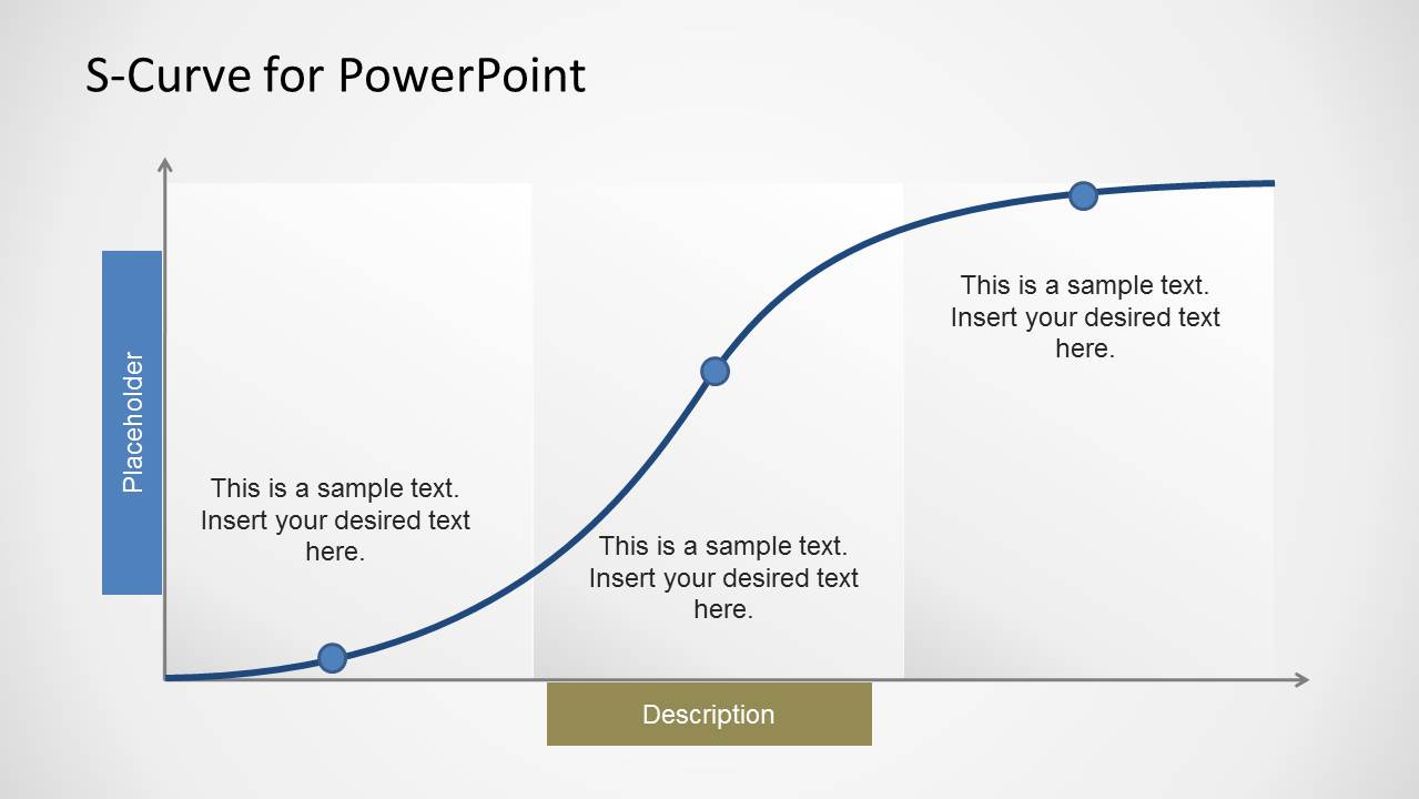
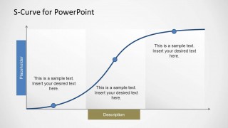
- A strategy consultant can use the shaded phase blocks to separate early growth, rapid expansion, and stabilization in a client workshop.
- A business analyst can use the annotated curve to summarize how a key variable changes over time without building a full data dashboard.
Features
- 100% editable presentation template
- Compatible with Microsoft PowerPoint and Google Slides
- Scalable vector shapes, icons and illustrations
- AI-Ready for Microsoft Copilot and Claude
- Instant access and download
Frequently asked questions
Q: How should a presenter explain the S-curve without overloading the audience?
A: Start with the curve shape before adding detail. Use Slide 1 to define the vertical measure and horizontal timeline, then place each milestone dot only where it clarifies the story. Keep labels short and attach each annotation to a decision point, such as launch, acceleration, saturation, or plateau.
Q: Who is this template best suited for in a business presentation?
A: This template fits presenters who need to explain nonlinear progress rather than a straight timeline. Product managers, innovation leads, analysts, and consultants can use the S-curve to discuss adoption, maturity, capability growth, or market development where progress begins slowly, accelerates, and later levels off.
Q: Why does the S-curve metaphor work for innovation and growth topics?
A: The S-curve gives the audience a familiar visual model for change over time. The slow start, steep middle section, and flattening top make it easier to discuss early investment, scaling pressure, and maturity. The shaded phases and milestone markers turn an abstract lifecycle into a staged business explanation.
S-Curve for PowerPoint
3-slide S-curve presentation template for growth curves, innovation adoption, and lifecycle analysis
S-Curve for PowerPoint is a 3-slide editable diagram template for showing variable growth, adoption, maturity, or innovation progress over time. The deck includes an S-curve with milestone markers, a dashed comparison curve with callout panel, and shaded phase blocks. It suits analysts, product managers, and strategy teams preparing PowerPoint presentations.


 Loading...
 Microsoft PowerPoint
  Microsoft Copilot
  Claude for PowerPoint
 Other formats supported
Subscribe today and get immediate
access to download our PowerPoint templates.