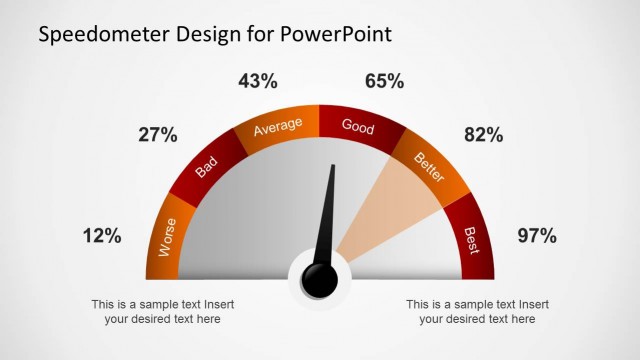
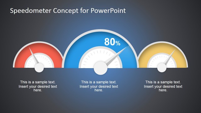
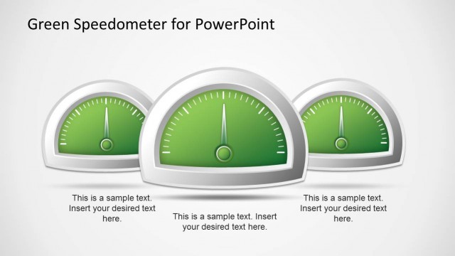
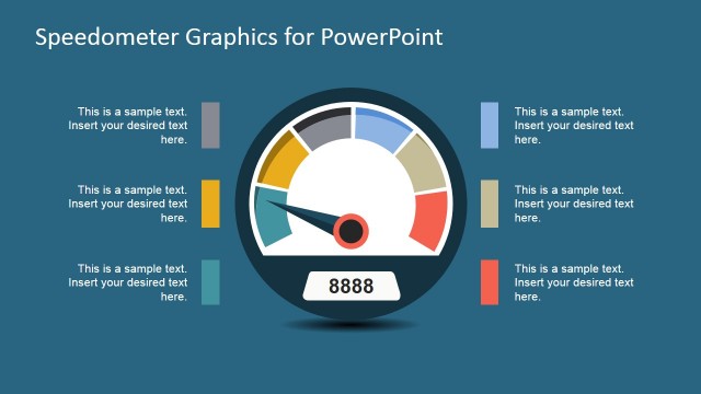
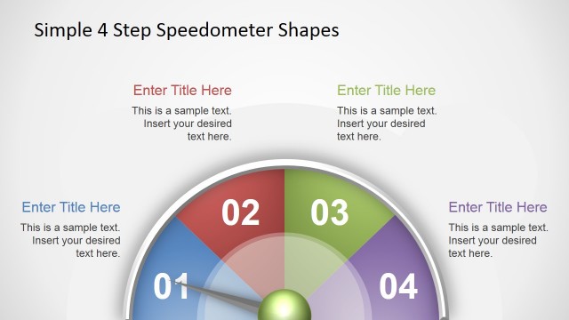
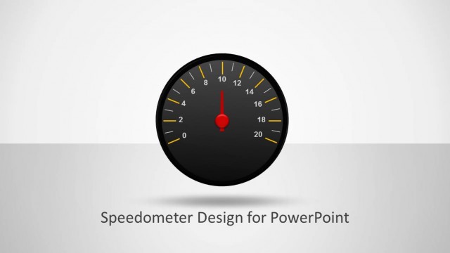
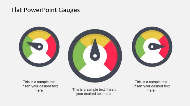
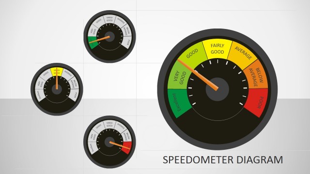
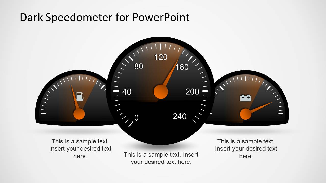
Dark Speedometer Template for PowerPoint is a presentation design containing speedometer shapes that you can adjust to match any desired level.
The given speedometers with adjustable dials can serve as a good resource for making presentations related to business, cars, oil, energy consumption, sustainable development, global warming, etc.
For more colorful speedometer templates, see our catalogue of Speedometer PowerPoint Templates.
What’s inside this template
Example presentation scenarios
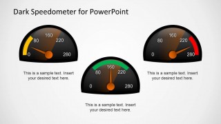
- An operations manager can use the multi-gauge dashboard slide to brief executives on current capacity, resource use, and whether each metric is near a target threshold.
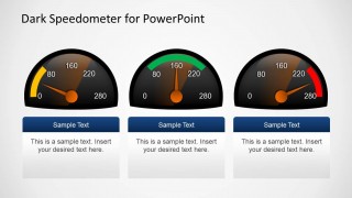
- A business analyst can use the three-card level comparison to explain low, medium, and high performance bands across departments, products, or service indicators.
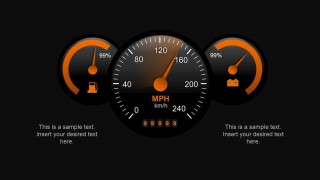
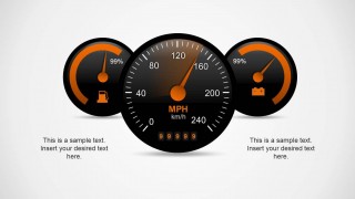
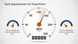
- An automotive presenter can use the central MPH speedometer and odometer-style slide to introduce speed, mileage, service performance, or vehicle-related metrics.
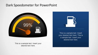
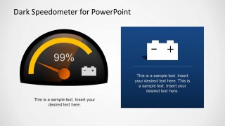
- An energy or sustainability team can use the fuel and battery callout panels to discuss consumption, storage, efficiency, or readiness in a visual status update.
Features
- 100% editable presentation template
- Compatible with Microsoft PowerPoint and Google Slides
- 16:9 aspect ratio slides
- Scalable vector shapes, icons and illustrations
- AI-Ready for Microsoft Copilot and Claude
- Instant access and download
Frequently asked questions
Q: How should a presenter use the gauges without oversimplifying the message?
A: Treat each gauge as a headline indicator, then explain the evidence in the text area beside or below it. Use the needle position to communicate status first, such as low risk or high usage, and reserve detailed numbers for captions or supporting slides. This keeps the audience focused on the decision implied by the level.
Q: Who is this template best suited for in a business presentation?
A: It works best for presenters who need to translate a condition into an easy status reading: operations managers, analysts, project leads, automotive teams, and energy presenters. The multi-gauge dashboard and fuel or battery slides are most useful when the audience must quickly compare readiness, consumption, risk, or performance bands.
Q: Why use a speedometer metaphor instead of a standard chart?
A: A speedometer shows direction, intensity, and threshold position in one glance. The yellow, green, and red arcs help the audience read urgency before reading text. This design is stronger for current-state communication than for trend analysis because the metaphor points attention to whether a metric is within an acceptable range.


Dark Speedometer Template for PowerPoint
10-slide presentation template with dark speedometer gauges, fuel meters, and KPI status indicators
Dark Speedometer Template for PowerPoint is a 10-slide gauge and meter presentation template for status reporting. It includes a multi-gauge cover, three-card level comparison, single speedometer with callout panel, fuel and battery meter slides, and icon placeholders. It is built for Microsoft PowerPoint and Google Slides.
- Category
- Shapes
- Rating


 Loading...
- Aspect ratio
- 16:9
- Item ID
- 6331-01
- Colors
 Microsoft PowerPoint
  Microsoft Copilot
  Claude for PowerPoint
 Other formats supported
Subscribe today and get immediate
access to download our PowerPoint templates.