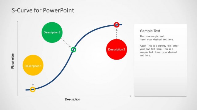
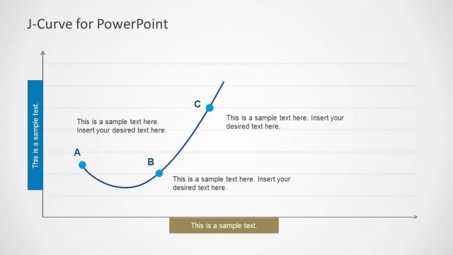
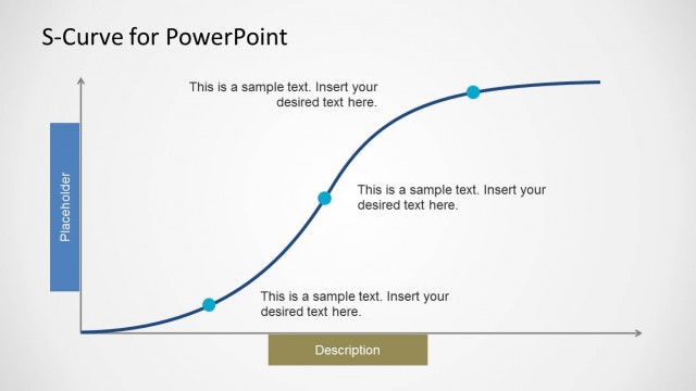
Downward Curves for PowerPoint provides multiple slides with editable downward curves that you can edit to create accurate curves in PowerPoint.
This template eliminates the need for laboriously making downward curves in PowerPoint, as the slides are easy to edit and can be customized using basic PowerPoint options.
Also see the Upward Curve Template for PowerPoint.
What’s inside this template
Example presentation scenarios
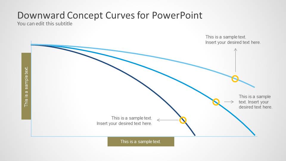
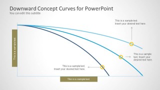
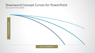
- A finance analyst can use the three-curve comparison slide to explain different projected rates of revenue decline to senior leadership.
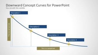
- A strategy consultant can use the four-milestone decline curve to show where market contraction accelerates and which events correspond to each marker.
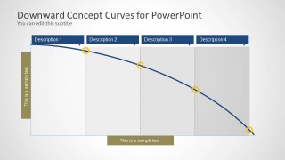
- An operations manager can use the segmented phase curve to describe stages of deteriorating performance, from early warning signs to a sharp drop.
- An instructor can use the labeled downward curve diagrams to teach mathematical or business interpretations of falling trends.
Features
- 100% editable presentation template
- Compatible with Microsoft PowerPoint and Google Slides
- Scalable vector shapes, icons and illustrations
- AI-Ready for Microsoft Copilot and Claude
- Instant access and download
Frequently asked questions
Q: How should I present a decline message without making the slide feel overloaded?
A: Start with the simplest curve slide to define the downward trend, then move to the milestone or segmented version only when the audience needs reasons, timing, or phases. Keep each marker tied to one short explanation. The curve should carry the main message, while callouts identify only the turning points that change the interpretation.
Q: Who is this template best suited for?
A: This template fits analysts, consultants, managers, and educators who need to explain deterioration rather than celebrate growth. It is useful for recession narratives, declining demand, operational failures, or performance slumps. The layouts work best when the presenter needs a conceptual trend diagram rather than a data-heavy dashboard.
Q: Why use curved decline diagrams instead of straight arrows or basic line charts?
A: The curved paths create a visual metaphor for changing momentum. A shallow curve suggests gradual decline, while a steeper curve signals acceleration and urgency. The milestone labels and shaded phases help the audience separate cause, timing, and consequence, making the message easier to follow than a single falling arrow.


Downward Curves for PowerPoint
4-slide presentation template with editable downward curve diagrams for decline, recession, and slump scenarios
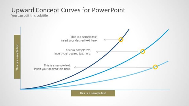
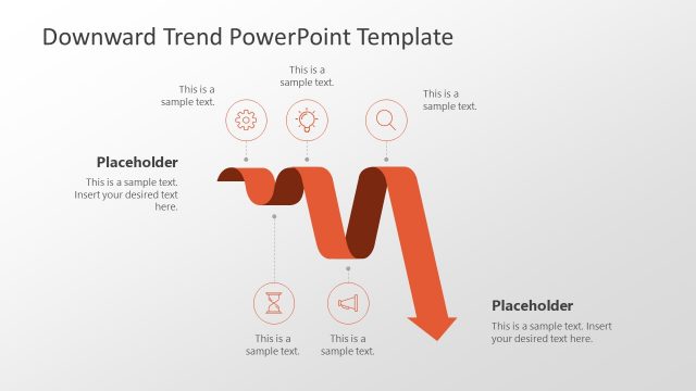
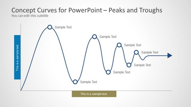
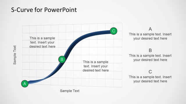
Downward Curves for PowerPoint is a 4-slide PowerPoint template for illustrating falling trends and negative performance patterns. It includes a callout curve diagram, a three-curve comparison, a four-milestone decline curve, and a segmented phase curve. Business presenters can use it to explain recession, slump, failure, or decreasing metrics.


 Loading...
 Microsoft PowerPoint
  Microsoft Copilot
  Claude for PowerPoint
 Other formats supported
Subscribe today and get immediate
access to download our PowerPoint templates.