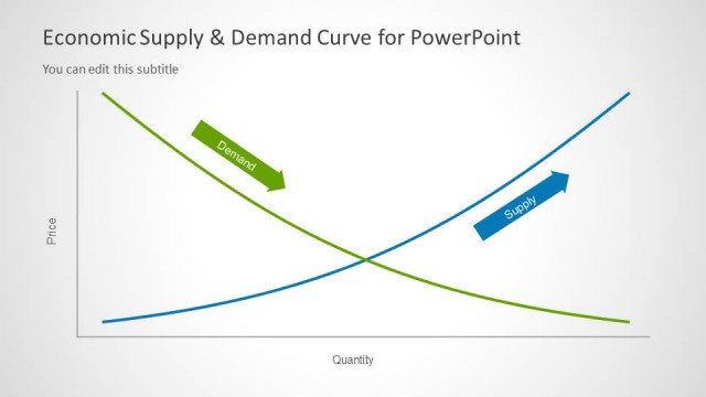
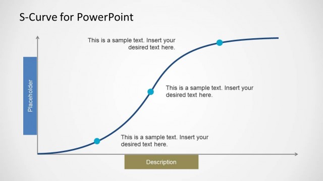
Supply & Demand Equilibrium for PowerPoint is a nice concept curve design for PowerPoint presentations on Economics and Supply & Demand analysis. This is an alternative to the classic Supply & Demand Curve for PowerPoint presentations that we have previously published. In this presentation template you can find useful supply & demand slides with curves showing the equilibrium.
What’s inside this template
Example presentation scenarios
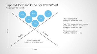
- An economics instructor can use the crossed supply-demand curve slide to introduce equilibrium before discussing how price and quantity meet in a market.
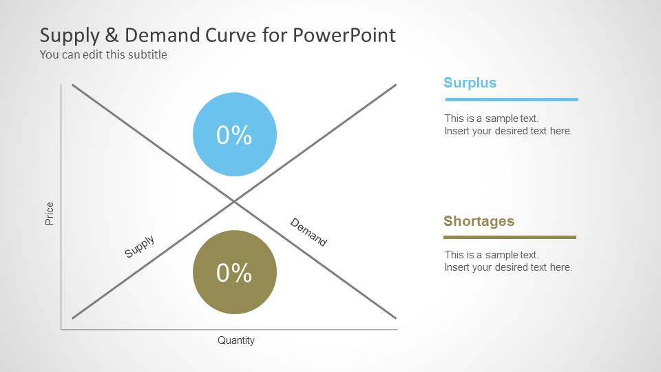
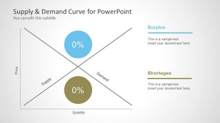
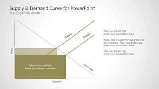
- A business analyst can use the surplus and shortage callout slide to explain why inventory buildup or unmet demand may appear under different pricing conditions.
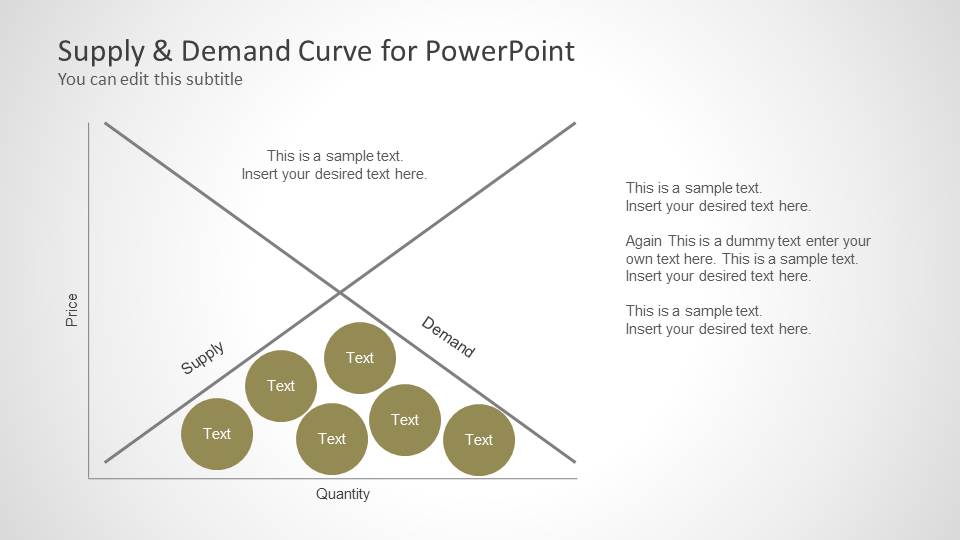
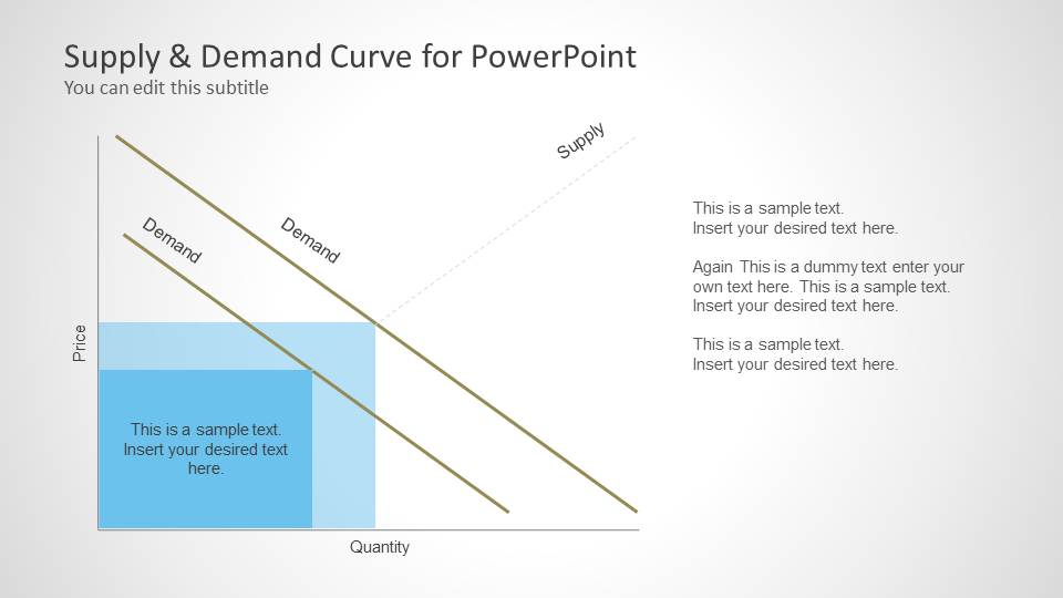
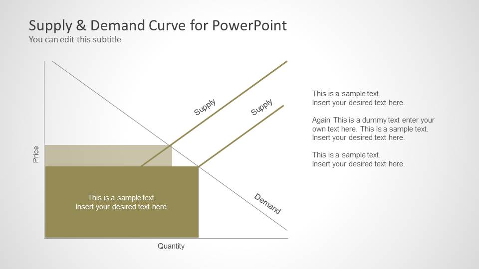
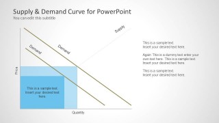
- A supply chain manager can use the shaded supply shift slide to discuss how capacity, cost, or availability changes affect market outcomes.
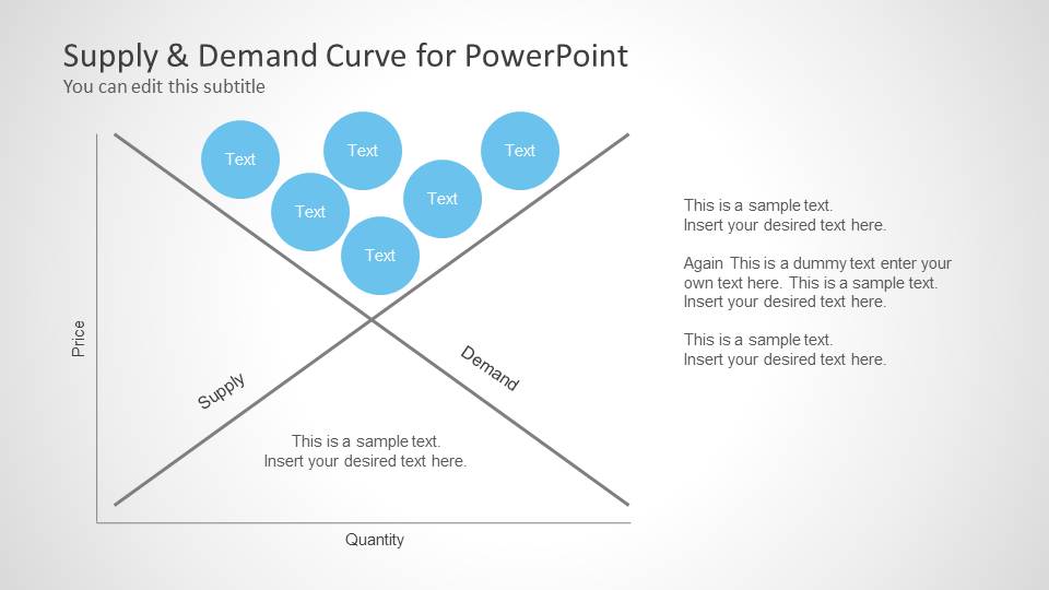
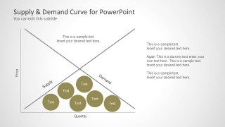
- A consultant can use the bubble annotation slides to compare groups of causes or market drivers located above or below the equilibrium point.
Features
- 100% editable presentation template
- Compatible with Microsoft PowerPoint and Google Slides
- Scalable vector shapes, icons and illustrations
- AI-Ready for Microsoft Copilot and Claude
- Instant access and download
Frequently asked questions
Q: How should a presenter explain equilibrium clearly with this template?
A: Start with the clean crossed-curve slide and define the axes before naming equilibrium. Then move to the surplus and shortage slide to show what happens away from that point. Keep each callout tied to one market behavior, such as excess supply, unmet demand, or pressure on price, so the audience follows the cause-and-effect logic.
Q: Who is this template best suited for?
A: This template fits instructors, analysts, consultants, and supply chain presenters who need to explain market behavior rather than report raw financial results. It is strongest when the audience needs a conceptual view of price, quantity, supply, demand, surplus, shortages, or curve shifts in a class, briefing, or business discussion.
Q: Why do the shaded areas and bubble clusters help the message?
A: The shaded regions give the audience a visible area to associate with market pressure or changed conditions, while the bubble clusters separate groups of factors from the main intersection. This reduces text dependency and lets the presenter point to where imbalance, drivers, or shifts appear on the economic diagram.
Supply & Demand Equilibrium for PowerPoint
5-slide PowerPoint presentation template for supply-demand equilibrium diagrams, surplus, and curve shifts
Supply & Demand Equilibrium for PowerPoint is a 5-slide economics presentation template for explaining market equilibrium, surplus, shortages, and curve shifts. It includes crossed supply-demand curve diagrams, surplus and shortage callouts, bubble annotations, and shaded demand or supply shift areas. It is built for instructors, analysts, and business presenters using PowerPoint.


 Loading...
 Microsoft PowerPoint
  Microsoft Copilot
  Claude for PowerPoint
 Other formats supported
Subscribe today and get immediate
access to download our PowerPoint templates.