Slide 2 of 5 from Supply & Demand Equilibrium for PowerPoint
6072-09-concept-curves-supply-demand-2
Supply and Demand Curve for PowerPoint
- Diagram
- Matrix Quadrant
- Concept Explanation Slide
- 16:9
- 100% Editable
The Supply and Demand Curve Diagram slide from the Supply & Demand Equilibrium for PowerPoint template visually explains market dynamics using editable shapes and vector icons. Ideal for economic presentations and business reports, this slide template helps illustrate price and quantity relationships clearly within a corporate presentation or educational lecture.
What’s on This Slide
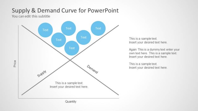
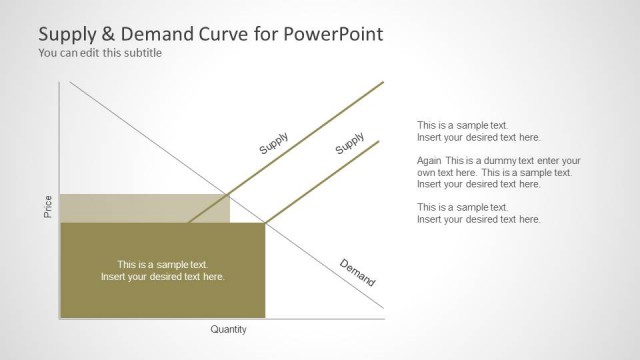
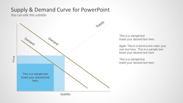
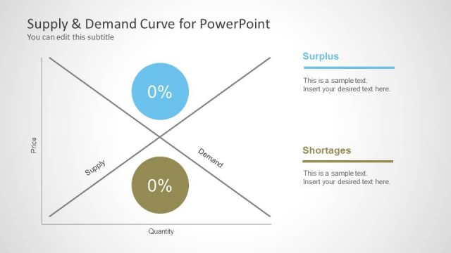
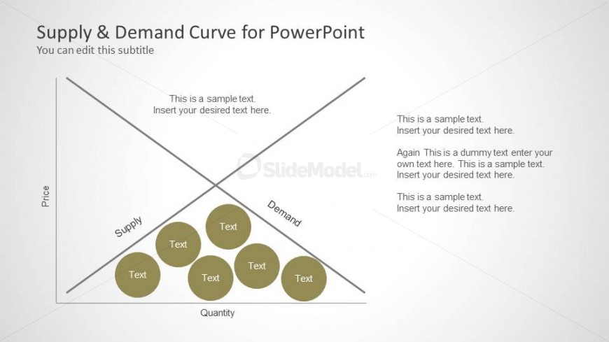
The layout features a diagonal supply and demand curve intersecting in the center, creating four quadrants. The top left quadrant is labeled 'Price,' while the bottom left is labeled 'Quantity.' The horizontal axis represents quantity, and the vertical axis represents price. Circular nodes are placed in the lower left quadrant, with text placeholders arranged inside them. Additional text placeholders are positioned in the upper right quadrant, aligned to the left. The overall color scheme is light with a gradient background, enhancing the visual hierarchy.
How to Use It
This diagram serves to illustrate the relationship between supply and demand in economics. It fits well in a presentation sequence following introductory concepts, allowing for detailed discussions on market dynamics. This layout is suitable for educators, analysts, or business professionals explaining market equilibrium, surplus, or shortages. It can be used in workshops, lectures, or economic reports to visualize complex concepts effectively.
Text Placeholders & Capacity
Keep your copy within these limits so it fits without resizing. Node slots can accommodate multiple text entries, roughly 5-8 words each.
| Placeholder | Count | Max characters (approx.) |
|---|---|---|
| Slide title | 1 | 30 |
| Subtitle | 1 | 40 |
| Item body | 5 | 50 |
| Body paragraph | 4 | 80 |
Slide Keywords
Download unlimited PowerPoint templates, charts and graphics for your presentations with our annual plan.
DOWNLOADReturn to Supply & Demand Equilibrium for PowerPoint.