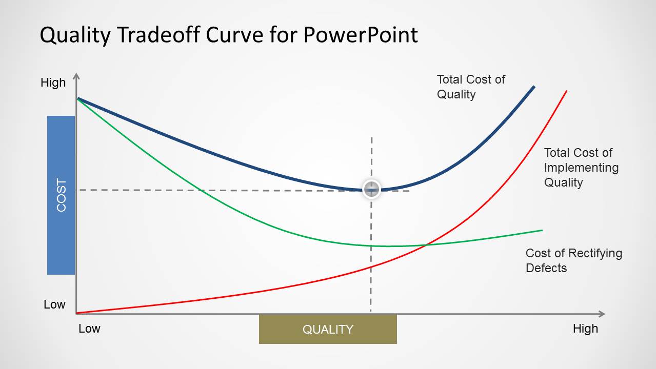
The Quality Tradeoff Curve for PowerPoint is a template for constructing a Quality Tradeoff Curve in the form of presentation slides. Unlike common curve templates, this template provides the option to move and adjust slide objects to create a custom curve with accurate depiction of cost and quality dynamics.
The template can be customized by changing the size and color of slide elements in PowerPoint and by customizing the curve via drag and drop. You can also download more Curve Templates for PowerPoint for depicting different types of curves in your presentations or download other slides for tradeoff analysis.
What’s inside this template
Example presentation scenarios
- A quality manager can use the base curve to explain why the lowest total cost of quality occurs at an optimal quality level rather than at either extreme.
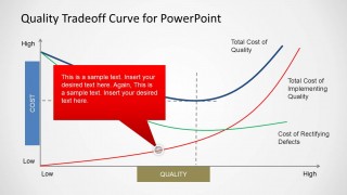
- An operations leader can use the red callout slide to discuss the rising cost of implementing higher quality standards during a process improvement meeting.
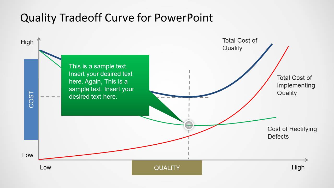
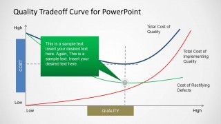
- A process improvement consultant can use the green callout slide to show how the cost of rectifying defects changes as product or service quality improves.
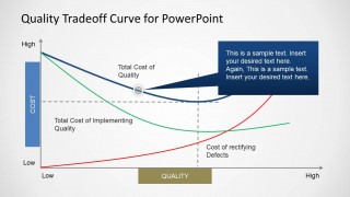
- A finance stakeholder can use the blue callout slide to connect investment in quality programs with the overall total cost of quality curve.
Features
- 100% editable presentation template
- Compatible with Microsoft PowerPoint and Google Slides
- Scalable vector shapes, icons and illustrations
- AI-Ready for Microsoft Copilot and Claude
- Instant access and download
Frequently asked questions
Q: How should the presenter explain the quality tradeoff curve clearly?
A: Start with the axes before discussing the curves. Define cost on the vertical axis and quality on the horizontal axis, then introduce the red, green, and blue curves one at a time. Use the dashed guide lines and circular marker to direct attention to the point where total cost of quality appears lowest.
Q: Who is this template best suited for?
A: This template fits quality managers, operations leaders, consultants, and analysts who need to explain a cost-of-quality concept without building a full financial model. It is especially useful in TQM, Kaizen, manufacturing, service operations, or process improvement discussions where the audience must understand the tradeoff before reviewing actions.
Q: Why use a curve diagram instead of a table for this message?
A: The curve acts as a visual metaphor for balance. A table can list cost categories, but the U-shaped total cost curve shows why too little or too much quality effort can create cost pressure. The colored lines and callouts help the audience see the economic tension behind an optimal quality point.


Quality Tradeoff Curve for PowerPoint
4-slide PowerPoint presentation template for quality tradeoff curves, cost of quality, and TQM analysis
Quality Tradeoff Curve for PowerPoint is a 4-slide presentation template for explaining cost-quality dynamics. It includes a base quality tradeoff curve, a cost versus quality axis diagram, an optimal point marker, and three colored callout variants. It is intended for quality, operations, process improvement, and TQM discussions in PowerPoint.


 Loading...
 Microsoft PowerPoint
  Microsoft Copilot
  Claude for PowerPoint
 Other formats supported
Subscribe today and get immediate
access to download our PowerPoint templates.