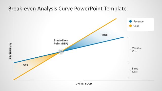
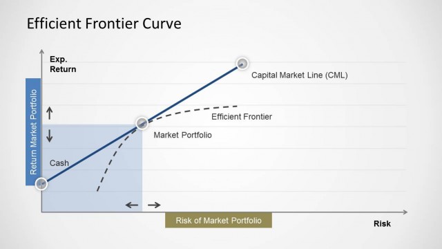
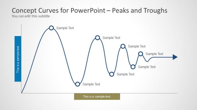
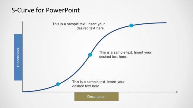
Break-Even Point Curves for PowerPoint is a presentation template for Microsoft PowerPoint that you can download to show a break-even analysis in a PowerPoint presentation.
You can copy and paste the break-even curves in your own slide designs to show the break-even point and edit the curve using PowerPoint shapes.
What’s inside this template
Example presentation scenarios
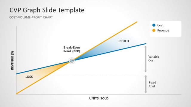
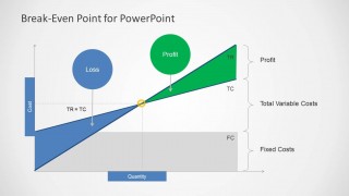
- A finance analyst can use the break-even point diagrams to show leadership where revenue begins to exceed total costs and how fixed costs affect the decision.
- A consultant can use the profit and loss shaded areas to explain a pricing recommendation and make the financial threshold easier for clients to interpret.
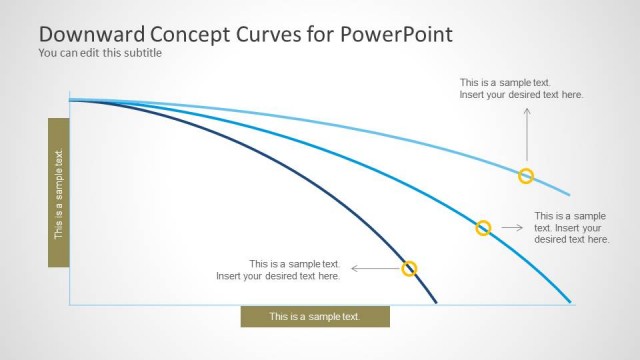
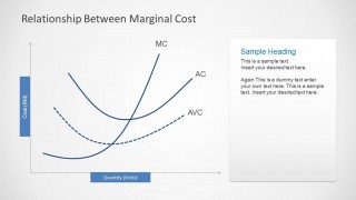
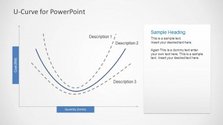
- An economics instructor can use the marginal cost and U-curve slides to teach cost behavior with labeled curves, axes, and short supporting notes.
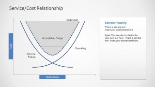
- An operations manager can use the service/cost relationship slide to discuss acceptable performance ranges and the cost impact of under-service or over-operation.
Features
- 100% editable presentation template
- Compatible with Microsoft PowerPoint and Google Slides
- Scalable vector shapes, icons and illustrations
- AI-Ready for Microsoft Copilot and Claude
- Instant access and download
Frequently asked questions
Q: How should I present the break-even message with these curve slides?
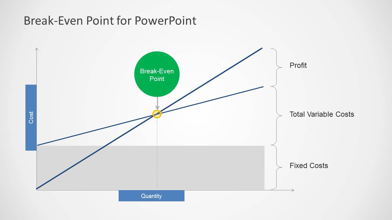
A: Start with one core question: at what quantity does the business stop losing money? Use Slide 1 or Slide 3 to orient the audience to cost, quantity, and the break-even marker. Then explain the fixed cost block before discussing profit and loss zones, so non-finance viewers understand the chart before seeing the conclusion.
Q: Who is this template best suited for?
A: This template is best for presenters explaining cost behavior rather than reporting a full financial model. Finance analysts, consultants, founders, operations managers, and economics instructors can use the break-even charts, marginal cost curves, and service/cost relationship slide to turn abstract economics into a clear visual discussion.
Q: Why do the shaded curve layouts make the analysis easier to understand?
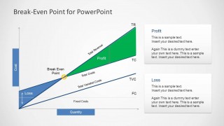
A: The shaded regions act as visual metaphors for financial zones: blue areas signal loss, green areas signal profit, and gray blocks separate fixed costs from variable behavior. That structure helps the audience read the conclusion before they inspect every label, which is useful when discussing thresholds and economic tradeoffs.


Break-Even Point Curves for PowerPoint
7-slide PowerPoint presentation template with break-even curves, cost areas, and U-curve diagrams
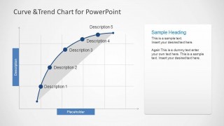
Break-Even Point Curves for PowerPoint is a 7-slide presentation template for explaining economic cost and revenue relationships. It includes break-even point diagrams, profit and loss shaded areas, service/cost relationship U-curves, marginal cost curves, and a curve and trend chart for analysts, consultants, finance teams, and educators.


 Loading...
 Microsoft PowerPoint
  Microsoft Copilot
  Claude for PowerPoint
 Other formats supported
Subscribe today and get immediate
access to download our PowerPoint templates.