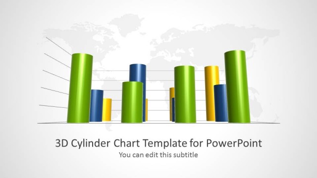
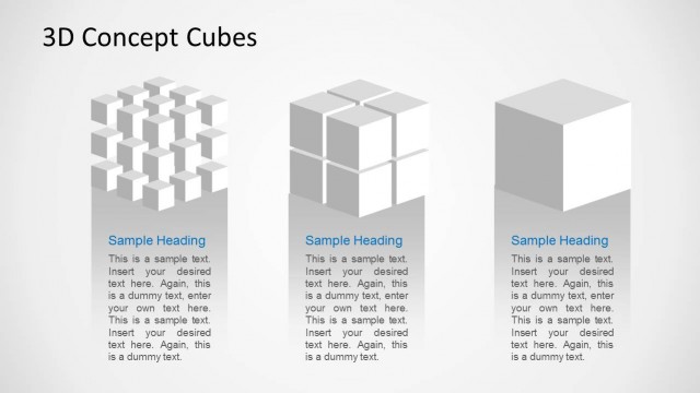
This 3D Cylinder Chart Concept for PowerPoint is a presentation design that features 3D cylinder shapes. Presenters can use these 3D shapes in their presentations in a versatile number of ways. They are especially useful for showing hierarchy, timelines, bar graphs, and platforms for first, second, and third place winners. However, there are many possible uses beyond these that presenters can apply to these slide shapes.
The sample layouts are easy to customize, with professionally crafted cylinder slides. Professionals have used these 3D cylinders because they are not forms commonly found in standard PPT styles. Neither are not easy to create from scratch. By using these 3D shapes, presenters can create engaging and unique PowerPoint presentations that best demonstrate the value of their information.
When users download these slide templates and add them to their own presentations, they are able to edit all aspects of the template. Editable features include color, placement on the slide, and text. They’re easy to edit and perfect for beginner PPT presenters, as well as experienced presenters looking for an uncomplicated way to elevate their presentations.
Professionals in virtually any field or industry can choose the 3D cylinder PowerPoint shape template that works best for their needs and integrate it into their presentation.
What’s inside this template
Example presentation scenarios
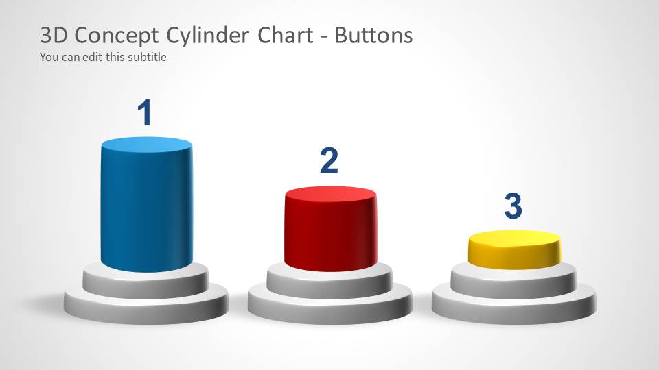
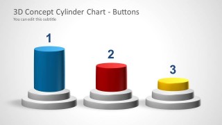
- A sales manager can use the ranking buttons layout to compare top product lines, territories, or teams and explain why each position matters.
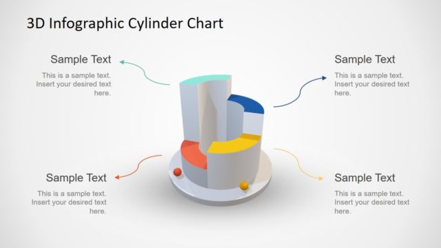
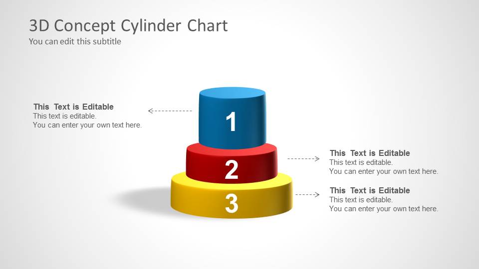
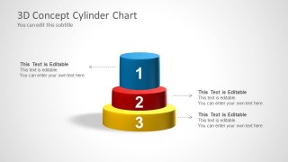
- A consultant can use the stacked cylinder diagram to show priority levels, maturity stages, or value layers with callout text for each tier.
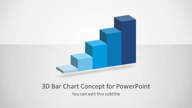
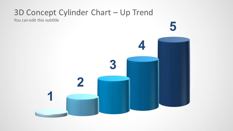
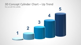
- An analyst can use the up trend cylinder bars to present rising adoption, performance, or output across five ordered periods or categories.
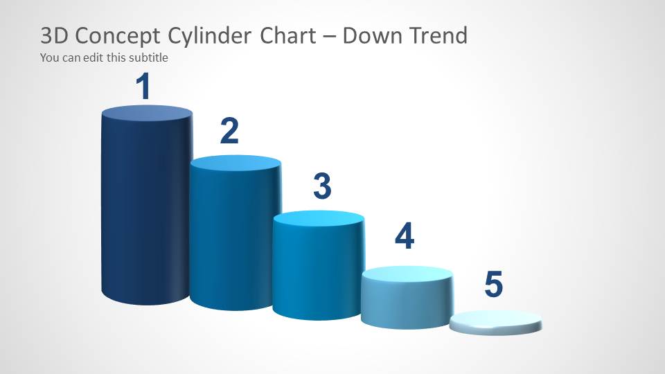
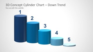
- A training presenter can use the down trend cylinder bars to explain risk reduction, cost decline, or process waste removal across five steps.
Features
- 100% editable presentation template
- Compatible with Microsoft PowerPoint and Google Slides
- Scalable vector shapes, icons and illustrations
- AI-Ready for Microsoft Copilot and Claude
- Instant access and download
Frequently asked questions
Q: How should a presenter use the 3D cylinder shapes without making the message feel decorative?
A: Treat each cylinder as a ranked idea, stage, or category, not as a generic ornament. Use the ranking buttons for three clear choices, the stacked cylinder for hierarchy, and the trend bars for movement. Keep labels short and add one interpretation sentence so the audience understands the business meaning behind the shape.
Q: Who is this template best suited for in a business presentation?
A: It fits presenters who need to explain simple comparisons or ordered concepts quickly, such as sales leaders ranking regions, consultants showing maturity levels, or managers describing performance movement. The visible layouts work best when the message has three to five items, because the cylinder forms give each item a distinct visual position.
Q: Why use cylinders instead of a standard flat bar chart for these slides?
A: The cylinder metaphor gives ranking and hierarchy a podium-like feel, which can make first, second, and third positions easier to recognize. The up and down trend slides also create a physical sense of growth or decline. This design is strongest for directional storytelling, not for exact statistical reading.
3D Cylinder Chart Concept for PowerPoint
5-slide PowerPoint presentation template with 3D cylinder charts, ranking podiums, and trend bars
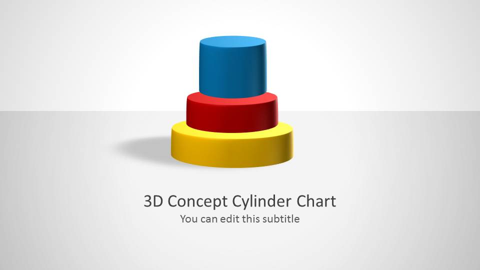
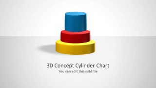
This is a 5-slide PowerPoint template built around editable 3D cylinder chart shapes. It includes a cover cylinder stack, ranking buttons, labeled stacked cylinders, and up trend and down trend cylinder bars for showing hierarchy, comparisons, or performance movement in business, education, and reporting presentations.

 Loading...
 Microsoft PowerPoint
  Microsoft Copilot
  Claude for PowerPoint
 Other formats supported
Subscribe today and get immediate
access to download our PowerPoint templates.