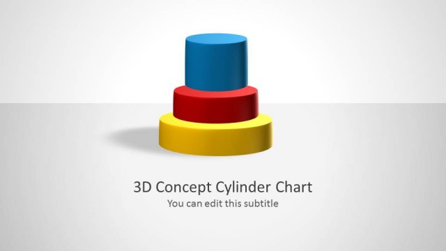
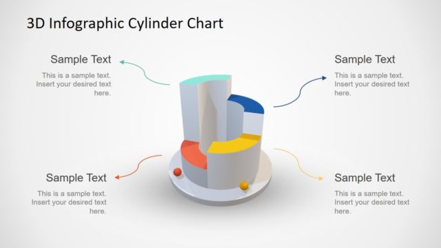
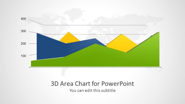
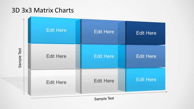
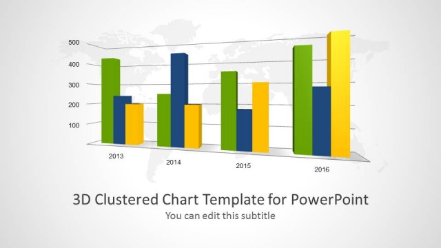
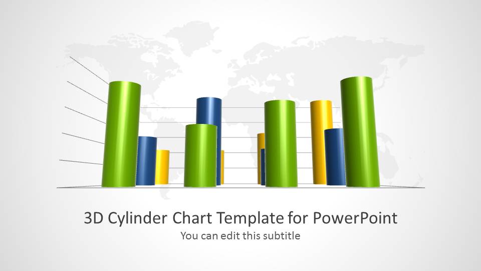
3D Cylinder Chart Template for PowerPoint provides a range of editable cylinder charts to help you present your statistical data in style.
This elegantly crafted PowerPoint template is perfect for presenting charts with the aid of 3D slide designs, to present information in an easy to grasp format for your audience.
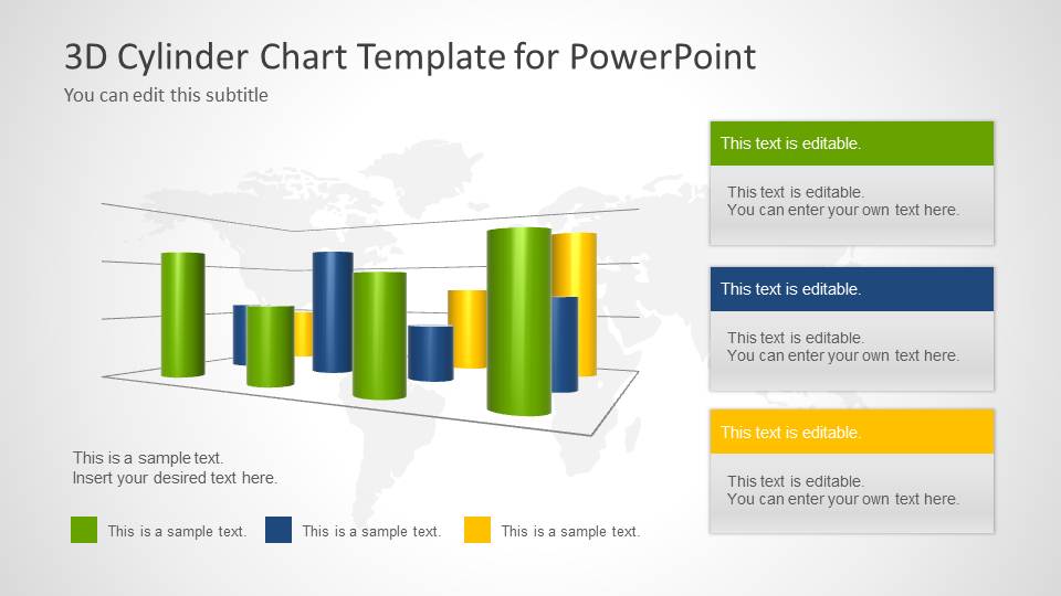
The given slides also come with relevant placeholders to help you describe your charts, with each textbox colored according to the data it represents.
What’s inside this template
Example presentation scenarios
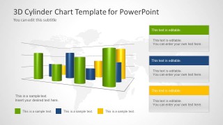
- A sales manager can report quarterly performance by replacing the clustered cylinder chart data with revenue categories and using the legend colors to separate product lines.
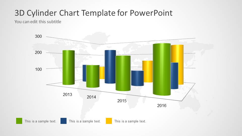
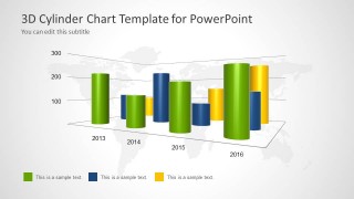
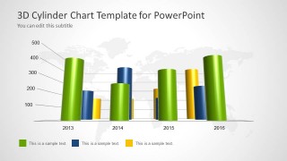
- A finance analyst can compare budget, actual, and forecast values across years with the large axis-based cylinder chart and add short interpretation notes in the text placeholders.
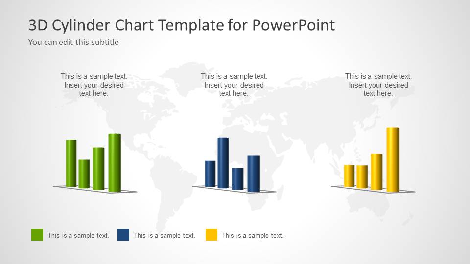
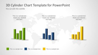
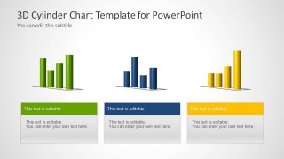
- An operations leader can show three department metrics side by side using the mini chart panels and the matching summary cards to explain what each metric means.
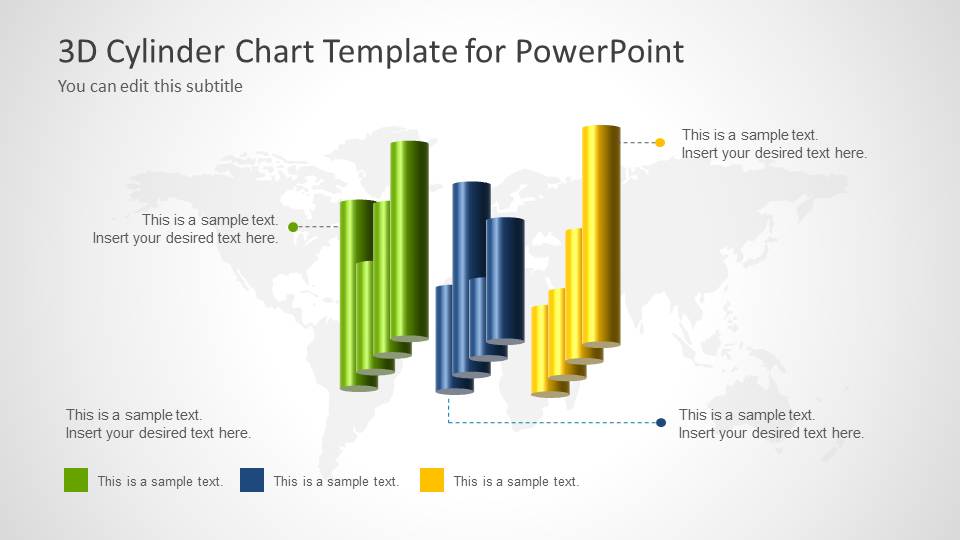
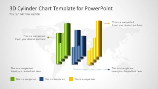
- A consultant can present regional market comparisons by using the world map background with callout annotations that point attention to the most important data differences.
Features
- 100% editable presentation template
- Compatible with Microsoft PowerPoint and Google Slides
- Scalable vector shapes, icons and illustrations
- AI-Ready for Microsoft Copilot and Claude
- Instant access and download
Frequently asked questions
Q: How should a presenter explain the 3D cylinder charts without making the data feel decorative?
A: Lead with the comparison the audience needs to understand, then use the cylinder height only as visual support. State the time period or category first, call out the largest gap, and use the colored legend consistently. The annotation slide is best for explaining why a specific bar group matters.
Q: Who is this template best suited for in a business presentation?
A: This template fits presenters who need to report a limited set of comparative metrics in a visually memorable way. Sales, finance, operations, and consulting teams can use the clustered cylinder charts for trend comparisons and the mini chart panels for category snapshots without building a full KPI dashboard.
Q: Why does the template use a world map background behind the charts?
A: The light map background gives the data a broad business or market context while staying behind the chart area. It is useful when the numbers relate to regions, markets, customers, or global operations. Because the map is pale, the green, blue, and yellow cylinder series remain the primary focal point.


3D Cylinder Chart Template for PowerPoint
7-slide presentation template with 3D cylinder charts, legends, callouts, and world map backgrounds
This 7-slide PowerPoint template contains editable 3D cylinder chart layouts for comparing categories over time or by segment. Visible slides include a cover chart, clustered cylinder charts, three mini chart panels, callout annotations, and text-card summaries. Chart data can be edited as an Excel spreadsheet in PowerPoint.


 Loading...
 Microsoft PowerPoint
  Microsoft Copilot
  Claude for PowerPoint
 Other formats supported
Subscribe today and get immediate
access to download our PowerPoint templates.