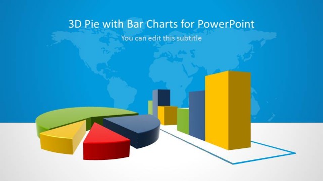
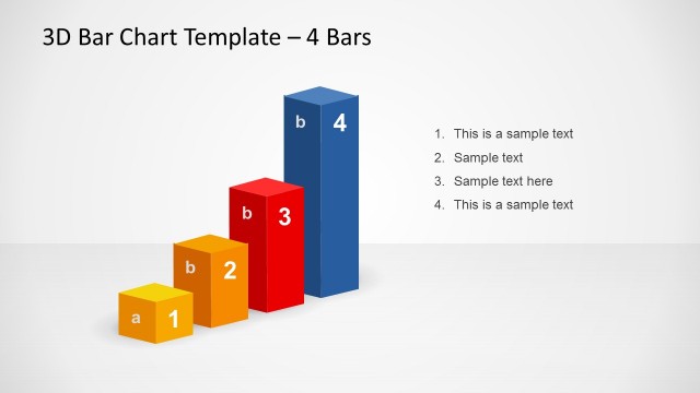
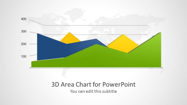
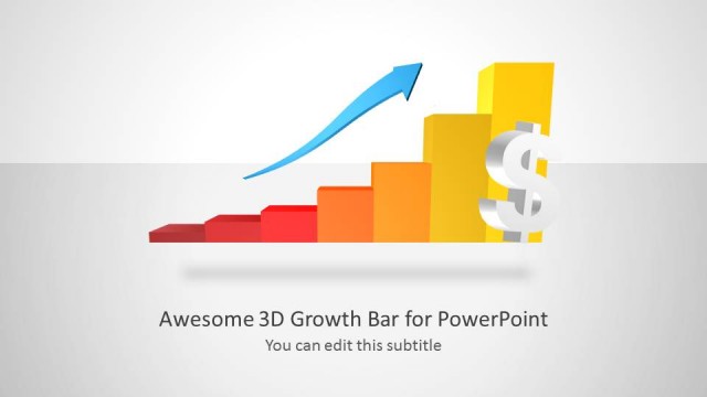
3D Clustered Chart Template for PowerPoint– a selection of 3D vertical bar charts that are grouped or clustered together. Colorful and elegant, the slide designs can surely impress professional audiences. The smart appeal of the layout can stimulate attention and conscious learning.
The PowerPoint template is perfect for data-driven presentations such as marketing and sales. It is actually generic which means that any subject matter can be applied. It can be used in research presentations where the user can visualize clustered results. It is ideal for statistics and inventory. Many business concepts can find it extremely useful such as financial reporting and in weighing strategies.
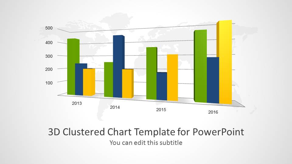
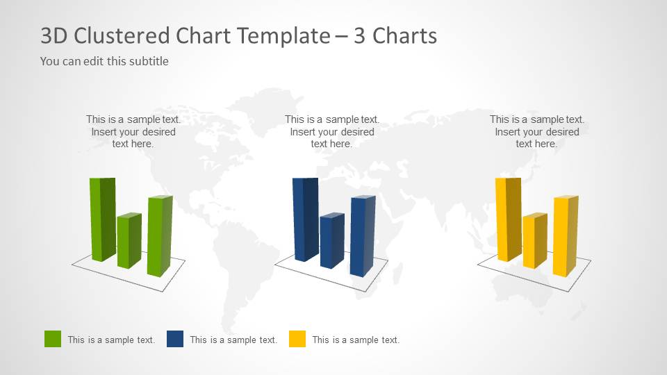
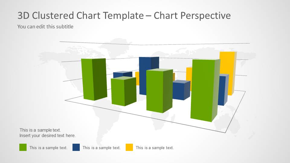
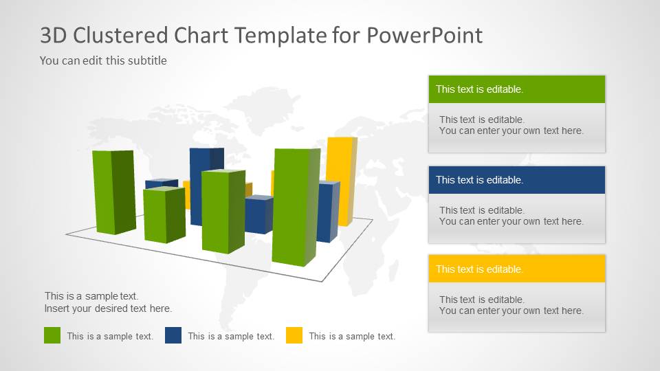
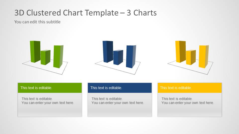
3D Clustered Chart Template for PowerPoint is composed of 5 novel slides. In the first slide, a perspective bar diagram is displayed inside a 3D horizontal grid. Each layer of the grid and every chart cluster have a corresponding text placeholder for labels. The second slide groups the data according to color coding. The background is a gray world map outline. The colors can symbolize a certain homogeneous collection. The third slide gathers all bar charts in one plane. In the fourth slide, the presenter can key in important descriptions on the text boxes relative to each color. Duplicate features from the second slide are pasted to the last slide. The only difference is the flat white background.
A clustered bar chart consists of many groups of data arranged graphically. The data is quantitative and the height of the bars is generally proportional to these values. The diagram can emphasize of different homogeneous clusters in a heterogeneous setting. This way, analysis becomes a lot easier. Patterns can emerge on the graph and gaps can be easily identified.
Present with awesome infographics with 3D Clustered Chart Template for PowerPoint. Get creative using Cluster Diagram Template for PowerPoint downloadable at the SlideModel gallery.
What’s inside this template
Example presentation scenarios
- A sales manager can use the title chart and perspective chart to compare revenue, pipeline, or unit performance across years and product groups.
- A marketing analyst can use the three mini chart panels to explain how separate campaign groups performed against the same set of measures.
- A research presenter can use the color-coded callout slide to explain clustered survey results while keeping the chart and interpretation on one slide.
- An operations manager can use the 3D bar chart with legend to compare inventory, capacity, or output across time periods and business locations.
Features
- 100% editable presentation template
- Compatible with Microsoft PowerPoint and Google Slides
- Scalable vector shapes, icons and illustrations
- AI-Ready for Microsoft Copilot and Claude
- Instant access and download
Frequently asked questions
Q: How should a presenter structure the message around these clustered bar charts?
A: Start by defining what each color represents, then point to the largest gaps or patterns rather than describing every bar. Use Slide 1 or Slide 3 for the main comparison, then move to the mini chart or callout layouts when the audience needs separated categories or a short interpretation beside the data.
Q: Who is this chart template best suited for?
A: It fits analysts, managers, consultants, and researchers who need to compare several related data groups in a short business report. The layout is strongest when the message depends on grouped comparison, such as product performance by year, market segments by region, or survey clusters across categories.
Q: Why use the 3D clustered chart metaphor instead of a standard table?
A: The 3D clustered bars make differences between groups easier to scan than a dense table, especially during a live presentation. The repeated green, blue, and yellow categories create a visual code across slides, while the map background and perspective grid add context without needing many extra labels.
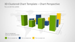
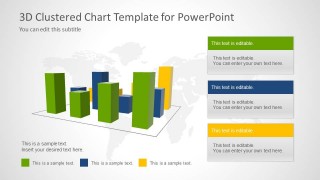
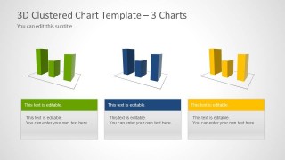
3D Clustered Chart Template for PowerPoint
5-slide PowerPoint presentation template with 3D clustered bar charts, category labels, and report callouts
The 3D Clustered Chart Template for PowerPoint is a 5-slide data and chart deck for comparing grouped metrics. It includes a full clustered bar chart, three mini chart panels, a perspective chart, and callout text boxes for analysts, managers, and report presenters working in PowerPoint.


 Loading...
 Microsoft PowerPoint
  Microsoft Copilot
  Claude for PowerPoint
 Other formats supported
Subscribe today and get immediate
access to download our PowerPoint templates.