Chart
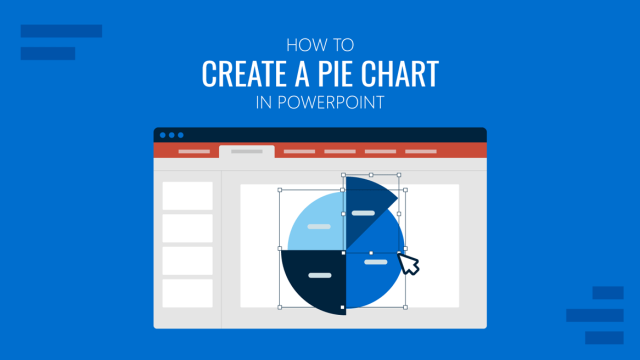
How to Create a Pie Chart in PowerPoint
Pie charts make proportional data easy to grasp at a glance. This guide walks you through how to create one in PowerPoint and customize it.
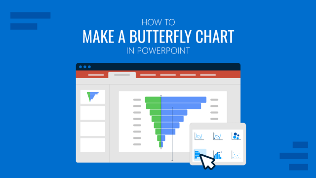
How to Create a Butterfly Chart in PowerPoint
Butterfly charts are ideal for comparing opposing data sets visually. This guide walks you through how to create a butterfly chart in PowerPoint.
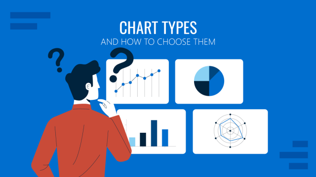
Chart Types and How to Choose Them in Presentations
A complete guide to chart types for presentations: comparison, trend, and composition charts, plus how to pick the right one fast.
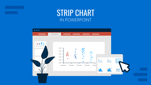
How to Create a Strip Chart in PowerPoint
Strip charts are a simple yet effective way to visualize data trends. Learn how to create a strip chart in PowerPoint with this step-by-step guide.
How to Make a Control Chart in PowerPoint
Improve the impact of your management or operation slides for data analysis by learning how to make a control chart in PowerPoint.
How to Create a Waterfall Chart in PowerPoint
A waterfall chart shows how the starting value changes over time due to a series of positive and negative contributions. Commonly used in finance and business reporting, this chart type helps the audience clearly understand how different factors impact a final result. If you’re wondering how to create a waterfall chart in PowerPoint, the guide […]
How to Make a Pyramid Chart in PowerPoint
Pyramid charts are widely used in business presentations to show information, such as hierarchical relationships, stages of development, or levels of importance. This might include an organizational chart, a marketing funnel, or strategic priorities laid out as a pyramid diagram. Learning how to create a pyramid chart in PowerPoint can help presenters organize layered information […]
How to Create a Bubble Chart in PowerPoint
Learn how to easily create a bubble chart in PowerPoint, its application in presentation slides, and common mistakes to avoid.
How to Create a Pareto Chart in PowerPoint
Stop confusing your audience with complex slides. Master the Pareto diagram in PowerPoint to simplify your datasets and emphasize the 80/20 rule.
How to Build a Mekko Chart Presentation That Actually Works
A Mekko chart is one of the few visuals that shows market size and composition at once. Here’s how to build, design, and present it effectively.
How to Use a Treemap Chart in Presentations
Do you need to present datasets arranged by hierarchy? A treemap chart is the ideal tool for this task, and in this guide, we’ll show you how to create one.

Sankey Diagrams (Quick Guide for Presenters)
Learn how to read Sankey Diagrams and how to design them for your presentations.