Comparing two related datasets can sometimes be difficult with standard bar charts. When considering chart types for showcasing your data analysis, a butterfly chart can help address this problem by displaying values on opposite sides of a central axis, making differences and similarities easier to identify at a glance. A butterfly chart in PowerPoint is commonly used for demographic analysis, survey results, performance comparisons, and before-and-after assessments. In this guide, we will explain what a butterfly chart is, when to use it, how it differs from a tornado chart, and how to create one in PowerPoint using built-in chart tools.
What is a Butterfly Chart
A butterfly chart is a variation of a horizontal bar chart that displays two datasets extending in opposite directions from a central axis, like the wings of a butterfly. Each side represents a separate category or group. This allows the audience to compare values across the same set of categories. Common examples include population distribution, planned vs. actual project performance, current-year vs. previous-year sales, survey responses from two audience groups, and regional performance comparisons.
When Should You Use a Butterfly Chart
A butterfly chart is particularly useful when you need to compare two groups across the same set of categories in a clear and visually balanced way. By displaying values on opposite sides of a central axis, the chart makes it easy to identify differences, similarities, and patterns. This type of visualization is commonly used in human resources reporting to compare workforce demographics, in market research to analyze consumer segments, in customer survey analysis to contrast responses between groups, and in population studies to examine age or gender distributions.
Butterfly charts are also effective for sales performance comparisons, operational dashboards, and other business reports where side-by-side analysis is important. As both datasets share the same scale and categories, viewers can quickly spot trends, gaps, and areas where one group outperforms or differs from the other.
Butterfly Chart vs Tornado Chart Difference
The terms butterfly chart and tornado chart are often used interchangeably because both visualizations use horizontal bars extending outward from a central axis. While they may look similar at first glance, the two charts are typically used for different analytical purposes. The distinction is less about the visual structure and more about the type of information being presented. While the underlying chart structure is similar, butterfly charts are generally used to compare datasets. In contrast, tornado charts are designed to rank and visualize the influence of different factors on a result. This difference in purpose is the main reason the two terms are sometimes used interchangeably, though they do not always mean the same thing.
Butterfly Chart
A butterfly chart is primarily designed to compare two related datasets side by side. Each group is displayed on opposite sides of a central axis, making it easy to identify differences, similarities, and trends across the same categories. Common examples include comparing men and women in population studies, comparing Product A and Product B in market analysis, or comparing actual performance and target performance in business reporting. The emphasis is on balance and comparison, allowing viewers to evaluate two groups simultaneously within a single chart.
Tornado Chart
A tornado chart is most commonly used in forecasting, risk analysis, and sensitivity analysis. Rather than comparing two groups, it focuses on showing the relative impact of different variables on a specific outcome. In a typical tornado chart, variables are sorted by magnitude, with the largest bars appearing at the top and progressively smaller bars below. This arrangement creates a funnel-like shape that resembles a tornado, which is how the chart gets its name. While butterfly charts are frequently used in demographics, surveys, and business reporting, tornado chart PowerPoint slides are more commonly associated with decision-making models, project planning, and risk management exercises.
How to Make a Butterfly Chart in PowerPoint
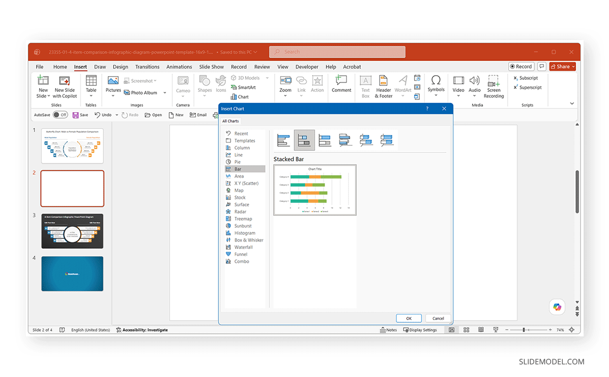
PowerPoint does not include a dedicated butterfly chart option, but you can easily build one using a stacked bar chart.
Step 1: Insert a Bar Chart via Insert -> Chart -> Bar -> Stacked Bar. PowerPoint opens an Excel worksheet where you can enter your data.
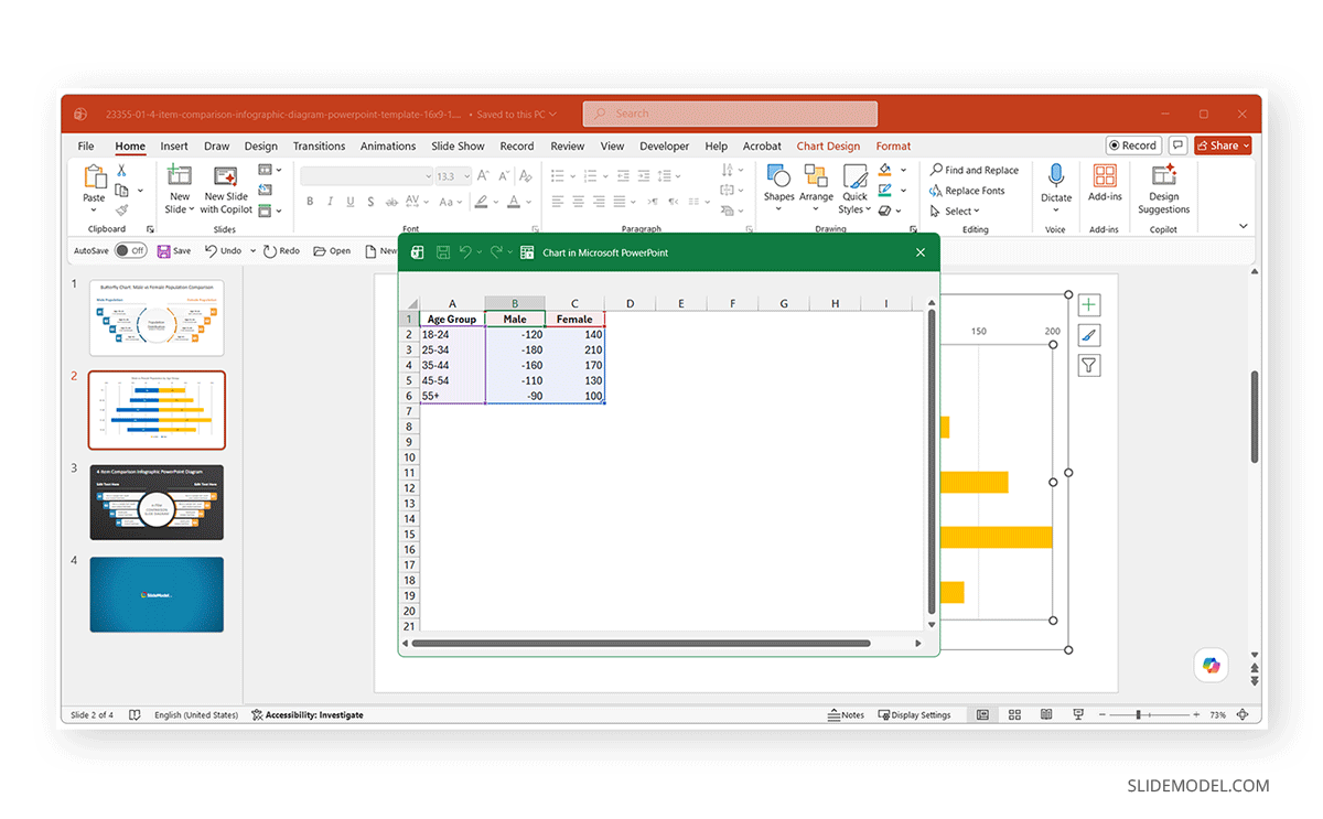
Step 2: Enter the data in the Excel sheet to generate the chart. The image below shows an example of data suitable for making such a chart. Notice that one series uses negative values. This causes the bars to extend in the opposite direction, creating the butterfly effect.
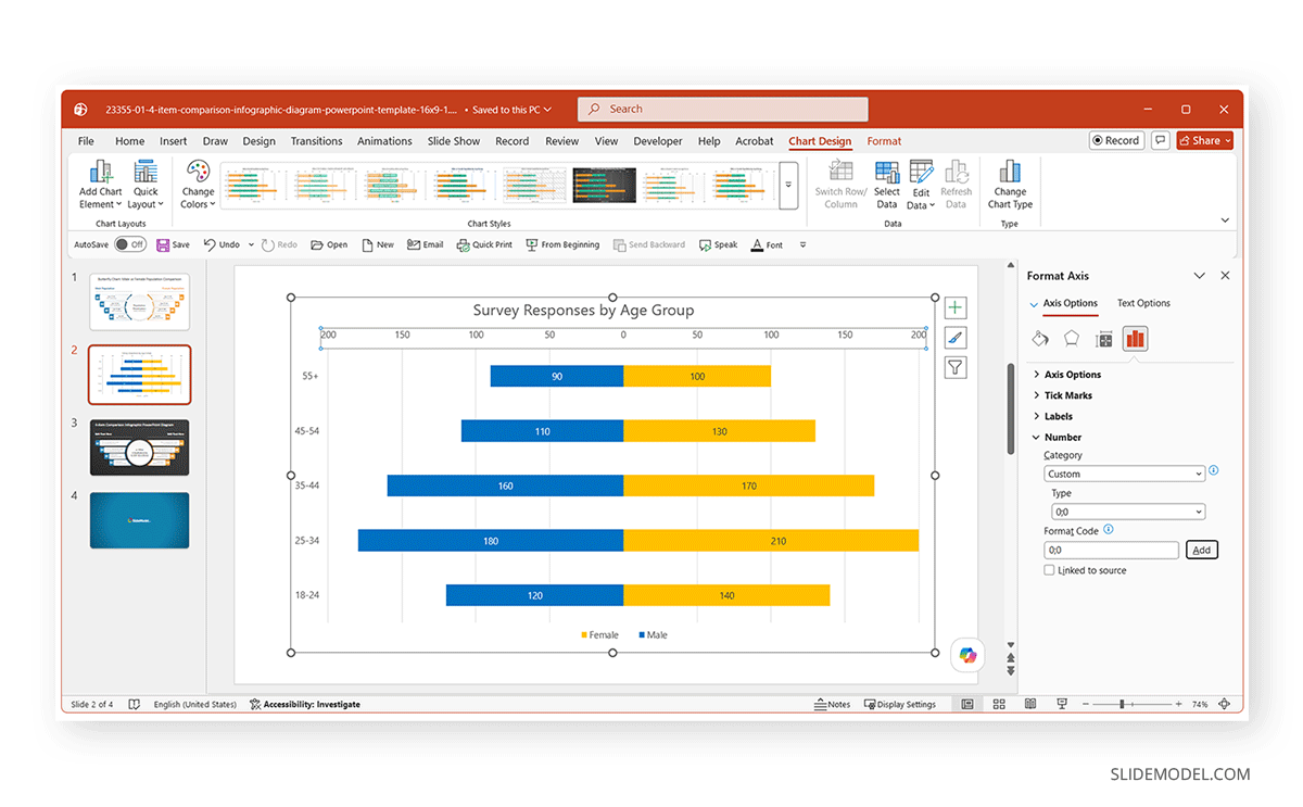
Step 3: Click the horizontal value axis and select Format Axis. Under Bounds, set matching minimum and maximum values (for example, -250 and 250). Using equal values on both sides of zero creates a balanced layout and ensures that comparisons are visually accurate. If necessary, set the axis to cross at 0 so that the categories appear between the two sets of bars.
Since one series uses negative values to position the bars, the data labels may display minus signs. To show positive numbers while preserving the chart structure, select the data labels, open Format Axis, go to Axis Options -> Number formatting, and apply a custom number format such as 0;0. This removes the negative sign from the labels without affecting the chart layout.
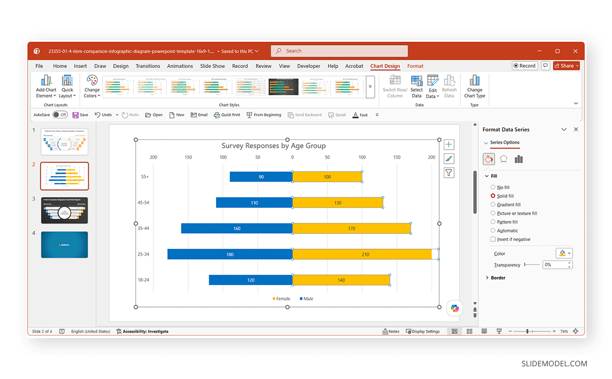
Step 4: Select each series and apply different colors to distinguish the groups being compared. In the example below, we used blue for male and orange for female survey responses. You can also reduce the Gap Width in the Format Data Series pane to make the bars thicker and easier to read.
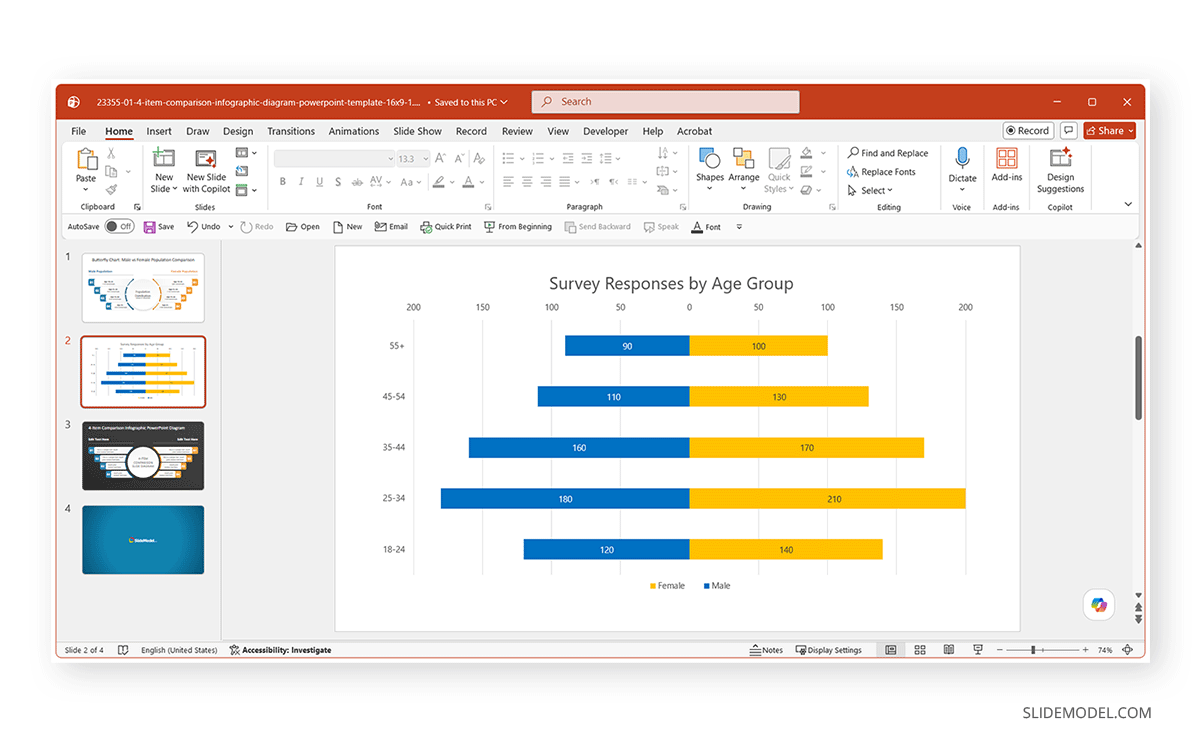
In this example, the butterfly chart compares survey responses from male and female participants across five age groups. Male responses are displayed on the left side of the chart, while female responses are shown on the right. The mirrored layout makes it easy to compare participation levels and identify demographic differences between groups.
Using PowerPoint Templates for Making Butterfly Charts
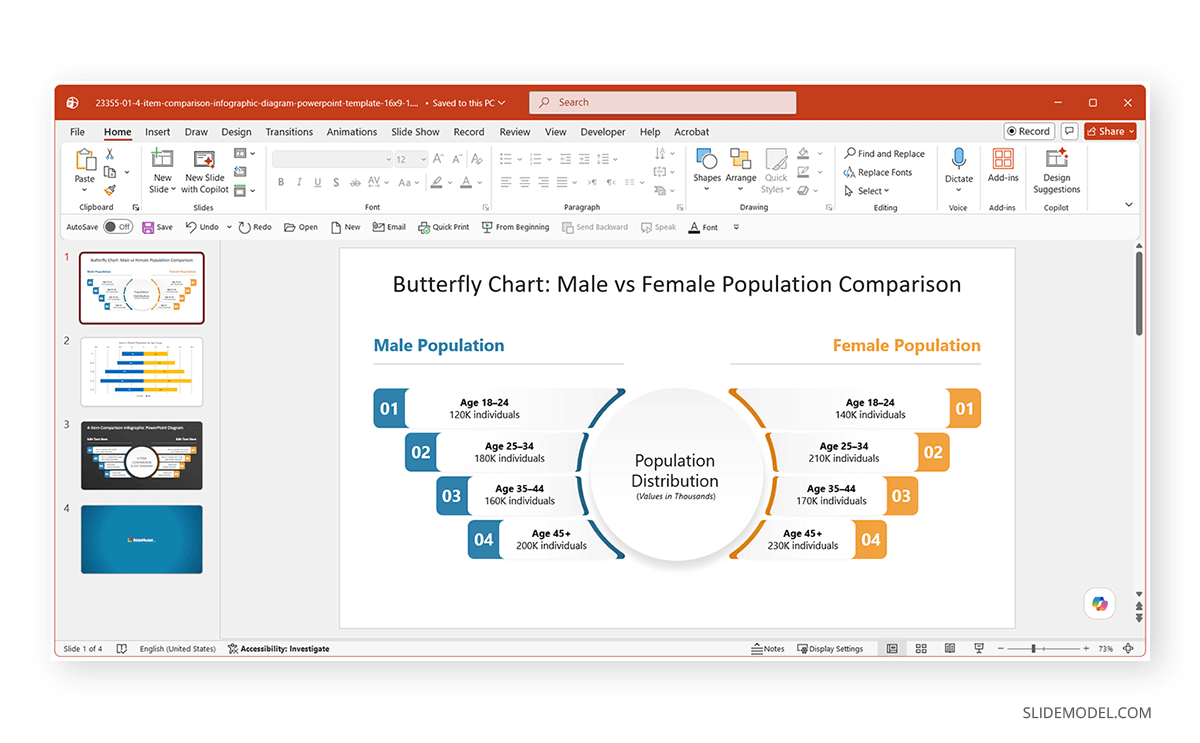
With the help of editable PowerPoint templates, you can create butterfly charts with ease. SlideModel’s Chart Templates for PowerPoint provide many handy options to create elaborate and basic butterfly charts. The example below shows a butterfly chart created using the 4-Item Comparison Infographic PowerPoint Template.
This butterfly chart compares male and female population counts across four age groups. The mirrored layout allows viewers to quickly evaluate demographic differences, while the shared categories and scale make comparisons easier to interpret. In this example, female population counts exceed male counts in each age segment, with the largest populations occurring in the 45+ and 25–34 age groups.
Final Words
A butterfly chart in PowerPoint can help compare two related datasets within a single visual. By placing horizontal bars on opposite sides of a central axis, the chart makes differences, similarities, and trends easy to identify. PowerPoint does not offer a dedicated butterfly chart option; creating one requires only a standard stacked bar chart and a few formatting adjustments. Such a butterfly bar chart PowerPoint or dual-sided bar chart PowerPoint visualization can provide a balanced way to present comparative data, with data displayed like butterfly wings.