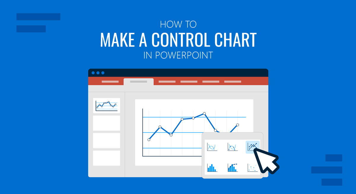
Control charts are widely used in quality management, operations, and data analysis to monitor processes over time. If you need to present performance trends, identify variations, or highlight process stability, learning how to build a control chart in PowerPoint can be very useful.
What is a Control Chart
A control chart is a type of graph used to track how a process changes over time. It helps distinguish between normal variation (common causes) and unusual variation (special causes). A typical control chart includes data points plotted over time, a Center Line (CL) representing the average, an Upper Control Limit (UCL), and a Lower Control Limit (LCL). These limits help determine whether a process is stable or if corrective action may be needed.
Control charts are commonly used in quality control reports, manufacturing and operations dashboards, business performance tracking, and other uses, such as process improvement presentations. They help audiences quickly understand trends, identify anomalies, and make informed decisions based on data.
How to Create a Control Chart in PowerPoint
You can create a control chart PPT using a variety of methods, including the chart tools in PowerPoint, shapes, and ready-made templates.
Method 1: Create a Control Chart Using PowerPoint Charts
The easiest way to create a control chart in PowerPoint is to use the built-in chart feature.
Step 1: Insert a Line Chart by going to Insert -> Chart -> Line Chart. PowerPoint will open an Excel sheet where you can enter your data.
Step 2: In the Excel window, replace the sample data with your own values, and add columns for Data Points, Center Line (average), Upper Control Limit (UCL), and Lower Control Limit (LCL).
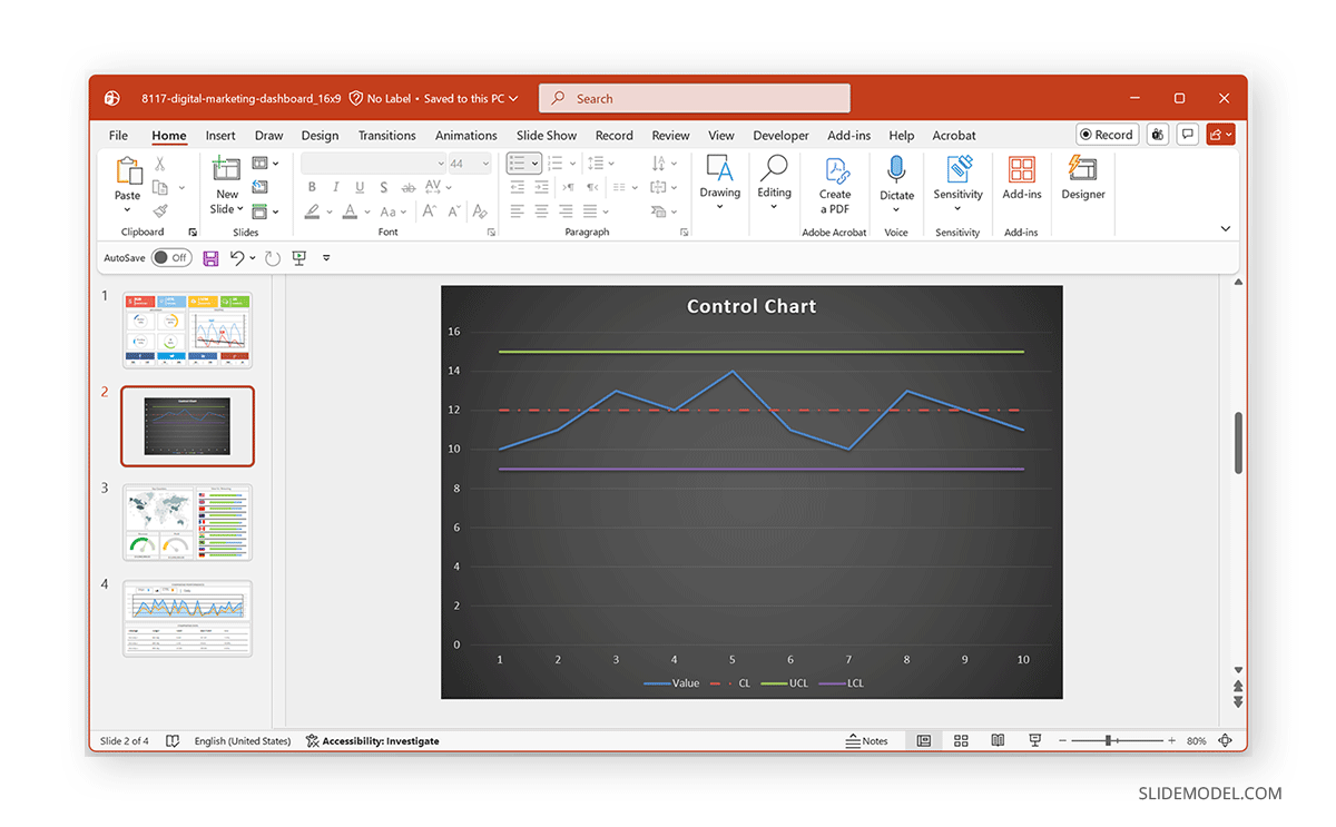
Step 3: Once the data is entered, format the chart by renaming each series (Value, CL, UCL, and LCL) and changing line styles, e.g., data line (solid), CL (dashed), and UCL/LCL (thin or different color for lines).
Step 4: Add a chart title, label the axes, and adjust the scale for readability.
Step 5 (Optional): If any points fall outside the control limits, you can change the marker color and add annotations.
Method 2: Create a Control Chart Using Shapes
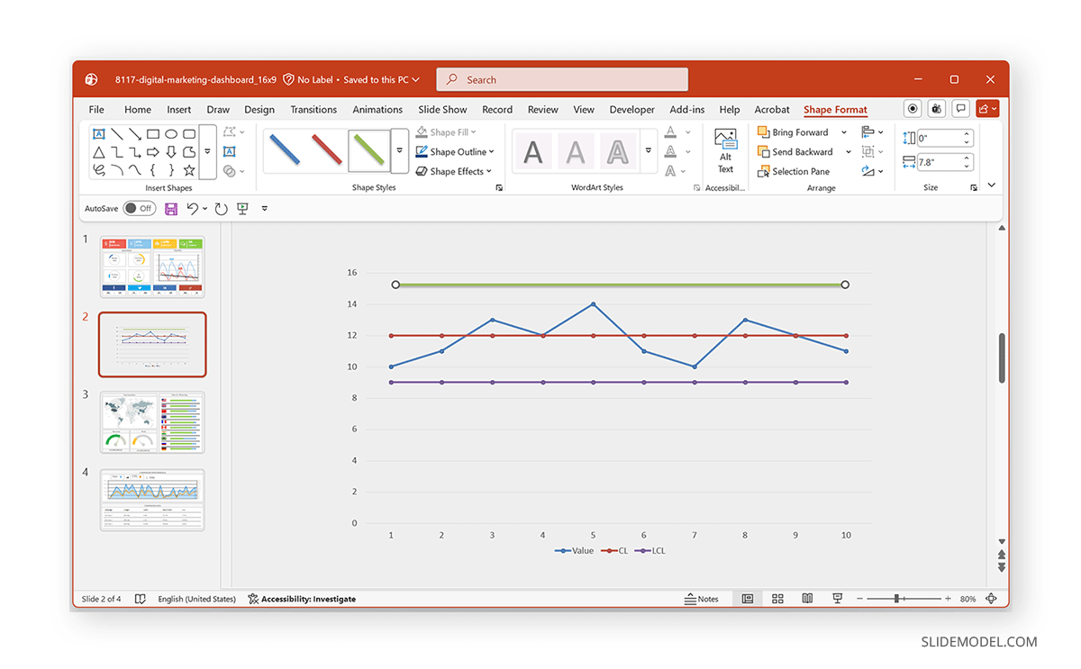
If you want more design control, you can build a control chart manually using shapes.
Step 1: Insert a basic line chart or manually draw the axes.
Step 2: Add horizontal lines for Center Line (CL), Upper Control Limit (UCL), and Lower Control Limit (LCL).
Step 3: Plot points using markers or shapes.
Step 4: Connect the points with lines, and add labels and annotations.
Method 3: Use a Control Chart Presentation Template
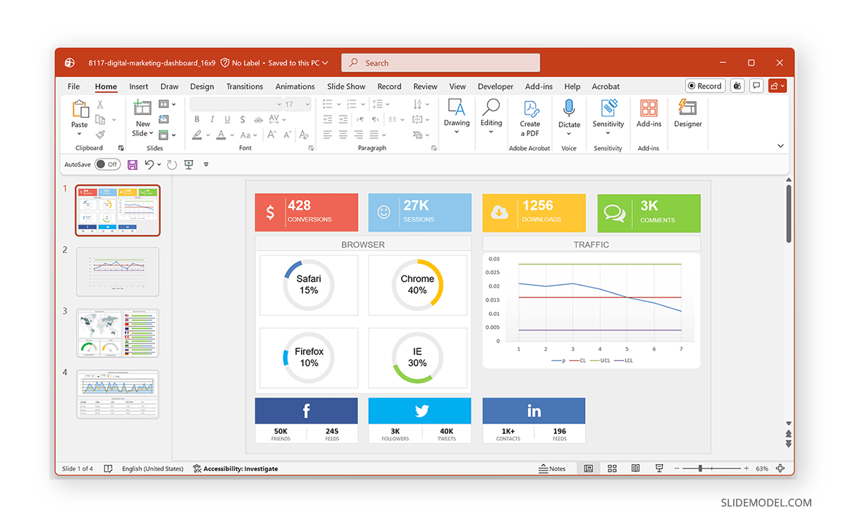
For faster results and professional visuals, using a control chart presentation template is often the best option. These templates come with pre-designed slides that already include chart layouts, data placeholders, and carefully designed formatting. You can explore these Data and Chart PowerPoint Templates by SlideModel to find ready-made presentation template designs that can be easily customized with your data by editing sample charts into control charts. In the example below, we customized a chart from the Digital Marketing Dashboard PowerPoint Template to create a control chart.
Design Tips and Best Practices for Control Charts in PowerPoint
Creating an effective control chart in PowerPoint is not just about inserting data; it’s about presenting that data in a clear, structured, and visually meaningful way. The following best practices can help ensure your chart communicates insights effectively to your audience.
Keep the Design Simple
Control charts are meant to highlight trends and variations, so avoid cluttering your slide with unnecessary elements. Too many labels, colors, or data points can make the chart difficult to read. Focus on the key message and remove anything that doesn’t directly support it.
Use Clear Labels and Legends
Each component of the chart should be easy to understand. Clearly label the data series, including the center line (CL), and control limits (UCL and LCL). If needed, include a legend so viewers can quickly identify what each line represents.
Use Colors Strategically
Color helps differentiate elements, but it should be used carefully. Choose subtle and consistent colors, for example, a solid color for data points, a dashed line for the center line, and lighter tones for control limits. Avoid overly bright or conflicting colors that can distract from the data.
Maintain Design Consistency Across Slides
Consistency in fonts, colors, and formatting improves readability and gives your presentation a cohesive look. Use the same styles throughout your slides so your audience can focus on the content rather than adjusting to visual changes.
Ensure Accurate Control Limits
Before presenting your chart, double-check that your upper and lower control limits are calculated correctly. Incorrect values can lead to misleading interpretations and reduce the credibility of your analysis.
Avoid Overloading the Chart
Including too much data in a single chart can reduce clarity. If you’re working with large datasets, consider splitting the data across multiple slides or focusing on a specific timeframe to keep the chart easy to interpret.
Ensure Clean Formatting
Small formatting details matter. Ensure proper alignment, consistent font sizes, and balanced spacing. Even minor inconsistencies can make a chart appear harder to follow.
Highlight Outliers and Key Insights
Outliers and unusual patterns are often the most important part of a control chart. Make these stand out by using markers, color changes, or annotations. Highlighting these points can help guide your audience toward the key insights in your data.
Final Words
Creating a control chart in PowerPoint doesn’t require advanced tools. With built-in chart features and shapes, a bit of formatting, and structured data, you can build effective visuals to monitor performance and communicate insights. For better results, you can consider using a control chart PowerPoint template to streamline the process and maintain a consistent design.