Showing survey results in PowerPoint isn’t just about throwing data on a slide—it’s about knowing your numbers and making the tool work for you. The real trick is using PowerPoint to pull them in, spark some insight, and make those results pop visually, but how do we actually manage such a feat?
This article explains how to create a lasting impact on survey results presentations, whether you’re sharing customer feedback, employee engagement stats, or market research takeaways with stakeholders.
Table of Contents
- What is a Survey Results Presentation?
- Structuring a Survey Results Presentation
- Visualizing Survey Data with Precision and Sophistication
- Integrating Real-Time Elements for Dynamic Delivery
- Crafting a Narrative Around the Data
- Enhancing Interactivity and Engagement
- Polishing the Design for Professional Impact
- Concluding with Actionable Insights
- Recommended Survey PPT Presentation Templates
- FAQs
- Final Words
What is a Survey Results Presentation?
A survey results presentation is a structured and visually supported delivery of findings derived from a survey, designed to communicate key insights, trends, and implications to a specific audience. It goes beyond merely displaying raw data; it involves synthesizing responses—whether from customers, employees, or other stakeholders—into a coherent narrative that highlights patterns, draws conclusions, and often suggests actionable outcomes.
Typically crafted using tools like PowerPoint, paired with survey results PowerPoint templates, a survey results presentation leverages charts, graphs, and other visual elements to make complex data accessible and engaging, while the accompanying spoken or written commentary provides context and depth.
Structuring a Survey Results Presentation
The foundation of any effective presentation on a survey begins with a logical and purposeful presentation structure. Rather than relying on a chaotic arrangement of slides, consider the narrative arc your survey data naturally suggests. Start the presentation by setting the context—briefly outline the purpose of the survey and its scope without dwelling on rudimentary details that your audience likely already understands. For instance, if you’re delivering a best Qualtrics presentation to stakeholders, you might begin with a slide that succinctly ties the survey objectives to the organization’s broader goals, using a subtle design that hints at the depth of analysis to come.
Transition smoothly into the methodology, but keep it concise and focused on aspects that enhance credibility, such as sample size, response rate, or statistical significance, rather than essential explanations of survey design. This sets the stage for the heart of the survey presentation: the results themselves. Organize the findings thematically or chronologically, depending on what best aligns with the data’s story. For example, if the survey tracked customer satisfaction over time, a chronological flow might reveal trends that a thematic approach could obscure. Conversely, grouping results by key topics—product features, service quality, or pricing—can highlight actionable insights for a stakeholder audience.
Recommended lecture: Research Presentation
Each section of the presentation on survey results should build toward a cohesive conclusion. Avoid abrupt shifts between topics; use transitional slides or verbal cues to guide the audience through the progression of insights. This narrative continuity ensures that the presentation feels like a unified exploration of the data rather than a disjointed collection of charts and numbers.
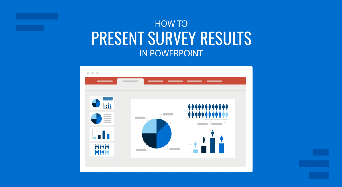
Visualizing Survey Data with Precision and Sophistication
PowerPoint’s strength lies in its ability to transform raw data into visual stories, and this is particularly critical when designing a survey results presentation. Nowadays, the public expects more than simple pie charts or bar graphs—they demand visuals that reveal patterns, relationships, and nuances within the data. Start by selecting the appropriate chart type for each data set. For instance, a stacked bar chart can effectively display how responses vary across demographic segments, while a line graph might better illustrate trends over multiple survey waves.
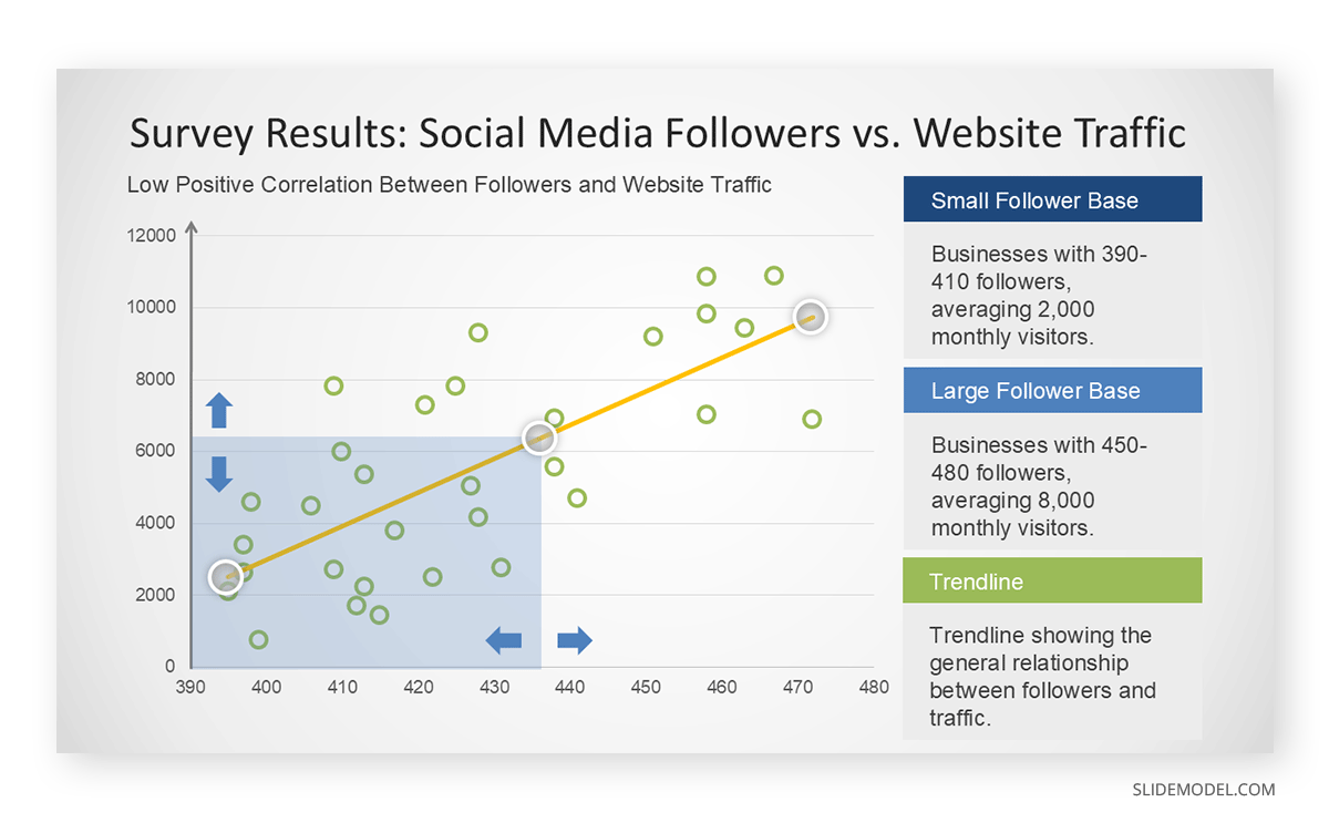
Consider layering complexity into your visuals to deepen the audience’s understanding. A heat map, for example, can highlight areas of strong agreement or dissatisfaction across survey questions, offering a quick yet sophisticated snapshot of sentiment. Alternatively, a scatter plot with trend lines can demonstrate correlations between variables—satisfaction scores and purchase frequency—without requiring lengthy explanations.
Customization is key to elevating these visuals beyond the generic. Adjust color schemes to align with your organization’s branding or to emphasize specific data points—perhaps using a gradient to show the intensity of responses. Annotations, such as callouts or data labels, can draw attention to outliers or statistically significant findings, sparing the audience the effort of deciphering dense tables. Avoid cluttering slides with excessive text; let the visual carry the weight of the message, supplemented by your spoken narrative. This approach respects the audience’s ability to interpret complex information while keeping an engaging presentation.
Recommended lecture: Visual Communication & Color Theory for Presentations
Integrating Real-Time Elements for Dynamic Delivery
One innovative way to enhance a presentation on survey results is to share them in real time in PowerPoint. This technique is particularly valuable when presenting to stakeholders who value immediacy, such as during a live feedback session or a strategic review meeting. PowerPoint’s integration with external data sources, such as Microsoft Excel, Microsoft Forms, or Qualtrics via Power Automate, allows you to embed live-updating charts or dashboards directly into your slides. For example, as responses trickle in from an ongoing survey, a bar chart could dynamically adjust to reflect the latest totals, vividly illustrating shifting opinions.
To implement this, link your survey platform to PowerPoint through a data connector or embed a web view of the survey dashboard. Test the setup thoroughly beforehand to ensure smooth performance, as lag or errors could undermine your credibility with a discerning audience. This real-time feature transforms the survey results presentation into an interactive experience, inviting stakeholders to engage with the data as it evolves. It’s particularly effective for presentations on survey platform implementation, where demonstrating the platform’s capabilities in action can reinforce its value.
Crafting a Narrative Around the Data
While visuals are critical, the spoken component of how to present survey results in PowerPoint is equally vital. Knowledgeable audiences expect a presenter who can weave the data into a compelling story without oversimplifying or overexplaining. Begin each slide by framing the data’s significance—why does this particular finding matter? If a survey reveals a dip in employee morale, connect it to broader organizational trends or recent policy changes. Let the visual reinforce your point—that’s the key to embracing storytelling in presentations.
Recommended lecture: Data Storytelling for Presentations
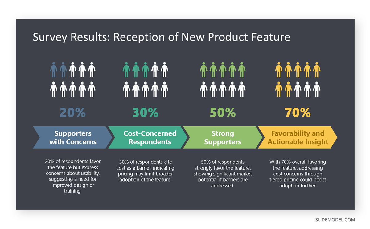
Avoid reading the slides verbatim; use them as a springboard for deeper analysis. Highlight implications, uncertainties, or areas for further investigation. For example, in a presentation on a survey, you might note that while 70% of respondents favor a new product feature, the remaining 30% cite cost as a barrier—prompting a discussion on pricing strategy. This layered commentary demonstrates your command of the data and respects the audience’s ability to follow complex reasoning.
When addressing sensitive or unexpected results, maintain a neutral tone and focus on the evidence. If the survey uncovered dissatisfaction with a recent initiative, present the numbers objectively, then pivot to potential solutions or next steps. This approach keeps the survey presentation constructive and forward-looking, aligning with the expectations of a sophisticated audience.
Enhancing Interactivity and Engagement
Even without real-time data, interactivity can elevate the presentation of survey results. Embed hyperlinks in PowerPoint to detailed reports or raw data files within the slides, allowing stakeholders to explore specifics post-presentation. Alternatively, PowerPoint animations can reveal data progressively, unveiling a chart segment by segment to build suspense or emphasize a key finding.
Consider incorporating polls or Q&A prompts within the presentation to gauge audience reactions to the survey findings. While this requires careful timing, it can transform a one-way delivery into a dialogue, particularly when discussing presentations on survey platform implementation. For example, after presenting adoption rates for a new survey tool, ask stakeholders to vote on which metric they’d prioritize for improvement using a quick PowerPoint poll linked to a live results slide.
Polishing the Design for Professional Impact
The aesthetic quality of your PowerPoint slides can significantly influence how your survey results presentation is received. Opt for a clean, modern template that avoids garish colors or overused stock images. Consistency in fonts, sizes, and alignments signals attention to detail—an expectation of knowledgeable audiences. Use white space strategically to prevent visual overload, ensuring each slide feels purposeful rather than crowded.
Incorporate subtle animations or PowerPoint transitions to guide the audience’s focus, such as a fade-in effect for a key statistic or a wipe transition to signal a shift between sections. However, restraint is essential—overusing effects can distract from the data itself. When preparing a presentation on a survey, export high-resolution visuals from your survey platform to maintain clarity, especially if the slides will be projected on a large screen or shared digitally.
Concluding with Actionable Insights
The final section of your survey presentation should distill the findings into a clear set of takeaways or recommendations tailored to the audience’s needs. Avoid vague platitudes; instead, propose specific actions grounded in the data. If a customer survey highlights the demand for faster delivery, outline potential logistics adjustments with estimated costs and timelines. This concreteness demonstrates the practical value of the survey and reinforces the presentation’s purpose.
End with a call-to-action slide that invites feedback or questions, reinforcing the collaborative nature of the exercise. If you’ve opted to share survey results in PowerPoint in real-time, this is an ideal moment to display the final live update, tying the presentation back to its dynamic elements. A strong conclusion leaves the audience with a sense of closure and direction, ensuring that the effort invested in the survey—and its presentation—translates into tangible outcomes.
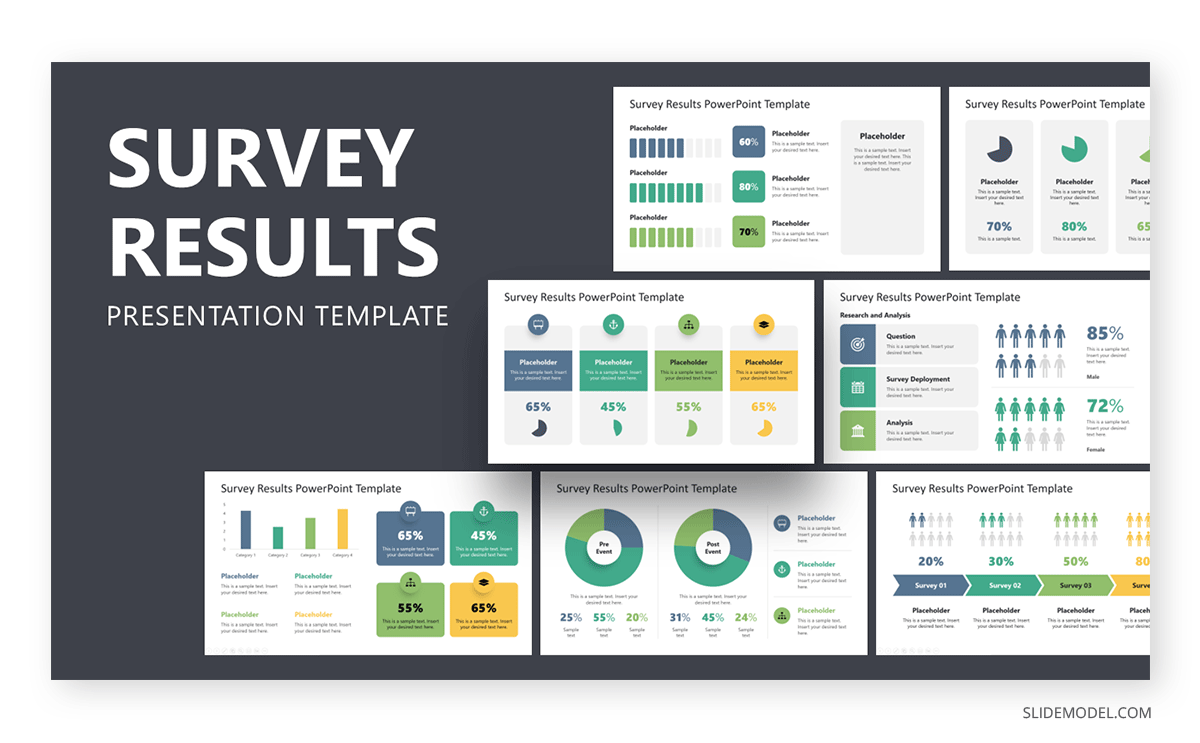
Recommended Survey PPT Presentation Templates
In this section, you can find a selection of curated PowerPoint templates for survey presentations. All these designs also work as Google Slides templates, although advanced animation or transition effects may not be rendered.
1. Survey Conjoint Analysis PowerPoint Template
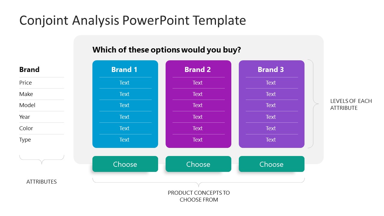
Unlock the power of data with our Survey Conjoint Analysis PowerPoint Template, perfect for a survey results presentation. This dynamic survey PPT template features structured slides to showcase attributes, product concepts, and preferences, making it easy to present survey results clearly. Ideal for market researchers, analysts, and managers, it helps you share survey results in real-time PowerPoint sessions, driving actionable insights. Use it to create a compelling presentation on survey results that engages stakeholders and simplifies complex data.
2. Survey Results PowerPoint Template
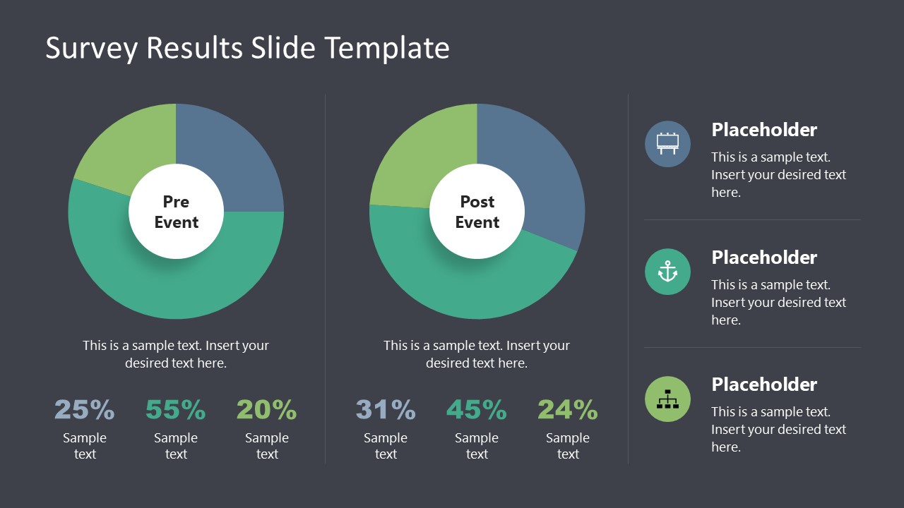
Transform your data into compelling stories with our Survey Results Presentation Template, a must-have for impactful survey presentation. Featuring diverse slides like pie charts, bar graphs, and demographic breakdowns, this template simplifies how to present survey results with clarity and style. Perfect for marketers, HR professionals, and analysts, it enables you to craft a standout presentation on survey results, highlighting key insights effortlessly. Customize it to share survey results in real-time PowerPoint sessions, engaging your audience with easy-to-understand analytics.
3. Survey Gauge Sentiment Analysis PowerPoint Template
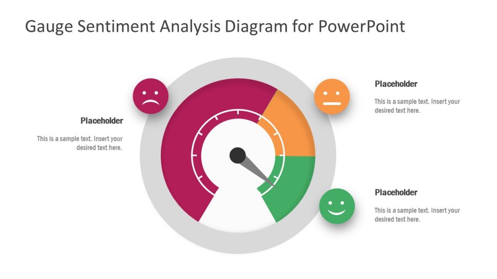
Capture audience sentiment with our Survey Gauge Sentiment Analysis PowerPoint and Google Slides Template, a standout choice for your survey results presentation. This template features intuitive gauge visuals and emotive scales, making illustrating feedback trends and emotions easy. Perfect for researchers, HR teams, and marketers, it simplifies how to present survey results with impactful clarity. Use it to showcase positive, neutral, or negative sentiments in a visually engaging way, ensuring your audience grasps key insights instantly.
4. Likert Scale PowerPoint Template
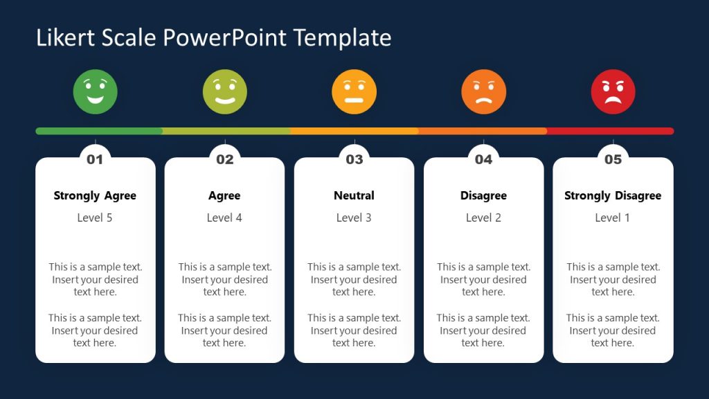
Visualize opinions with our Likert Scale PowerPoint Template, designed for an engaging presentation on survey data. This template features a clear 5-point scale with emotive icons, from “Strongly Agree” to “Strongly Disagree,” allowing you to display responses accurately. Ideal for educators, researchers, and business professionals, it makes your survey presentation intuitive and actionable. Edit the slides to break down feedback, highlight trends, and spark meaningful stakeholder discussions.
5. Scatter Plots Correlations PowerPoint Templates
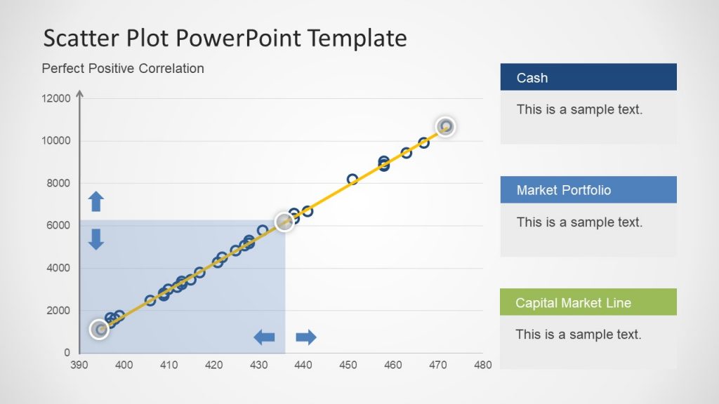
Uncover data relationships with our Scatter Plot PowerPoint Template, an excellent tool for your survey presentation. This template showcases scatter plots with clear correlations, perfect for visualizing trends and patterns in survey data. Ideal for data analysts, researchers, and business professionals, it simplifies creating a presentation on survey results that captivates your audience. Highlight key variables like market portfolios or financial metrics, making complex insights accessible. 100% customizable with PowerPoint and Google Slides.
FAQs
How can I ensure data integrity when preparing a survey results presentation?
Data integrity starts with validating your survey outputs before importing them into PowerPoint. Cross-check response totals against the survey platform’s raw data export to catch discrepancies from manual entry or filtering errors. Use PowerPoint’s data linking feature to pull directly from a verified Excel or CSV file, minimizing transcription mistakes and ensuring your presentation on survey results reflects accurate, untainted insights.
What’s the best way to handle incomplete responses in a presentation on a survey?
If mishandled, incomplete responses can skew your narrative. Calculate their percentage and disclose it upfront in your survey presentation, perhaps on an introductory slide, with a note like “12% partial completions excluded unless specified.” If relevant, create a separate visual—like a donut chart—showing their distribution across key questions, giving stakeholders context without derailing the main focus on how to present survey results.
How do I address conflicting findings in a survey results presentation?
Conflicting findings, such as high satisfaction but low loyalty scores, require transparency. Dedicate a slide to juxtapose these contradictions—use side-by-side bar charts or a matrix—and label it clearly, e.g., “Divergent Trends.” In your presentation on survey results, narrate potential hypotheses (e.g., external market factors) and invite discussion, positioning the conflict as a springboard for deeper analysis rather than a flaw.
How can I protect sensitive data in a survey results presentation?
To safeguard sensitive data, anonymize respondent details before importing them into PowerPoint. Use aggregated visuals (e.g., averages rather than individual scores) and apply password protection via “Info > Protect Presentation.” For a presentation on a survey, brief stakeholders on confidentiality measures upfront, reinforcing trust in the survey results process.
How do I handle multilingual survey data in a survey presentation?
For multilingual data, consolidate responses into a primary language for consistency, but acknowledge diversity in your presentation on survey results. Add a slide with a breakdown—e.g., “Responses: 60% English, 25% Spanish, 15% Other”—and use dual-axis charts if comparing across languages, ensuring clarity in your survey results presentation.
What’s the benefit of using icons in a survey results presentation?
Icons can visually cue topics in a presentation on survey results, enhancing navigation. Place a small “people” icon next to demographic data or a “gear” for presentations on survey platform implementation. Source them from PowerPoint’s built-in library or SlideModel.com, keeping them subtle and uniform to avoid cluttering your survey presentation.
Final Words
Creating a presentation on survey results in PowerPoint demands a blend of technical skill, analytical depth, and narrative finesse. By structuring the content thoughtfully, visualizing data with sophistication, integrating real-time features where appropriate, and delivering a polished narrative, you can transform raw survey output into a powerful tool for data-driven decision-making.