Scatter Plots Correlations PowerPoint Templates
The Data-Driven Scatter Plots Correlations PowerPoint Template presents for one of the most commonly used data analysis tools. This design of PowerPoint template is formed specially for statistical study. It is formulated to analyze performance against values in XY axes. The beauty of the layout is that It can be used to represent from candy sales to something as complicated as highly professional business financial reports.
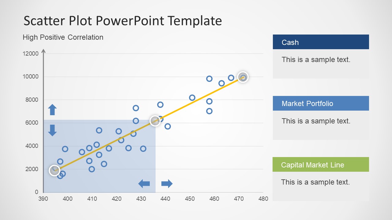
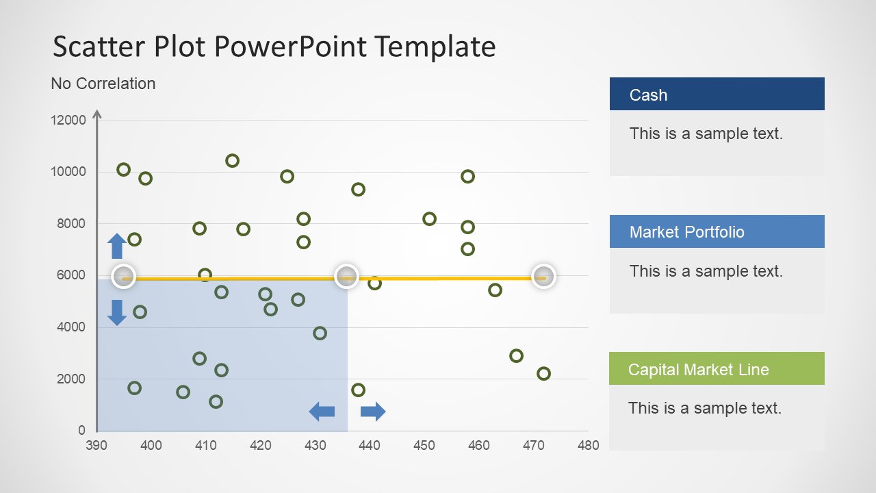
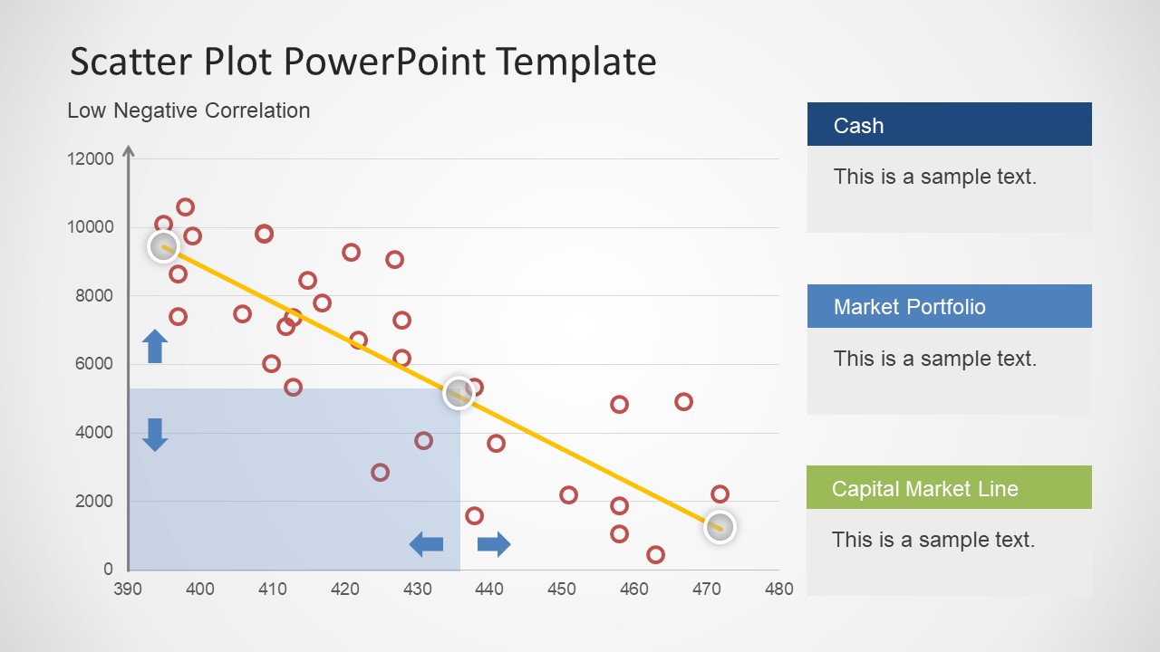
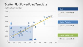
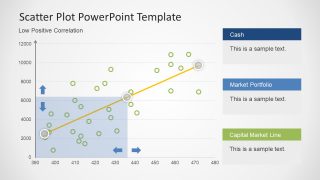
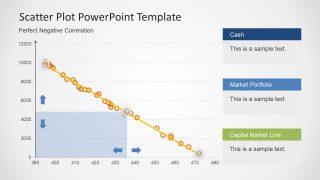
The scatter plot charts are used to analyze relationship between two separate set of variables and level of correlation between them. The numerical values from two axes are combined to display into a single data point on graph. These points help understand the close or no relation between them in visually attractive manner.
The Scatter Plots Correlations PowerPoint Template consist of 8 slides with all the possible outcomes. It includes perfect/high/low positive, no correlation and perfect/high/low negative. The slides in this presentation are data-driven, which mean users can drive excel data into the presentation for its visual impact. The template is also editable with text placeholders for cash and market capital analysis. The connection line in graph also contains three substantial progress icon points. Users can add callout boxes or text fields to detail each point. The translucent blue square shape in diagram can be used to display maximum or minimum correlation fields in graph.
This PowerPoint Presentation is ideal for the performance assessment and progress reporting where objectives are analyzed in terms of allocated budget. It helps identify which strategy give better outcomes and which goals need assistance to achieve a desired result. The presentation template is highly effective in risk management process where resources can be tracked and monitored easily through scatter plot chart in order to ensure efficacy. The field professionals can take an effective decision based on the results of their analysis.
The users can impress the audience with this data-driven scatter plot PowerPoint presentation template. Find more similar data chart and diagram for PowerPoint in our Curves and Lines Gallery to complement the presentation design.


You must be logged in to download this file.
DOWNLOAD- Category
- Data & Charts
- Rating

 Loading...
- Size
- 16x94x3
- Item ID
- 7443-01
- Colors
Subscribe today and get immediate
access to download our PowerPoint templates.