Diagrams exist to reduce cognitive effort. They compress relationships, sequences, contrasts, or structures into an arrangement that the human eye can parse faster than text alone. In presentations, the advantage is even greater because audiences process information under time pressure.
A well-crafted diagram not only displays content; it sets the rhythm for how the audience interprets it. Visual order suggests conceptual order. When a diagram is balanced, legible, and aligned around a clear central idea, the audience immediately senses structure even before understanding the specifics. This early perception strengthens credibility and allows the presenter to lead the interpretation without being overwhelmed by visual noise.
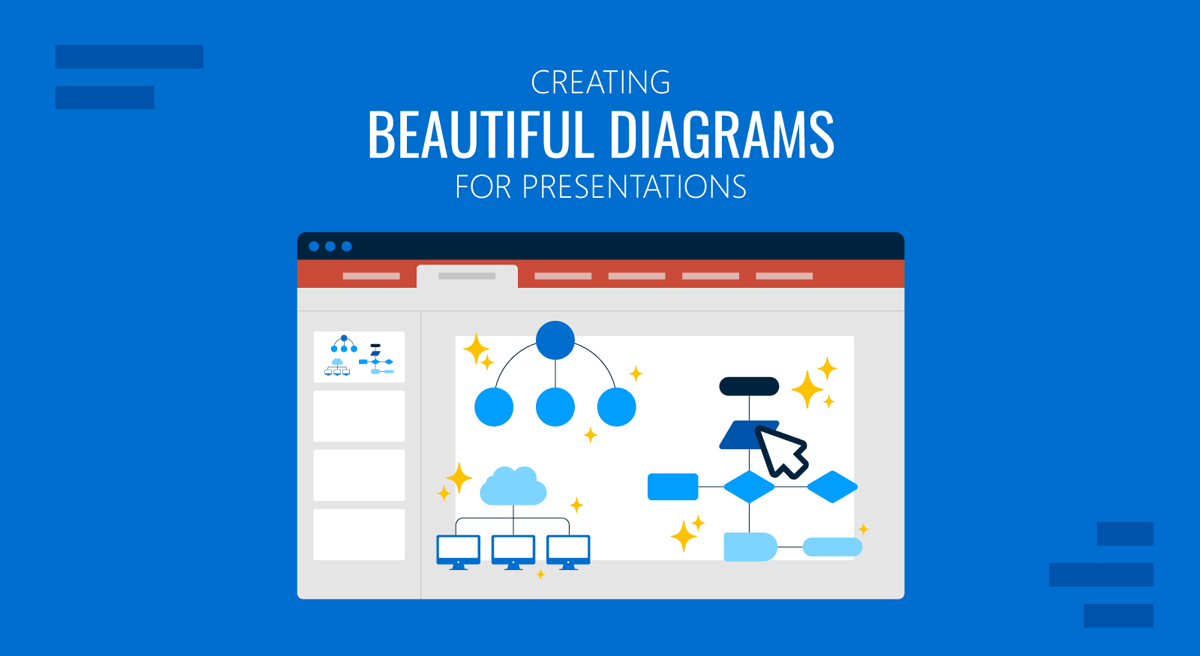
Beauty in diagrams has little to do with ornamentation. Instead, beauty emerges from clarity, proportion, and coherence. Visual harmony reduces distraction and allows meaning to surface without resistance. Whether the diagram represents a process, a model, a decision path, or a conceptual map, its aesthetic value depends on how quickly the viewer can identify the primary relationship. In this guide, we will learn the principles for creating beautiful diagrams for presentations, with visual references to aid comprehension.
Understanding the Function of a Diagram
A diagram is fundamentally a representation of relationships. It is not a drawing, not an illustration, and not a chart. Its purpose is to show how the components of an idea connect, interact, or contrast. For this reason, the core question is always the same: What relationship does the audience need to understand first? When presenters skip this question and jump directly to shapes, they often produce visuals that look complete but communicate nothing specific. Meaning evaporates behind decorative elements.
To understand the function of diagrams, consider how audiences process visual information. They search for orientation first, then hierarchy, then structure. Orientation answers where to begin. Hierarchy answers what matters most. Structure answers the question of how the parts fit together. A diagram that fails at any of these levels forces the viewer to decode unintentionally. The eye darts around, the mind tries to impose order, and attention fragments. When a diagram succeeds, the audience can answer those three questions in seconds.
Function also depends on scale. Some diagrams are meant to explain a high-level idea without dwelling on details. Others require enough granularity to support decision-making. If the presenter misaligns the scale with its purpose, the audience either becomes overwhelmed by unnecessary specifics or receives a superficial abstraction that lacks operational value. Matching scale to intent prevents conceptual drift.
Types of Diagrams
Flowcharts
Flowcharts are used to represent sequential logic, decisions, and conditional paths. In presentation settings, they are effective for explaining processes, operational workflows, approval chains, or system behavior where one step leads to another. Their value lies in clearly showing causality and decision points, allowing the audience to follow the logic without being overwhelmed by words. They work well in strategy reviews, process explanations, and technical briefings.
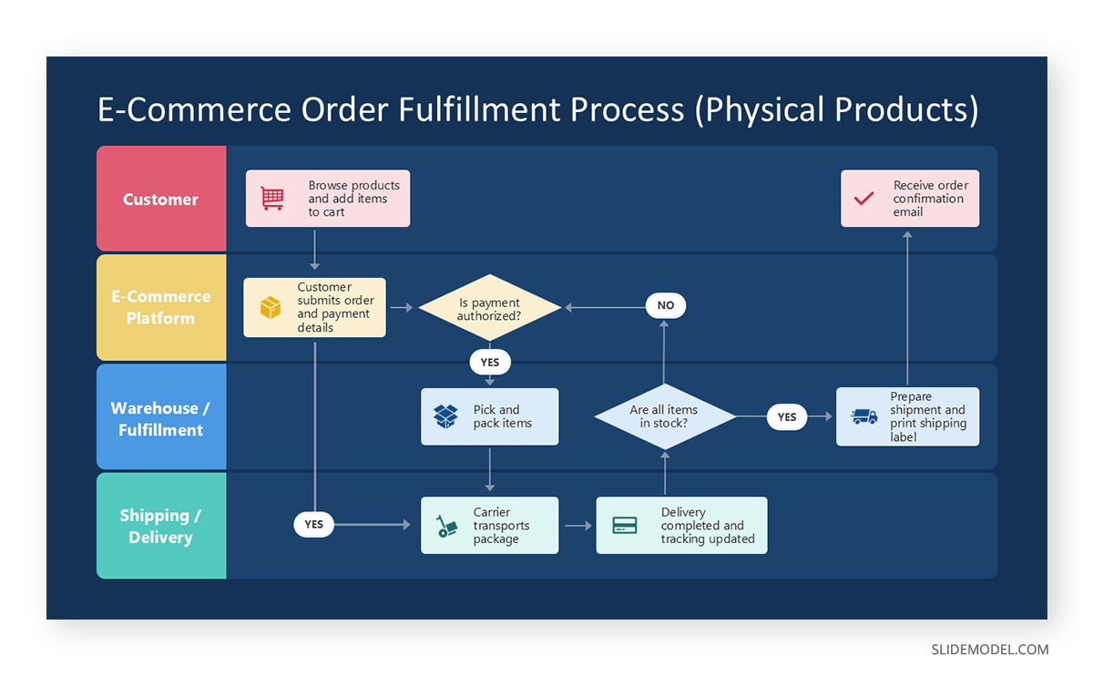
A common alternative is a step diagram when decisions are not required, and the process is strictly linear. If the process is cyclical rather than sequential, a cycle diagram communicates the idea more accurately than a traditional flowchart.
Cycle Diagrams
Cycle diagrams or circular flow represent repeating processes, feedback loops, or ongoing systems. They are frequently used to explain continuous improvement models, lifecycle concepts, iterative product development, or recurring business operations. In presentations, they help convey the idea that there is no fixed start or end, only progression through stages.

An alternative is a circular flowchart when conditional paths exist within the cycle. If the emphasis is on time rather than repetition, a timeline template may be more appropriate.
Hierarchical Diagrams
Hierarchical diagrams show levels of authority, dependency, or structure. They are commonly used for organizational charts, system architectures, and layered frameworks. In presentation contexts, they help audiences quickly understand how components relate vertically, which elements are foundational, and which depend on others.

When hierarchy is less rigid, a nested diagram or layered block diagram can be used instead. For comparisons across levels rather than authority, a matrix may be more suitable.
Matrices
Matrix templates organize information across two dimensions, such as comparison, prioritization, or categorization. They are often used in strategic presentations to compare options, assess risk versus impact, or classify items across defined criteria. Their strength lies in allowing multiple relationships to be seen simultaneously.
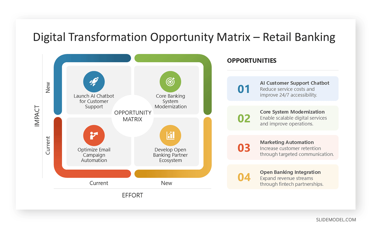
Alternatives include table templates when numerical precision is required, or quadrant diagrams when only high-level positioning is needed without granular detail.
Timelines
Timeline PPT templates visualize events or phases along a temporal axis. They are used for project planning, historical overviews, roadmaps, and milestone tracking. In presentations, timelines help audiences understand sequence, duration, and progression over time, making them particularly effective for planning and reporting contexts.
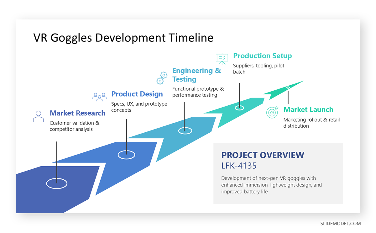
If the focus is on dependencies rather than time, a process flow may be more effective. For future-oriented plans without strict dates, a roadmap diagram offers more flexibility.
Conceptual Maps
Conceptual maps display relationships between ideas rather than steps or hierarchy. They are useful in presentations that explore systems, ecosystems, or abstract models in which elements coexist and influence one another. Their value is in showing interconnectedness without implying sequence.
When the presentation structure needs more constraint, a framework diagram or layered model provides clearer guidance. If emphasis shifts toward comparison, a matrix may work better.
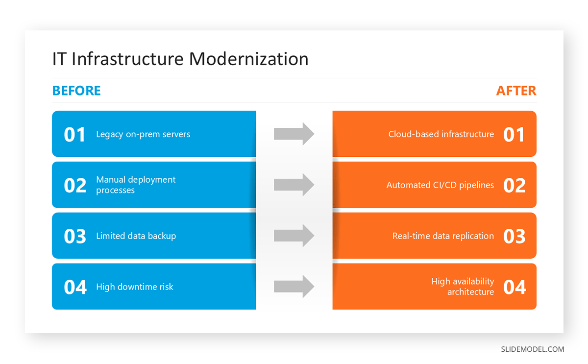
Comparison Diagrams
Comparison diagrams highlight differences or similarities between two or more elements. Common formats include split layouts or mirrored structures. In presentation settings, they are useful for evaluating options, before-and-after scenarios, or competitive analysis.
Tables serve as an alternative when detailed attributes must be listed. For qualitative contrast, a two-column narrative slide may be sufficient without a formal diagram.
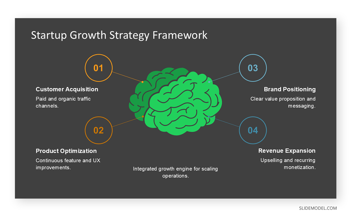
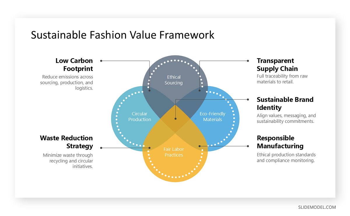
Relationship Diagrams
Relationship diagrams illustrate how entities interact without hierarchy or sequence. They are often used to explain stakeholder relationships, system interactions, or network models. In presentations, they help audiences see influence patterns and connections at a glance. A common use case is the Venn Diagram.
If interactions are directional, a flow-based diagram may be more precise. For complex systems, a simplified ecosystem map can reduce visual overload.
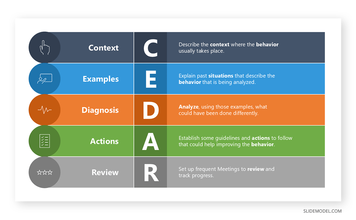
Framework Diagrams
Framework diagrams present structured models or methodologies. They are common in consulting presentations, strategy presentations, and academic presentations. Their purpose is to anchor discussion around a defined mental model, making abstract reasoning easier to follow.
An alternative is a layered diagram when emphasis lies on depth rather than structure. If the framework compares dimensions, a matrix may communicate the idea more efficiently.
Cause-and-Effect Diagrams
Also known as fishbone diagrams, these represent contributing factors that lead to a specific outcome. They are commonly used in problem analysis, retrospectives, and risk assessments. In presentations, they help structure reasoning and prevent oversimplified explanations of complex issues.
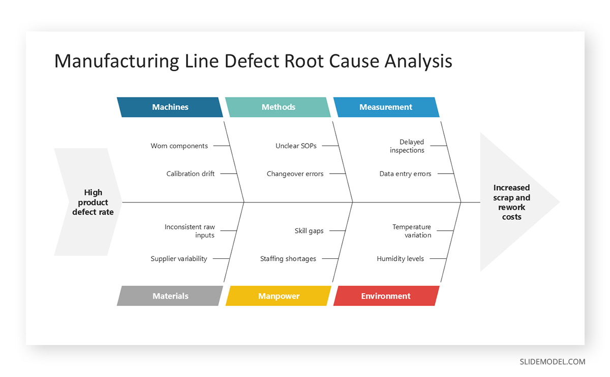
An alternative is a logic tree where causes branch hierarchically. For narrative explanations, a sequential reasoning slide may work better.
Logic Trees
Logic trees break down a problem into mutually exclusive and collectively exhaustive branches. They are effective in analytical and consulting presentations, particularly when diagnosing issues or structuring decision-making. They help audiences follow reasoning paths without losing coherence.
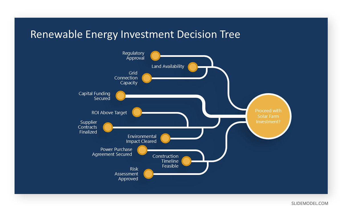
When the emphasis is on dependencies rather than logic, a hierarchical diagram may be more appropriate. For simpler decisions, a decision flowchart is easier to interpret.
Pyramid Diagrams
Pyramid diagrams represent prioritization, dependency, or abstraction levels. They are often used to show foundational elements at the base and strategic or abstract ideas at the top. In presentations, they communicate structure, emphasis, and logical build-up efficiently.
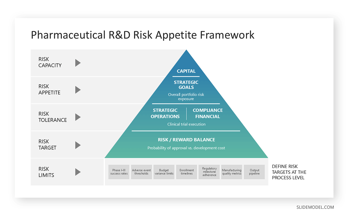
If hierarchy is less rigid, a layered stack diagram offers more flexibility. For time-based progression, a roadmap is a better alternative.
Stacked Diagrams
Stacked diagrams show composition, accumulation, or contribution to a whole. They are useful for explaining how multiple components combine to produce an outcome, such as a cost structure or resource allocation. In presentations, they make proportional relationships easier to grasp visually.
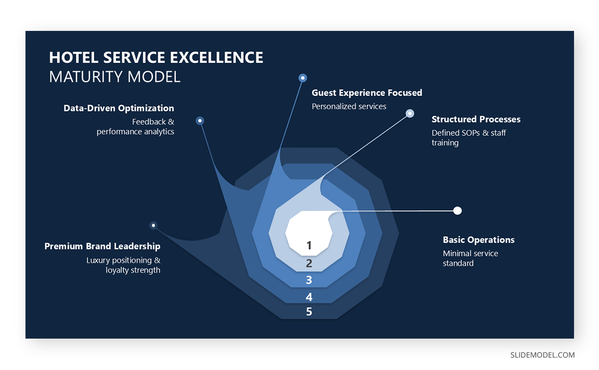
If precise values matter more than proportion, a table is preferable. For comparison across categories, a bar-based visual may be clearer.
Stakeholder Maps
Stakeholder maps position individuals or groups based on their influence, interest, or involvement. In presentations, they are useful for governance discussions, change management, and project alignment, helping audiences quickly see who matters and why. Spatial distance often represents relevance or power, making interpretation intuitive.

A matrix is a suitable alternative when stakeholders must be assessed across two explicit dimensions. For narrative explanations, a role-based breakdown may suffice.
Recommended lecture: Stakeholder Mapping
Journey Maps
Journey maps visualize experiences across stages, touchpoints, or interactions. They are widely used in service design, customer experience, and process optimization presentations. Their value lies in combining sequence with context, showing not only what happens but also where friction or opportunity arises.

If emotional or experiential detail is unnecessary, a process flow may be clearer. For high-level planning, a roadmap offers a more abstract view.
Choosing the Right Diagram for the Message
Choosing an appropriate diagram is a strategic decision. The form must match the type of relationship being communicated. Presenters often default to flowcharts or cycles because they feel familiar, but familiarity is not a rationale. A diagram only works if its structure mirrors the logic of the idea.
Processes require directional movement. A flowchart is appropriate when one event leads to another through defined steps or decisions. However, if the process is iterative rather than linear, a circular or looping diagram may better convey the concept of refinement. For structures involving hierarchical organization, a tree diagram or layered model works because it visually represents levels of dependency. When the goal is to contrast categories or classify information, grids and matrices are more effective because they place items in comparative proximity.
Maps serve a different role. They aren’t geographical but conceptual, showing how parts of a system coexist rather than progress. Presenters use them to illustrate ecosystems, internal functions, or multi-component frameworks. The value lies in relational density: the diagram displays multiple connections without implying sequence or dependence.
Timelines belong to a category of their own. They organize information in chronological order, making them ideal for roadmaps, histories, and project stages. However, timelines are often misused when the content contains no relevant time dependency. Presenters should avoid placing items on a horizontal line merely to create a sense of structure. Structure must emerge from meaning.
Comparisons demand symmetry. When the task is to highlight differences, a two-column comparison or a segmented diagram emphasizes contrast without distraction. Symmetry reinforces fairness; the audience perceives the comparison as intentional and controlled.
Design Principles That Make Diagrams Beautiful
Beautiful diagrams rely on predictable visual logic. The audience should sense order immediately. Visual harmony does not require artistic talent; it requires consistency, spacing, and proportion. These principles allow diagrams to communicate without noise.
Alignment
Alignment is foundational. Elements should align along invisible grid lines. When items drift from alignment, even by small margins, the viewer feels tension. That tension translates into cognitive effort, reducing comprehension. Precise alignment creates a sense of discipline and control. Presenters should use PowerPoint’s alignment tools rigorously rather than relying on manual placement.
Spacing
Spacing determines legibility. Clusters of shapes without enough breathing room merge visually, making it harder for the eye to distinguish their boundaries. Appropriate spacing gives each element conceptual space. Distance signals independence; proximity signals connection. A beautiful diagram uses this logic deliberately instead of by accident.
Proportion
Proportion guides perception of importance. Larger shapes imply priority. Smaller shapes imply supporting roles. Scale communicates hierarchy faster than labels. If scale contradicts meaning, the audience misinterprets the structure. Presenters should ensure that visual weight matches conceptual weight.
Shape Consistency
Shape consistency matters for rhythm. Using multiple shape styles disrupts perception. Rounded rectangles mixed with sharp-edged squares, irregular icons, and gradients create visual noise. A consistent shape family creates unity. Beauty emerges from sameness handled with intention.
Reduction
Reduction is another principle. Removing borders, shadows, or unnecessary lines often improves clarity. Simplicity expresses confidence. Decorative effects have no functional value unless they reinforce hierarchy. When in doubt, remove.
Symmetry
Finally, diagrams should balance symmetry and intentional asymmetry. Symmetry calms the viewer, suggesting stability. Asymmetry highlights contrast or directional movement. Presenters should choose which energy they want the diagram to convey. A roadmap benefits from asymmetry because it indicates progression. A conceptual model benefits from symmetry because it indicates stability.
Color, Typography, and Visual Rhythm
Color supports comprehension when used systematically. It identifies categories, reinforces hierarchy, and guides attention. Random color choices weaken the structure because the viewer cannot form associations with it. Presenters should assign specific colors to functional roles, such as main components, secondary components, and connectors, and apply them consistently throughout the deck. Consistency trains the audience’s perception, enabling faster recognition of meaning.
Color intensity should match importance. High-saturation colors draw attention first. Low-saturation or neutral tones recede. When everything is bright, nothing stands out. When everything is neutral, hierarchy collapses. Strategic contrast is essential. Presenters should avoid using full white backgrounds on projectors when possible, as they increase visual fatigue. Muted tones often produce better legibility in bright rooms.
Typography influences rhythm. Fonts for diagrams must be legible at a distance. Heavy decorative fonts distort shapes and slow recognition. Sans-serif fonts with uniform stroke width work well because they don’t interfere with the diagram’s geometric clarity. Text size should reflect importance, but extremes should be avoided. Oversized labels compete with shapes, and undersized labels force the audience to squint.
Rhythm emerges from repetition. When spacing, color distribution, and shape patterns repeat across a diagram, the eye moves smoothly. Irregular rhythm creates friction. Presenters must check whether their diagram provides a steady visual path or forces abrupt directional shifts. Rhythm doesn’t mean symmetry; it means predictable structure.
Legibility also depends on the contrast between text and background. Presenters should avoid placing dark text on dark shapes or light text on light shapes without proper outlines. Subtle contrast differences visible on high-resolution devices may disappear on projectors.
Diagram Complexity and Cognitive Load
Facing complexity is not inherently negative. Some ideas require nuance, layers, and interconnected components. The problem arises when visual complexity exceeds cognitive capacity. If the viewer cannot identify focal points within seconds, the diagram becomes a barrier rather than a tool.
Cognitive load reduction begins with prioritization. The diagram should make clear what the audience needs to understand first. Secondary layers can remain visible but should not compete visually with the primary relationship. One effective approach is progressive elaboration: the presenter starts with the core structure and then adds layers on subsequent slides. This creates the perception of complexity without overwhelming the viewer at once.
Recommended lecture: How to Present Complex Concepts
Grouping is another strategy. Related elements should sit near each other, ideally within shared boundaries, as applied in the Rule of Three. Grouping reduces cognitive effort because viewers process clusters rather than isolated objects.
The number of elements must remain manageable. Even if the underlying idea has many components, a diagram should rarely contain so many visual units that the viewer cannot recall them. When information density is unavoidable, presenters should segment the diagram into zones that can be discussed one at a time.
Labels should remain concise. Excessive wording increases reading time and reduces visual processing. If labels become too long, the diagram is carrying too much semantic weight and should be accompanied by spoken explanation rather than textual detail.
Storytelling Through Diagrams
A diagram becomes a narrative device when its structure aligns with the presenter’s spoken progression. Don’t misinterpret storytelling in presentations as adding drama to the explanation; it is about organizing information in a sequence that mirrors thought. When the diagram reveals relationships in the same order as the presenter explains them, comprehension accelerates.
The beginning of a diagram-based story is orientation. The presenter clarifies the central idea before diving into components. Orientation can be done verbally or visually by highlighting the main category or axis. Without this starting point, the viewer may misinterpret the diagram’s focus, making the rest of the explanation harder to follow.
After orientation comes expansion. The presenter moves into secondary elements, carefully guiding attention. Highlighting or dimming segments can help, but the spoken explanation must provide context. Each part should feel like an essential step in understanding the whole.
Connections matter. Storytelling thrives on showing how parts influence one another. A diagram that isolates components without connective cues limits narrative potential. When arrows, lines, or spatial arrangements reflect actual relationships, the story becomes coherent.
Moments of contrast and transition sustain interest. For example, a diagram comparing two strategies naturally creates a point of tension. The presenter can then resolve it by explaining which strategy aligns better with the goals. This narrative movement keeps the audience engaged even during technical explanations.
Storytelling also includes pacing. A diagram should not expose all layers at once if the audience needs time to absorb them. Progressive reveal techniques, such as showing one quadrant of a matrix colored at a time, help maintain control over the flow of meaning.
Common Mistakes When Creating Presentation Diagrams
Excessive Ornamentation
Decorative icons, gradients, 3D shapes, shadows, and borders create visual clutter. They distract from relationships and add no conceptual value.
Wrong Diagram Type
Another mistake is using a diagram type that contradicts the underlying logic. Presenters sometimes choose a cycle to represent stages that do not repeat or a flowchart to represent items that are not sequential. This mismatch confuses the audience, who may infer relationships that do not exist.
Overpopulating with Text
Overloading diagrams with text is also problematic. A diagram is not a paragraph; it is a structural representation. When every shape contains long sentences, visual interpretation collapses, and reading becomes the only option. If the diagram cannot communicate structure without text, the design itself needs revision.
Spacing and Alignment
Poor spacing and inconsistent alignment break visual harmony. Audiences may not consciously identify alignment issues, but they sense disorganization. Misaligned shapes imply a lack of attention, which affects perceived professionalism.
Scaling Problems
Distorted scales mislead. Shapes should not imply proportional meaning unless deliberate. A small box representing a large concept, or an oversized shape representing a minor element, creates conceptual imbalance.
Inconsistent Color Palette
Finally, inconsistent color choices weaken the association. Using different colors for the same category across multiple diagrams prevents pattern recognition. Similarly, switching styles mid-presentation interrupts visual continuity.
FAQs
How do I know if a diagram is necessary?
A diagram is necessary when the relationship between elements is more important than the elements themselves. If describing the idea verbally takes more than a few seconds, a diagram likely improves clarity.
What is the ideal number of elements in a diagram for a presentation?
There is no fixed number, but diagrams with too many components lose interpretability. The viewer should understand the main relationship at a glance. If they cannot, break the content into multiple diagrams.
Can presentation diagrams replace text completely?
They can replace structural text but not conceptual explanation. Diagrams show relationships; presenters explain meaning. Both roles are essential.
How do I choose between a flowchart and a roadmap?
Use a flowchart when decisions or branches matter. Use a roadmap when stages progress sequentially over time without decision points.
Should presentation diagrams include icons?
Icons can help if chosen carefully and consistently. They should reinforce meaning, not decorate. If the icon adds no clarity, remove it.
Why do diagrams sometimes look cluttered even when the content is minimal?
Clutter often comes from inconsistent spacing, mismatched shapes, unnecessary borders, or low contrast. Clean structure matters more than the number of elements.
Is animation useful for diagrams?
Only when it supports pacing. Sequential reveals help guide attention. Complex animations distract from meaning.
How do I maintain consistency across multiple diagrams for presentations?
Use a shared color system, typography, and shape library. Establish rules for spacing and alignment. Consistency builds visual trust.
What happens if the audience misinterprets my diagram?
Clarify verbally and adjust delivery. Misinterpretation usually indicates unclear structure or poor orientation. Future revisions should prioritize the primary relationship.
Can diagrams be used in highly technical presentations?
Yes, but scale and accuracy must remain precise. Technical audiences value transparency; diagrams should reflect true relationships without oversimplification.
Final Words
Diagrams in presentations give form to thinking. They condense logic into geometry, allowing audiences to grasp structure without decoding dense text. Presenters who master diagram creation gain an advantage: their ideas become easier to follow, harder to misinterpret, and more memorable.
Beauty in diagrams comes from clarity, intention, and restraint. It reflects not artistic flair but editorial discipline. When diagrams align with narrative flow, audiences follow the presenter’s reasoning with minimal effort. When presentation diagrams distract or confuse, the message weakens.