In any visual communication medium, first impressions are crucial. In the presentation niche, the aesthetics of a slide deck often sets the tone before a single word is spoken, making it essential to work with a polished and professional appearance. On this behalf, PowerPoint templates and Google Slides templates are excellent tools to help designers convey their message in designer-approved slide layouts. Yet, one problem arises from this: having too many similar slide decks.
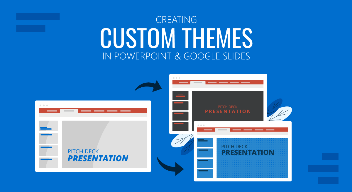
Rather than panicking or outsourcing graphic design services to create unique results, we invite you to discover how to create custom themes for any PowerPoint and Google Slides presentation. From basics to advanced techniques, this guide will help you master the tools at your disposal and create unique slide decks.
What Is a Presentation Theme?
When discussing presentation software, we refer to a theme as a collection of design elements defining your presentation slides’ overall look and feel. Themes typically include a coordinated set of colors, fonts, slide layouts, background styles, and effects. These elements work together to ensure design consistency throughout the slide deck, helping the audience understand the presentation much faster.
Benefits of Custom Themes for Business Presentations
Consistency and Professionalism
One of the primary benefits of working with custom themes in business presentations is maintaining brand consistency. A well-designed custom theme ensures that every slide adheres to your company’s brand guidelines, including colors, fonts, logos, and overall design aesthetic. This implies that your brand identity is consistently represented, which is especially important for targeting potential customers or investors, helping build brand awareness.
Communication and Flexibility
Not all pre-made templates offer the complete set of tools we need for a specific presentation type. Sometimes, we have to mix and match slides from templates to create that much-needed slide deck. If, on the other hand, we take the time to tailor a theme to include all the tools we require with the same aesthetic, the end result will look natural.
As a result of the previous point, custom slides give us the adaptability to accommodate a slide deck for multiple purposes depending on the topic and the audience, all this while ensuring that it aligns with your company’s core values.
Consistency Across Teams
A common mistake large organizations make is lacking common ground for visual communication standards. In-team meetings are done with any kind of template, so if we intend to repurpose the content for an external meeting, the slides must be created practically from scratch, as the content from one team doesn’t match others.
By implementing a custom theme, you standardize the presentation process across your organization. This ensures that every presentation, whether created by financials, HR, marketing, or operations, adheres to the same visual guidelines.
The Role of Fonts, Colors, and Layouts
The choice of fonts, colors, and layout schemes in presentation themes is not accidental. Each element plays a vital role in shaping the presentation’s identity.
Fonts
Fonts contribute to readability and mood. When we think about a business or formal presentation, a combination of serif and sans-serif typefaces immediately comes to mind. Sans serif fonts give a clean and modern aesthetic, while serif fonts speak of traditionalism.
Consistent use of fonts is fundamental in any slide deck. To avoid amateurish results, stick to a maximum of 3 fonts (or variations of the same). You can learn more in our guide on fonts for presentations.
Color
Colors evoke emotions. An incorrect color palette can distract your audience from the content you intend to share, whereas a well-chosen color palette helps to convey the message more effectively.
We created a very detailed guide on color theory for presentations. In it, you can learn about the emotions that colors can transmit, how to pair colors and plenty of other useful content to customize the color in your presentation themes.
Layouts
Think of layouts as the skeleton of your slides. They ensure the content is structured, making it easier for the audience to process the information.
Multiple design rules guide presentation layouts, such as the rule of thirds, the golden ratio, the grid system, working with negative space, and the Z-pattern and F-pattern layouts.
Differences Between PowerPoint and Google Slides Themes
Although both presentation design tools are excellent for creating custom themes, there are some differences in the management and creation of themes for each platform:
- Flexibility: PowerPoint offers extensive customization options compared to Google Slides, especially in shapes, transitions, animation effects, and shadows. Custom gradients, advanced typography settings, and other interesting tools are unavailable to Google Slides users.
- User Interface: Although Google Slides lacks the full range of tools of PowerPoint’s Slide Master function, it is more user-friendly for customizing slides. PowerPoint’s Slide Master allows advanced users granular control over every aspect of the theme, but it can be challenging for newcomers.
- Cross-Platform Compatibility: Compatibility issues are well-known when migrating presentation slides from PowerPoint to Google Slides or Keynote. This is present when the slides contain complex shadow effects, animation effects that are only PowerPoint available, or if the illustrations contain curved texts. Although they can be “fixed,” the results are nowhere near as neat as PowerPoint can offer.
Therefore, presenters must consider these aspects when picking their preferred design tool and invest time and effort into creating custom presentation themes.
Creating Custom Themes in PowerPoint
Accessing the Slide Master
Locating Slide Master is the first element you must learn to create a custom theme in PowerPoint. This tool controls the slide layout elements for different kinds of pre-established slides, which means you can add footers, branding elements, page numbers, graphic effects, etc.
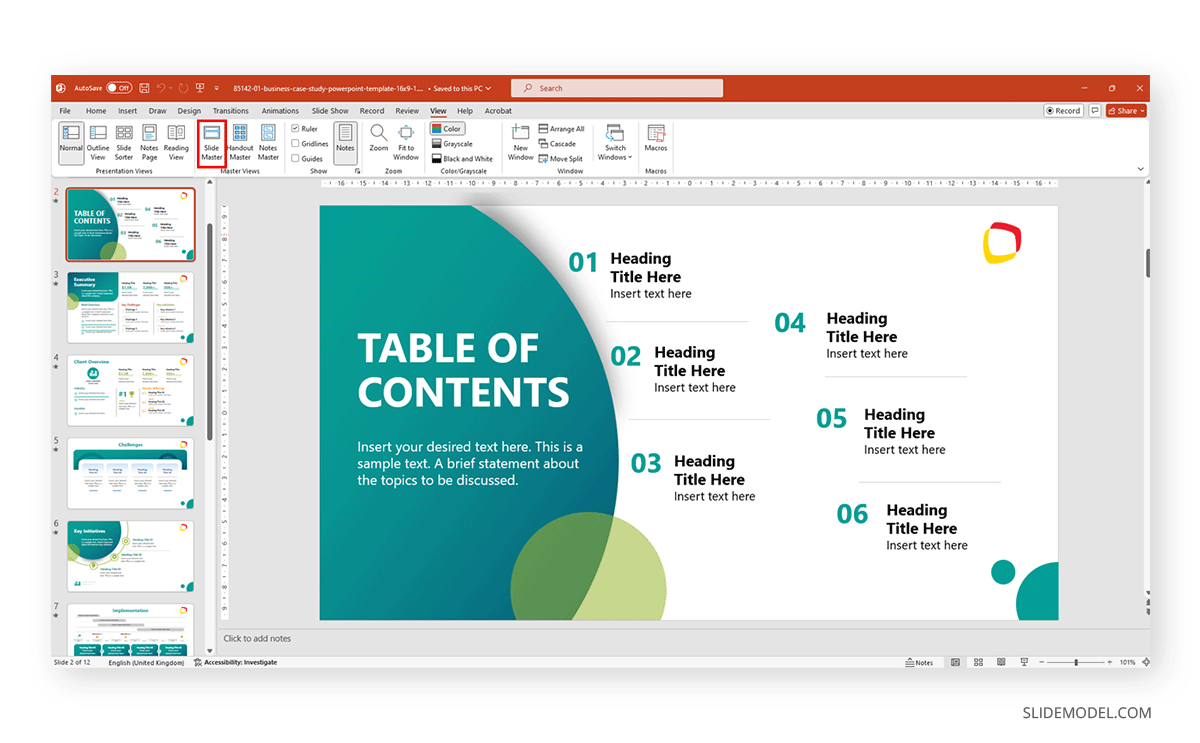
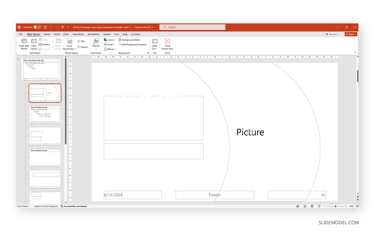
Follow our guide on how to work with Slide Master for PowerPoint for more detailed information.
Customizing Colors
Now that we know where some of the elements of a PPT template are located, it’s time to discuss customizing the colors for our slides. This can be done in two ways: customizing color element by element or changing the color theme.
Select any element you want to recolorize and go to the Shape Format tab. You can use Shape Styles, or work your way with Shape Fill and Shape Outline.
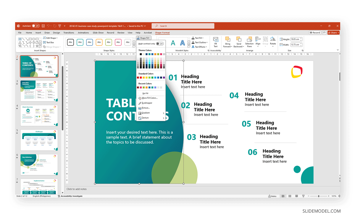
On the other hand, if you want to alter the entire color theme, which is a much faster procedure as it affects all slides alike, check our guide on how to use theme colors in PowerPoint.
Setting Up Fonts
As with the colors, you have two methods for editing the fonts in your PowerPoint theme. The first method is done inside Slide Master; you need to access Fonts and click on Customize Fonts.
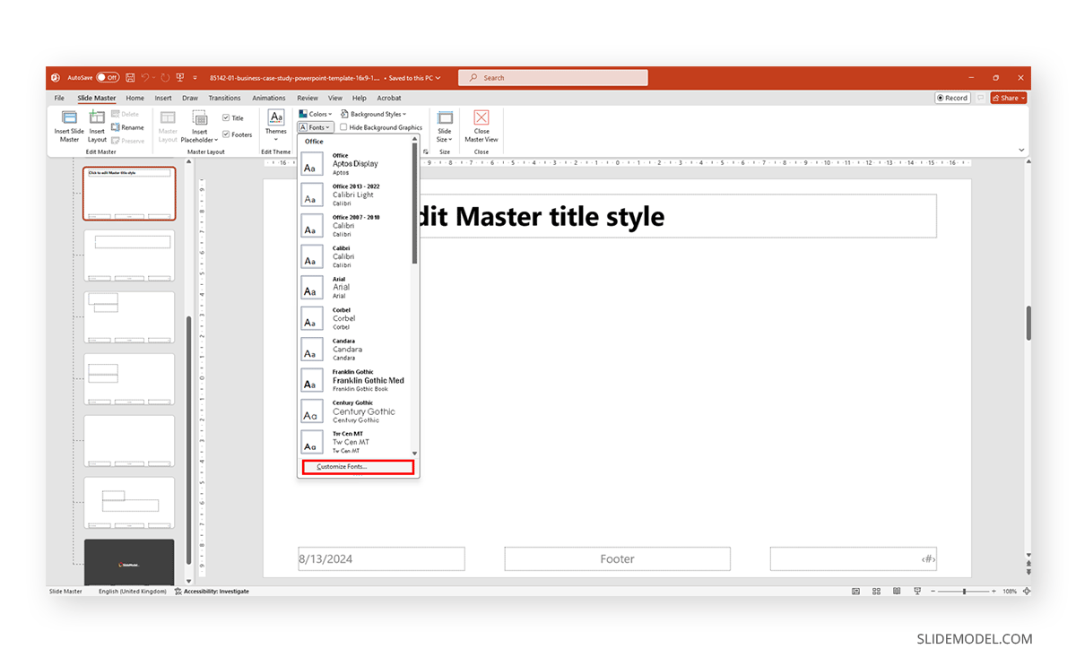
This will open up a font customization dialog to select the preferred fonts for headings and body text.
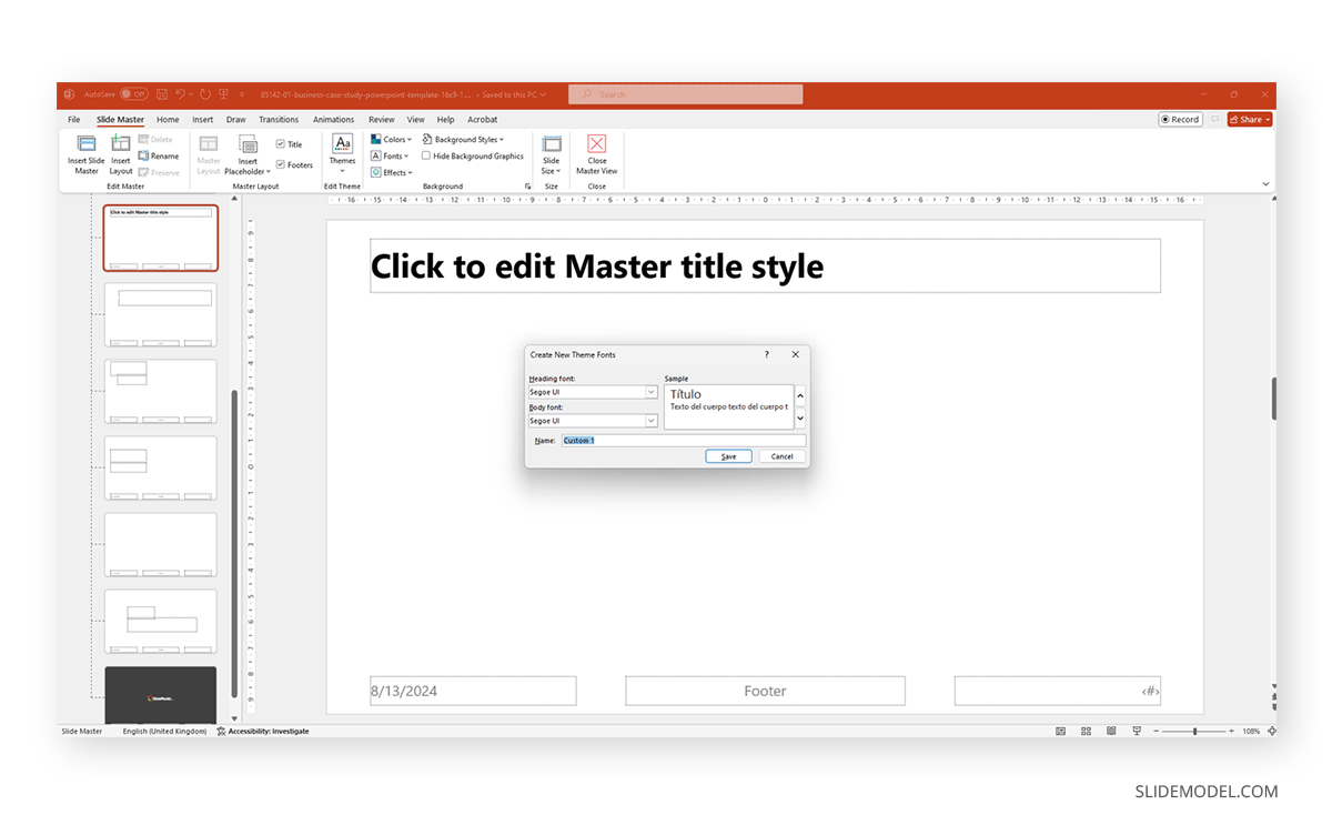
The second way is to manually edit the fonts by selecting each text element and changing the font. It’s more time-consuming, but it may be the method that works best when we only need to alter certain text elements in the slide deck.
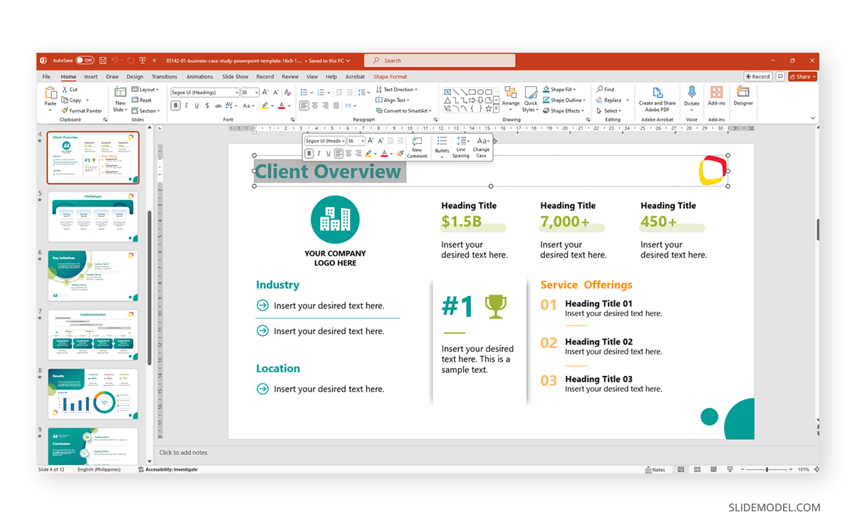
Keep in mind the compatibility issues if you work with non-common fonts. Since fonts are only displayed if installed on the streamer PC, keep a copy of your font families used or stick to pre-installed fonts.
Designing Layouts
Presenters can alter the existing layouts by entering Slide Master and repositioning placeholders, changing their sizes, or adding new placeholder elements (text, image, chart, etc.). The changes will be reflected on all slides that use this same layout.
Alternatively, we can create new layouts by selecting Insert Layout in Slide Master. This newly generated layout works as a blank canvas to which you can add whichever elements you prefer.
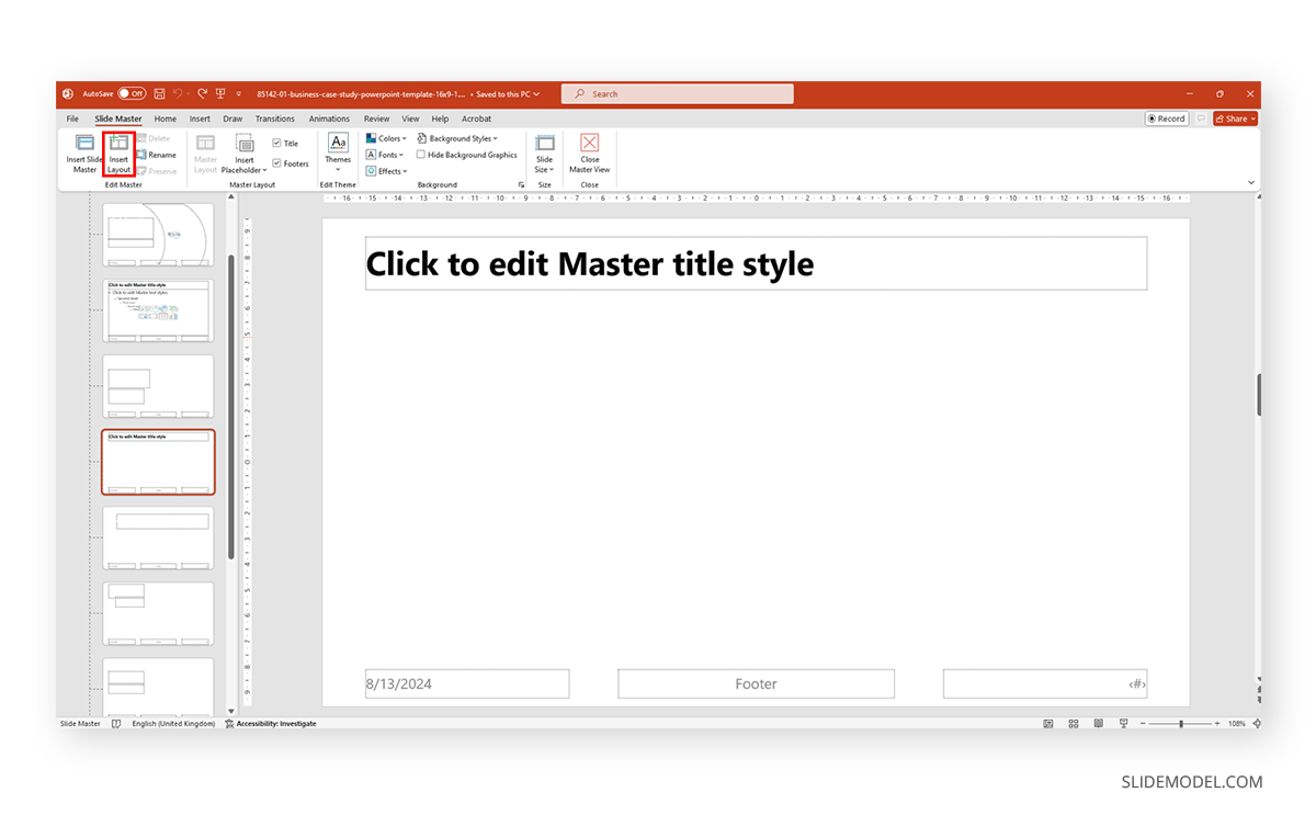
Saving and Applying Custom Slides in PowerPoint
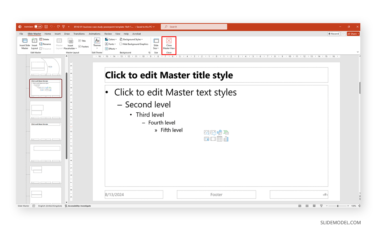
Say you created a PowerPoint custom template with all the elements that adapt to your presentation style and requirements. Now, it’s time to save it for backup purposes or to share it with your organization. First of all, inside Slide Master, select Close Master View to exit the Slide Master mode.
Next, switch to the Design tab and click on More in the Themes group. Select the option Save Current Theme. Give your created theme a name and save it to the default location (important!) to make it easy to access it for future presentations.
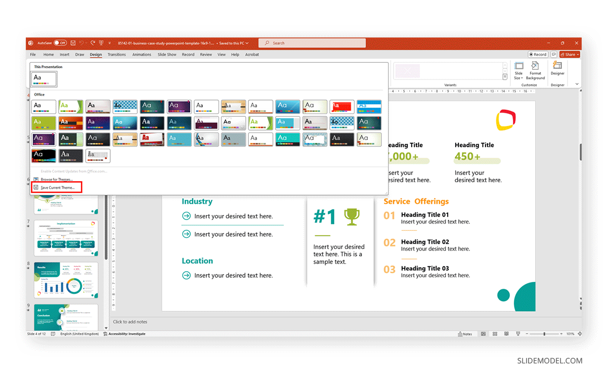
A quick tip to export a copy of your created theme is to repeat the steps to save the theme after Save Current Theme but instead of overwriting the file, right-click on it and select Copy.
Now go to your desired backup folder location, right-click inside it, and select Paste. A copy of the original PowerPoint theme will be stored.
Creating Custom Themes in Google Slides
Accessing the Master Slide
Google Slides’ version of PowerPoint Slide Master is quite simplified in terms of tools and user interface; it is known as Master Slide, and it can be easily accessed from Slide > Edit Theme.
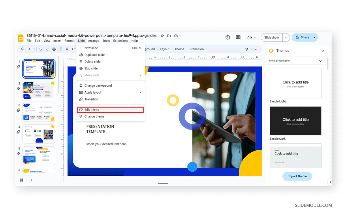
Check our article on how to edit master slide in Google Slides for further information.
Customizing Theme Colors
Theme colors in Google Slides are managed at the theme level and can be edited from the Master view. Click on Color in the toolbar available in the Master view, and this will open the Theme Colors panel, where we can customize the colors used for text, background, accents, and links.
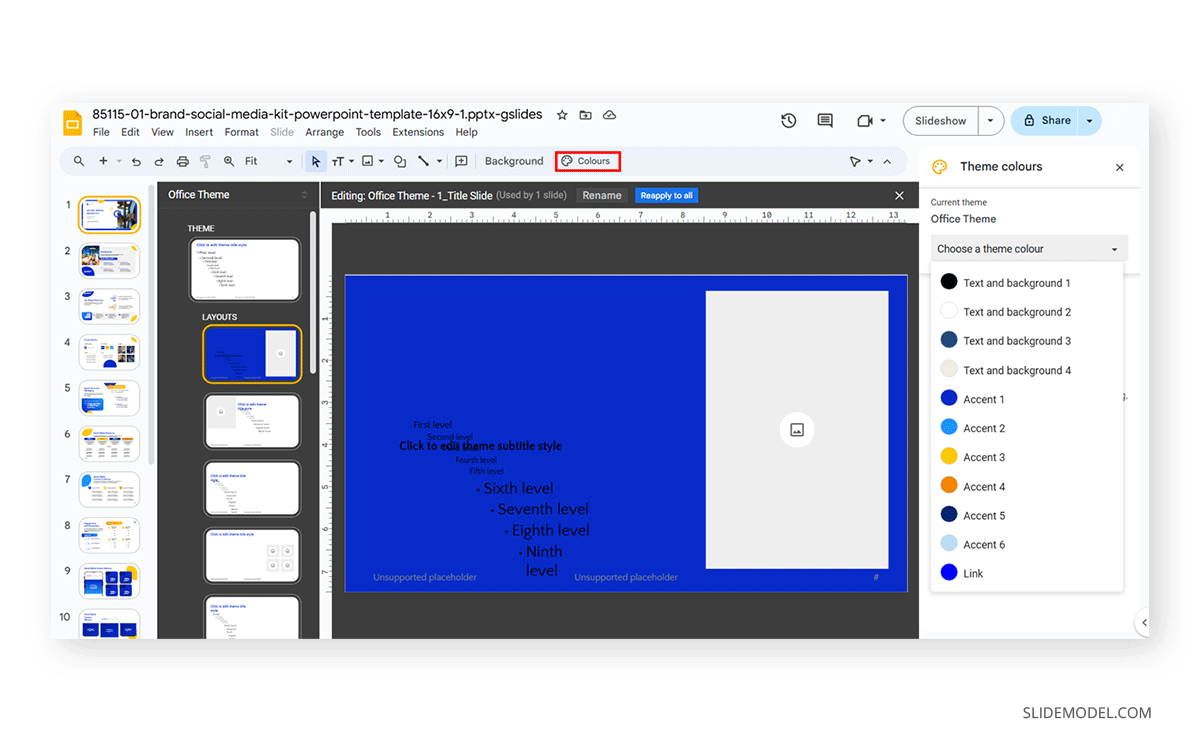
Google Slides allows us to modify the colors by clicking on the color box next to each element. This can be done by using color picking, selecting a color from the provided color palette, or adding a HEX code. Since the Master slide contains all the information for the slide deck, changes will be made globally once saved. If you need to edit an individual element, you can select it from the slide containing it and change the colors.
Choosing and Setting Fonts
Font customization in Google Slides is pretty much similar to PowerPoint as it’s managed from the Master view. The main advantage here is Google Slides’ integration with Google Fonts. This means that you don’t have to worry about compatibility issues in your presentation.
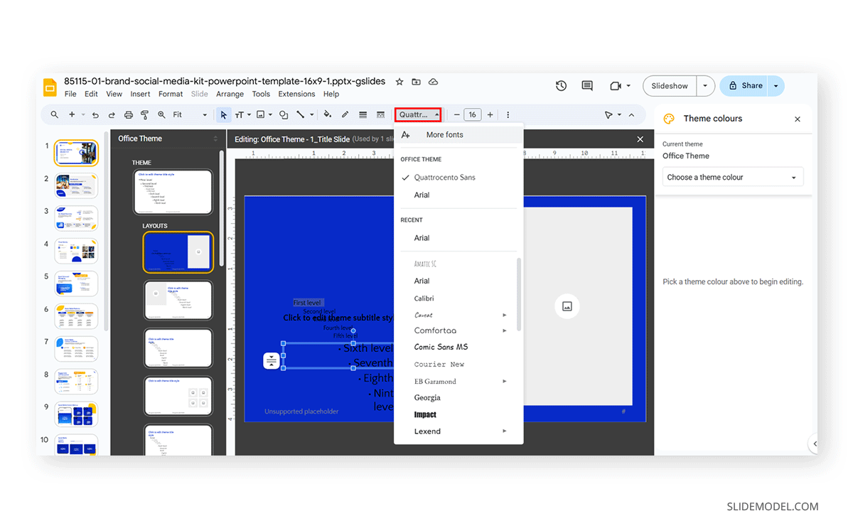
The font compatibility issues do not apply if you work with third-party extensions. In that case, you have to double-check if the recipient’s computer has that extension linked to the account to be used; otherwise, they won’t display.
Learn more about how to add fonts to Google Slide with our article.
Creating and Modifying Layouts
You can create or modify existing layouts in the same fashion as you did with PowerPoint. Access the Master view, select any layout slide, and edit its content.
If you need to create a brand new layout, click on the layout above the one you need to create and use the CTRL+M shortcut.
Saving and Reusing Custom Slides in Google Slides
Since Google Slides doesn’t include a “Save Theme” option, the customized theme becomes part of a specific presentation. This means you have to make a copy of the presentation to reuse it or go to the Import Theme option to select a theme from a previous presentation or a slide deck you uploaded.
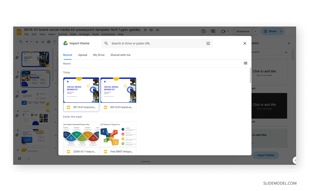
Learn our article on how to import Google Slides themes to master this procedure.
Advanced Customization Techniques
We have already explored the basics of creating a custom theme in PowerPoint and Google Slides. However, some advanced techniques can give you an extra edge, making your slides look more professional and boosting your brand identity.
Incorporating Logos and Branding Elements
A must-have for any professional presentation is to count on branding elements, such as logo and branding colors. Follow the steps mentioned above to apply your brand’s color palette to your custom presentation theme – and, as a tip, it’s best to stick with HEX values for assigning colors so you won’t have mismatches.
Check out these articles for further reference on how to work with branding elements.
- How to create a logo presentation
- How to make a branded presentation
- How to present your brand identity
Using Graphics and Backgrounds
You can add custom backgrounds, like patterns created in Adobe Illustrator, by right-clicking on the slide in Slide Master and select Format Background. PowerPoint allows you to use solid colors, gradients, textures, and images as backgrounds.
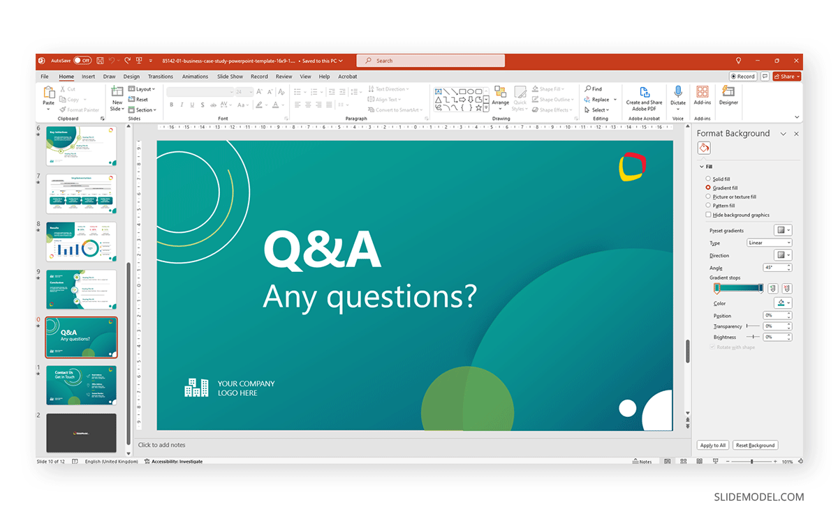
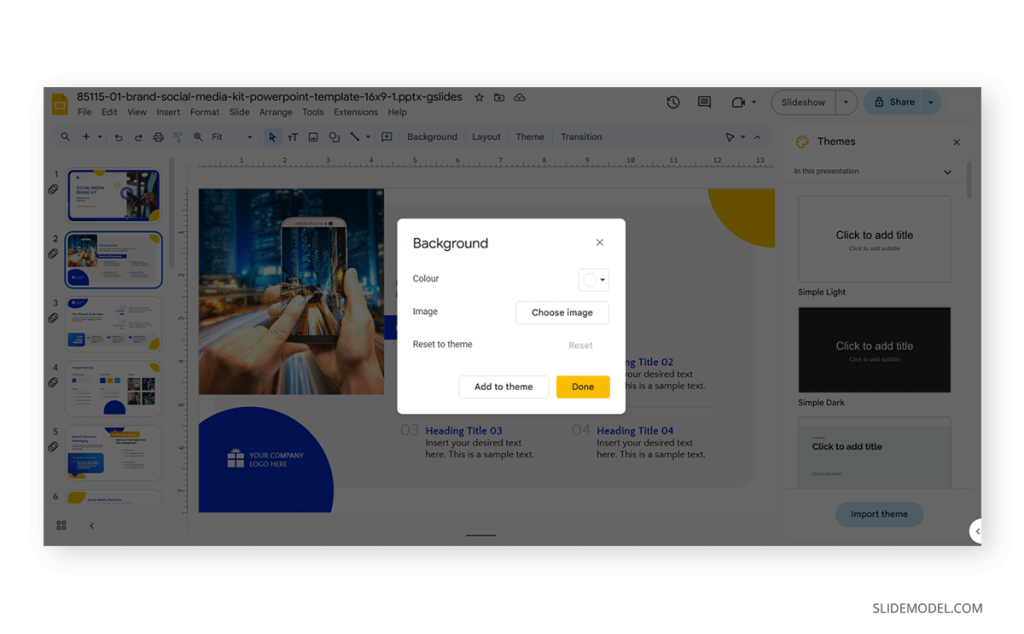
In case you work with Google Slides, the procedure is almost the same: selecting the Background option in the toolbar shown in Master view, or access it for a single slide as shown below. The possibilities are limited compared to PowerPoint, especially regarding complex gradients and shadow effects, so keep it simple.
Remember to work with images or textures that won’t pixelate on your slide. As a reference, always opt for 1920×1080 px when in doubt, but use optimized files to avoid making heavy-sized presentation files.
Animation and Transition Customizations
The two presentation software options we managed in this article offer significantly different animation and transition options. The first is PowerPoint, which has a more extensive offering and complex effects. Access the Transitions tab to add transitions to your slides or the Animations tab to add animated effects to make an entrance, add emphasis, or an exit animation for your slides.
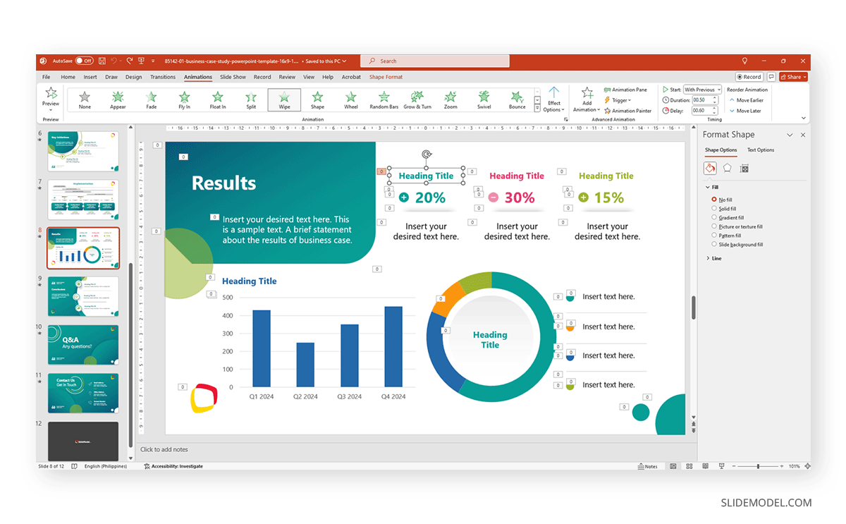
Google Slides offers a limited selection of effects available via Insert>Animation or Slide>Transition.
Check the following articles for in-detail information about both animations and transitions:
- How to Animate on Google Slides
- How to Create PowerPoint Animations
- How to Remove Animations from PowerPoint and Google Slides
- How to Add Transitions in PowerPoint
Ensuring Accessibility in Themes
Accessibility in presentations is a key element we must consider when designing custom themes. We can identify three main points that presenters ought to check:
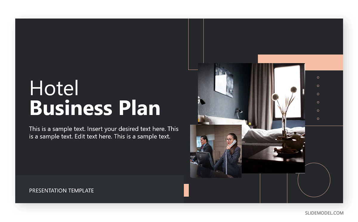
- Color Contrast: There must be sufficient contrast between the text and background color, as otherwise, it compromises readability (especially for individuals with visual impairments).
- Font Size: Choose a font large enough to be read easily from a distance. Typically, we use a minimum of 16 pt for body text. As we mentioned above, avoid using script or overly-decorated fonts.
- Alt Text for Images: Alt text is not limited to SEO purposes. In presentations, using alt text can help people with visual impairments understand your slides as screen readers go through alt text.
Let’s take, for example, a well-known case in mass media content: Netflix. If we think about Netflix, we immediately associate its branding identity with the sans-serif caps logo and a red-and-black contrasting color scheme. The rest of its user interface works with the same sans-serif font in two weight options (bold and regular), using different sizes to distinguish between headings and body copy.

From an accessibility point of view, the Netflix website’s contrast ratio is 4.8:1, and according to WebAIM, text and text images ought to have at least a 4.5:1 contrast ratio. Regarding text, they use a 48px sans serif bold font for the headings and a 24px sans serif regular font for the body text: a 2:1 ratio.
Applying these rules to a presentation slide, here’s a fine example of what an accessible slide looks like.
Conclusion
Creating custom PowerPoint and Google Slides themes is a powerful way to ensure your presentations are visually consistent, professional, and aligned with your brand identity. By understanding the key elements of a theme—such as colors, fonts, and layouts—and how to customize them in each platform, you can create polished presentations that effectively communicate your message.
Remember that consistency is the key to a successful presentation theme. By adhering to best practices in design and accessibility, testing your themes across different platforms and devices, and keeping your design elements simple yet impactful, you can create presentations that resonate with your audience and elevate your brand.
