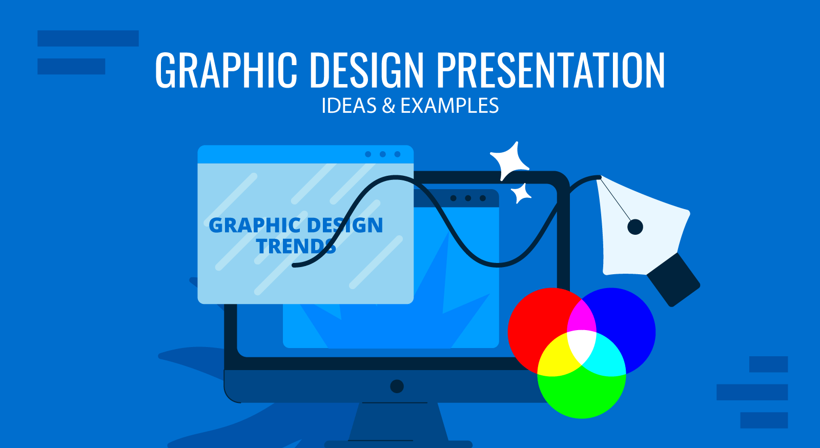
Do you want to give your presentation a new distinctive look this year? In that case, you should know the latest graphic design trends. Surely, following the hype may seem tiresome, but sticking with a standard PowerPoint presentation template will hardly impress the modern audiences, already spoiled by the good design looks everywhere around them.
By investing time in creating a trendier presentation design, you instantly gain several advantages:
- You (as a presenter) and your company are viewed as more progressive. Appearing as an innovator raises your authority profile.
- Your presentation content becomes more memorable. Even the most thrilling information gets forgotten when presented in a bland “wrapper”. But unique, on-point presentation get recalled better time and again.
- You can retain the audience’s’ attention for longer when each new slide looks unique and designed with great attention to details.
Feeling convinced that it’s time to try something new? Here’s our look at the future of graphic design through the context of presentation design.
- Font Trends: Best Fonts for PowerPoint Presentations
- Trendy Colors to Use in Presentation Design
- Cool Graphic Design Trends to Use In Presentation Design
- What’s Your Take on Presentation Design Trends?
Font Trends: Best Fonts for PowerPoint Presentations
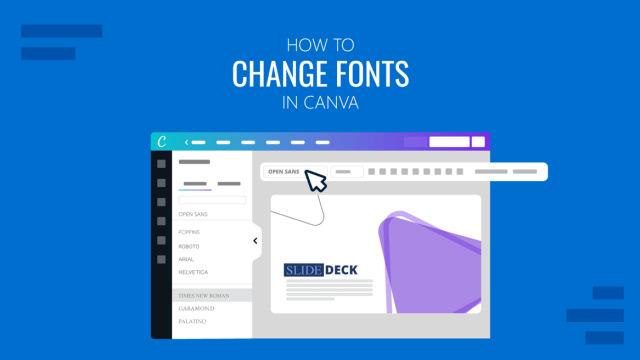
Choosing the right font is an art as it can make or break your entire presentation look and feel. Sloppy typography and weird font pairings will immediately offend some of your viewers and undermine your authority. Luckily, there are a lot of font generator tools available online to help you find a good font for your presentation, good font pairings and combinations for your presentations. With the help of a font generator, you can easily create unique fonts and customize your presentations.
Besides, it’s important to remember that not all digital fonts look particularly great in presentations. Some are better suited for posters and other graphics. Our line-up, however, features the best fonts for PowerPoint specifically.
1. Lydian
Lydian is a “humanist” sans-serif font. Originally designed back in the 30s for book covers, it has recently re-surged in popularity once again. Apart from the bookstores, you can now see Lydian used in print materials, digital collateral and presentation materials.
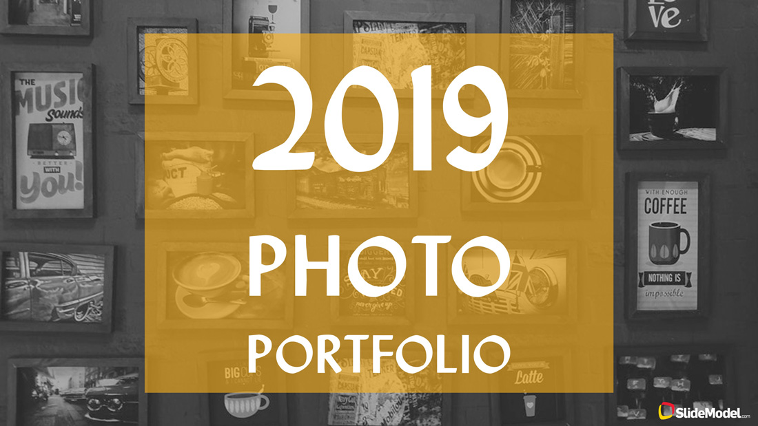
2. Nostalgic Vintage Fonts
Hipster design trends remain strong. If you want to give your presentation that cool “old school” vibe without overdoing it, use a few funky vintage fonts for your headings and subtitles. They will instantly make your presentation design more modern, and yet professional.
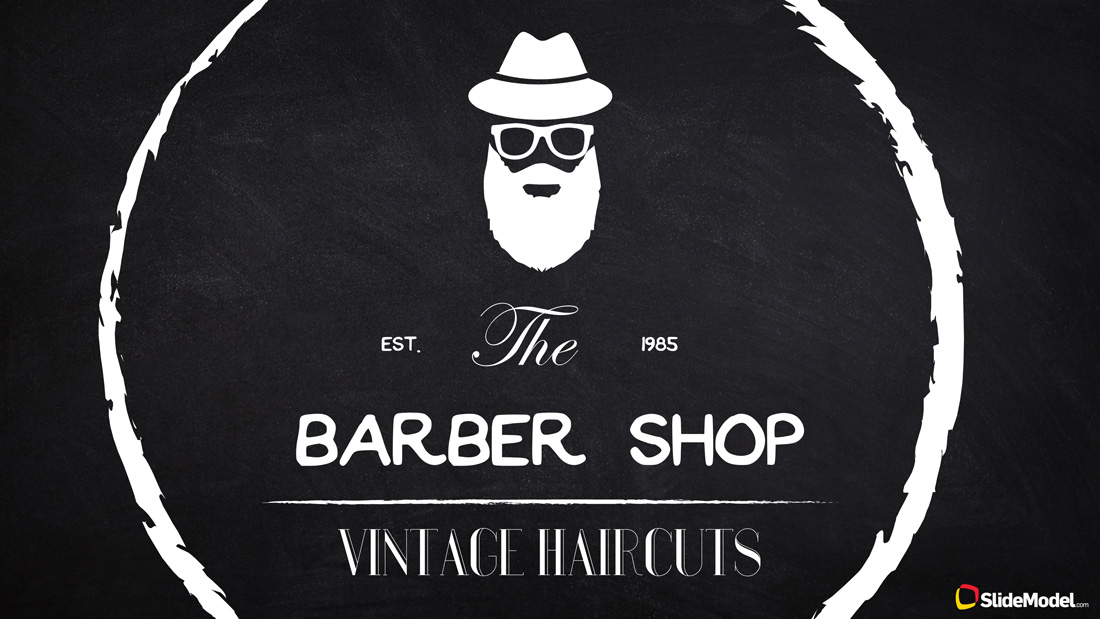
3. Elaborate Script Fonts

Per Shutterstock, “vintage romantic rococo” aesthetics is one of the rising graphic design trends. Loose, feminine, handwritten and somewhat elaborate scripts are in vogue too. From greeting cards to clothes, wine glasses and digital materials – such typefaces feel more organic and warm than more traditional geometric sans fonts. So if you want to give your deck that less formal look, we have lined up the best handwritten fonts below:
4. High-Contrast Serif Fonts
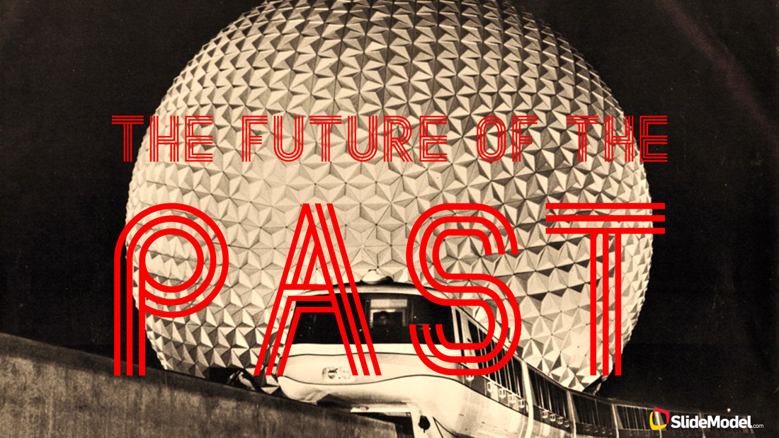
Retrowave is making a come-back this year in modern graphic design. Think about the 80s aesthetics: bold colors, neon lights, groovy lines and abstract patterns. While getting this style right may require some design skills, you can always “safely” add a funkier font to your slides whenever you want to accentuate some information or make a bigger statement. The fonts we advise to try out are:
Trendy Colors to Use in Presentation Design
If you feel like experimenting with fonts is a bit too complicated, fret not. You can always make your deck more timely and on-point by opting for a trendy graphic design background or a color scheme. Shutterstock identified the following color trends.
1. UFO Green

Bold and bright, this shade of green combines them seemingly incompatible – the natural and the supernatural. While it may be too “loud” for specific diagram or shape, you can use it as a PowerPoint background to provide an overall vivid hue to a cover or section separator. Use the additional green combination in the palette to create impactful gradients.
2. Plastic Pink
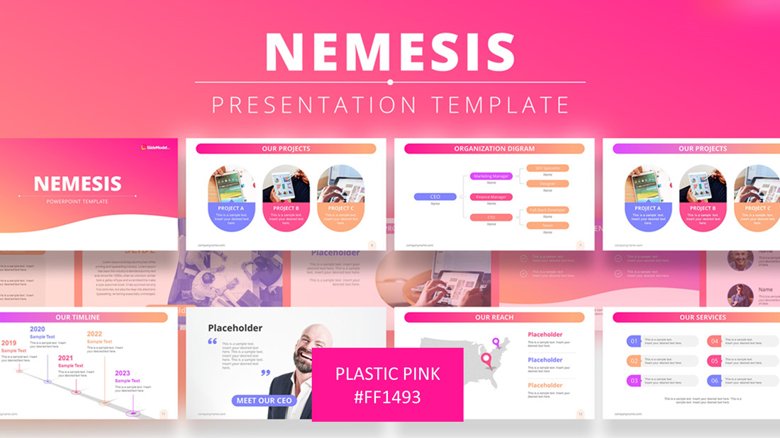
Move on the subtler “millennial pink”. Plastic is now the shade to go. If you want to add some neon graphic design elements (another major design trend 2025), consider painting them in the Plastic Pink color.
3. Proton Purple
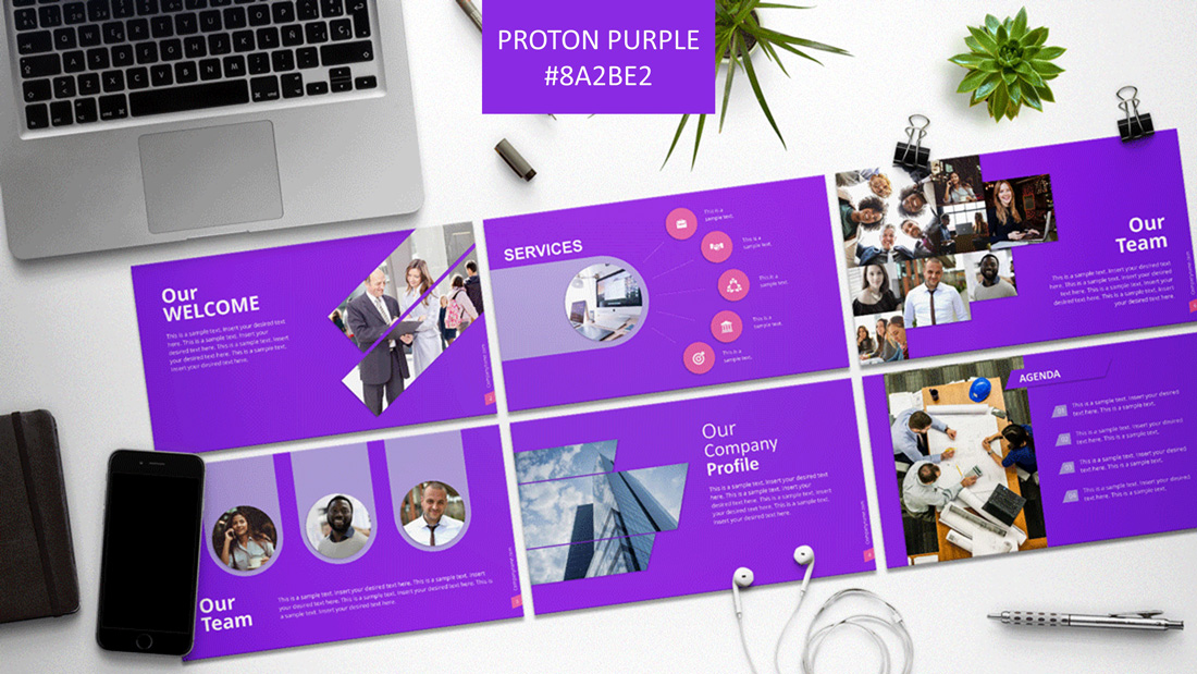
And here’s another color trend fueled by the Retrowave and Futuristic design trends. This vibrant shade of purple makes an instant strong impression. Use it add strategic pops of color to your slides, whenever you want to make a big memorable statement.
4. Living Coral
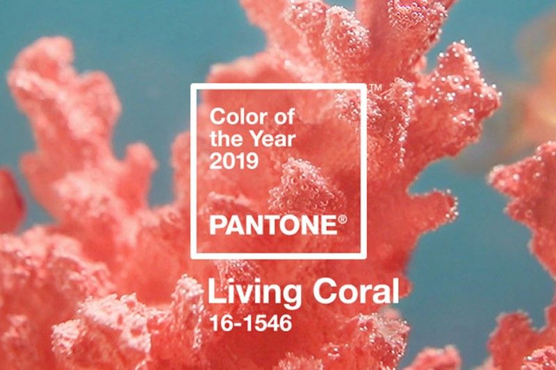
Of course, no color trends list is complete without Pantone’s Color of The Year. In 2025, their choice is another pink-tinted hue. It has a softer golden undertone, making it more pleasant to the eye, yet lively and vibrant at the same time. It’s a perfect choice for a pastel presentation template.
Cool Graphic Design Trends to Use In Presentation Design
Here comes the juiciest part of our design trends outlook. In this section, you can browse the latest graphic design trends and presentation ideas, and learn how to apply them to your PowerPoint presentation design. Let’s start experimenting.
1. Pastel Colors
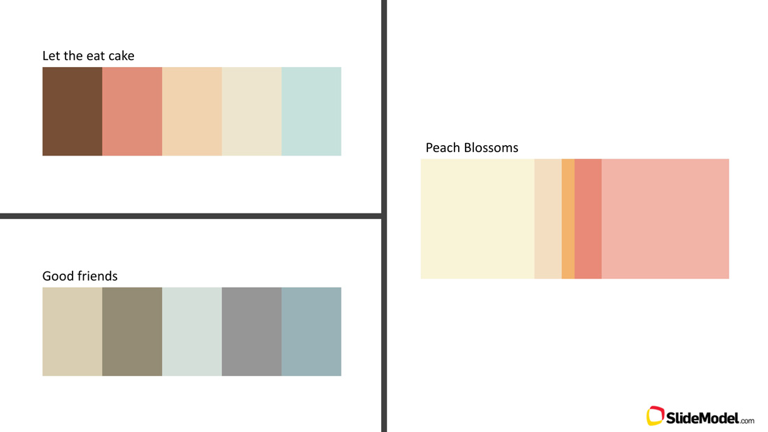
“Living coral” is one prime color example to consider. Other romantic undertones and softer, sensual colors are in trend as well. Per Shutterstock, this trend will witness a +160% rise in popularity this year, migrating from print and interior design to the category of web design trends 2025.
We’ve lined up several pallets you can use for your presentation color scheme: (Let Them Eat Cake , Good Friends , Peach Blossoms)
2. Neon Gradients
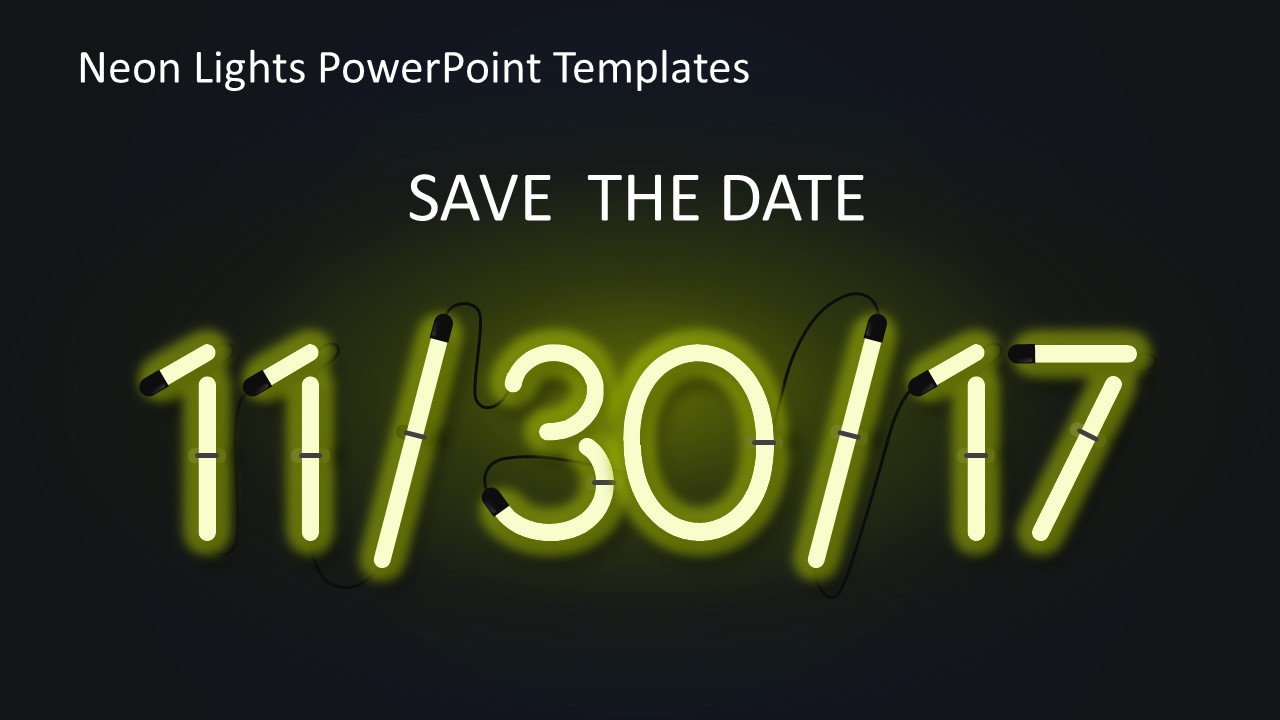
Futuristic design elements in neon colors are among the hottest design trends in 2025. Neon may be somewhat hard to pull off if you are not a designer, so for starters experiment with using just a few elements, rather than applying this trend to your entire presentation. SlideModel has this funky neon lights powerpoint template elements you can use to light up your presentation.
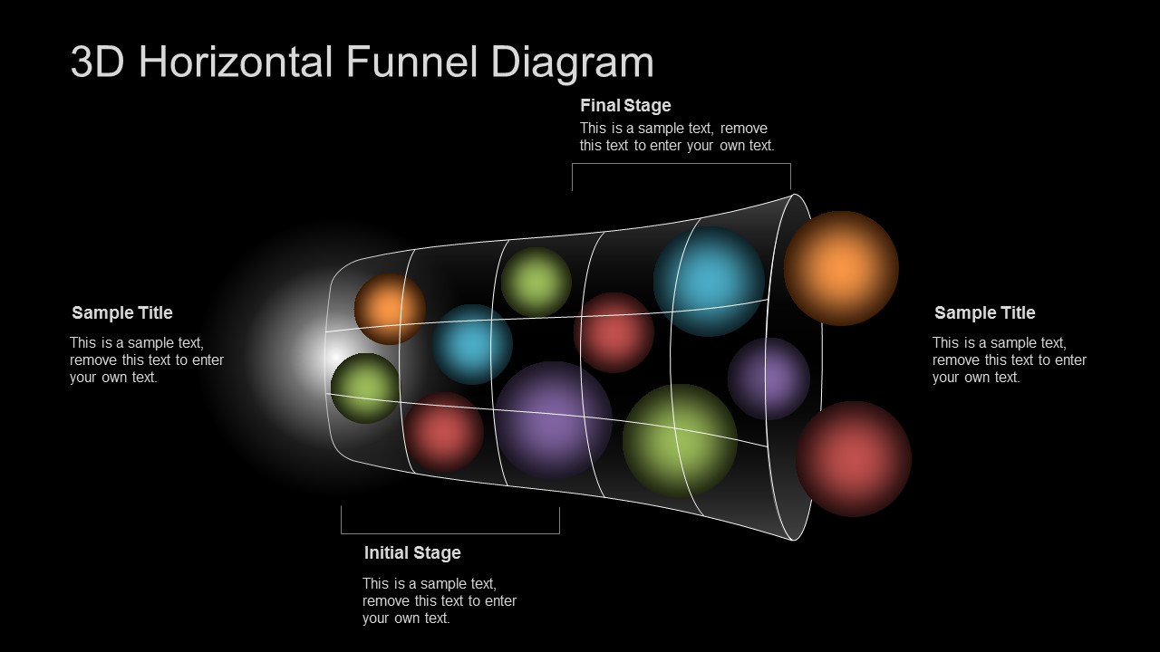
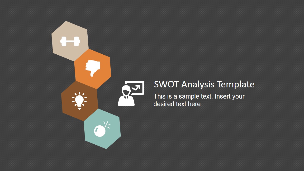
3. Dark Backgrounds
Dark backdrops are already making a comeback in web design. Apple is arguably the master of pulling off the “white on dark” trick and has been consistently using it to advertise their products including the latest iPhone X.
Dark backgrounds create this luxury, minimalistic vibe and can cast a lasting and memorable impact on your presentation. Additionally, this trend pairs well with the previous one. Neon gradients and vector shapes look particularly appealing on a darker background. Take a look at how we play this out in several PowerPoint presentation templates.
3D Horizontal Funnel for PowerPoint
Minimalist SWOT Analysis Template
Simple Animated PowerPoint Template

4. Colorful Gradients and Duotones
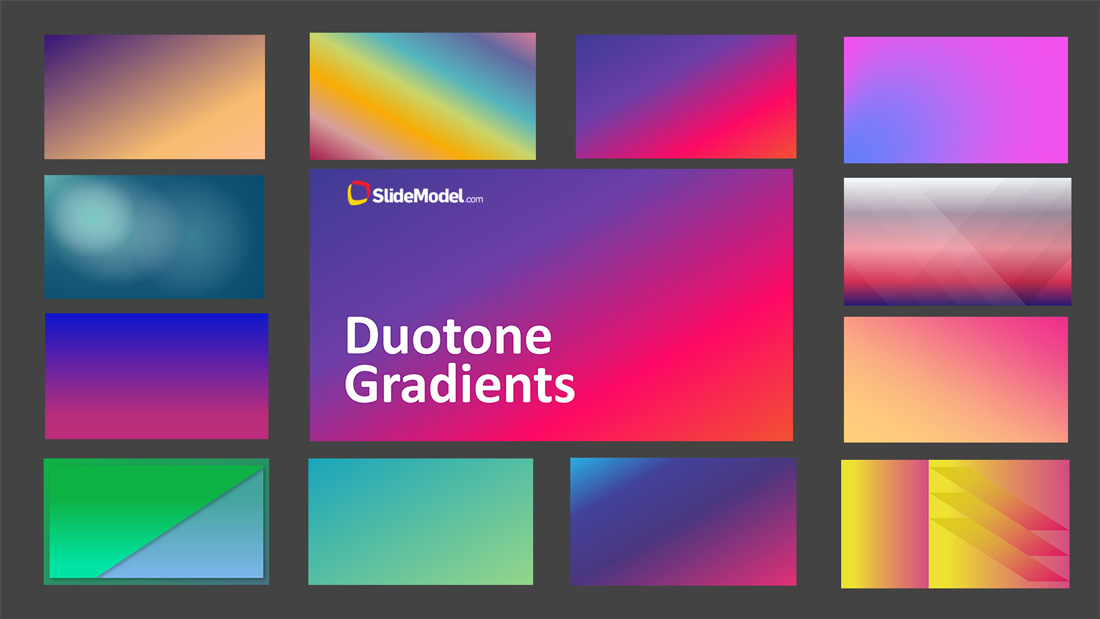
“Zine” look is back to the fore yet again this year and gradients are a major part of that look. You can notice that duotone fades and two-color combinations are already actively used in logo and web design. And now the use of color transitions creeps into presentation design.
If you want to design a presentation using this trend, browse our newly-made collection of Duotone Gradients PowerPoint Templates.
5. Colorful (Rainbow) Geometry
This trend is another tribute to the 80s and the retrograde trend in design. To look modern, you can now opt for a colorful presentation template. Or if that’s too bold for the occasion, consider adding just a few rainbow elements or shapes to your slides.
Remember: to look hip, you do not need to fully apply a certain design trend or try to mix all the presentation design trends within one slide deck. Be moderate, especially when it comes to colorful elements.
Amazing Rainbow Template for PowerPoint with Business Slides
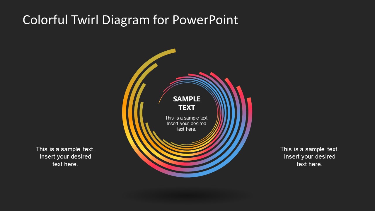
Colorful Twirl Diagram for PowerPoint
6. Distinctive Retro Aesthetics
You’ve already seen this trend applied in numerous coffee shops, diners and interior designs. Natural colors, wooden floors, Edison bulbs and the “form follows function” overall aesthetics.
To give your presentation that cool mid-century retro flair, apply the next presentation design tips:
- Opt for a natural color palette with a few vivid pops of color.
- Make use of white space and give your design elements plenty of breathing room, esp the colorful shapes or elements.
- Use fun, groovy and expressive illustrations and visuals. SlideModel prepped this excellent collection of retro icons.
- Aim to create a whimsical composition.
And if you are looking for some ready-to-use Retro PowerPoint presentation templates, check out some of our designs.
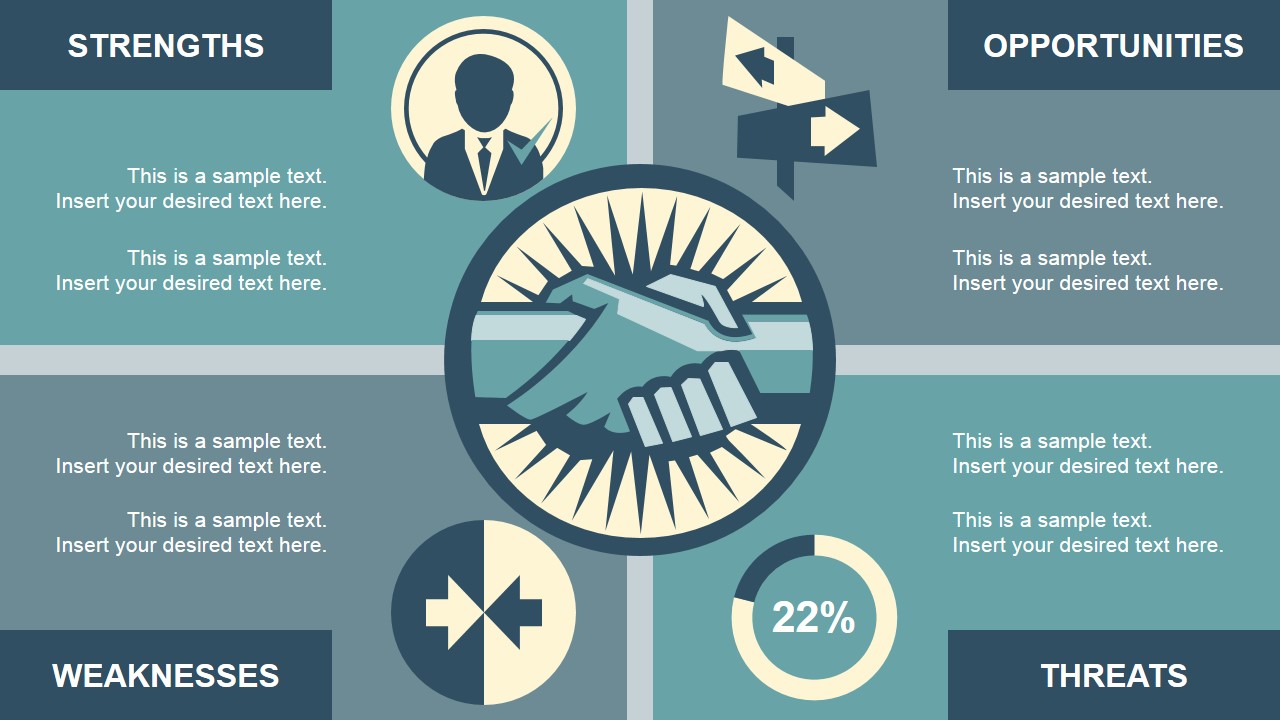
Retro SWOT Analysis PowerPoint Template
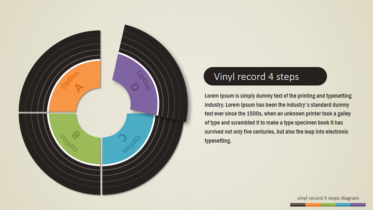
4 Steps Vinyl Record PowerPoint Diagram
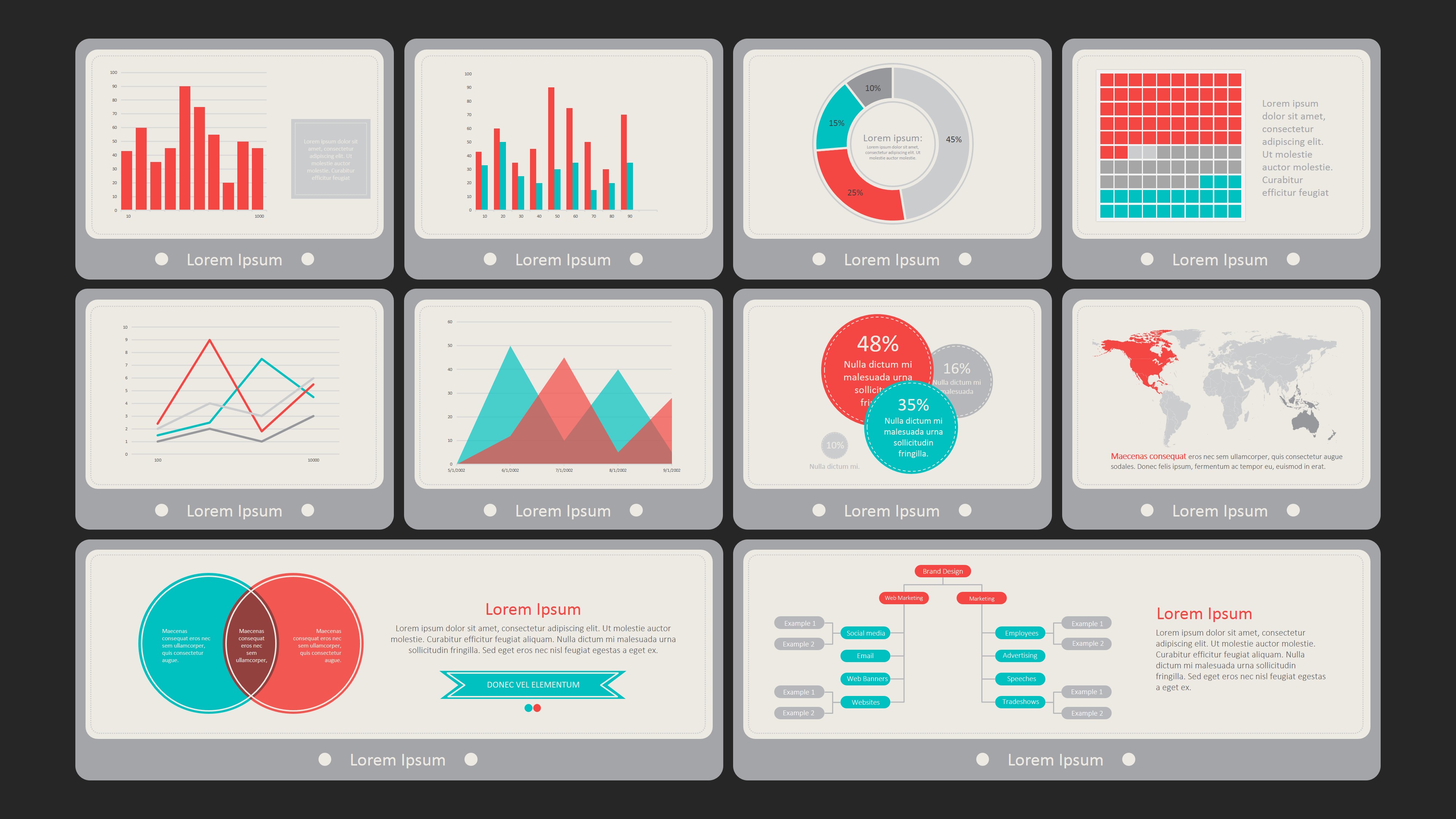
Flat Vintage PowerPoint Dashboard
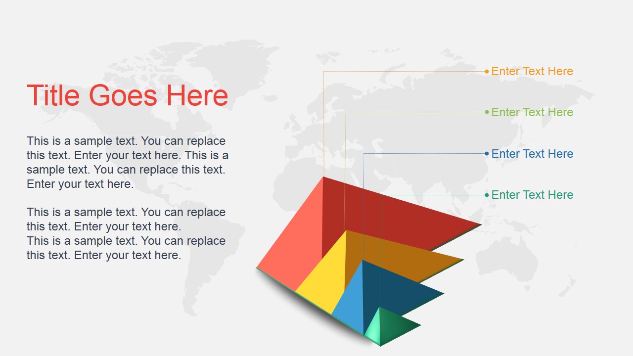
7. Broken Grid and Asymmetrical Layouts
This type of design is an excellent tool for drawing attention to your key slides and making your delivery more memorable. A broken grid means that your design elements placed a bit chaotically around the page so that the visual grid looks less rigid.
Asymmetrical layouts are among the newer presentation design trends, but it’s surely here to stay. These may be a bit tough to pull off though. For starters, try matching both symmetrical and asymmetrical elements within your PowerPoint design before completing forgoing the grid.
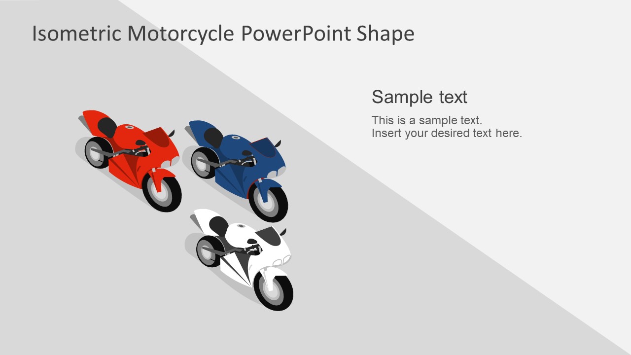
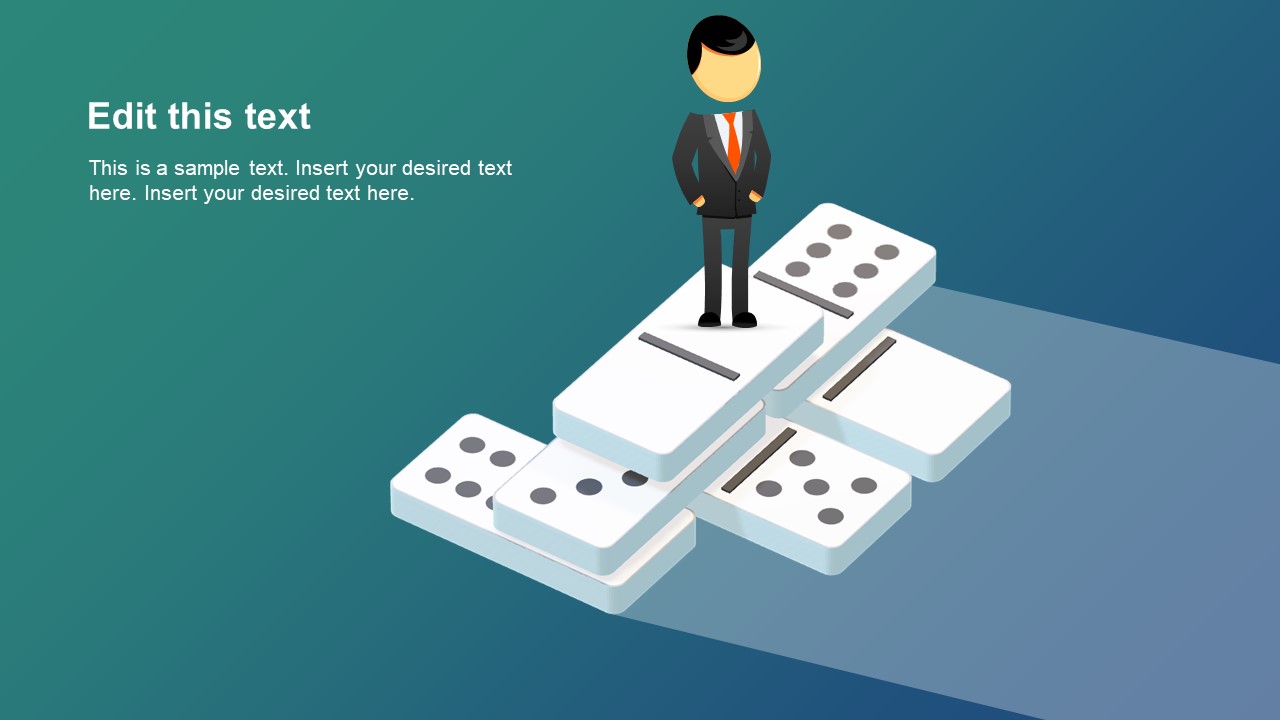
8. Isometric Design
Isometric design elements are now aplenty around the web. If you aim for a futuristic sci-fi aesthetics, use this technique in presentation design as well.
Isometric design is a method of drawing a 3D object in two dimensions. Such illustrations tend to be simple and clean, but offer more depth than the standard flat design. Isometric icons are particularly in vogue as they convey more tactility and warmth. So if you want to spice up your presentation design with some eye-catching elements, consider isometric styles.
Isometric Motorcycles PowerPoint Shapes
Isometric Domino PowerPoint Design
What’s Your Take on Presentation Design Trends?
This year re-surged some newer trends in graphic and web design that are now actively applied towards presentation design as well. Surprisingly, this year it’s a mixed bag – with opposite trends (pastel vintage design vs futuristic colorful design) being equally popular.
The best part of this clash? There’s something for everyone now. You can opt for a cleaner, more professional and minimalist look or go bold with vibrant backgrounds or funky fonts and shapes. You now have plenty of graphic design inspiration to apply towards your next presentation!