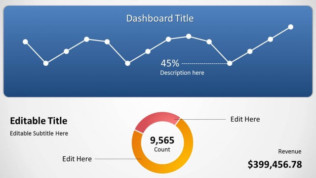
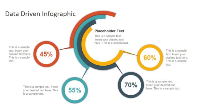
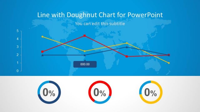
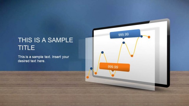
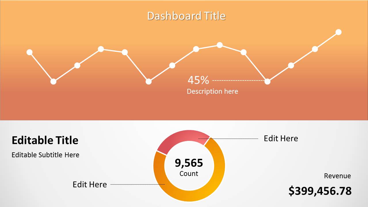
Orange Data-Driven Chart is a concept chart presentation containing a chart in a single slide PowerPoint presentation. You can use this presentation design to prepare a single slide presentation in PowerPoint with data-driven line chart and doughnut chart. There are some text boxes and values that you can also edit in PowerPoint.
Alternatively, you can download other data-driven PPT templates including dashboard slide templates for PowerPoint and Google Slides.
What’s inside this template
Example presentation scenarios
- A sales manager can use the line chart and revenue text to report monthly performance trends to leadership in a short update meeting.
- A marketing analyst can use the doughnut chart and 45% KPI callout to explain campaign share, conversion mix, or audience composition to stakeholders.
- A finance presenter can use the dashboard title, center count, and revenue label to summarize one financial result without building a full dashboard deck.
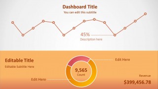
- A project lead can use the alternate orange-and-white dashboard layout to compare current status against a previous period during an executive check-in.
Features
- 100% editable presentation template
- Compatible with Microsoft PowerPoint and Google Slides
- 16:9 aspect ratio slides
- Scalable vector shapes, icons and illustrations
- AI-Ready for Microsoft Copilot and Claude
- Instant access and download
Frequently asked questions
Q: How should a presenter explain the dashboard without overloading the audience?
A: Start with the headline metric, then move to the line chart trend, and finish with the doughnut chart count or share. The layout works best when each text box answers one question: what changed, how much it changed, and why the audience should care. Avoid filling every label with long commentary.
Q: Who is this template best suited for?
A: This template is best for analysts, managers, and team leads who need a concise metric update rather than a long report. The line chart supports trend discussion, the doughnut chart supports proportion or total count discussion, and the revenue label gives executives a quick business outcome to anchor the slide.
Q: Why does the split dashboard design help communicate the data?
A: The design separates trend reading from metric interpretation. The line chart occupies the broad upper area, making the movement easy to scan, while the doughnut chart and revenue label sit in the lower area for focused numeric takeaways. The orange gradient creates a clear visual hierarchy around the key dashboard section.


Orange Data-Driven Chart Concept for PowerPoint
2-slide data-driven presentation template with orange dashboard, line chart, and doughnut chart layouts
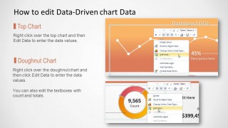
Orange Data-Driven Chart Concept for PowerPoint is a 2-slide data chart template for Microsoft PowerPoint and Google Slides. It includes an orange dashboard concept with a line chart, doughnut chart, KPI percentage callout, revenue label, and text placeholders. Chart data can be edited as an Excel spreadsheet in PowerPoint.
- Category
- Data & Charts
- Rating


 Loading...
- Aspect ratio
- 16:9, 4:3
- Item ID
- 8042-01
 Microsoft PowerPoint
  Microsoft Copilot
  Claude for PowerPoint
 Other formats supported
Subscribe today and get immediate
access to download our PowerPoint templates.