Slide 3 of 3 from Orange Data-Driven Chart Concept for PowerPoint
8042-01-data-driven-chart-concept-orange-3
How to Edit Data-Driven Charts in PowerPoint
- Text Layout
- Other
- Concept Explanation Slide
- 16:9
- 100% Editable
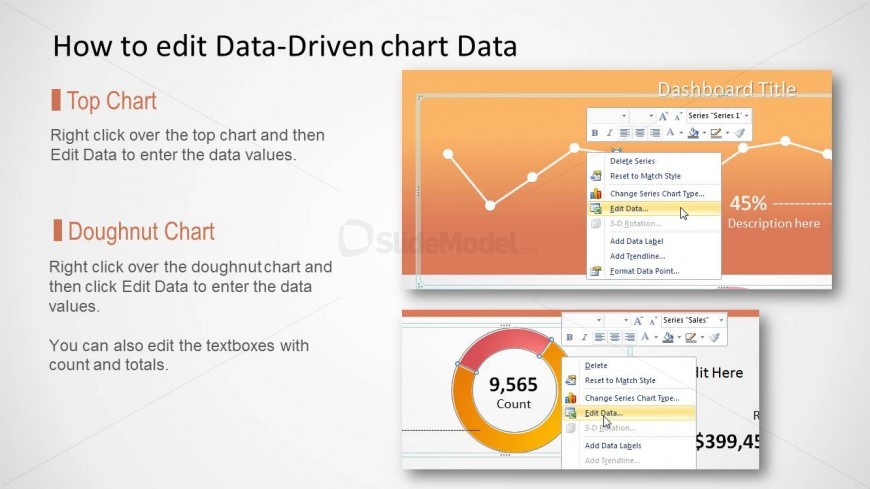
The Data-Driven Chart Editing Instructions slide from the Orange Data-Driven Chart Concept for PowerPoint template offers a clear layout for tutorials and workshops focused on data visualization. This slide template includes editable slides with line and doughnut charts designed to facilitate step-by-step guidance in updating chart data and descriptions, making it suitable for corporate presentations and training sessions requiring precise data manipulation.
What’s on This Slide
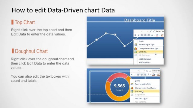
The layout features two main charts: a line chart at the top and a doughnut chart below. The line chart is positioned in the upper section, with a title placeholder above it. Below, the doughnut chart is centered, accompanied by text boxes for count and totals. Each chart has a clear visual hierarchy, with the line chart being larger. Text placeholders are aligned left and right, providing space for descriptions. The background is a gradient of orange tones, enhancing the visual appeal while maintaining clarity.
How to Use It
This layout serves as a guide for editing data-driven charts in presentations. It fits well in instructional contexts, particularly when demonstrating how to manipulate chart data in PowerPoint. Ideal scenarios include training sessions, workshops, or tutorials focused on data visualization. The structure allows users to easily follow steps for updating chart values and descriptions, ensuring clarity in data representation and editing processes.
Text Placeholders & Capacity
Keep your copy within these limits so it fits without resizing. Body slots can accommodate roughly 15-20 words each.
| Placeholder | Count | Max characters (approx.) |
|---|---|---|
| Slide title | 1 | 30 |
| Body paragraph | 4 | 100 |
Slide Keywords
Download unlimited PowerPoint templates, charts and graphics for your presentations with our annual plan.
DOWNLOAD