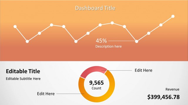
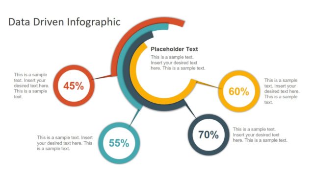
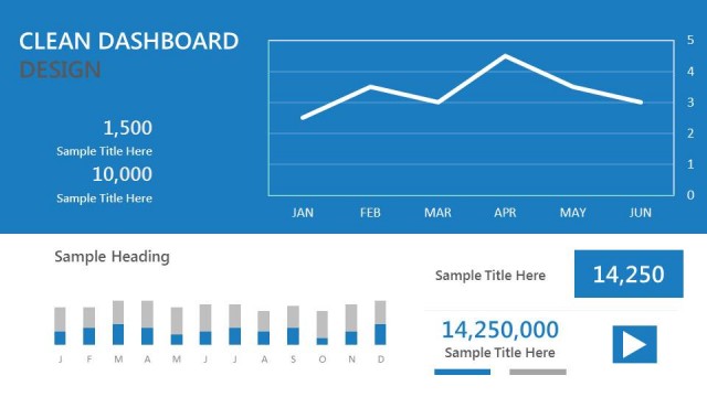
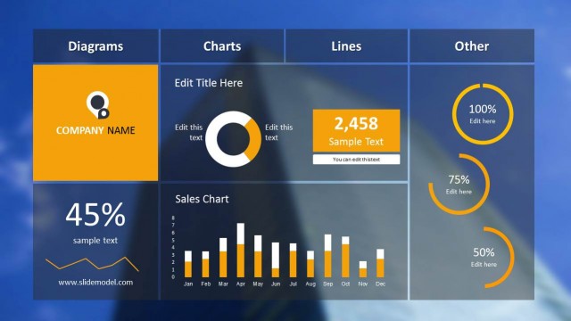
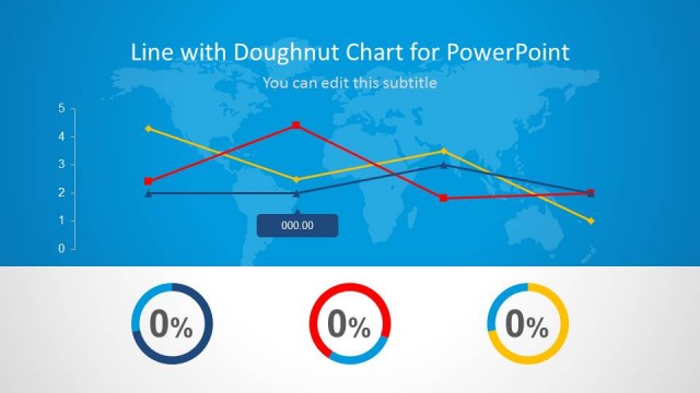
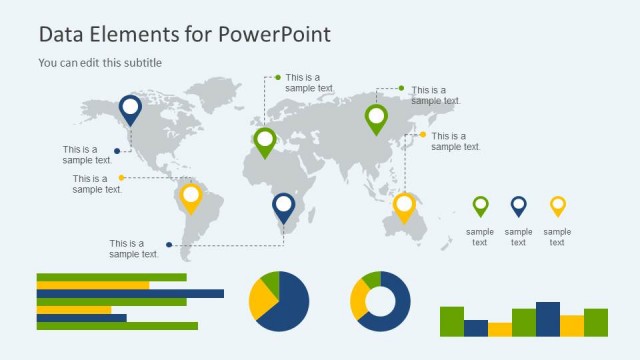
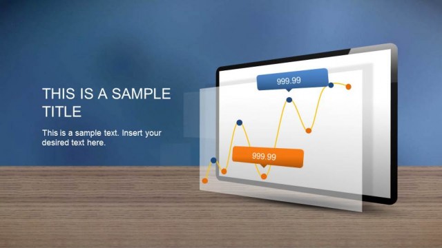
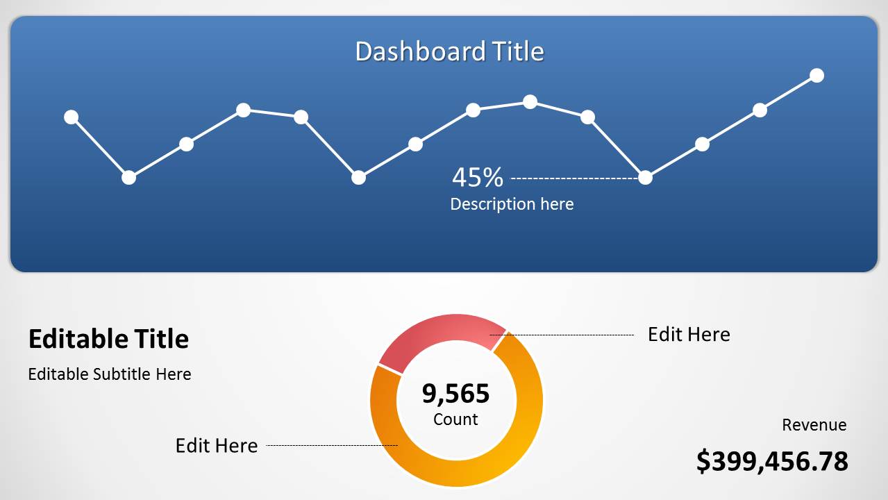
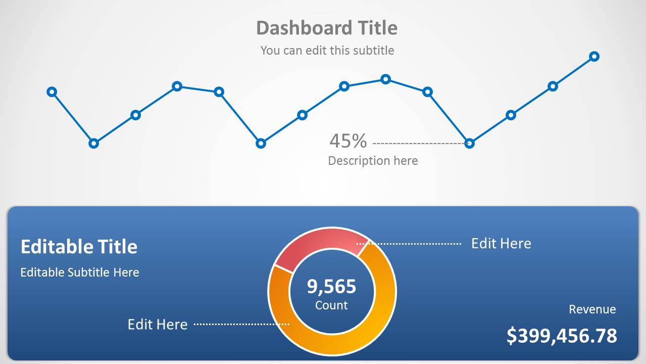
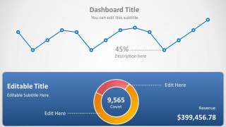
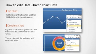
Blue Data-Driven Chart Concept is a presentation design for PowerPoint containing a line chart the slide. You can use this presentation chart template to prepare a single slide presentation in PowerPoint with data-driven line chart and doughnut chart. There are some text boxes and values that you can also edit in PowerPoint.
What’s inside this template
Example presentation scenarios
- A sales manager can use the line chart and revenue figure to report recent sales movement and connect the trend to a headline business result.
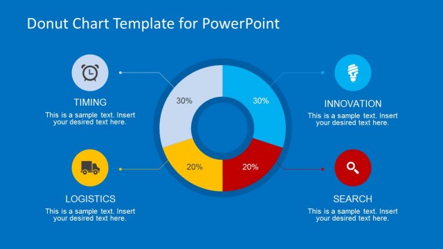
- A business analyst can use the doughnut chart and 9,565 Count center label to summarize a share, total, or segment value in an executive update.
- A marketing presenter can use the KPI percentage callout and editable labels to explain campaign performance while keeping supporting detail secondary.
- A team lead can use the instruction slide to show colleagues how chart data should be updated before a recurring dashboard review.
Features
- 100% editable presentation template
- Compatible with Microsoft PowerPoint and Google Slides
- Scalable vector shapes, icons and illustrations
- AI-Ready for Microsoft Copilot and Claude
- Instant access and download
Frequently asked questions
Q: How should a presenter explain the line chart and doughnut chart without overcrowding the message?
A: Lead with the line chart because it shows movement across time, then use the doughnut chart to anchor the current total or share. Keep the 45% callout and center count tied to one takeaway. Avoid reading every marker; instead, name the pattern, the important turning point, and the business implication.
Q: Who is this template best suited for in a business presentation?
A: This template fits presenters who need a short dashboard snapshot rather than a full analytics report. Analysts, sales managers, marketing managers, and operations leads can use it to present one trend, one proportional metric, and one revenue or KPI value to decision makers in a brief review meeting.
Q: Why does the design combine a blue dashboard panel with white space and circular chart elements?
A: The blue panel frames the dashboard as the primary evidence area, while the white space gives the title, labels, and KPI figures room to stand out. The line chart acts as a motion metaphor for change over time, and the doughnut chart creates a quick visual read of part-to-whole performance.

Blue Data-Driven Chart Concept for PowerPoint
3-slide PowerPoint presentation template with line chart, doughnut chart, and KPI dashboard layouts
Blue Data-Driven Chart Concept for PowerPoint is a 3-slide data dashboard template with a line chart, doughnut chart, KPI callout, and chart-editing instruction slide. It is intended for analysts, managers, and teams that need to present trend and share values in PowerPoint using data-driven charts.


 Loading...
 Microsoft PowerPoint
  Microsoft Copilot
  Claude for PowerPoint
 Other formats supported
Subscribe today and get immediate
access to download our PowerPoint templates.