Slide 2 of 3 from Orange Data-Driven Chart Concept for PowerPoint
Data Driven Orange Chart Slide for PowerPoint
Data-Driven Dashboard Chart for Presentations
- Chart
- Dashboard Composite
- Evaluation Slide
- 16:9
- 100% Editable
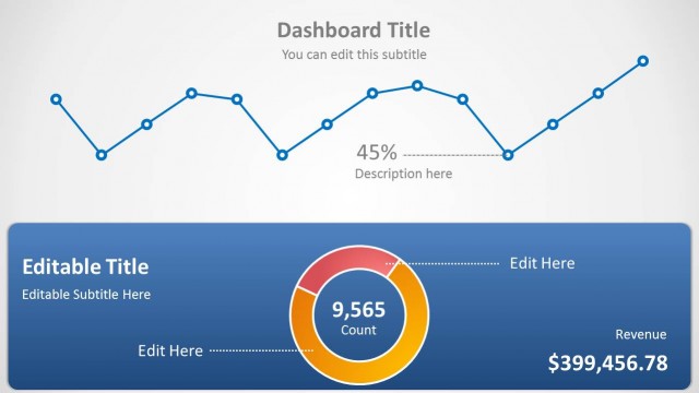
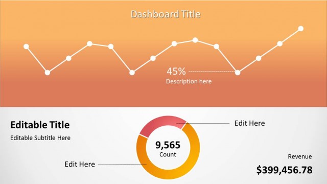
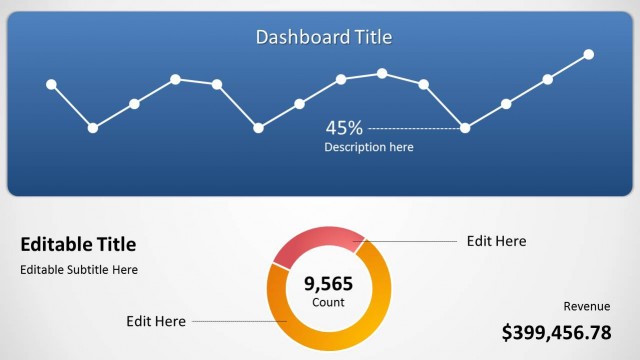
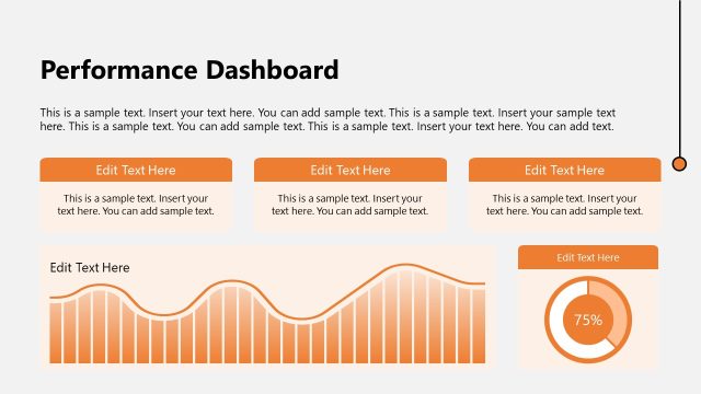
The Dashboard with Line and Donut Chart slide from the Orange Data-Driven Chart Concept for PowerPoint template offers a clear visual summary of key metrics, combining editable charts and text placeholders. This layout supports business presentations like sales performance reviews and marketing analytics by highlighting trends and KPI summaries with customizable PowerPoint slides and vector icons.
What’s on This Slide
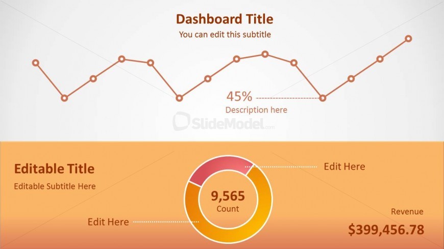
The layout features a top section with a line chart displaying data trends, positioned centrally. Below, a donut chart is centered, indicating a count value of 9,565. The background is a gradient of light to dark orange, enhancing visual separation. Text placeholders are present, including a main title at the top, a subtitle beneath it, and a percentage callout. The donut chart includes a revenue label, with additional editable text areas below. The overall composition is structured to highlight key metrics clearly.
How to Use It
This layout serves as a dashboard overview, ideal for presenting key performance indicators and trends. It fits well in a presentation sequence following a problem statement, providing a visual summary of data insights. Suitable for business contexts such as sales performance reviews, marketing analytics, or financial reporting, it allows for quick comprehension of critical metrics. The editable elements enable customization for various data sets, making it versatile for different presentations.
Text Placeholders & Capacity
Keep your copy within these limits so it fits without resizing. Body slots can accommodate roughly 3-5 words each.
| Placeholder | Count | Max characters (approx.) |
|---|---|---|
| Slide title | 1 | 30 |
| Subtitle | 1 | 50 |
| Item body | 1 | 20 |
| Item body | 1 | 20 |
| Item body | 1 | 20 |
| Item body | 1 | 20 |
Slide Keywords
Download unlimited PowerPoint templates, charts and graphics for your presentations with our annual plan.
DOWNLOAD