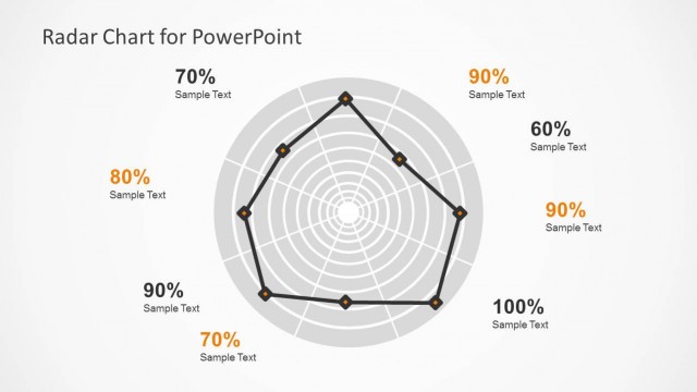
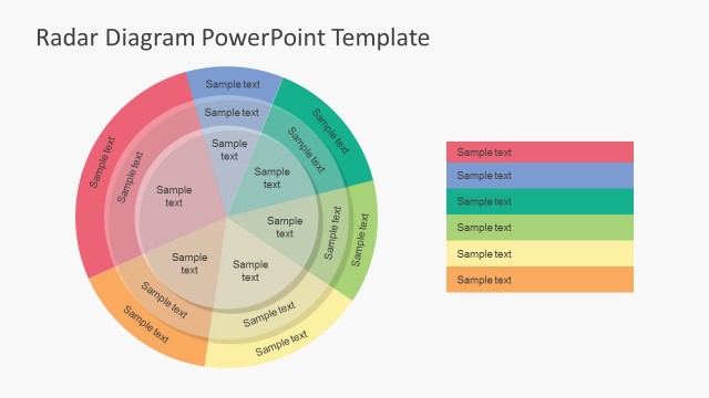
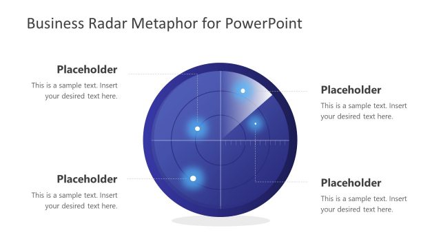
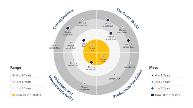
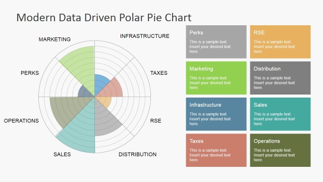
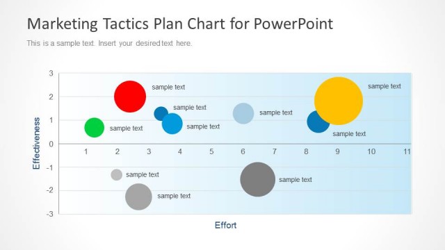
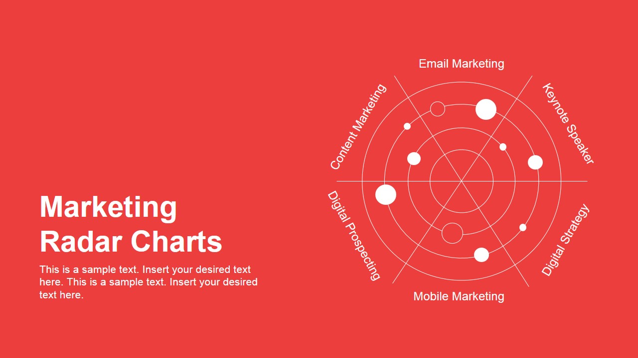
Marketing Radar Charts for PowerPoint is a creative marketing radar chart design that you can use in your presentations on digital marketing and marketing strategy projects. A radar chart is a graphical method of displaying multivariate data in the form of a two-dimensional chart of three. Radar charts are also known as web chart, spider charts, polar chart or Kiviat diagrams.
What’s inside this template
Example presentation scenarios
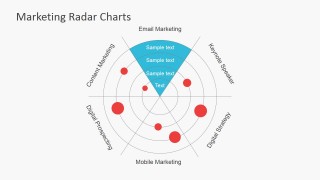
- A marketing manager can present a channel performance review by using the full radar bubble chart to compare email, mobile, content, prospecting, and strategy dimensions.
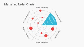
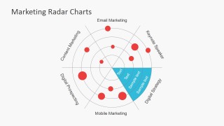
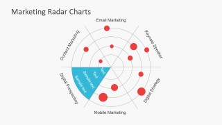
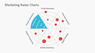
- A digital agency strategist can explain a campaign audit by using the teal sector callout slides to focus discussion on one priority area at a time.
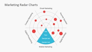
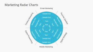
- A consultant can summarize a marketing maturity assessment by using the full circular web chart overlay to show how criteria relate across the same radial framework.
- A brand team lead can compare strategic options by replacing the spoke labels and red markers with brand-specific criteria and emphasizing the selected quadrant with a teal wedge.
Features
- 100% editable presentation template
- Compatible with Microsoft PowerPoint and Google Slides
- 16:9 aspect ratio slides
- Scalable vector shapes, icons and illustrations
- AI-Ready for Microsoft Copilot and Claude
- Instant access and download
Frequently asked questions
Q: How should I explain a radar chart so the audience understands the comparison quickly?
A: Start by defining each spoke before discussing the red markers. Then move clockwise and call out only the largest gaps, strongest scores, or decision points. The teal sector slides are best used after the full radar view, because they let the presenter isolate one dimension and explain the reason behind the shape.
Q: What presentation situation is this template best suited for?
A: This template fits marketing reviews where several criteria must be compared at once, such as channel maturity, campaign readiness, or capability scoring. It is most useful for marketing managers, consultants, and agency teams who need to summarize patterns visually instead of reading through a long scorecard or written audit.
Q: Why does the radar metaphor work for marketing strategy discussions?
A: The circular radar metaphor suggests scanning a full operating environment, which matches strategy conversations about strengths, gaps, and priorities. The red points act as visible signals on the grid, while the teal wedges turn one signal into a discussion area. This helps the audience move from comparison to interpretation.


Marketing Radar Charts for PowerPoint
9-slide presentation template for marketing radar charts, spider charts, and channel comparison visuals
Marketing Radar Charts for PowerPoint is a 9-slide presentation template for comparing marketing dimensions with radar, spider, and web chart diagrams. It includes a red cover slide, full radar bubble chart, teal sector callouts, and a full circular web chart overlay for marketers, consultants, and strategy teams using PowerPoint or Google Slides.
- Category
- Business PowerPoint Templates, Marketing
- Rating


 Loading...
- Aspect ratio
- 16:9, 4:3
- Item ID
- 6831-02
- Colors
 Microsoft PowerPoint
  Microsoft Copilot
  Claude for PowerPoint
 Other formats supported
Subscribe today and get immediate
access to download our PowerPoint templates.