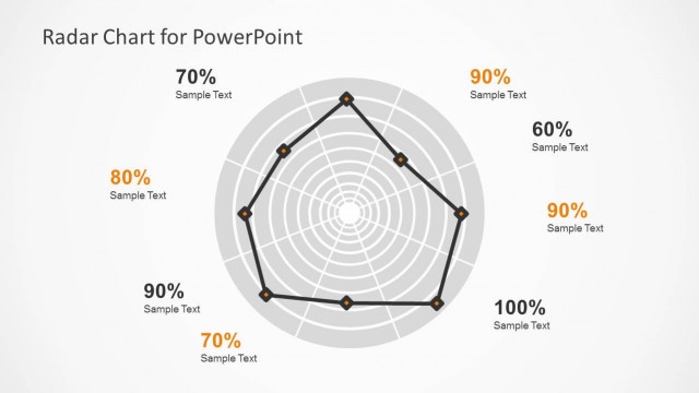
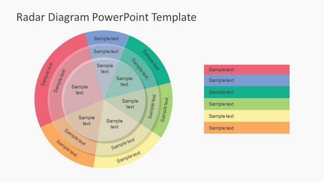
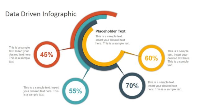
Data Driven Polar Charts for PowerPoint – This professional presentations contains a set of different Microsoft PowerPoint Data Driven Radar Charts adapted to visualize data in a new format called Polar Charts. The Charts are created with the Excel and PowerPoint built in functionality and with the help of built in edition properties, manipulated to generate different visual representations. This PowerPoint Template provides the user the ability to edit the charts just changing the data, without the need of any shape edition. Complex charts are created with professional data manipulation, creating Polar Area Charts and Polar Pie Chart, which are versions of the Radar Chart that do not come as built in options. The user will be able to easily create Polar Area Charts just updating a column in an excel spreadsheet, the same occurs for the Polar Pie Chart.
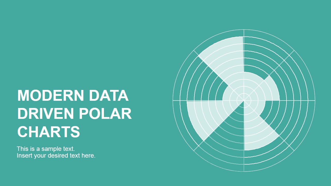
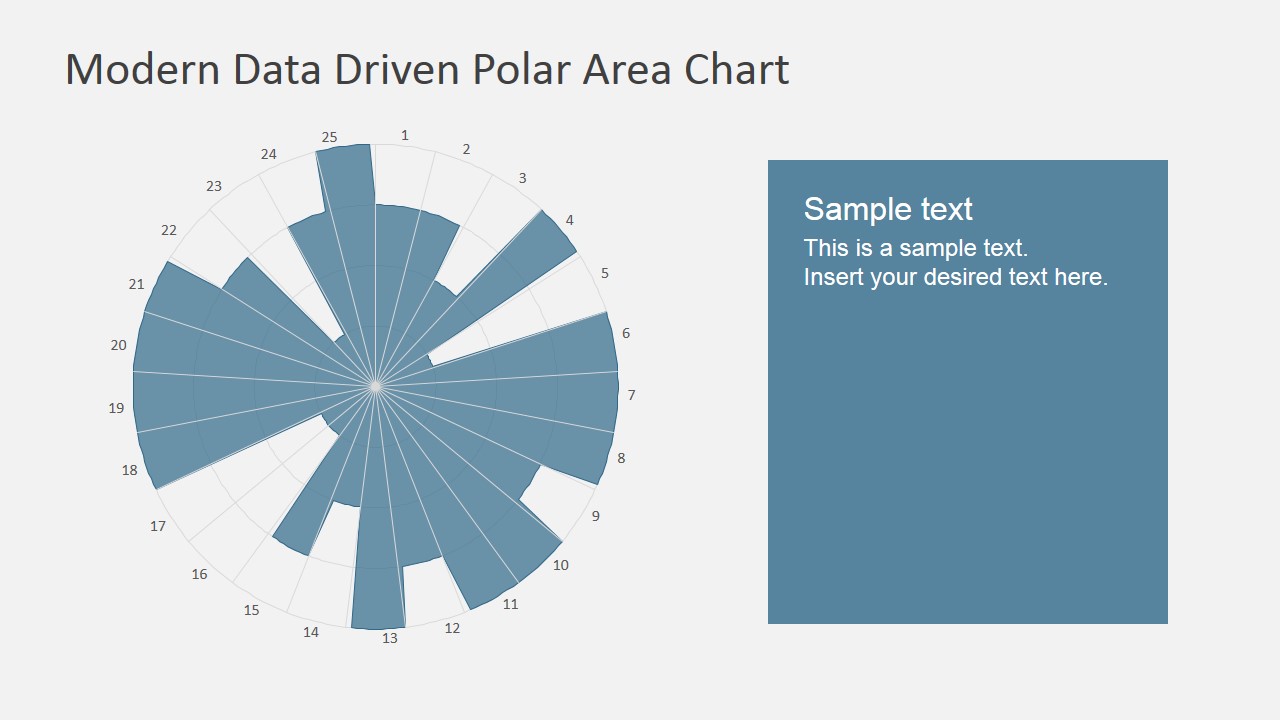
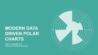
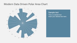
The Polar Area Chart is similar to a regular pie chart, except sectors are equal angles and differ rather in how far each sector extends from the center of the circle. This visual representation is popular to plot cyclic events (number of sales by months). For example in the sales by month, the area will be separated in twelve months while each level represents the counts of sales.
Decorated with modern Flat palette colors and pixel perfect details, this Data Driven Polar Charts for PowerPoint are ideal for surveys analysis, stacked Percentages and variations of area charts. Combine any of our Data Driven PowerPoint Dashboards with the Data Driven Polar Charts for PowerPoint or data driven PPT templates for creating KPI’s presentations that appeals to executive audiences.
What’s inside this template
Example presentation scenarios
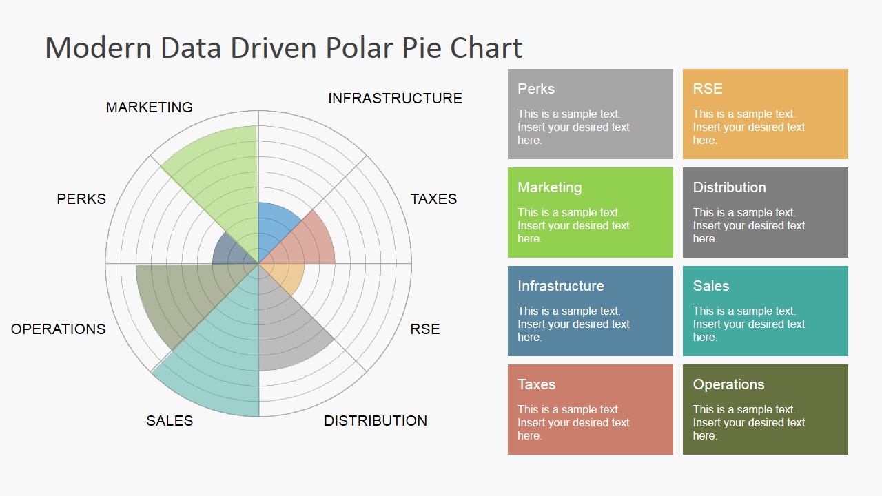
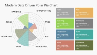
- A business analyst can use the polar pie chart to compare performance categories such as marketing, sales, operations, infrastructure, and taxes in an executive KPI review.
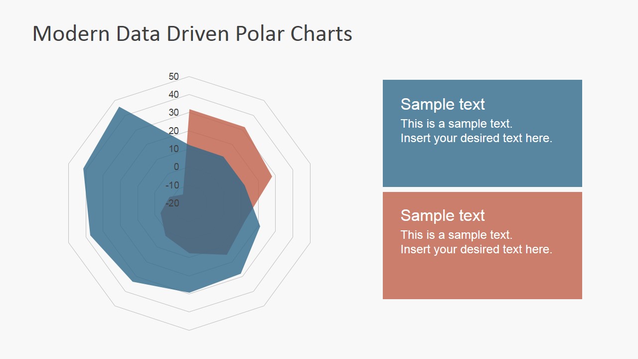
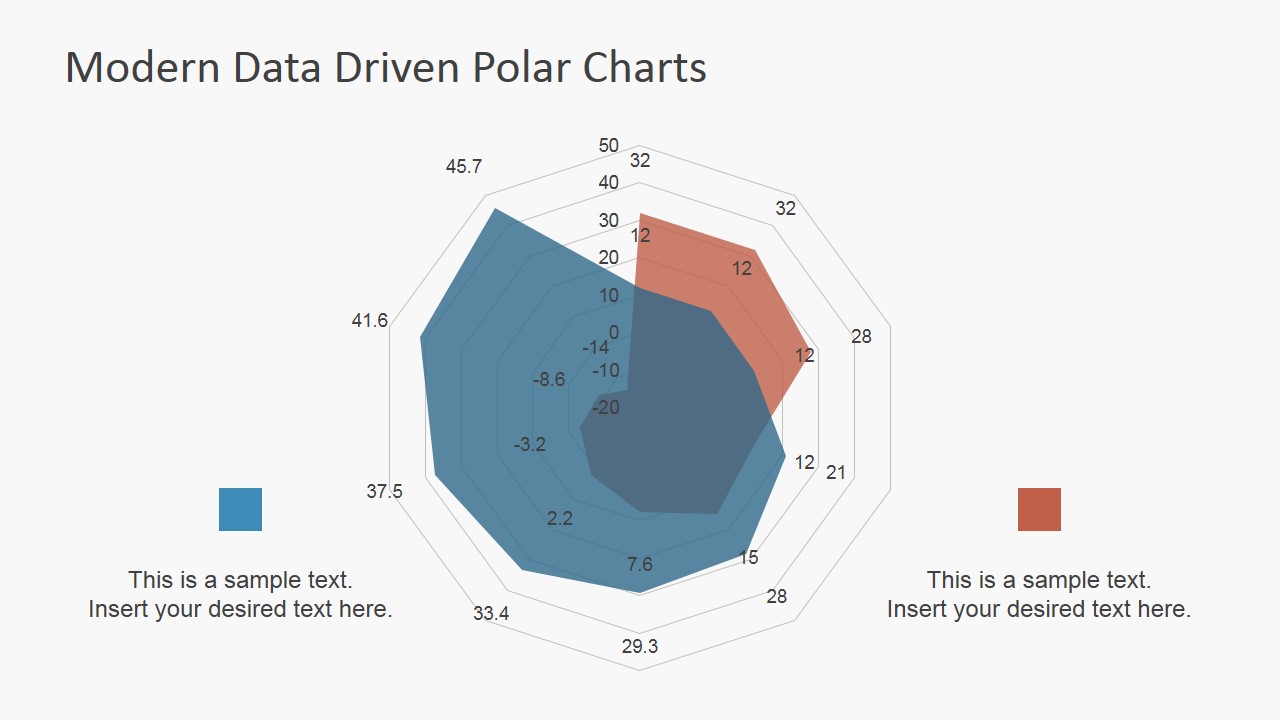
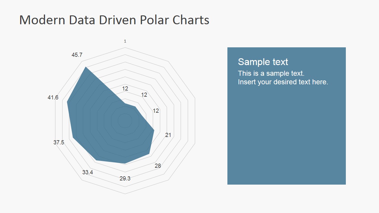
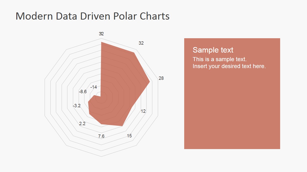
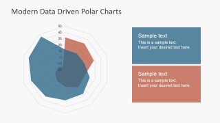
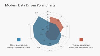
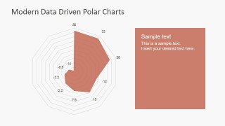
- A marketing manager can use the radar comparison chart to show how two segments differ across repeated dimensions, then explain the main differences in the right-side callout cards.
- An operations leader can use the polar area chart to report cyclic activity by numbered periods, such as hours, days, weeks, or campaign waves.
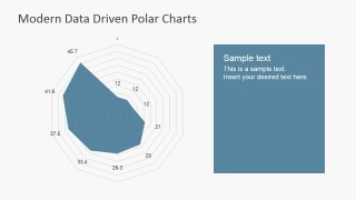
- A consultant can use the cover slide and single-series radar chart layouts to introduce a data findings section and isolate one metric pattern for client discussion.
Features
- 100% editable presentation template
- Compatible with Microsoft PowerPoint
- 16:9 aspect ratio slides
- Scalable vector shapes, icons and illustrations
- Data-driven charts, editable in Microsoft Excel
- AI-Ready for Microsoft Copilot and Claude
- Instant access and download
Frequently asked questions
Q: How should a presenter explain polar charts without confusing the audience?
A: Start by defining what each spoke or sector represents, then explain that distance from the center shows magnitude. Use the polar pie slide for category contribution and the radar slides for dimension-by-dimension comparison. Keep the text panels focused on one takeaway, so the audience does not have to interpret every ring on its own.
Q: Who is this template best suited for in a business presentation?
A: This template fits analysts, managers, and consultants who need to report cyclic or category-based metrics in a compact visual form. It is strongest for KPI reviews, survey analysis, and performance comparisons where the pattern around the circle matters as much as the exact value of each point.
Q: Why use radial charts instead of standard bar or line charts here?
A: The radial structure helps show repeated categories, cyclic periods, or multidimensional profiles as a shape. In the radar comparison slides, overlapping filled areas make contrast easy to see. In the polar area chart, longer sectors quickly signal stronger periods or categories, which is useful when the message is about distribution and pattern.
Data Driven Polar Charts for PowerPoint
7-slide PowerPoint presentation template with polar charts, radar charts, and KPI dashboard visuals
Data Driven Polar Charts for PowerPoint is a 7-slide data chart template for Microsoft PowerPoint. It includes a polar pie chart with category cards, a teal cover slide with radial graphic, radar comparison charts, and a polar area chart for KPI, survey, or cyclical performance reporting.
- Category
- Data & Charts
- Rating


 Loading...
- Aspect ratio
- 16:9, 4:3
- Item ID
- 6835-03
 Microsoft PowerPoint
  Microsoft Copilot
  Claude for PowerPoint
 Other formats supported
Subscribe today and get immediate
access to download our PowerPoint templates.