Analysis PowerPoint Template is a creative PowerPoint presentation design that you can use to make slides for research & development presentations or to give a presentation with results of a business analysis. Analysis PowerPoint template contains creative slide layouts that you can reuse in your own PowerPoint presentations, just by copying and paste the slides and editing the text placeholder.
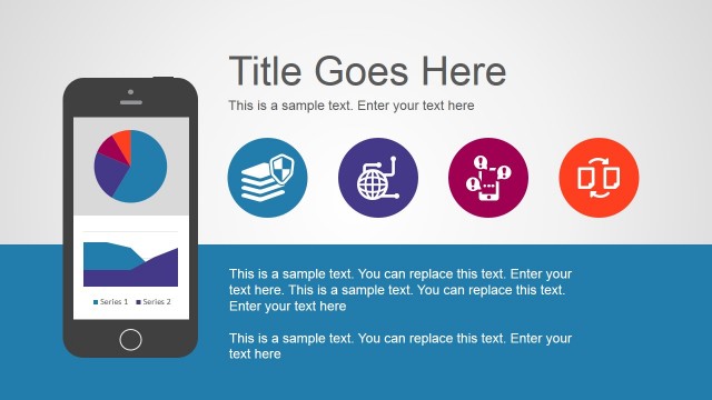
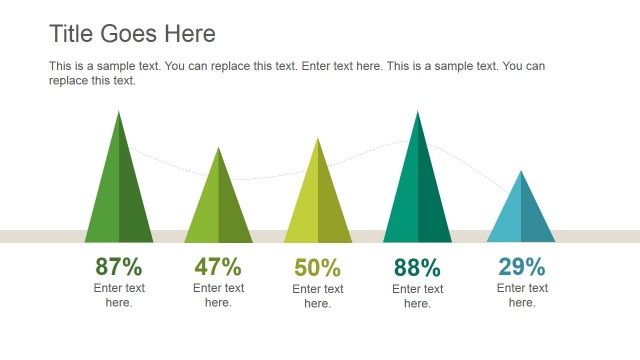
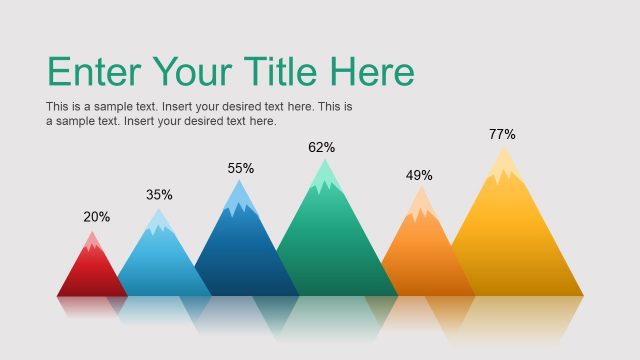
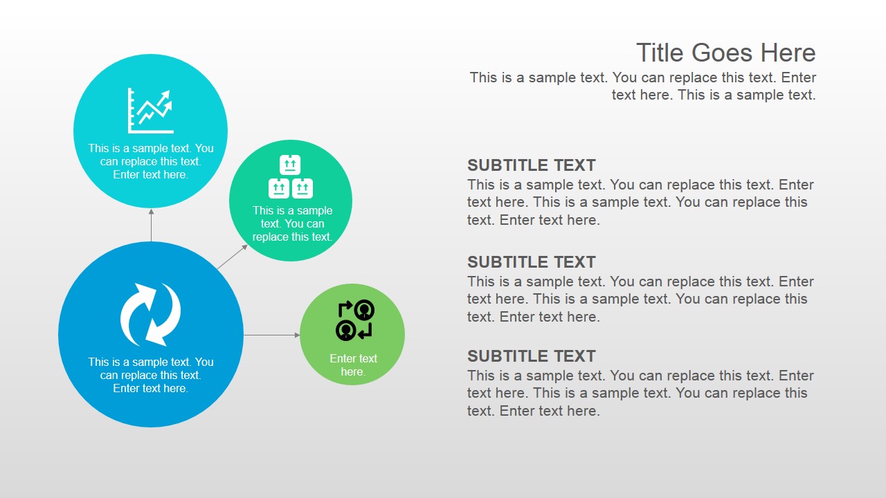
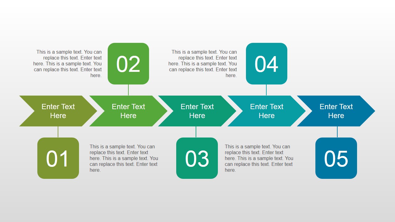
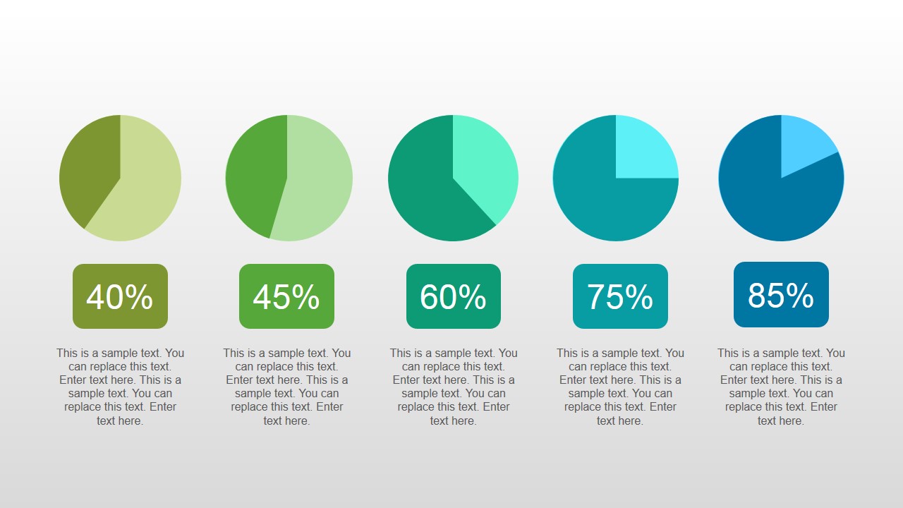
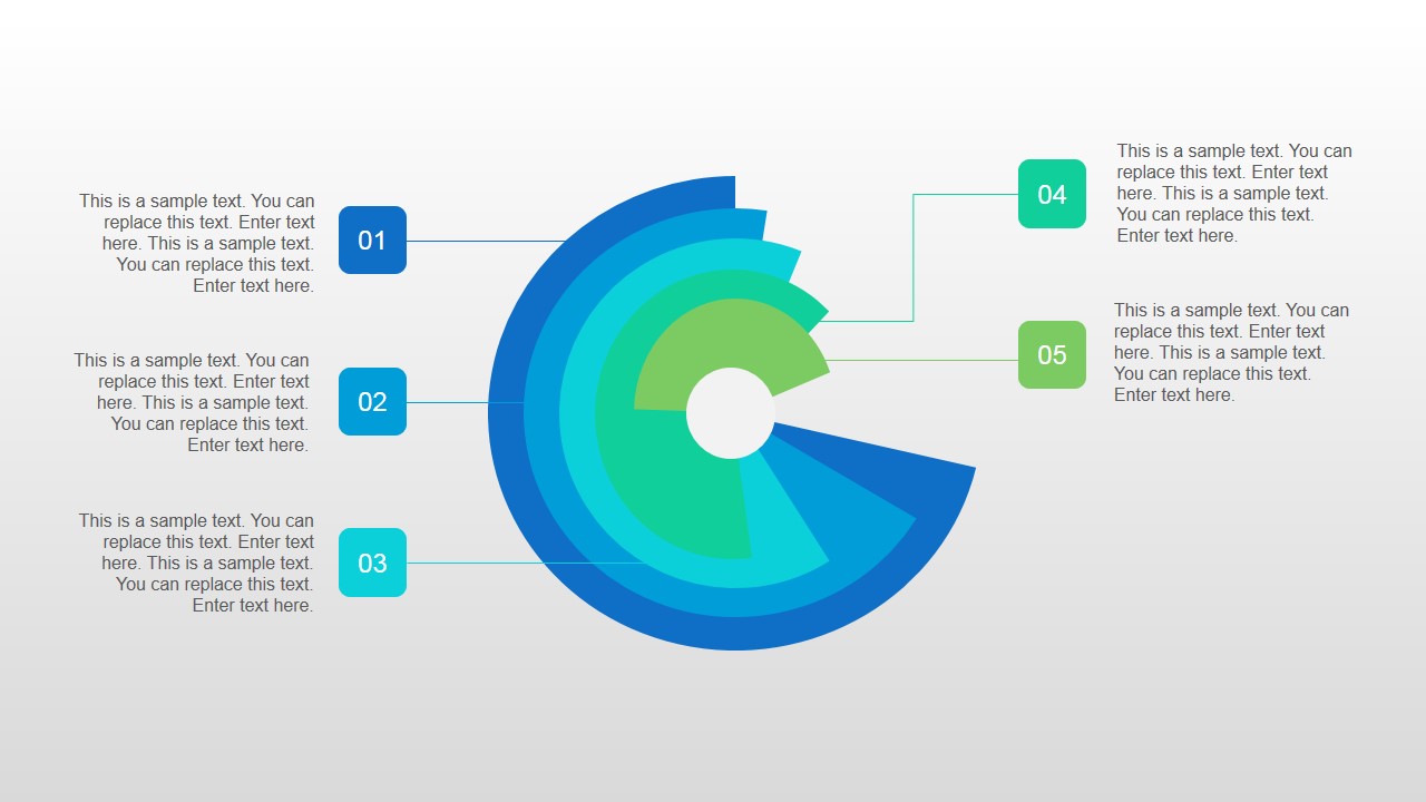
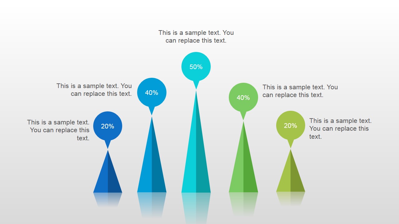
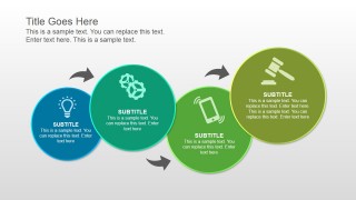
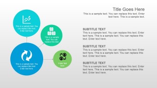
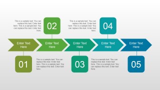
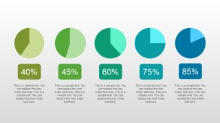
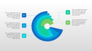
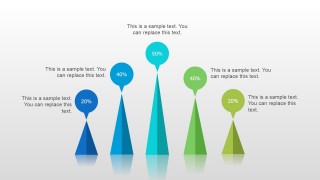
Inside this presentation template you can find circular data charts, slide layout with a simple process flow diagram created with circles and PowerPoint shapes, a very basic chevron arrow with V-shaped pattern, an agenda slide design, pie charts to present your data, and a creative cone chart design with text reflect effect in PowerPoint.
What’s inside this template
Example presentation scenarios
- A business analyst can report operational findings to managers by using the circular segmented chart to show category contributions and the pie visuals to compare percentage levels.
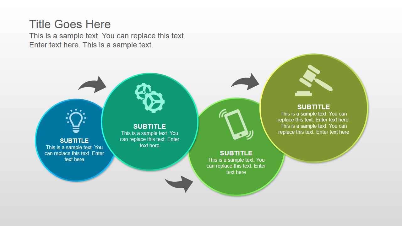
- A consultant can explain a client assessment by opening with the circle process diagram, then using the chevron process flow to map recommended action steps.
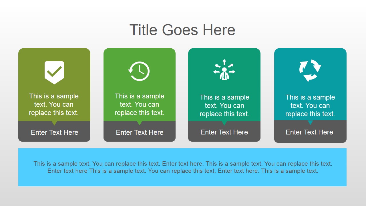
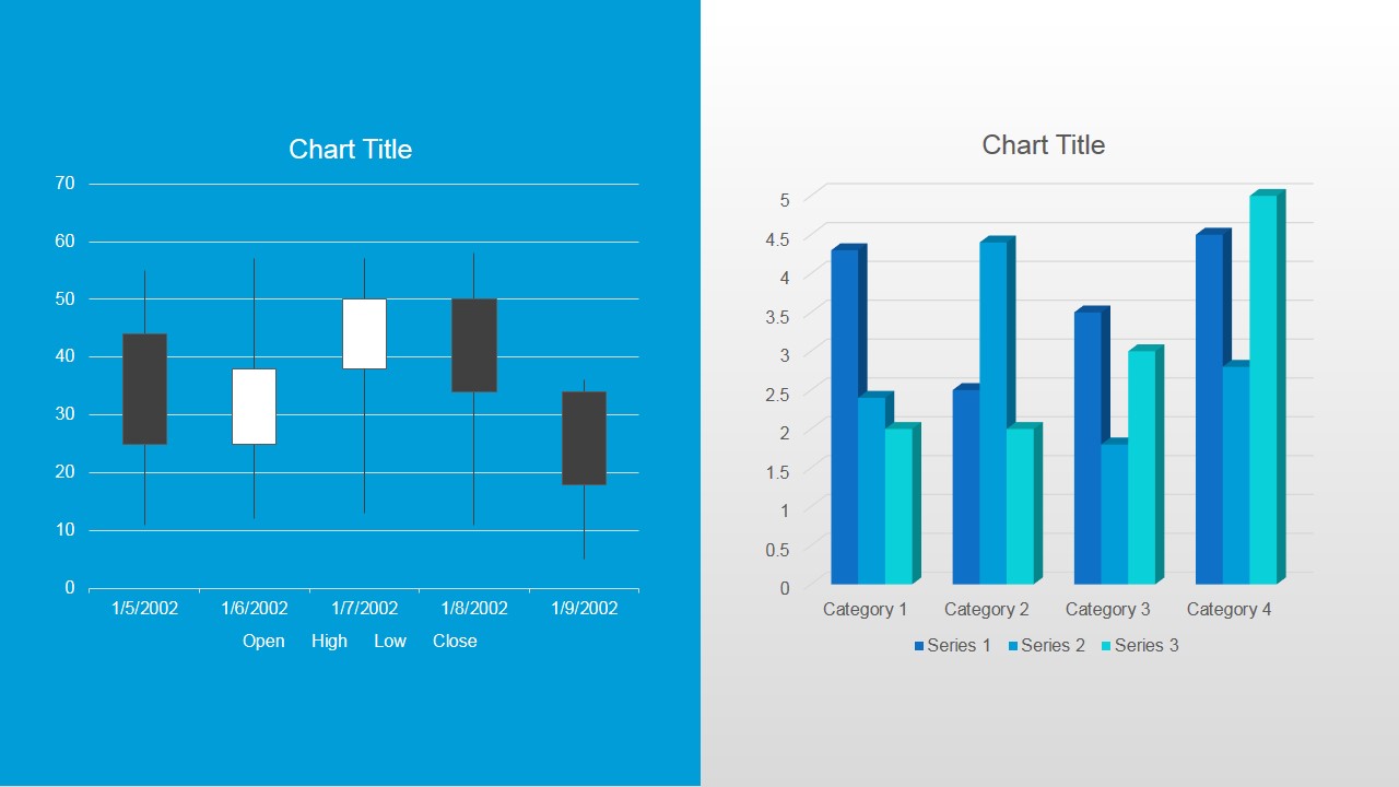
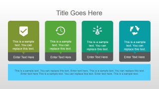
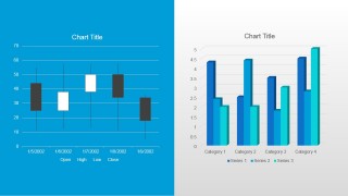
- A project manager can brief stakeholders on progress by using the agenda card layout for priorities and the clustered column chart for performance comparisons.
- A research and development lead can summarize test results by pairing the bubble relationship diagram with the cone chart to show ranked observations and relative scores.
Features
- 100% editable presentation template
- Compatible with Microsoft PowerPoint and Google Slides
- 16:9 aspect ratio slides
- Scalable vector shapes, icons and illustrations
- AI-Ready for Microsoft Copilot and Claude
- Instant access and download
Frequently asked questions
Q: How should a presenter organize an analysis message with this template?
A: Start with the circle or bubble diagram to frame the analysis categories, then use the chevron slide to show the logic or process behind the findings. Move into the percentage pies, segmented circle, or cone chart for comparisons. Close with the editable chart slide when the audience needs numeric proof before discussing decisions.
Q: Who is this template best suited for in a business setting?
A: This template fits analysts, consultants, project managers, and research leads who need to explain patterns without building a dense dashboard. It is strongest for meetings where the presenter must summarize findings, compare categories, show process steps, and point to supporting chart data in a short executive or team review.
Q: Why do the circular and cone visuals help communicate analysis?
A: The circles suggest relationships, cycles, or grouped dimensions, which makes them useful for showing how analysis factors connect. The chevrons create a clear left-to-right sequence, while the cone chart gives a ranking or magnitude metaphor. Together, these layouts turn abstract findings into visual patterns the audience can scan quickly.
Analysis PowerPoint Template
8-slide analysis presentation template with circular charts, chevrons, cone charts, and data visuals
Analysis PowerPoint Template is an 8-slide, 16:9 presentation template for business analysis, research summaries, and performance reporting. It includes circle process diagrams, agenda cards, chevron process flow, percentage pie visuals, a circular segmented chart, cone chart, and column and stock-style charts for Microsoft PowerPoint and Google Slides.
- Category
- Template Backgrounds
- Rating


 Loading...
- Aspect ratio
- 16:9
- Item ID
- 4026-01
- Colors
 Microsoft PowerPoint
  Microsoft Copilot
  Claude for PowerPoint
 Other formats supported
Subscribe today and get immediate
access to download our PowerPoint templates.