
A journal club presentation is an essential academic exercise that fosters critical thinking, collaboration, and knowledge sharing. It is a platform for analyzing and evaluating a specific research article in medical and research fields, often to assess its validity, applicability, and potential impact on clinical practice or scientific understanding.
This article will delve into every aspect of how to present journal club, from defining its purpose to creating a polished, insightful analysis.
Table of Contents
- What is a Journal Club Presentation?
- Step 1: Defining the Clinical Question
- Step 2: Introducing the Article and Its Context
- Step 3: Analyzing the Hypothesis
- Step 4: Appraising the Evidence Base
- Step 5: Evaluating Study Design
- Step 6: Interpreting Results
- Step 7: Conclusion
- Recommended Journal Club PPT Templates
- FAQs
What is a Journal Club Presentation?
A journal club presentation is a formal discussion where a selected research article is critically appraised. The primary goal is to evaluate its methodology, results, and relevance to clinical or academic practice. The format of journal club presentations is common in academic, medical, and research environments, serving as a tool to enhance evidence-based decision-making, critical thinking, and collaborative learning.
While the focus is on dissecting the study, the presentation’s visual design plays a crucial role in delivering the message effectively. Research articles are often dense, filled with jargon, and rich in data, which can overwhelm an audience. Effective graphic design bridges this gap, transforming complex ideas into accessible visuals that improve comprehension and retention.
Visual aids in journal club presentation templates can include infographics, data visualizations, thematic templates, and interactive animations. These elements make conveying the research’s significance, implications, and limitations easier while keeping the audience engaged. For example, instead of listing all the study’s inclusion and exclusion criteria as text, you can use an animated Venn diagram or comparison chart to simplify the information.
Step 1: Defining the Clinical Question
The clinical question sets the foundation for how to start a presentation, making it essential to frame it visually in a way that captivates the audience. The clinical question typically addresses a problem or gap in the literature that the study seeks to address.
To effectively convey this in a journal club presentation, use a slide that blends visual storytelling with structured content. Start by displaying a high-resolution image or an illustration that captures the topic’s essence—such as a heart for cardiovascular studies or an array of DNA strands for genetic research. Overlay this image with the clinical question in a bold, legible font to immediately draw attention. The font size and placement should prioritize readability, and the text should be aligned centrally or placed in a visually dominant position. You can learn more about this in our article on accessibility for presentations.
Enhance understanding by including a graphical flowchart or conceptual map contextualizing the question. For example, if the clinical question involves determining whether Drug A is more effective than Drug B, create a two-column graphic comparing current treatments’ limitations with the new intervention’s potential advantages. Color coding these elements—for instance, red for limitations and green for potential improvements—creates a visual narrative highlighting the problem the study aims to solve. Check more references in our guide on color theory for presentations for better color palette management.
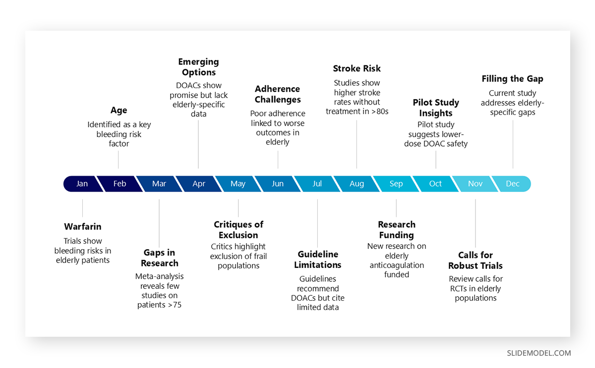
You can also design a timeline graphic illustrating how the clinical question emerged from previous research, ending with the gap this study addresses. For instance, the timeline might show a progression of findings on a topic, concluding with, “What remains unanswered is the long-term safety of Drug A in elderly patients.”
Step 2: Introducing the Article and Its Context
When introducing the article, the goal is to establish its credibility and relevance without overwhelming the audience. A clean, professional slide design ensures this information is in a digestible format.
Start by prominently displaying the article’s title, using a modern and minimalist font. Pair this with an image of the article’s first page or the journal’s logo to provide authenticity and set the tone. On the same slide, include key publication details such as the journal name, publication date, and impact factor. Plan your presentation structure to organize this information—useful examples can be a split-screen design with text on one side and visuals on the other.

Include a timeline or citation map if the article builds on previous work. A timeline template can show the evolution of research in the field, with the current study highlighted as the latest contribution. Alternatively, a citation map—a diagram showing key references and their relationships to the current study—visually demonstrates how the study fits within the broader scientific narrative.
Highlighting the authors is another crucial aspect. Use a consistent format to include professional headshots of the lead authors alongside their affiliations. For instance, a slide might feature the lead author’s image on one side, their name and credentials below, and the institution’s logo on the other side. For high-profile authors or institutions, you can add a spotlight effect to emphasize their contributions.

One effective way to create the initial draft of your slides is by using an AI tool. For instance, SlideModel AI can convert a research paper into a professionally crafted presentation in minutes with the help of AI. By extracting key elements such as the article’s title, context, and primary findings, the tool generates visually appealing slides that serve as a solid starting point for your journal club presentation. This allows you to focus on refining the content and tailoring it to your audience while saving significant time and effort.
Step 3: Analyzing the Hypothesis
The hypothesis is the foundation of the study and needs to be presented with clarity and creativity. Instead of reading the hypothesis verbatim, turn it into a central graphic element that visually conveys its components.
Start with a single slide that prominently displays the hypothesis statement at the center, surrounded by visual aids that break down its elements. For example, you could use arrows pointing outward to summarize the study’s objectives, key variables, and expected outcomes. This approach transforms the hypothesis from a dense sentence into a clear, visually engaging concept map.
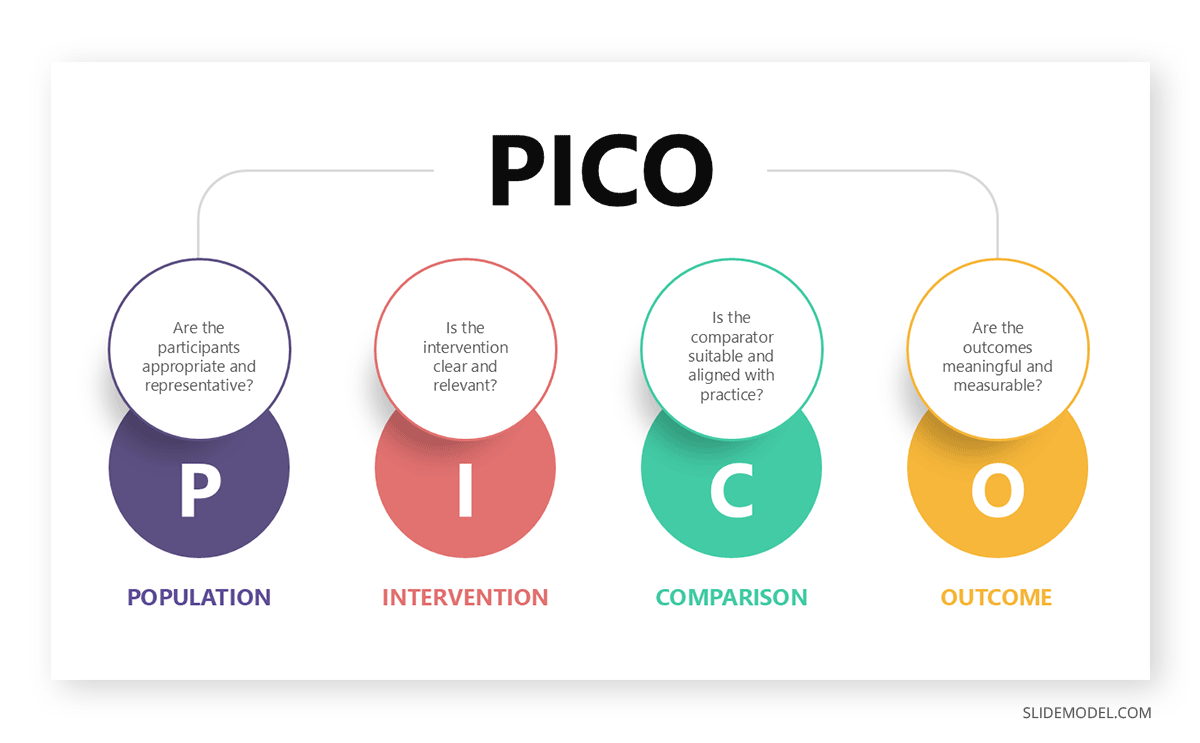
If the hypothesis follows the PICO framework (Population, Intervention, Comparison, Outcome), create a dedicated graphic highlighting each component. Design a grid or circular diagram using icons and brief text to represent each part. For instance, a silhouette of elderly individuals can symbolize the population, while a pill icon represents the intervention. Adding subtle animations—for example, having each PICO element appear sequentially—keeps the audience’s attention.
For comparative studies, consider using a scale or a side-by-side visual metaphor. A balanced scale graphic could symbolize the study’s intention to compare two treatments, while color-coded columns summarize the attributes of each group. These visuals enhance understanding and set the tone for discussing results later in the presentation.
Step 4: Appraising the Evidence Base
Appraising the evidence base requires visual tools that clarify the study’s context and demonstrate its contribution to existing knowledge. Begin by summarizing the key references cited in the study, using an infographic or visual summary to present the data in a digestible format.
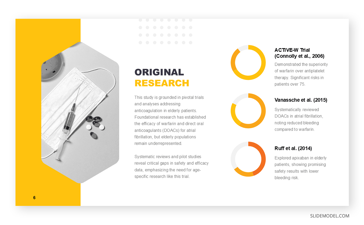
For instance, design a slide with a central node representing the study, surrounded by smaller nodes representing key referenced articles. Connecting lines can show how these references relate to the current study. Include brief annotations or callouts to summarize the key findings of each referenced article.
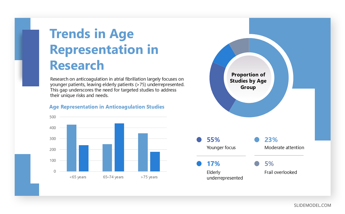
Alternatively, use bar charts or tables to summarize gaps in existing knowledge. For example, a bar chart might show the proportion of studies focusing on younger versus older populations, highlighting the underrepresentation of elderly patients. This immediately visualizes why the current study is important and what it aims to address.
If the study addresses conflicting evidence in the literature, create a comparison table. Use two columns to juxtapose findings from opposing studies, clearly illustrating where the gaps or contradictions lie. Adding icons or color-coded text (e.g., green for supporting evidence, red for conflicting findings) enhances clarity and helps the audience follow your reasoning.
Step 5: Evaluating Study Design
Study design is often one of the more abstract and technical sections of a presentation, but effective visuals can make it accessible. Use flowcharts or process diagrams to explain the study’s methodology step by step. For example, create a flowchart that starts with participant recruitment, moves through randomization, and ends with outcome measurement. Each step can include a small icon (e.g., a clipboard for recruitment or a syringe for intervention) to reinforce understanding.
To explain randomization, use a split diagram that visually separates participants into intervention and control groups. Overlaying arrows or animations can show how participants were allocated and how blinding was maintained.
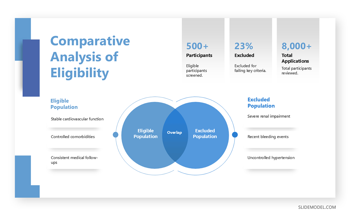
Inclusion and exclusion criteria are another area where visuals can shine. Instead of listing them as text, use a Venn diagram or infographic to show the overlap between eligible and excluded populations. This format is especially helpful for emphasizing the representativeness of the study population.
Step 6: Interpreting Results
The results section is the heart of a journal club presentation, where the study’s findings take center stage. To ensure clarity and engagement, the data must be visually represented in a way that communicates key points effectively while minimizing cognitive overload.
Data Visualization for Key Findings
One of the most effective ways to present results is through interactive data presentations. Use bar charts, line graphs, or scatter plots to simplify numerical data and make trends easy to grasp. For example, if the study compares the efficacy of two drugs, a side-by-side bar chart can visually depict the difference in treatment outcomes.
To enhance comprehension, highlight significant results using color contrasts. For instance, green should be used to indicate statistically significant improvements, and red should be used to show areas of concern or adverse effects. Adding labels with percentages or hazard ratios directly on the chart ensures the audience doesn’t have to search for values in a legend.
Tables and Infographics for Secondary Outcomes
While primary outcomes are often the focus, secondary outcomes can provide valuable context. Consider using a matrix infographic instead of listing these in a dense table. For example, design a grid with rows representing secondary outcomes (e.g., side effects, adherence rates) and columns indicating the comparison groups. Use checkmarks, arrows, or icons to signify positive or negative trends.
If a particular result stands out, isolate it on a separate slide with a visual emphasis, such as a glowing border or an enlarged icon, to draw attention.
Handling Negative or Neutral Results
When results are not statistically significant, they still provide valuable insights. Use muted colors (e.g., gray or blue) to represent these findings and include a brief explanation of their implications. For instance, a slide might feature a line graph showing overlapping confidence intervals, paired with a caption: “No significant difference observed between groups, suggesting equivalent efficacy.”
Step 7: Conclusion
End your presentation with a slide that prominently displays the primary outcome. Use a bold, central statement summarizing the result, such as: “Drug X reduced thromboembolic events by 20% compared to Drug Y.” Surround this statement with supporting visuals, such as a simplified bar graph, to reinforce the takeaway.
Include a smaller section below or to the side summarizing secondary outcomes. Use brief, bullet-free phrases accompanied by icons (e.g., a heart icon for safety outcomes or a graph icon for adherence rates) to make the content visually appealing.
Clinical Implications with Flow Diagrams
To translate the study’s findings into clinical practice, create a flow diagram or decision tree that illustrates how the results can inform treatment decisions. For example, a diagram might start with a patient profile and branch into two pathways: one for patients eligible for Drug X and another for those better suited to Drug Y. Use color coding to indicate preferred choices based on the study’s findings.
Future Directions
End the journal club presentation by addressing unanswered questions and areas for further research. Use an upward-pointing arrow or a roadmap graphic to symbolize progress. Each stop on the roadmap could represent a potential research avenue, such as “Long-term safety evaluation” or “Cost-effectiveness analysis.”
If appropriate, include a motivational quote or a thought-provoking question to spark audience discussion. For instance, overlay a question like, “How would these findings change your approach to anticoagulation therapy in elderly patients?” on a visually engaging presentation background.
Recommended Journal Club PPT Templates
1. Journal Club Presentation Research Deck

Prepare your upcoming journal club presentation with this slide deck. Featuring slides for problem statements, research questions, study design, population sampling, and data analysis, it ensures clarity and structure in showcasing complex findings. Its modern layout, bold typography, and strategic use of icons enhance audience engagement while maintaining professionalism. Tailored for medical, academic, or clinical research discussions, this slide deck is perfect for presenting evidence-based studies, critical appraisals, or original research in journal clubs or academic conferences.
2. Journal Club Deck PowerPoint Template

This best PPT template is perfect for journal club presentations, offering a sleek and modern design. With slides dedicated to key components like the problem statement, methodology, analysis, and proposed timeline, it ensures a structured flow for discussing research papers. The visually appealing format, with clean layouts and space for graphs and data, allows you to present research findings effectively. Ideal for reviewing and critiquing academic studies, this template enhances audience engagement and supports clear communication of complex information.
3. Academic Research Deck PPT Template

This Academic Presentation Template provides a polished platform for delivering journal club presentations with clarity and impact. Its carefully crafted slides, including problem statements, methodologies, and outcomes, ensure seamless organization of research content. Designed to simplify complex data with visual aids and engaging layouts, it’s perfectly suited for academic discussions. Whether critiquing studies or presenting findings, this template offers versatility and professionalism, fostering insightful dialogue in journal club settings and beyond.
4. Journal Club Presentation PowerPoint Template
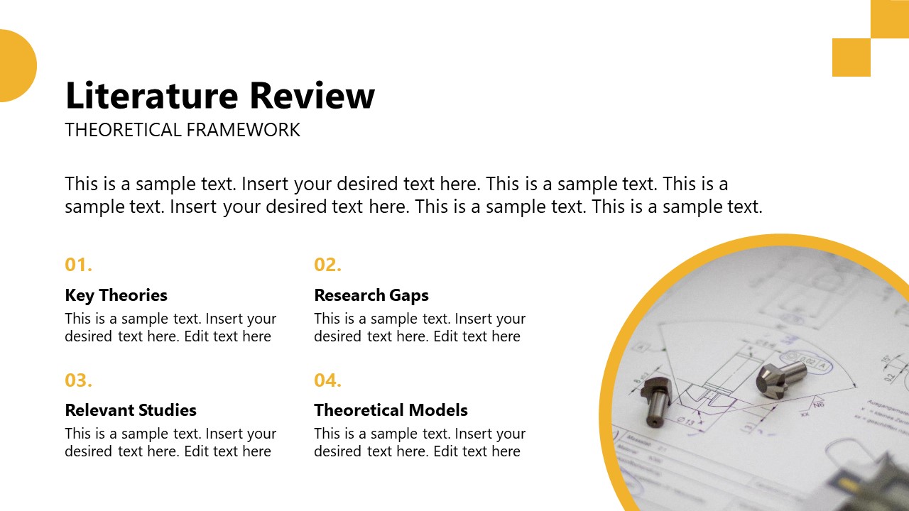
This Journal Club Presentation PowerPoint Template is tailored for academic and research discussions. Its clean, structured layout is ideal for journal club settings. Its slides cover essential components like key theories, research gaps, relevant studies, and theoretical models, providing a strong foundation for presenting critical appraisals. The modern design, complemented by visual aids and data-driven elements, enhances the audience’s understanding of complex frameworks. Perfect for highlighting study relevance and contextualizing findings, this template ensures impactful delivery in journal club presentations and scholarly reviews.
FAQs
How many slides should a journal club presentation have?
Aim for one slide per minute of your presentation. For a 30-minute talk, 25–30 slides are ideal, balancing content depth and pacing.
What’s the best way to handle technical data in journal club presentations?
Convert dense data tables into visual formats like bar graphs, pie charts, or infographics. Highlight key points with annotations or callouts.
How should I choose an article for a journal club presentation?
Select an article that aligns with your audience’s interests and addresses a current or unresolved clinical or research question. Prioritize articles from high-impact journals or studies with significant implications for practice. Avoid overly complex studies if the audience is diverse in expertise.
How much background information should I provide in a journal club presentation?
The amount of background information depends on your audience’s familiarity with the topic. For experts, focus on key gaps in the literature. For a mixed audience, provide sufficient context to ensure everyone understands the clinical question and its importance.
How do I handle controversial or conflicting findings in the article?
Acknowledge conflicting findings transparently and discuss their implications. For example, explain whether methodological differences or biases could account for discrepancies. Encourage audience participation to explore alternative interpretations.
What role do supplementary materials play in a journal club?
Supplementary materials provide additional context, such as appendices, statistical models, or extended data sets. Highlight critical points from these materials if they clarify key aspects of the study but avoid overwhelming the audience with excessive detail.