
In corporate reporting, market share is not a standalone vanity metric. It is used as a signal of positioning, leverage, operational strategy, and risk. Presenting it well demands precision, awareness of your audience’s sophistication, and clarity about what you’re truly communicating. The stakes are high. Market share presentations are often reviewed by executives, boards, investors, and strategic partners. Their expectations go far beyond pie charts and broad statements. They require context, defensibility, and actionable insight.
This article explains how to present market share effectively in business settings. Which slides are better suited to support your speech, their structure, and strategies to connect with your audience in high-stakes business conversations. Graphical examples will be provided using market share PowerPoint templates.
Table of Contents
- What is a Market Share Presentation?
- Why is it Important to Present Market Share in Business Meetings?
- Key Slides to Include in a Market Share Presentation
- Data Credibility and Methodological Discipline
- Building the Narrative: Structure and Logic
- Forecasting in Market Share Presentations
- Ending with Strategic Implications
- FAQs
- Final Words
What is a Market Share Presentation?
A market share presentation is a business tool used to report a company’s portion of sales within a defined market. It breaks down how much of the total market is captured by the company, often using revenue or units sold, and compares it to competitors. The goal is not just to show performance but to inform decision-making.
Recommended lecture: TAM SAM SOM in Presentations
These presentations are typically aimed at executives, boards, or investors who want to understand competitive positioning, identify trends, and evaluate strategic priorities. They include data visualizations, like bar charts or time series graphs, and are framed by clear definitions of market boundaries, timeframes, and sources. A good market share presentation doesn’t just present figures; it explains what they mean and what should happen next.
Why is it Important to Present Market Share in Business Meetings?
Presenting market share in business meetings is important because it provides a direct view of a company’s position in the competitive landscape. It shows how well the company is performing relative to others in the same market, which helps decision-makers understand whether current strategies are effective or need to be adjusted. Unlike isolated sales or revenue figures, market share accounts for external dynamics; if your revenue increased but your competitors grew faster, your share may have actually declined. This matters in planning resource allocation, pricing, product development, and market expansion.
Recommended lecture: Data-Driven Decision Making
Executives and boards use market share data to assess traction, identify risks, and prioritize initiatives. In commercial reviews, it helps uncover regional or segment-specific weaknesses. In investor discussions (like investor pitches), it supports or challenges growth narratives. Market share trends also highlight emerging threats, such as new entrants gaining ground or dominant players expanding into your space.
Without market share context, internal performance data is misleading. Presenting it clearly, anchored in well-defined markets, supported by reliable sources, and interpreted with precision, adds credibility to strategic recommendations. It turns isolated data into actionable insight. That’s why market share is a core element in high-stakes business meetings, not just a metric for reports.
Key Slides to Include in a Market Share Presentation
Market Definition Slide
This slide exists to eliminate ambiguity and set hard parameters on what “the market” means. Before anyone can trust the figures that follow, they need to know the market scope: which product lines are included or excluded, which customer profiles are being considered, which geographies are counted, and which time period is being measured.
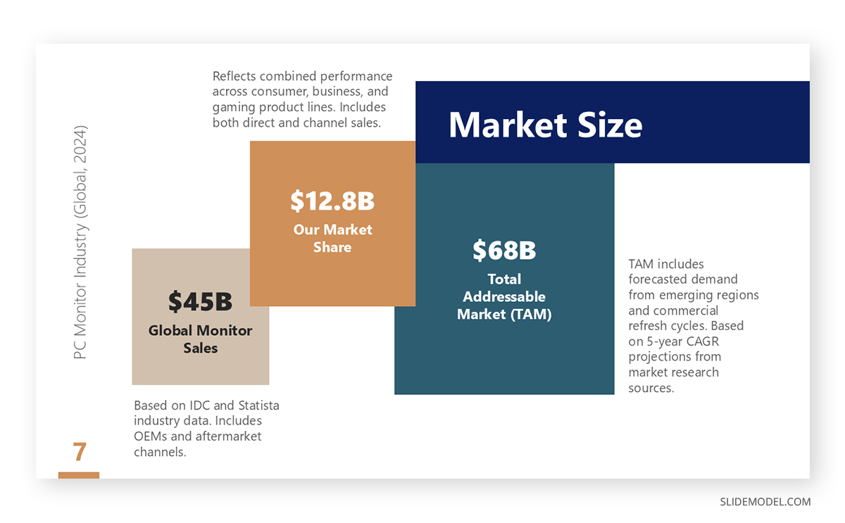
Include the source of your total market size data and disclose whether figures are based on revenue, volume, customers, or another metric. If estimates were modeled in-house, state the methodology briefly: was it bottom-up (channel-level aggregation) or top-down (based on secondary data or analyst reports)? Most importantly, if your market definition excludes major players or gray-market activity, state it. This slide isn’t flashy, but it’s the structural foundation of the entire presentation. If done poorly, every other slide becomes questionable.
Tool to Use:
Use a TAM–SAM–SOM diagram, Venn diagram, or segmented quadrant layout. These tools help communicate market hierarchy, scope boundaries, and the subset where your company is active. If the market includes overlapping segments (e.g., B2C/B2B), a matrix or layered circle model is also effective.
Market Share Snapshot Slide
This is the first data-heavy slide. It shows your company’s share alongside key competitors as of the most recent period. Present this with precise figures, percentages, and absolute values side-by-side, so viewers understand scale, not just proportions.
Emphasize your company’s position by using consistent color-coding and labeling competitors in order of market share. Do not include long-tail competitors unless their share is significant. This slide should allow an executive to answer: “Where do we stand right now in this space, and who are the top players?”
Tool to Use:
Use a horizontal bar chart, not a pie chart. Horizontal bars allow better readability, especially when there are more than four players. You can also include a bullet graph if you need to compare actual vs. target share within the same view. Keep the focus on scale and comparative positioning.
Market Share Over Time Slide
This slide reveals how market share has evolved over a defined period: monthly, quarterly, or annually. A strong presentation doesn’t just show a trend but marks key inflection points with annotations: product launches, competitor moves, marketing campaigns, pricing shifts, etc.
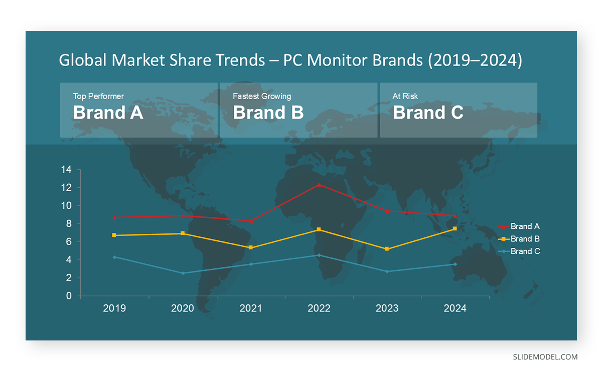
Use no more than three players per graph unless trends are clear and legible. This is where executives look for performance durability or sudden disruptions. If your share is increasing, indicate why. If it’s declining, show the correlation with internal or external events.
Tool to Use:
Use a line chart with time-series annotations. Combine this with a milestone timeline if you need to overlay specific initiatives (like a campaign calendar). An area chart may be used if you’re layering total market expansion on top of share performance.
Segment or Regional Breakdown Slide
Aggregate share figures often hide volatility. This slide exposes that by breaking down share performance across dimensions like geography, customer type, product tier, or channel. Use this slide to identify areas where your company is over- or underperforming.
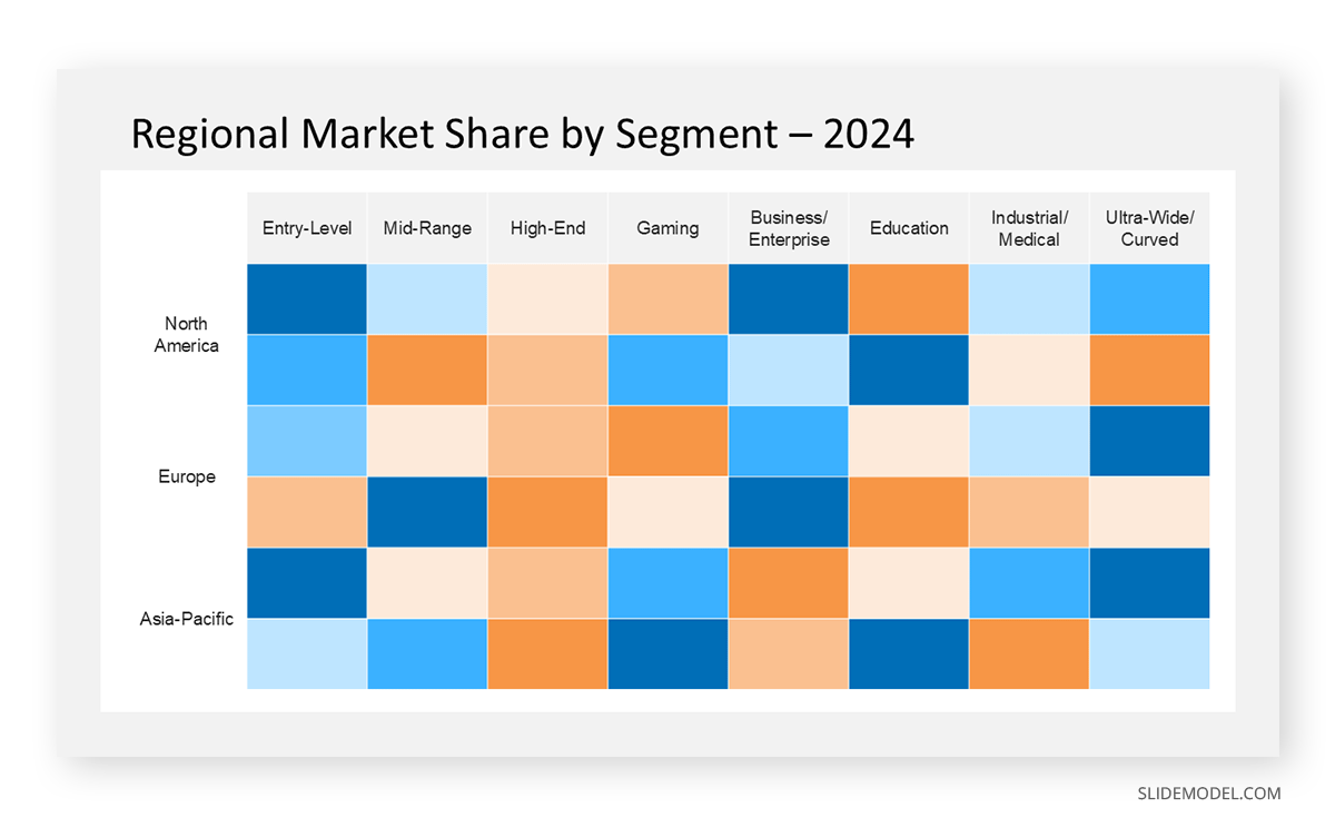
For example, you might dominate premium-tier sales but struggle in entry-level products. Or perform well in Southeast Asia but lag in EMEA. This is the operational layer of the presentation, where insights turn into targeted strategy.
Tool to Use:
Use grouped bar charts for comparisons between segments. A stacked bar chart is effective when the total market size differs across segments but needs to be normalized. For geographic data, use a choropleth map (color-coded region map) to show spatial distribution. A heat map also works well for channel or segment concentration.
Share of Growth Slide
This slide is critical in fast-growing markets. Even if your company’s total share hasn’t changed, gaining a large portion of net-new demand shows momentum. This is what investors and senior leadership look for in early-stage or expanding markets. Show not only how much of the market grew, but how much of that growth your company captured versus competitors. This reframes the conversation from “we’re flat” to “we’re outpacing rivals in capturing new demand.”
Tool to Use:
Use a 100% stacked column chart that compares competitors’ share of incremental market growth. Overlay growth totals with delta arrows or data callouts to quantify contribution. If you’re framing growth across regions or segments, consider a small multiples layout where each mini chart represents one market.
Competitor Dynamics Slide
This slide dives deeper into competitive movement. It’s not enough to say “Competitor X gained 4%.” Explain how and why. Use this slide to isolate tactical moves made by others: new product launches, aggressive discounting, exclusive retail partnerships, or geographic entry, and show how these correlate with share shifts. This isn’t just reporting what happened; it’s demonstrating competitive awareness and market intelligence.
Tool to Use:
Use a waterfall chart to show net share change per competitor with annotations. A comparison table with directional indicators (arrows, flags) also works if you’re detailing multiple competitors. You might also combine a SWOT grid if this is part of a broader competitive analysis deck.
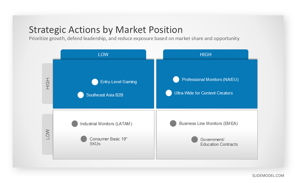
Strategic Implications Slide
Conclude with strategic guidance. This isn’t a summary; it’s a directional analysis based on the data shown. Identify where the company should defend its position, where it can accelerate growth, and where retreat might be prudent. Don’t overreach; if the data doesn’t justify a move, don’t propose one. Use this slide to link share trends to resource allocation, product development, or sales strategy. Decision-makers rely on this to turn insight into action.
Tool to Use:
Use a 2×2 strategic matrix to classify opportunities by impact and feasibility. Alternatively, a prioritized action list or SMART goals table works well if tied to specific initiatives. If part of a larger business review, insert this analysis into a gap analysis layout that connects shared shortfalls to operational or marketing levers.
Data Credibility and Methodological Discipline
Presenting market share without rigorous data handling undermines the entire purpose of the presentation. Executives, board members, and investors won’t act on figures they don’t trust. That’s why data credibility and methodological discipline are not optional; they are structural requirements. Any market share claim, no matter how compelling, must be anchored in transparent, replicable logic.
Start by clearly identifying your data sources. If you rely on third-party reports (e.g., Euromonitor, IDC, Gartner), state exactly which report, edition, and year. If the data comes from a custom model built in-house, explain how the market size was calculated: was it a bottom-up estimate based on unit shipments and pricing? Or a top-down figure derived from competitor disclosures and public filings? Don’t gloss over these points; experienced audiences will ask.
State whether your share is based on revenue, unit sales, customer count, or engagement (such as active users). Define timeframes (fiscal vs. calendar year), currencies, and geographic scope. If foreign currencies were converted, specify the exchange rate assumptions. If data for competitors was inferred or interpolated due to a lack of public disclosure, describe the method used.
You must also guard against false precision. Presenting a share of 27.381% looks authoritative but creates the illusion of accuracy. Use round figures unless you’re working with high-frequency transactional data, and always include margins of error if estimations are involved. If you model your market from third-party components (e.g., aggregating data across product lines or subcategories), explain that logic, ideally in appendix slides or a footnote.
Building the Narrative: Structure and Logic
We can’t just see a market share presentation as a collection of data visuals in slides. In business contexts, raw numbers are rarely useful on their own. Executives expect interpretation: they want to know what the data reveals, what caused the changes, and what actions follow. Without a clear narrative, even accurate visuals lose strategic value.
Data storytelling provides that necessary structure. It frames the figures within a defined market context, explains what’s driving the changes, and links the analysis to operational or competitive factors. When a company’s share rises or falls, decision-makers aren’t satisfied with knowing that it happened; they need to understand why. Was it pricing pressure? A competitor’s launch? A regional supply issue? The narrative connects these dots.
A good presentation guides the audience through a logical sequence. It starts with a clearly defined market and a snapshot of the current share. It then traces historical changes, introduces competitor dynamics, and examines performance across segments. Each part builds on the last, forming a cohesive story that moves from evidence to implication.
Forecasting in Market Share Presentations
Some teams are tempted to project future market share growth based on internal goals or pipeline assumptions. This is acceptable only when done with caution and transparency. Forecasts should be scenario-based and show sensitivity to market variables. For instance, what happens if a competitor launches early, if price compression accelerates, or if a regulatory environment shifts?
Do not confuse internal ambitions with market projections. If you forecast that your share will grow from 9% to 15% in the next year, you must articulate the drivers: channel expansion, pricing, product launch, customer migration, etc. Forecasts without assumptions and probability ranges damage credibility.
Ending with Strategic Implications
The closing section of your market share presentation should translate analysis into strategic options or decisions. Do not recap the slides. Instead, ask: What does this mean for resource allocation? For pricing? For R&D? For channel expansion?
If your remit does not include strategy formulation, your role is to surface the relevant insights for those who do. For example, if you’ve shown that your market share in Southeast Asia is declining while your brand awareness remains high, flag that disconnect. Suggest it be explored in the marketing or commercial team’s next strategic planning cycle. The point is to elevate the data from information to insight to action.
FAQs
What is the main goal of a market share presentation?
To communicate a company’s position within a defined market and explain the strategic implications of that position. It’s not just about reporting figures; it’s about linking data to performance, risk, and decision-making.
Who is the typical audience for a market share presentation?
Executives, senior managers, board members, investors, or commercial teams. The level of detail and framing should match their strategic role and information needs.
Should I use pie charts to show market share?
Rarely. Pie charts can be hard to read beyond four or five segments. Horizontal bar charts or stacked columns are clearer, especially when dealing with multiple competitors or comparing multiple time points.
Do I need to define the market scope in the presentation?
Yes, always. Without a clear definition of what “the market” includes (e.g., product categories, regions, timeframe), market share figures are meaningless or misleading.
How do I handle incomplete or estimated data?
Be transparent. Clearly state assumptions, methodologies, and any interpolations or exclusions. Executive audiences expect modeling and can tolerate estimates, as long as they’re credible and well-explained.
What time period should I use for market share analysis?
That depends on the industry and audience. Quarterly or trailing twelve-month views are common for internal reviews; yearly figures are more appropriate for board and investor presentations. Be consistent.
How do I explain changes in market share over time?
Use annotated time-series charts and link each movement to a clear driver: pricing changes, product launches, distribution expansion, competitor exits, or macro events. Always show causality when possible.
How many competitors should I include on each slide?
No more than 5–6 unless the market is highly fragmented, and that fragmentation is central to your point. Use an “Other” category for marginal players, but define what it includes.
What tool is best for showing shifts in competitive position?
Waterfall charts, delta comparisons, or time-series line charts. Add brief annotations for context (e.g., “Competitor X launched new SKU Q3”) to connect data with real-world actions.
How do I turn the data into a strategic takeaway?
Use a closing slide that connects the data to actions or decisions. Highlight what to defend, where to expand, and what risks to watch. Your role is to interpret, not just report.
What should I include in the appendix of a market share presentation?
Detailed data tables, methodology, alternative segment views, competitor profiles, and backup for forecasts. Keep the core slides clean; push depth into the appendix for reference.
Final Words
Market share presentations are often delivered mechanically. That’s a missed opportunity. They offer a window into how markets are shifting, how competitors are behaving, and how well your company is adapting. When presented with analytical rigor, narrative structure, and visual clarity, they become catalysts for strategic debate and directional change. But only if you resist the temptation to decorate the truth, sugarcoat the numbers, or rely on generic visuals. The audience you’re presenting to is trained to see through that. What they want, what they need, is clarity, discipline, and insight.