Most ESG decks fail for a reason that has nothing to do with design. They are built backward. Someone exports the sustainability data, picks the numbers that look best, arranges them across twenty slides, and only then discovers that the audit committee wants ESRS data points and the institutional investor wants IFRS S2 climate disclosures. Neither finds what they came for.
An ESG and sustainability report presentation is not a highlight reel of your reporting year. It is a structured argument built on a disclosure framework, delivered to people who increasingly assume they are being sold something. In a survey of 350 investment decision-makers, 85% said greenwashing is a more serious problem than it was five years ago, and 80% said the materiality and comparability of corporate sustainability reporting needed substantial improvement. That is the room you are presenting to.
This guide works from the framework outward. Decide what you report against, let that govern your materiality analysis, build each pillar to the evidentiary standard the framework demands, and only then choose visuals. The order matters more than the slide count.
What an ESG Presentation Has to Prove
An ESG and sustainability report presentation is a slide deck that communicates an organization’s environmental, social, and governance performance, the standards used to measure it, and the decisions the audience is being asked to make in response. It sits downstream of the sustainability report and upstream of a decision: approve the transition capex, sign the supplier contract, keep the position in the portfolio, ratify the disclosure.
That burden of proof shapes everything downstream. Every figure needs a boundary, a period, a methodology, and a status: assured, internally verified, or estimated. Presenters who cannot answer those four questions on demand should leave the number off the slide.
Where the CSR and Social Impact Report Fits
The two documents get conflated constantly, and the confusion shows up in slide decks. A CSR and social impact report presentation tells the story of what a company chose to do beyond its obligations: community programs, volunteering, philanthropy, supplier development, and the outcomes those produced for the people they were aimed at. It is voluntary, narrative, and judged on whether the impact claimed is real. An ESG presentation reports how the organization manages sustainability risks and impacts against a defined standard, usually because a regulator, a lender, or an index provider requires it. It is standardized, comparable, and judged on whether the numbers survive assurance.
Most large companies end up needing both, drawn from one data set. The social pillar of the ESG deck and the impact section of the CSR deck often share source figures, but they are framed for different audiences and answer different questions. Problems start when the framing crosses over: CSR narrative language inside an ESG disclosure reads as evasion to an analyst, and dense ESRS data point tables inside a community-facing CSR deck read as a stonewall. Decide which document you are presenting before you decide what goes on the slides, and if the audience genuinely wants both, present them as two sections with a clear boundary rather than blending them into one ambiguous story.
Report Against the Framework Before You Design a Slide
Name the framework your numbers answer to before you open a presentation deck. Three dominate corporate practice; they ask for different information, and a slide deck built for one reads as incomplete to an audience expecting another. Reporting against more than one is manageable, but only if the mapping is deliberate.
ESRS and the Post-Omnibus CSRD Perimeter
The European Sustainability Reporting Standards are mandatory for companies inside the Corporate Sustainability Reporting Directive perimeter, and that perimeter narrowed considerably. The Omnibus I Directive, published in the Official Journal on 26 February 2026 and in force since 18 March 2026, restricts mandatory reporting to large undertakings with more than 1,000 employees and net turnover above 450 million euros, exempts listed SMEs entirely, and cuts mandatory ESRS datapoints by roughly 60% subject to materiality. The revised scope applies to financial years beginning on or after 1 January 2027.
None of that removes the presentation problem. In-scope companies still owe structured, auditable disclosure subject to third-party assurance, and the presentation deck summarizing it has to reconcile line by line with the filing. Out-of-scope companies face a subtler issue: customers, banks, and procurement teams inside the perimeter push disclosure requests down the value chain, so the ESG presentation may serve someone else’s compliance obligation rather than your own. Say which situation applies on the opening slide, because audiences read voluntary and mandatory disclosure very differently.
IFRS S1 and S2: What Investors Came For
The ISSB standards have become the investor-facing baseline, absorbing the TCFD recommendations and the SASB standards into a single reference point. IFRS S1 covers general sustainability-related financial disclosures; IFRS S2 covers climate specifically, including governance, strategy, risk management, and metrics and targets, with the full standards available through the IFRS Sustainability Standards Navigator.
In practice, an ISSB-aligned deck is a financial risk deck in sustainability vocabulary. The audience wants to know which sustainability matters could affect cash flows, access to finance, or cost of capital over the short, medium, and long term. Slides leading with community photography underperform slides that quantify exposure. For an investor audience, structure the climate section as risk and mitigation rather than achievement, and state scenario assumptions explicitly. A transition risk figure without its temperature pathway is unusable.
GRI and Reporting Against More Than One Standard
The GRI Standards remain the most widely used voluntary basis for impact reporting worldwide and are aimed at a broader stakeholder set: employees, communities, suppliers, civil society, regulators. Where ISSB asks how the world affects your business, GRI asks how your business affects the world. A GRI-based deck therefore devotes real space to impacts, affected groups, and management approach, which an investor deck compresses into a line.
Reporting against several standards does not require several presentation decks. The impact materiality definition in ESRS aligns with GRI 3, the financial materiality assessment in ESRS 1 is designed to be consistent with IFRS S1, and GRI and the IFRS Foundation reaffirmed their commitment to complementary disclosure in May 2026. One well-run materiality assessment feeds all three. The technique for the deck is a framework index slide, a compact reference table mapping each disclosure to its ESRS, IFRS, and GRI identifiers. It looks bureaucratic, and it is the slide analysts photograph.
Double Materiality Decides What Goes in the ESG Deck
Double materiality is the assessment that determines which sustainability matters are material from two directions: impact materiality, meaning how the business affects people and the environment, and financial materiality, meaning how sustainability matters affect the company’s own performance and position. Under ESRS, it is not optional, and it is the analytical foundation the rest of the disclosure sits on.
For a presenter, the assessment functions as an editorial filter. A topic that cleared the threshold earns slide time proportional to its score. A topic that did not clear it belongs in an appendix or nowhere. ESG presentations that ignore this end up giving equal weight to a material Scope 3 category and a volunteering program, which tells the audience that nobody applied judgment.
Presenting the assessment is where most decks stumble. The default is a scatter matrix with impact on one axis and financial significance on the other, which works at eight topics and becomes unreadable at thirty. When the list is long, a heat map layout handles density better, because color intensity carries the ranking without crowding every label into a quadrant. Whichever you choose, show the method on the same slide or the next: who was consulted, how many stakeholder groups were mapped, what thresholds applied. A materiality matrix with no visible method is a graphic, not evidence.
Turning the Three Pillars Into Slides That Hold Up
Environmental, social, and governance are not equally difficult to present. Data quality, audience scrutiny, and failure modes differ sharply across the three, and treating them as parallel sections of equal length is one reason so many ESG decks feel flat. Build each to the level of challenge it actually attracts.
Environmental Data and the Scope 3 Problem
Scope 1 and Scope 2 emissions are usually defensible. They come from meter readings, fuel invoices, and utility contracts, and the boundary is clear. Scope 3 is where the ESG presentation becomes vulnerable, because most categories are modeled from spend data, industry averages, or supplier estimates rather than measured, and the resulting error bars can exceed the year-over-year change you are reporting.
Disclose the method on the slide rather than defending it under questioning. Label each Scope 3 category by data quality: supplier-specific, average-data, or spend-based. State the baseline year and flag any restatement. If emissions fell because a business unit was divested rather than decarbonized, say so in the subtitle, because an analyst will find it in the filing within a day.
For the trajectory itself, a waterfall chart is the most honest structure available. It opens at the baseline, breaks out each contribution to the change, whether reduction projects, growth, acquisitions, or methodology revisions, and closes at the current figure. Organic reduction becomes a distinct bar instead of hiding inside a net number, which is why credible reporters use it and why presentation slides that obscure it avoid it.
Social Metrics That Withstand Questioning
Social data invites a different kind of challenge. The numbers are easier to collect and much easier to dispute, because audiences bring their own experience of the organization into the room. Headcount diversity percentages, training hours, and engagement scores are reported almost universally, which also means they carry little differentiating weight.
The metrics that hold up are tied to a decision or an outcome. Representation by management level rather than in aggregate. Voluntary attrition split by demographic group. Recordable incident rate with the hours-worked denominator visible. Supplier audit coverage as a share of spend rather than a count. Pay gap figures with the methodology named, since an unadjusted gap and a like-for-like gap describe different things.
Two practices help. Show the denominator, because a percentage without its base invites the question you least want. And where a progress report view fits, present multi-year series rather than single points, since one year of social data rarely establishes a trend and audiences know it.
Governance, the Pillar Most Slide Decks Underbuild
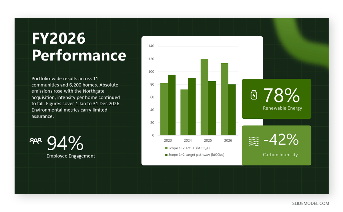
Governance receives the least slide space and the most board scrutiny. It also determines whether the other two are believed, because it answers who is accountable when a target slips and what happens next.
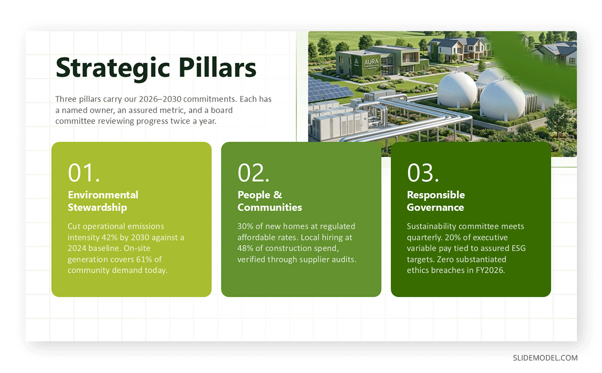
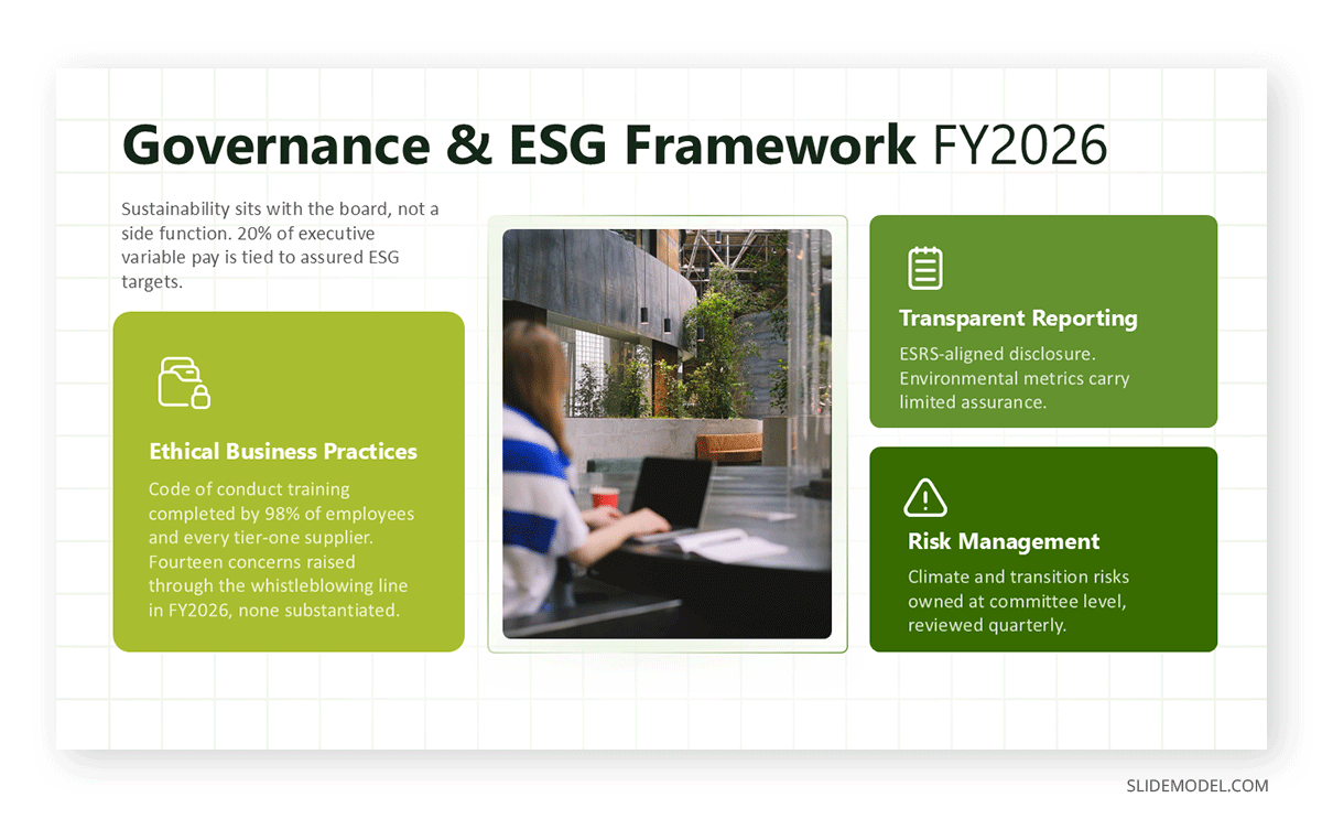
A credible governance section covers board oversight, including which committee holds the mandate and how often it meets on the topic, the link between ESG performance and executive remuneration with the actual weighting, the escalation path for a missed target, ethics and anti-corruption incidents reported versus substantiated, and the assurance arrangement covering the disclosure. Under IFRS S2, governance disclosure is a requirement, not a courtesy, so the slide must name mechanisms rather than describe intentions.
This is also the natural home for a risk and mitigation view of sustainability exposures, showing each material risk with its owner, its current controls, and its residual rating. Boards read that layout fluently because it is the same structure they see in every other risk paper.
Matching Visuals to ESG Data
ESG datasets are mixed: time series, category breakdowns, geographic distributions, framework mappings, and qualitative commitments in one deck. Matching each to the right visual matters more here than in most business reporting, because the audience already suspects that presentation choices are hiding something.
Time series with a labeled target line handle emissions, energy intensity, and water withdrawal. Stacked bars work for Scope 1, 2, and 3 composition but stop working past four or five segments. Waterfall charts belong to any figure that moves for several reasons at once. Tables, not charts, belong to framework indices and assurance status, since the audience is looking up values rather than reading a shape.
Two habits do disproportionate damage. Truncated y-axes make a 3% emissions reduction look like a collapse, and any analyst who notices will discount everything after that slide. Dual-axis charts pairing revenue growth against emissions intensity can be scaled to show almost anything, so they attract suspicion even when built in good faith. Sound data presentation favors the least flattering honest chart over the most flattering defensible one.
When the Numbers Move the Wrong Way
Targets get missed. Baselines get restated when a methodology improves, or an acquisition closes. Data gaps appear when a newly acquired site has eighteen months of records, and the rest of the estate has ten years. How the presentation deck handles these moments determines whether people believe the good numbers.
The structure that works holds regardless of the miss. Put the target and the actual result on the same line, with equal visual weight. Give the cause in one checkable sentence. State what changes as a result, with an owner and a date. Then say whether the longer-term target stands or has been revised, plainly, rather than quietly reprinting a new number later in the ESG presentation.
Restatements deserve their own treatment. When a baseline moves, show the old and new figures together with the reason, because a silently revised baseline is the fastest way to be accused of manipulating a trend. Companies that restate openly usually get the benefit of the doubt. Companies that restate quietly do not.
Credibility Failures That Sink ESG Decks
The failures below recur across industries and reporting maturity levels. They are not design problems, and better graphics will not fix any of them.
Presenting activity as achievement. Initiatives launched, training hours delivered, and policies published measure effort. Emissions intensity, incident rate, and supplier compliance measure results. ESG decks weighted toward the first signal that the second is unflattering.
Quiet boundary exclusions. Leaving a joint venture, a leased fleet, or a recently acquired plant out of the boundary without saying so is technically defensible and practically fatal once discovered. State the boundary and its exclusions early.
Undated framework claims. Saying a report is prepared in accordance with a standard without naming the version and reporting period is meaningless when standards revise annually. ESRS in particular changed substantially under Omnibus.
Selective baseline years. Choosing 2019 because it flatters the trend, or shifting the baseline between reporting cycles without explanation, is visible to anyone with two years of your reports side by side.
Assurance ambiguity. Limited assurance, reasonable assurance, and internal verification are three different things. Presentation slides that use the word assured without a qualifier are read as claiming more than they have.
Aggregating away the problem. A global figure that averages a compliant region with a non-compliant one hides exactly the information a regulator or a serious investor is looking for. Disaggregate where the variance is material.
Delivering the ESG Slide Deck to a Skeptical Room
Your audience has heard versions of this presentation from your competitors and has developed pattern recognition for evasion. Long lead-ins, aspirational language, and photography that carries arguments data should carry register as warning signs before anyone consciously registers why.
Open with the assessment rather than the ambition. A short executive summary stating the material topics, the headline results including those that went the wrong way, and the decisions being requested earns more attention than a mission statement. Then work through the framework, the pillars, and the outlook, keeping detailed data point tables in an appendix you can jump to when challenged.
Prepare for the questions that will come: how much of the Scope 3 figure is estimated, what happens to the 2030 target given this year’s result, which parts of the disclosure carry assurance, how the ESG presentation reconciles with the filed report, and what changed in the methodology since last cycle. Rehearsed answers to those five cover most of what a board presentation or an analyst session will surface. When a question exceeds what the data supports, say so and commit to a follow-up date. Overreaching once in a Q&A undoes an hour of careful reporting, and the people in the room will check.
ESG and Sustainability Report Presentation Templates
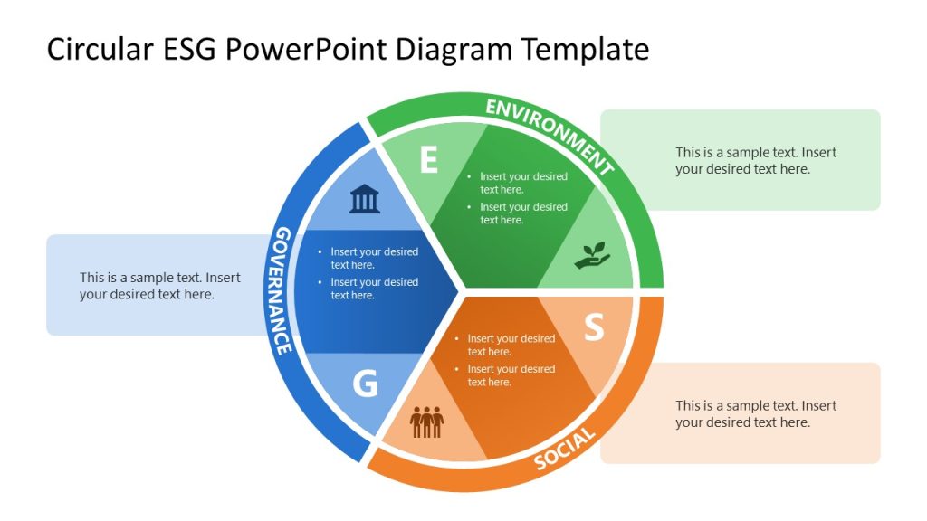
Building framework-aligned slides from a blank canvas costs time that is better spent on data quality. The PowerPoint templates below cover materiality matrices, emissions dashboards, pillar breakdowns, and reporting index layouts that can be populated with your own figures and adapted to whichever standard governs your disclosure.




FAQs
How is an ESG presentation different from a sustainability report?
The report is the complete disclosure document, often a hundred pages or more, structured to satisfy a standard. The presentation is a selective argument drawn from it, built around what a specific audience needs to decide. The report exists to be searched and audited; the deck exists to be questioned live. Every figure in the slide deck should trace back to the report, but the ESG deck should never try to reproduce it.
Which framework should we build the presentation around?
Whichever one carries obligation for you. Companies inside the post-Omnibus CSRD perimeter build around ESRS. Those whose primary audience is capital markets build around IFRS S1 and S2. Voluntary reporters serving a broad stakeholder base build around GRI. Where more than one applies, use the mandatory standard as the spine and add a framework index slide.
What are Scope 1, 2, and 3 in ESG presentations?
Scope 1, 2, and 3 are the GHG Protocol categories for classifying a company’s greenhouse gas emissions based on where they occur relative to the company’s operations.
Scope 1 covers direct emissions from sources the company owns or controls, such as fuel burned in company vehicles, on-site boilers, or manufacturing processes.
Scope 2 covers indirect emissions from purchased energy: the electricity, steam, heating, or cooling a company buys, with emissions generated at the power plant rather than on-site.
Scope 3 covers all other indirect emissions across the value chain, both upstream and downstream: things like purchased goods and services, business travel, employee commuting, transportation and distribution, waste, and the use and disposal of sold products. It’s usually the largest and hardest-to-measure category, since it depends on suppliers and customers rather than the company itself.
In ESG reporting, Scope 3 has become a major focus of scrutiny because it often represents the majority of a company’s carbon footprint, even though it’s outside direct control.
What is double materiality in practice?
It means assessing each topic twice: once for how the organization affects people and the environment, once for how that topic affects the organization’s financial position and prospects. A topic can be material on one axis and not the other. Water stress may be financially material to a beverage producer and impact-material to the communities around its plants, for different reasons and at different thresholds.
How many slides should an ESG presentation be?
Fifteen to twenty-five slides for a board or investor session, plus a longer appendix carrying the framework index, the full datapoint tables, and the methodology notes. Length matters less than being able to reach any supporting number within two clicks.
Should Scope 3 emissions be included if the data is weak?
Yes, with the weakness labeled. Omitting Scope 3 is more damaging than reporting it with acknowledged uncertainty, since for most sectors it is the majority of the footprint and its absence is conspicuous. Label each category by data quality and state the basis for the estimate. Audiences accept modeled figures. They do not accept modeled figures presented as measured ones.
How do we present a missed ESG target?
Put the target and the actual result side by side at equal visual weight, give a specific cause in one sentence, state the corrective action with an owner and a date, and say clearly whether the longer-term commitment stands or has been revised. Burying a miss in an appendix costs more credibility than the miss itself, and it will be found.
What does assurance mean on an ESG slide?
It means an independent third party examined the disclosure. Limited assurance means the provider found nothing suggesting material misstatement. Reasonable assurance is a higher bar, closer to a financial audit opinion. Internal verification is neither. Mark the level per metric rather than labeling the whole ESG deck, since coverage is rarely uniform.
Is ESG reporting still mandatory in the EU after the Omnibus changes?
It remains mandatory for a smaller population. The Omnibus I Directive limits CSRD scope to large undertakings above 1,000 employees and 450 million euros in net turnover, exempts listed SMEs, and applies from financial years beginning on or after 1 January 2027. Companies below those thresholds may still face disclosure requests from in-scope customers and lenders operating along their value chains.
Who should deliver the ESG presentation?
Whoever can answer methodology questions without deferring. Often that is the sustainability lead presenting alongside a finance or risk executive, since the hardest questions in a board or investor setting concern financial exposure and control environment rather than program design. A presenter who takes every technical question offline undermines the disclosure regardless of how sound it is.
How often should the ESG deck be rebuilt?
The full ESG presentation follows the annual reporting cycle, but figures should refresh on the cadence of the data behind them. Emissions data typically lags a quarter or more, so a slide deck presented in Q2 may carry Q4 figures, which is why every data slide should include an as-of date. Where sustainability items appear in a quarterly business review, use a short subset rather than compressing the annual deck.
Final Words
The framework you report against is not administrative overhead to be resolved before the interesting work starts. It is the structure that makes the deck defensible, because it tells your audience which questions you have committed to answering and to what standard. Presentation decks built framework-first survive scrutiny that decks built slide-first do not.
The rest follows. Let double materiality set the agenda, build each pillar to the level of challenge it will attract, choose the chart that shows change most plainly rather than most favorably, and treat missed targets as a credibility opportunity. Audiences that arrive skeptical are not asking to be impressed. They are asking whether the numbers hold, and a presentation organized around that question is far harder to dismiss than one organized around achievements.