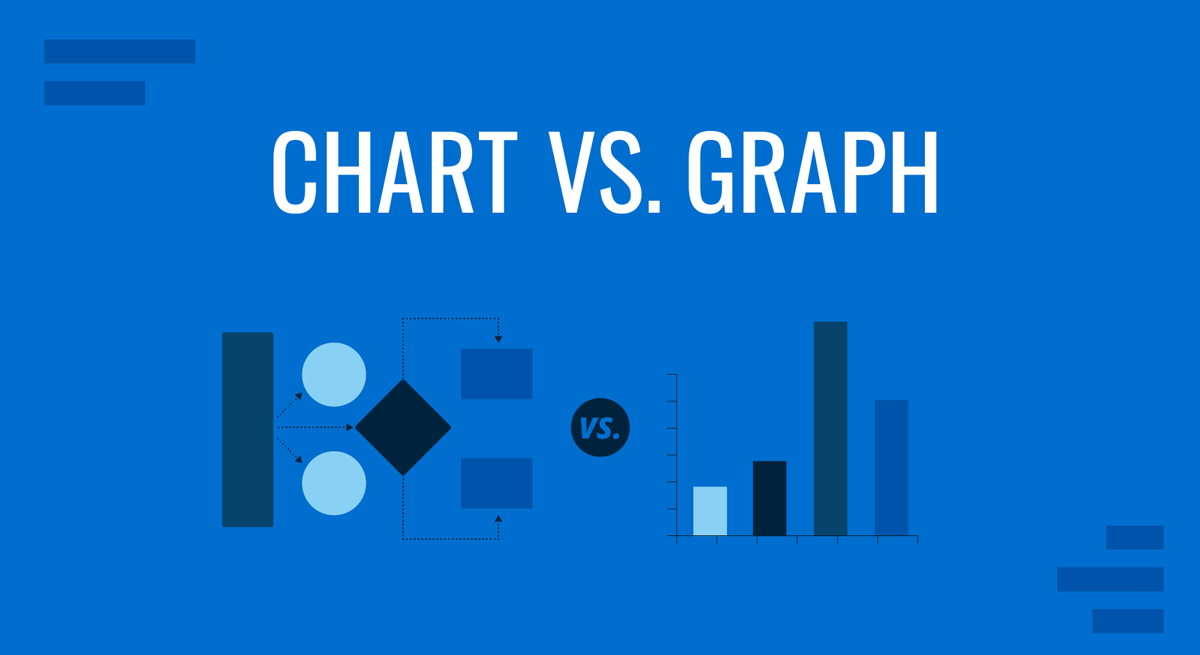
Presenters face a common question when representing data whether to pick graphs vs. charts. Which one do you need to visualize your information? Well, the short answer is: it depends.
The trick to confidently knowing if you need a chart or a graph when visualizing information is knowing how the two are related to each other hierarchically.
Did you know that all graphs are charts, but not all charts are graphs? The two terms are often used interchangeably but do have unique distinctions. Knowing these characteristics will help you create and present better data presentations.
Let’s go deeper into the semantics of it all.
Difference Between a Chart and a Graph
As a person that creates presentations, it’s important that you know the relationship between charts and graphs and how they support the visual and graphical representation of data. The difference between a chart and a graph lie in semantics and hierarchy.
In biology, we have systems of classification to understand the hierarchical relationship between animal genera, kingdoms, and species. In the same way, charts are graphs are two parts of a larger hierarchical classification system of data visualizations.
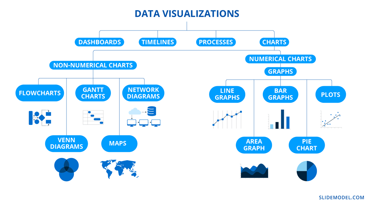
Think of a tree diagram (or organizational chart) with a Data Visualization label at the top. The next tier underneath includes labels like charts, infographics, and dashboards. The next tier branches from these terms into their subcategories. Underneath charts, you find; graphs, flowcharts, organizational charts, Gantt charts, maps, and diagrams.
Charts and graphs are related hierarchically. When you define the term “chart,” graphs are inherently included in that definition. So, what is the difference between a graph and a chart?
A chart is a visual representation of information or data. The purpose of a chart is to help viewers understand and analyze information easily with the help of visuals. Charts can be stand-alone visuals or grouped to create infographics, dashboards, and other more complex data visualizations.
A graph is a chart that uses mathematical equations to visualize data and analyze relationships and trends. For a chart to be a graph—and not another type of chart—it must involve a mathematical analysis, generally using the x and y axis to plot data points. Common graphs use lines and bars to visualize data quantities, relationships, and trends.
Edward Tufte, a pioneer in the field of data visualization, has profoundly influenced how we understand and present data. His principles of clarity, efficiency, and truthful communication in data presentation serve as foundational guidelines for creating more effective and insightful visual representations. Tufte advocates for the use of high-resolution data displays, the integration of words, numbers, and images into a single narrative, and the elimination of non-data ink to focus attention on the data itself.
Edward Tufte
Good design is clear thinking made visible, bad design is stupidity made visible.
By applying Tufte’s principles to the design of charts and graphs, presenters can significantly enhance their ability to convey complex information in an accessible and engaging manner. Whether you’re working with PowerPoint, Google Slides, Microsoft Excel, Tableau, R or any other tool, incorporating Tufte’s insights can elevate the clarity of your data visualizations in presentations and book reports.
What is the Role of Diagrams here? Diagram vs Chart
Diagrams can be viewed as a broad category that encompasses any visual representation designed to illustrate information in an abstract manner. This can include labeled images, organizational tree diagrams, floor plans, infographics, electrical circuit layouts, process flows, and more.
A practical guideline when choosing terminology is to use chart, graph, or plot when the visual representation is primarily based on numerical data.
The main difference between Diagram and Chart lies in their purpose and data foundation. Diagrams can depict both abstract and structured information without necessarily relying on numerical data. They emphasize relationships, concepts, and processes in a visual format. In contrast, charts are specifically designed to represent quantitative information and are built from datasets. Charts often help analyze trends, compare figures, and interpret numerical data in a straightforward, visual manner.
Types of Graphs & Types of Charts
The tree diagram above shows the big picture: graphs are a subset of charts. Now let’s look at the details of these charts as visual representations of data.
Charts can be separated into two main categories; numerical and non-numerical. Graphs are the numerical type. Here’s an outline to help you visualize the hierarchy of these terms.
- Data Visualizations
- Dashboards
- Timelines
- Processes
- Charts
- Numerical Charts
- Graphs
- Non-numerical charts
- Numerical Charts
When to use a Chart or Graph?
Deciding whether to use a chart or graph is not trivial. This is not a question of choosing between a chart or a graph. Because inherently, If you choose a graph, you are also choosing to use a chart. So let’s rephrase it.
Question: When is a good time to use a chart or—more specifically—a graph while creating a presentation?
Answer: If you want to steer away from blocks of text and visualize information across slides engagingly, then you should use a chart for a visual representation.
Now the question is, which one? The chart you use depends on the nature of your data, so you’ll have to choose according to that.
Here are some questions to help make a decision:
- What type of data do you need to visualize?
- Is the data numerical (quantitative) or categorical (qualitative)?
- Do you want to;
- compare values or represent relationships between variables?
- show patterns or trends over time?
- show proportions or parts of a whole?
- show distribution or frequency of data?
- highlight specific values or data points?
- What is the message you want to convey with the chart?
- What is the target audience, and what charts are they familiar with?
- What is the context, and how is it relevant to your audience?
How to create Charts and Graphs in PowerPoint & Google Slides?
Creating visual representations using charts and graphs in PowerPoint and Google Slides is easy. Here are instructions to guide you.
How to add charts in PowerPoint?
To add visual representation charts in PowerPoint, follow the steps below:
1. Open your PowerPoint presentation and navigate to the slide where you want to add the chart.
2. In the top menu bar, click on Insert > Charts. The popup window will show you chart options, most of which are graphs. Select the type you want to use by selecting it and clicking ok.
3. Input the data in the worksheet that pops up for your graph.
4. Customize the design with colors and fonts for the chart’s legend.
How to add charts inside Google Slides?
1. Open your Google Slides presentation and navigate to the slide where you want to add the chart.
2. In the top menu bar, click on Insert > Charts. The dropdown offers four simple graphs; choose one by clicking on it. You can also insert a graph from a Google Sheet that you own or have access to.
3. A default graph is placed into your slide, offering a prompt to edit the data in Sheets. For every new graph, Google creates a separate sheet for the data. The Sheet remains linked to the graph in the presentation unless you unlink it.
4. Customize the design with colors and fonts for the visualization and the legend.
You can browse more detailed information on how to make charts & graphs in Google Slides in this article on “How to Make a Graph in Google Slides.”
A better way to add charts and graphs to PowerPoint & Google Slides
Yes, it’s easy to add charts and graphs to presentations in PowerPoint and Google Slides, but there’s a way to make them look better easily.
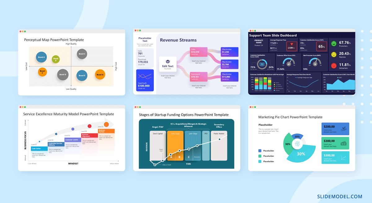
Download chart and graph templates from SlideModel and give your presentations a more refined look. In the SlideModel template repository, you’ll find plenty of professionally designed charts. Most of which are compatible with both PowerPoint and Google Slides.
Start with a comprehensive slide deck template with various PPT charts and graphs to choose from. Or download individual ppt graph templates to mix and match freely.
You’ll also find charts—that aren’t graphs—like flowcharts, tree diagrams, bubble charts, and concept maps.
After downloading from SlideModel, you can select either PowerPoint or Google Slides as your presentation design software, and customize the data, colors, and fonts to match the rest of your presentation.
How to Present Charts & Graphs
What is the purpose of graphs, charts, and diagrams? To help people understand and analyze information visually and effectively. We use them in presentations, reports, proposals, and other business communication.
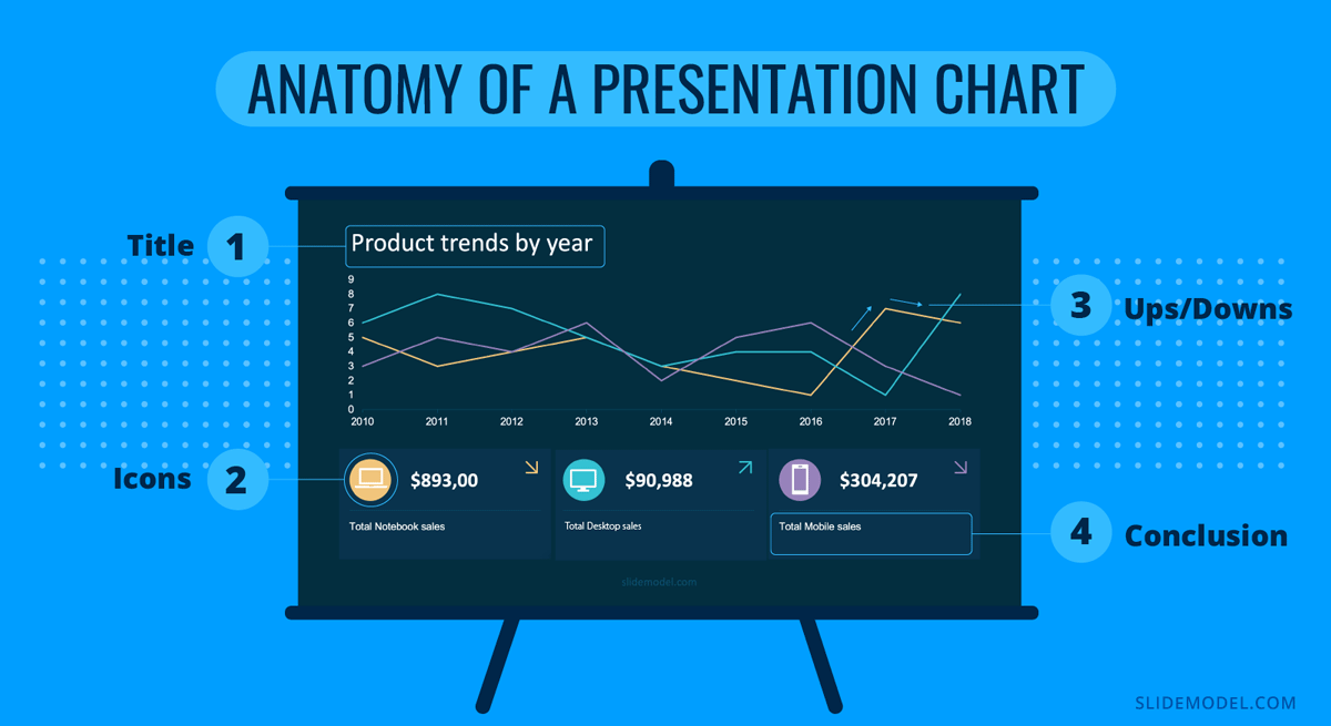
The most efficient way to present charts and graphs is to follow this formula:
- Introduce the graph.
- Identify the variables.
- Highlight key info.
- Share conclusions.
This formula works for presentation slides and your speech during a keynote or talk.
Let’s break it down.
Introduce the Graph
Add a descriptive title at the top of the slide. The title must say exactly what the chart is about, and an optional subtitle to reinforce the message. While presenting, seamlessly say the chart’s name as you speak and tell a two-sentence story about it, like an elevator pitch.
Identify the variables
Identify the variables by using color, size, and location concerning the chart. While presenting, speak about each variable succinctly and mention its visual characteristic. For example, “As you can see, telephone calls—here in the blue line—have increased yearly.”
Highlight key info
Highlight key info using subtle and not-so-subtle design techniques to bring attention to specific areas of the chart. Use icons to visualize the most critical variables in the chart legend. Add noticeable colors and bigger fonts. During your talk, speak about these data points and then about the others as support.
Share conclusions
Share conclusions in small text boxes below the chart legend. These don’t necessarily need to be in your slides, but they do need to appear in your speech. The conclusions are what bring everything full circle with the introduction.
Charts and Graphs in Action
All charts—including graphs—help you share information and data across presentations, reports, proposals, scientific posters, etc.
Including charts and graphs in slides is a necessary step in creating analytic presentations, so why not maximize their efficiency by taking the time to customize them visually according to your brand or project?
Discover all the chart and graph options in the SlideModel template library. Browse flowcharts, Gantt charts, and all types of graphs for your slides.
And remember, charts and graphs are different and related, all rolled into one.

