Score Meter for PowerPoint
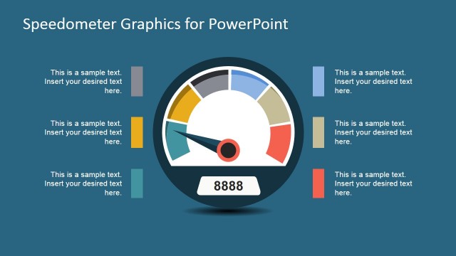
Score Meter for PowerPoint– Score Meter is a tracker of credit scores that translates the figures to meaningful graphics. Colorful diagrams are generally effective visual aids. This can help the audience grasp important subject matters in the presentation easily. Use Score Meter for PowerPoint to generate relevant meter reports on different scores.
The PowerPoint design is ideal for score meters on economic concepts. Some examples can be a country’s credit output, financial standing or currency exchange rates. Taxation is another perfect subject for the slide designs. This includes output tax as credit, which consists of payable goods or services.
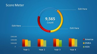
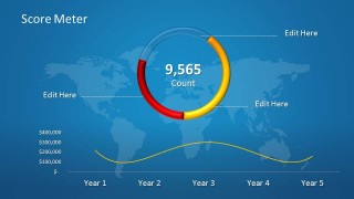
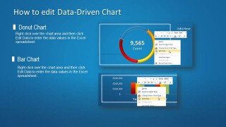
There are three uniquely designed slides in the Office template. All of them have cool blue background that stimulates learning. A set of bar charts and one donut chart are featured on the first slide. In the lower part, the bar charts are labeled with Years 1, 2, 3, and 4 on the x axis, and the y axis shows $100,000, $200,000 and $300,000. Color legends can be seen on the right side of the slide where red corresponds to America, yellow for EMEA and green for ASIA. The center of the donut chart on the upper space highlights the total value count. The second slide showcases the donut chart in a world map background. This can be related to a scoring meter with a global scope. The 3rd slide is entitled “How to edit Data-Driven Chart”. It shows the options the presenter has in modifying the PowerPoint shapes.
Score meters usually have a specific purpose. In this case, the layout is meant for finance-related topics because of the dollar currency format of the given text on the first 2 slides. The diagrams and texts are 100% customizable. The user can opt to change the labels and titles to suit a specific keynote.
Optimize visual resources for credit scoring presentations using Score Meter for PowerPoint. Checkout Data, Curve and Charts for PowerPoint from the SlideModel gallery.


