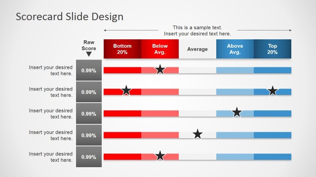
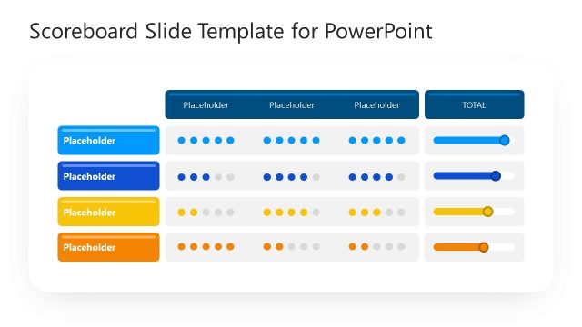
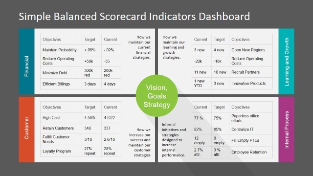
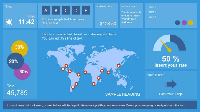
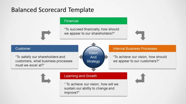
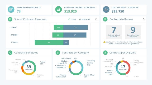
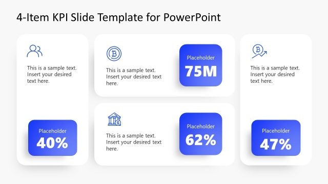
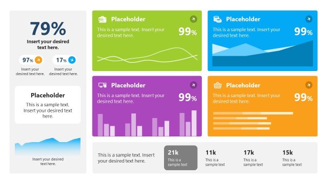
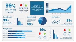
This dashboard slide design for PowerPoint can be used as a scorecard presentation template to present the most important vital signs or KPIs that help you understand the underlying health of your company or business.
Our scorecard dashboard PowerPoint templates are created with built-in PowerPoint shapes and charts so you can easily customize the dashboard with your own data in PowerPoint to meet your presentation requirements. You can download other scorecard PowerPoint templates or browse our catalog of presentation templates for business dashboards.
How can you use the scorecard dashboard PPT template in real-life presentations? Here are just some examples:
- Corporate Reviews: Senior executives can leverage this scorecard dashboard PPT template to present annual or quarterly performance results, comparing metrics year-over-year or against set targets.
- Sales and Marketing Analyses: Marketing teams can track campaigns, conversions, and other pertinent metrics using this scorecard dashboard template to evaluate the success and areas of improvement in their strategies.
- Financial Reporting: Finance teams can use the scorecard dashboard PowerPoint template to present financial KPIs, revenue growth, expenditure trends, and profitability metrics.
- Operational Insights: Operations & supply chain managers can map out production efficiencies, inventory levels, and other related indicators. This scorecard dashboard slide template is suitable for these purposes.
- Healthcare Metrics: Hospitals and healthcare institutions can use the scorecard dashboard slide template to display patient flow, treatment outcomes, and other vital stats to improve patient care.
- Academic Evaluations: Educational institutions can use the scorecard dashboard PPT template showcase student performance, departmental achievements, or research metrics over a given period.
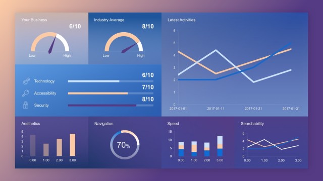
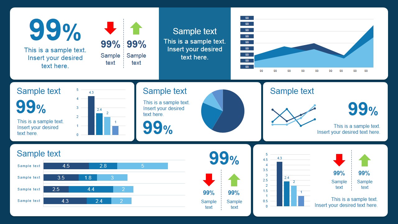
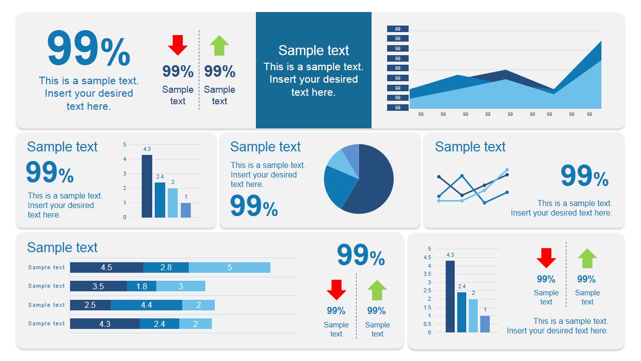
Our 100% editable Scorecard Dashboard PowerPoint template has components in a presentation template such as the responsive area chart, illustrative bar charts, intuitive line charts, and a pie chart. The components also include indicators – the upward pointing green arrow and the downward pointing red arrow – serving as immediate visual cues to highlight positive growth or areas of concern. Accompanied by editable text placeholders, you have complete freedom to customize the data points, captions, and titles to suit your specific presentation needs. The scorecard template dashboard is compatible either for PowerPoint & Google Slides.
What’s inside this template
Example presentation scenarios
- A finance leader can use the KPI tiles, horizontal stacked bars, and pie chart to report revenue mix, expense movement, and target progress during a quarterly business review.
- A sales manager can present pipeline health and team performance by replacing the sample percentages, bar charts, line chart, and red or green arrow indicators with sales metrics.
- A marketing analyst can summarize campaign performance for executives by mapping conversion trends to the area chart, channel distribution to the pie chart, and campaign KPIs to the scorecard blocks.
- An operations manager can brief leadership on production, inventory, or service-level performance using the stacked bar section, vertical bar charts, and directional arrows to flag improvements or risks.
Features
- 100% editable presentation template
- Compatible with Microsoft PowerPoint and Google Slides
- 16:9 aspect ratio slides
- Scalable vector shapes, icons and illustrations
- AI-Ready for Microsoft Copilot and Claude
- Instant access and download
Frequently asked questions
Q: How should a presenter organize the KPI message on this dashboard?
A: Start with the largest KPI percentage to establish the headline result, then use the arrow indicators to show which measures need attention. The area chart and line chart should explain direction over time, while the bar and pie visuals can support comparison or composition. Keep labels short so the audience reads status before details.
Q: Who benefits most from using this scorecard dashboard format?
A: This template is best for presenters who must report performance to decision makers without building a long report. Finance, sales, marketing, and operations teams can each map their main metrics into the KPI tiles, trend charts, and stacked bars, making it suitable for executive reviews, status meetings, and monthly performance check-ins.
Q: Why does the layout mix big numbers, arrows, and several chart types?
A: The dashboard uses visual hierarchy to separate instant signals from supporting evidence. Large percentages work as executive takeaways, red and green arrows act as traffic-light cues, and the charts provide context for trend, comparison, and distribution. This mix helps audiences decide where to focus without scanning a dense spreadsheet.
Scorecard Dashboard PowerPoint Template
2-slide scorecard dashboard presentation template for KPI tiles, charts, and performance reporting.
The Scorecard Dashboard PowerPoint Template is a 2-slide data dashboard for reporting business performance in Microsoft PowerPoint and Google Slides. It includes KPI tiles, arrow indicators, an area chart, bar charts, a line chart, a pie chart, and horizontal stacked bars for executives, analysts, and managers.
- Category
- Business PowerPoint Templates
- Rating


 Loading...
- Aspect ratio
- 16:9
- Item ID
- 7121-01
- Colors
 Microsoft PowerPoint
  Microsoft Copilot
  Claude for PowerPoint
 Other formats supported
Subscribe today and get immediate
access to download our PowerPoint templates.