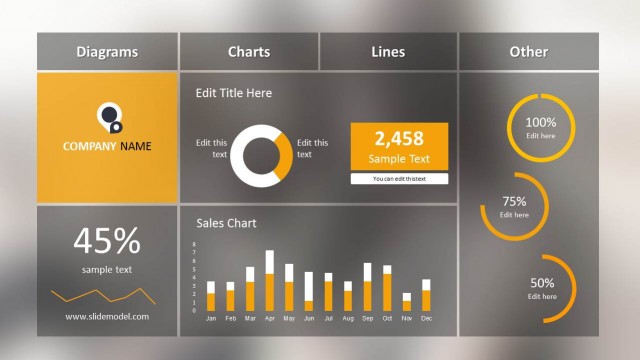
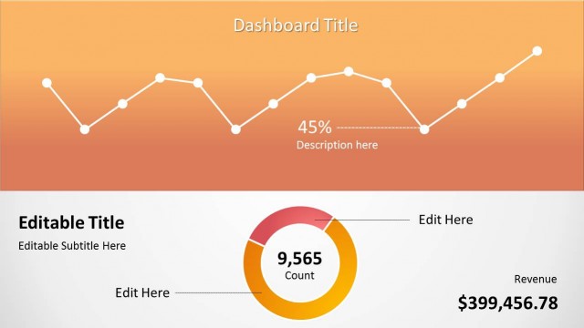
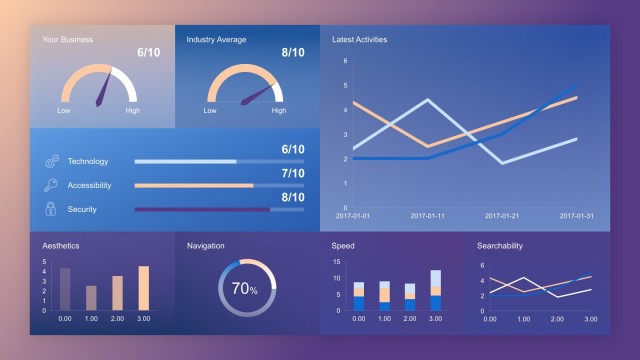
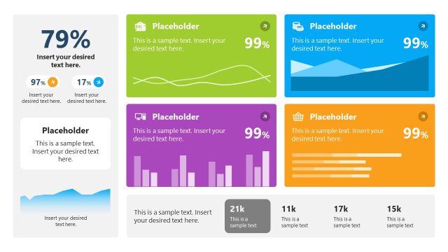
Orange Project Dashboard PowerPoint Template is a presentation dashboard template for Microsoft PowerPoint that you can use to make an awesome presentation for project planning or strategy.
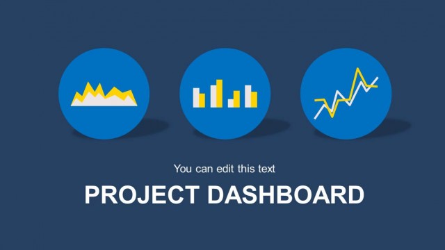
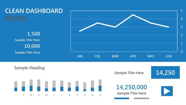
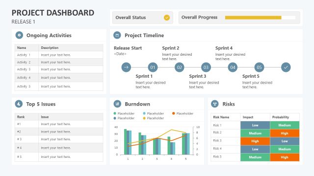
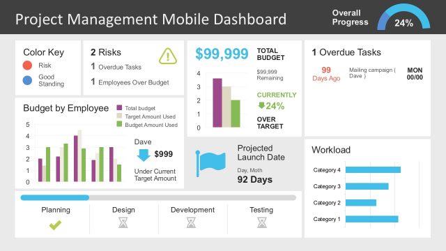
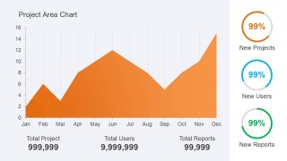
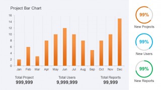
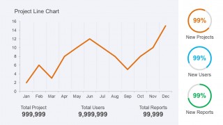
This dashboard template for PowerPoint contains useful slide designs with area chart, bar chart and line chart examples that you can use to present a project using Microsoft PowerPoint. The template is also good to make presentations on KPI or Key Performance Indicators in a Business Performance PowerPoint presentation.
What’s inside this template
Example presentation scenarios
- A project manager can use the area chart slide to brief sponsors on monthly changes and connect the trend to total project, user, and report metrics.
- A PMO lead can use the bar chart slide during a monthly governance meeting to compare activity by month and call out the three side KPI indicators.
- A business analyst can use the line chart slide to show direction over time and explain whether project activity is rising, falling, or recovering.
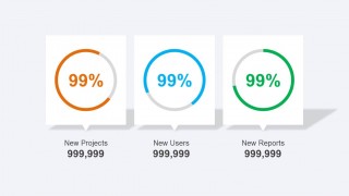
- An operations manager can use the KPI summary slide to open or close a status update with three headline measures shown as circular progress cards.
Features
- 100% editable presentation template
- Compatible with Microsoft PowerPoint and Google Slides
- Scalable vector shapes, icons and illustrations
- AI-Ready for Microsoft Copilot and Claude
- Instant access and download
Frequently asked questions
Q: How should a presenter communicate the dashboard message without overloading the audience?
A: Start with the main trend, not the numbers. On the area, bar, or line chart slide, state what changed across the months, then use the three bottom KPI totals as supporting evidence. Treat the circular indicators as headline status cues and avoid reading every label if the audience can already see them.
Q: Who is this project dashboard best suited for?
A: This template fits project managers, PMO leaders, and business analysts who need to report project activity in a short review. It works best when the discussion depends on month-by-month movement, KPI totals, and a quick status snapshot rather than detailed task planning or resource allocation.
Q: Why does the dashboard metaphor help the presentation?
A: The dashboard layout mimics an executive control panel: a large trend chart shows movement, while compact circular gauges summarize status. This split improves scanning because the audience can first see direction, then confirm the message with project totals and percentage indicators placed in predictable positions.


Orange Project Dashboard PowerPoint Template
5-slide dashboard presentation template for project KPI reporting with area, bar, and line charts
Orange Project Dashboard PowerPoint Template is a 5-slide PowerPoint dashboard deck for reporting project activity and KPI status. It includes an area chart, bar chart, line chart, KPI summary panels, and circular progress indicators for project managers and business teams. Chart data can be edited as an Excel spreadsheet in PowerPoint.
- Category
- Business PowerPoint Templates
- Rating


 Loading...
- Item ID
- 6301-01
- Colors
 Microsoft PowerPoint
  Microsoft Copilot
  Claude for PowerPoint
 Other formats supported
Subscribe today and get immediate
access to download our PowerPoint templates.