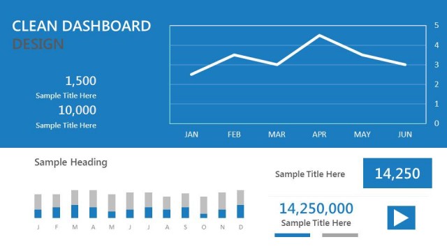
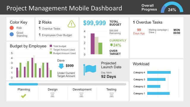
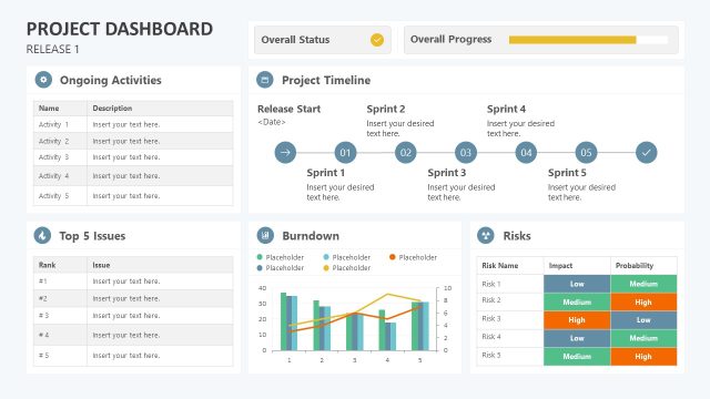
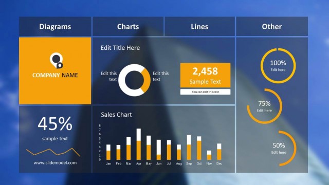
Blue Project Dashboard PowerPoint Template– a Microsoft Office presentation template with creative and reusable shapes design. Use Blue Project Dashboard PowerPoint Template for quality reports on project results and progress. The cool color scheme stimulates focus and learning from the audience. The tool can surely entice engagement and information retention.
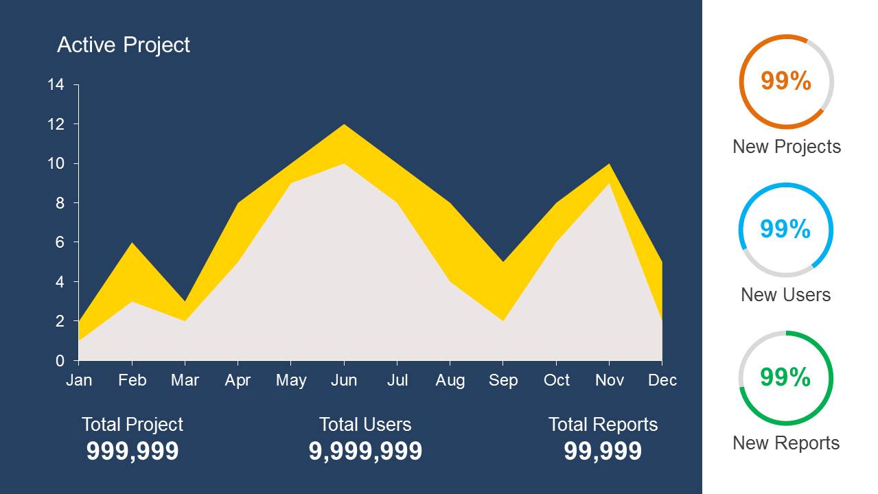
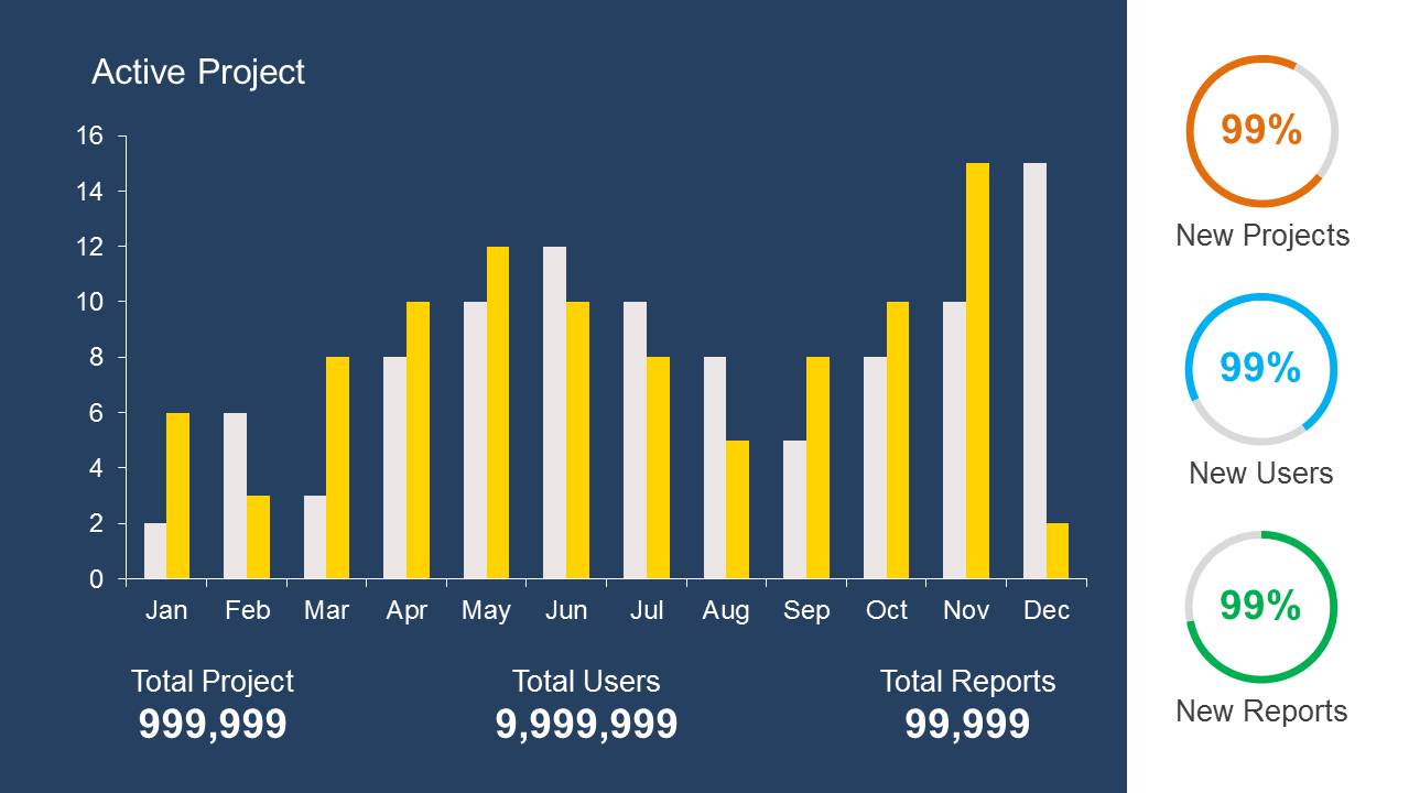
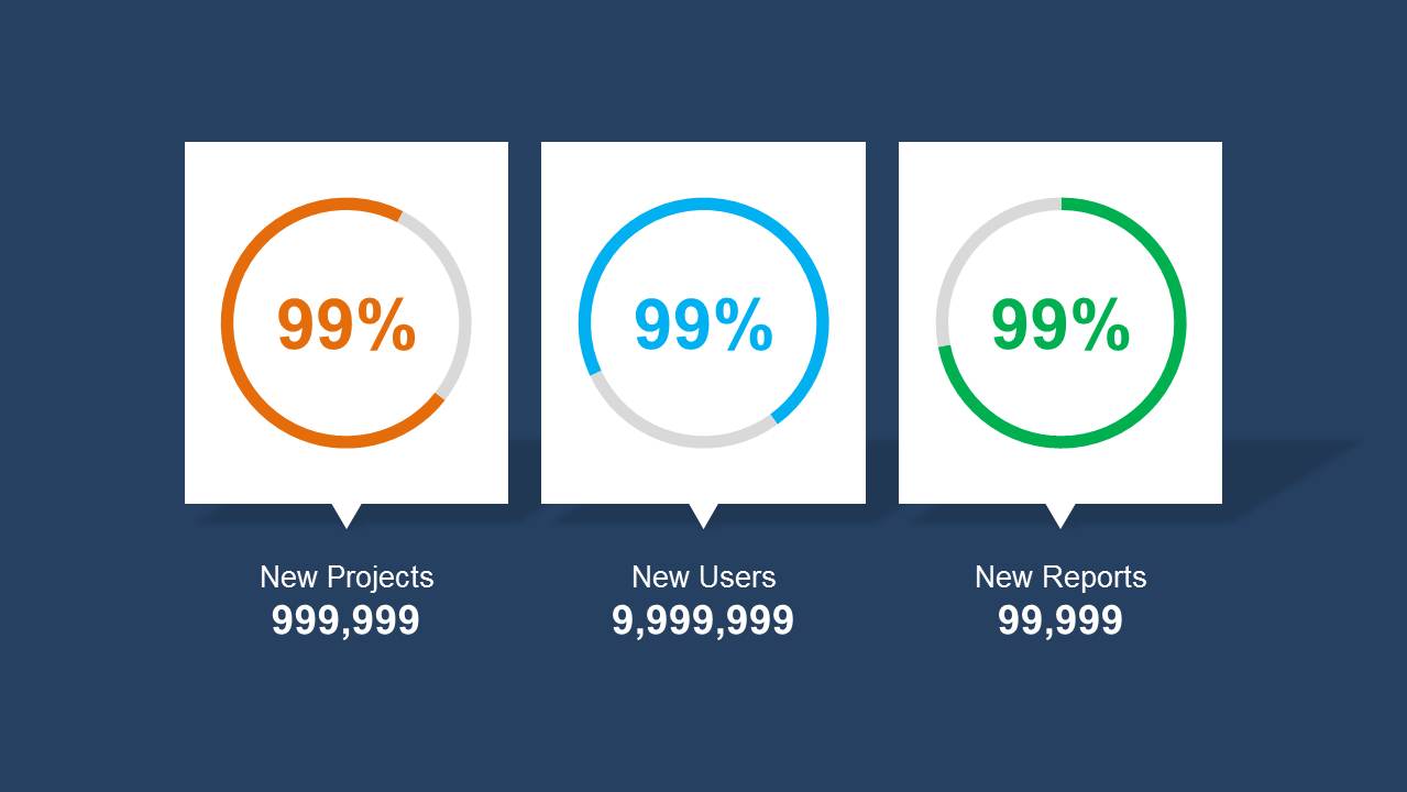
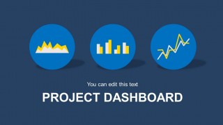
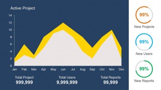
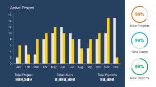
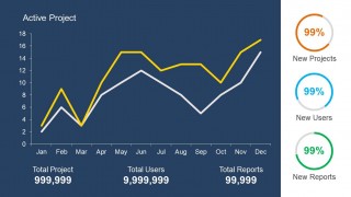
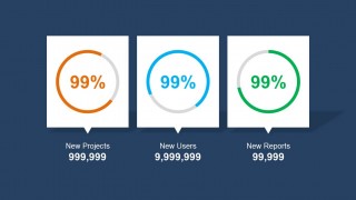
There are 5 slides in the outline. The first slide contains diagram icons- area chart, bar graph and line graph. Below the icons is the title Project Dashboard with an editable subheading. In the 2nd slide, the area graph is shown. The bottom part displays figures that describe the values on the plot. On the right side are donut charts that correspond to each quantitative figure’s percentage of New Projects, New Users and New Reports. The 3rd slide features a bar graph while the 4th slide has a line graph. All other layout components are basically on the same setting. In the last slide, a summary of ratios is illustrated. The user can give a conclusive speech on this part. Questions can be raised while this dashboard is on screen.
The PowerPoint template is somehow a resource of useful diagrams. Effective presentations generally use info-graphics. That is the edge of this collection. The visuals are attractive which can draw the attention of the audience. Minimal texts also allow an easier grasp of important details. Project dashboards serve as a dynamic tool in sharing the findings of a project. This way, researchers can relay the hard earned knowledge that they acquired on the process.
This is ideal for research project presentations. It is perfect for progress reports in business, organization and marketing. It has many more applications such as in academic, professional and personal demonstrations.
Impress global audiences with Blue Project Dashboard PowerPoint Template. Look into SlideModel’s Dashboard PowerPoint Templates for additional stunning selections.
What’s inside this template
Example presentation scenarios
- A project manager can use the area chart dashboard to show month-by-month activity and explain how total projects, users, and reports are moving over time.
- A business analyst can use the bar chart slide to compare monthly performance categories and support a data-backed operations review with leadership.
- A marketing or product team lead can use the line chart dashboard to discuss trend direction and call attention to changes across the year.
- An executive presenter can use the donut KPI summary slide to close a meeting with three headline ratios and the related numeric totals.
Features
- 100% editable presentation template
- Compatible with Microsoft PowerPoint and Google Slides
- Scalable vector shapes, icons and illustrations
- AI-Ready for Microsoft Copilot and Claude
- Instant access and download
Frequently asked questions
Q: How should a presenter structure a project update with this dashboard template?
A: Start with the title slide to frame the project and reporting period, then move from the area chart to the bar and line charts as separate evidence views. Use the donut KPI panel as a recurring cue so the audience can compare New Projects, New Users, and New Reports without relearning the layout each time.
Q: Who is this template best suited for in a business presentation?
A: This template fits project managers, analysts, and team leads who need to report progress with a small set of repeated KPIs. It is most useful when the audience wants a fast read on activity trends, monthly changes, and headline ratios rather than a detailed task-by-task project plan.
Q: Why does the design repeat the KPI donut panel beside different chart types?
A: The repeated donut panel creates a stable visual anchor while the main chart changes from area to bar to line. That design choice helps audiences separate the main comparison from the headline indicators. The circle metaphor also works well for ratios because it shows completion and proportion at a glance.

Blue Project Dashboard PowerPoint Template
5-slide presentation template for project dashboards with area, bar, line, and donut charts
Blue Project Dashboard PowerPoint Template is a 5-slide dashboard deck for project status reporting. It includes a title slide, area chart dashboard, bar chart dashboard, line chart dashboard, and donut KPI summary. Project managers, analysts, and business teams can present progress metrics, with chart data editable as an Excel spreadsheet in PowerPoint.
- Category
- Business PowerPoint Templates
- Rating


 Loading...
- Item ID
- 6301-02
- Colors
 Microsoft PowerPoint
  Microsoft Copilot
  Claude for PowerPoint
 Other formats supported
Subscribe today and get immediate
access to download our PowerPoint templates.