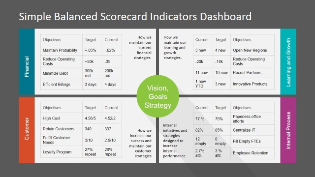
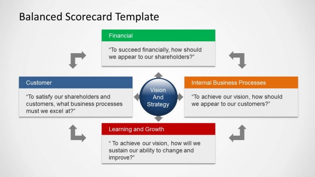
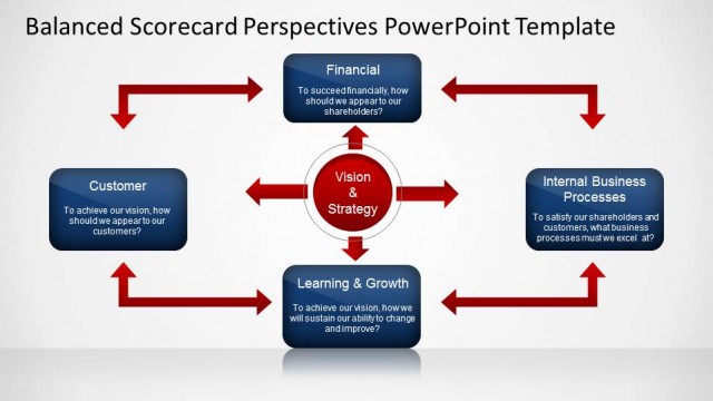
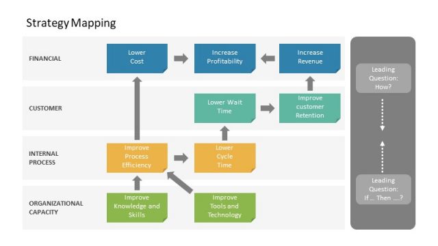
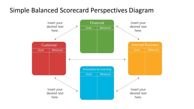
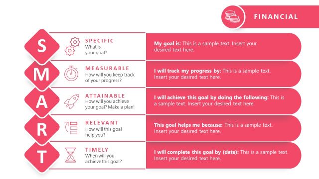
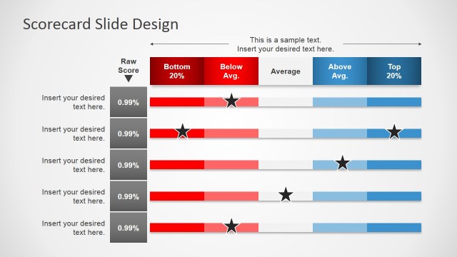
Balanced Scorecard Indicators Dashboard – Balanced scorecard was developed to steer the business towards its desired direction. This method of business management was created by Robert Kaplan and David Norton in the early 1990s. They pointed out that businesses at that time based its rate of success only through the financial aspects. They are able to evaluate whether the business is at a profit or loss but there wasn’t a tool used to maintain stability or to guide it towards increased growth. The balanced scorecard is a business management tool used to maneuver business operations towards its goals.
A business’s profit or loss data is an important tool in managing future growth. This information is used in generating a balanced scorecard template. For example, if a service oriented company experienced a break-even for the quarter with 60% customer satisfaction on one of its quarterly data, perhaps targeting 90% customer satisfaction on its balanced scorecard will yield more profit. Well this is just a plain example of how this method works. Target scores that result to increased profit are based on the aspects of the business that affects its financial growth the most.
Business organizations can have a holistic benchmark that is applicable to its entirety. However, in order to achieve this benchmark, all departments have to work together towards each desired target. A balanced scorecard keeps these departments or business aspects in check. It’s a set goal for each department and compared against their actual performance. This way, concerned parties are always aware whether or not they are meeting the goals, or if they need daily improvement and how much improvement is needed. This method of business management is a tool that helps unite the whole organization towards cohesive efforts.
With this scorecard dashboard PowerPoint template you can create review reports that appeal to global audiences.
What’s inside this template
Example presentation scenarios
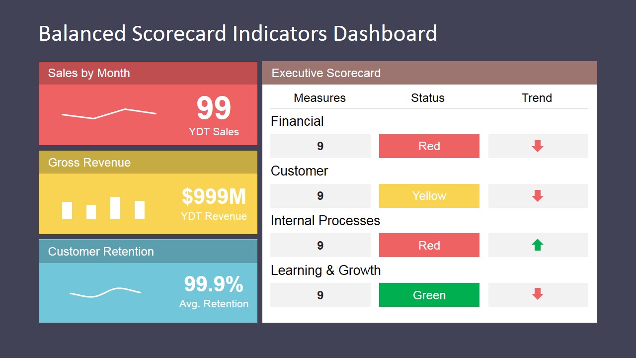
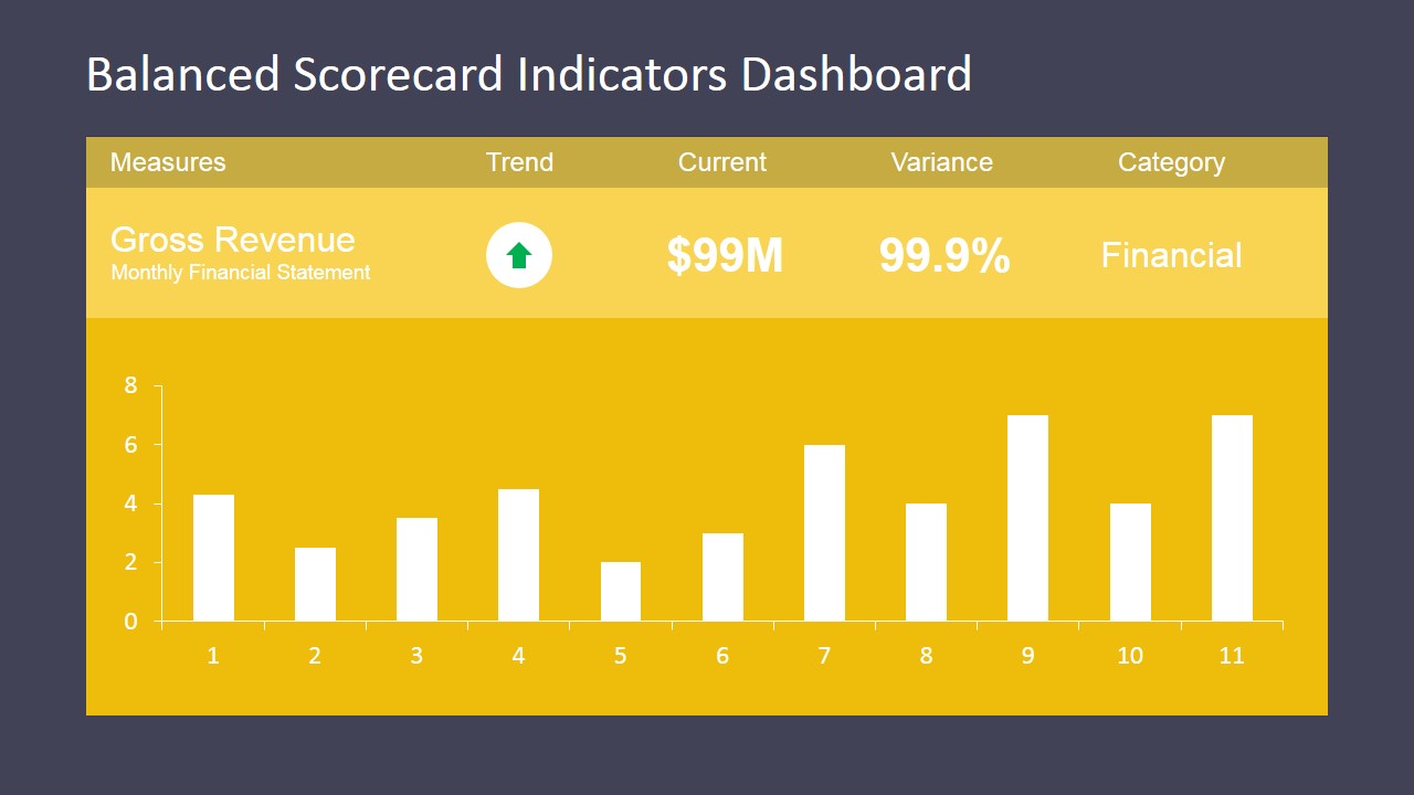
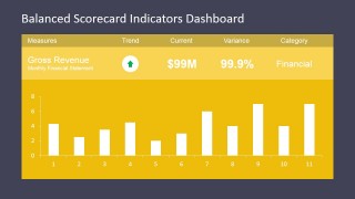
- A CFO can present quarterly financial performance by using the executive scorecard table and the gross revenue bar chart to compare current values, variance, and trend direction.
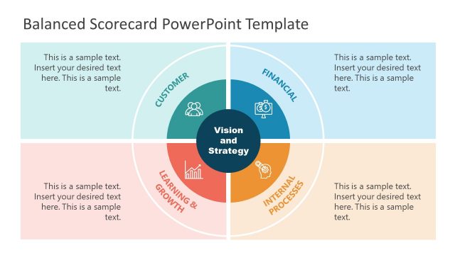
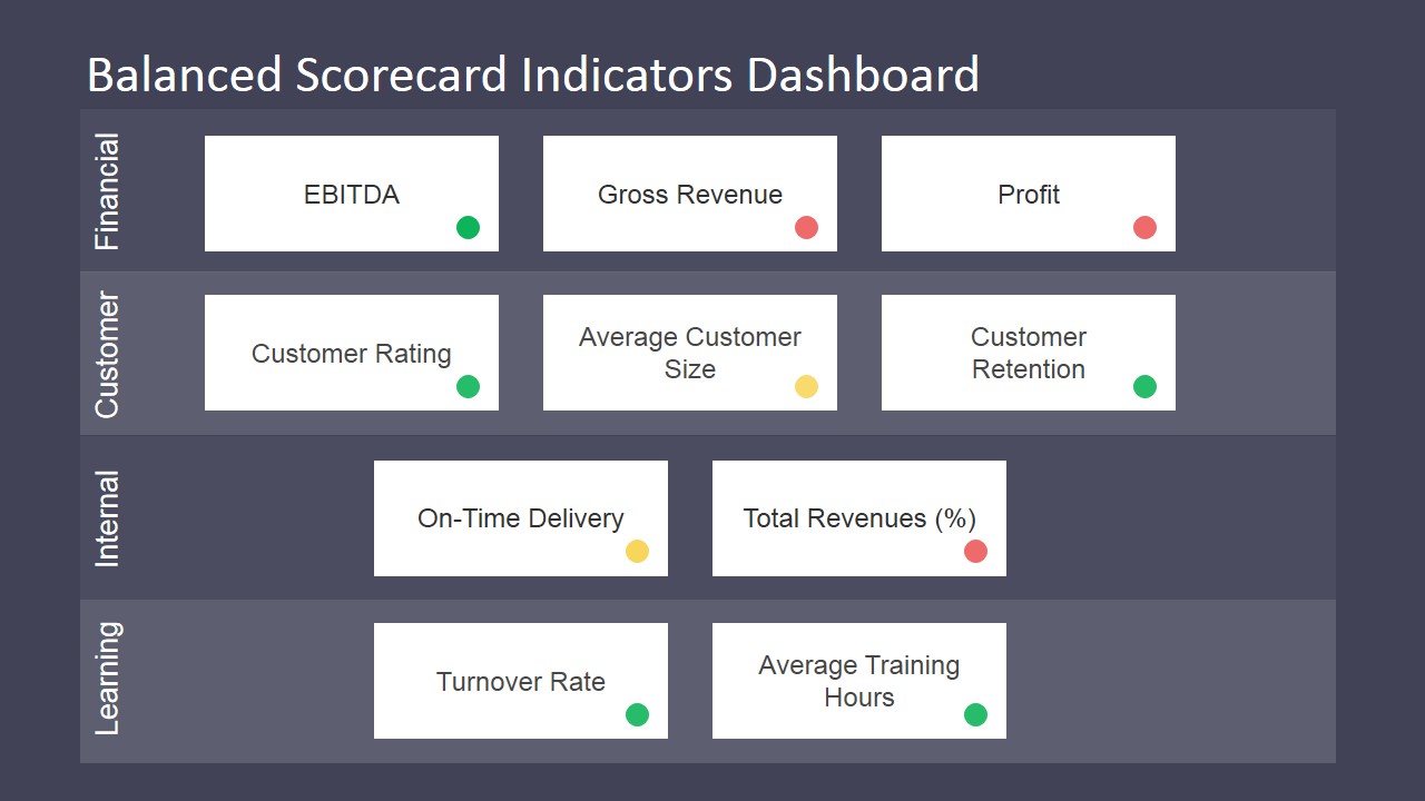
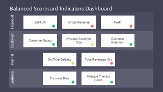
- A strategy manager can align leadership around balanced scorecard perspectives by using the indicator map with Financial, Customer, Internal, and Learning rows.
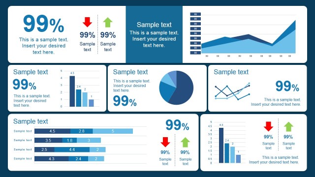
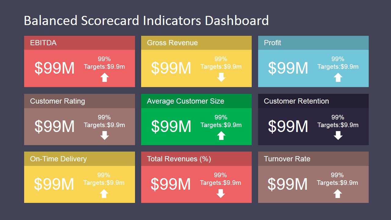
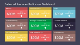
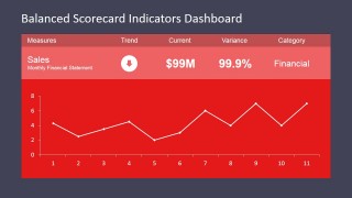
- An operations leader can report service delivery performance by replacing the KPI tile labels with internal measures and highlighting on-time delivery, retention, and turnover status.
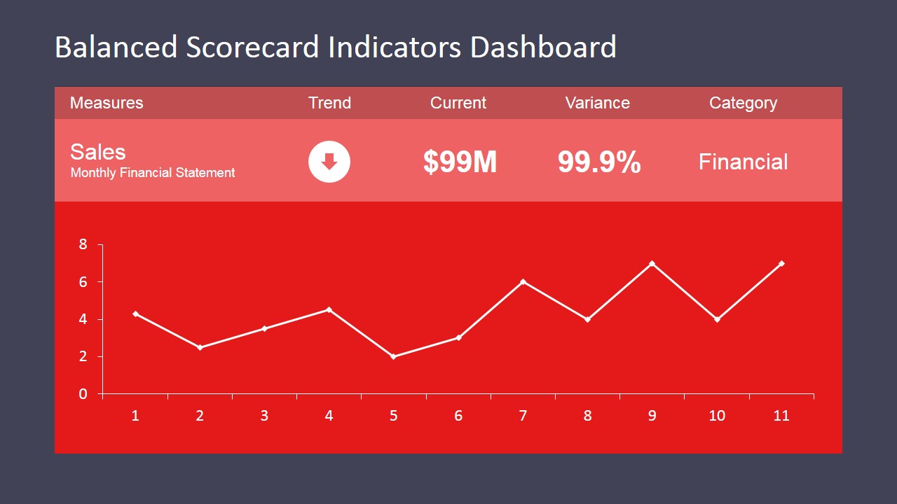
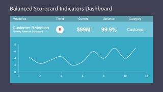
- A business analyst can summarize customer-facing metrics by using the customer retention line chart and the customer row of metric cards to separate trend discussion from scorecard status.
Features
- 100% editable presentation template
- Compatible with Microsoft PowerPoint and Google Slides
- 16:9 aspect ratio slides
- Scalable vector shapes, icons and illustrations
- AI-Ready for Microsoft Copilot and Claude
- Instant access and download
Frequently asked questions
Q: How should a presenter explain the scorecard without overwhelming executives?
A: Start with Slide 1 to frame the overall status in one view, then move only to the detail chart that explains the biggest variance. Use the KPI tile dashboard to show breadth, but reserve the line or bar chart slides for the few measures that require a decision or follow-up action.
Q: Who benefits most from this dashboard format?
A: This template fits executives, finance leads, strategy teams, and operations managers who must review performance against targets. It is strongest when the message depends on comparing status, variance, and trend across financial, customer, internal process, and learning categories rather than presenting a long narrative.
Q: Why does the design use tiles, status dots, and large color panels?
A: The tile structure lets the audience scan many KPIs before looking at a single chart. Status dots and trend arrows act as quick visual cues, while the large color panels separate each measure. This supports a dashboard metaphor: first see signal, then inspect the evidence.

Balanced Scorecard Indicators Dashboard
6-slide dashboard presentation template for balanced scorecard KPI tables, metric tiles, and trend charts
Balanced Scorecard Indicators Dashboard is a 6-slide data and charts template for performance reviews and management reporting. It includes an executive scorecard table, KPI tile dashboard, line chart detail slides, a bar chart slide, and a category indicator map for financial, customer, internal, and learning metrics in PowerPoint and Google Slides.
- Category
- Data & Charts
- Rating


 Loading...
- Aspect ratio
- 16:9, 4:3
- Item ID
- 6762-01
- Colors
 Microsoft PowerPoint
  Microsoft Copilot
  Claude for PowerPoint
 Other formats supported
Subscribe today and get immediate
access to download our PowerPoint templates.