Admin Dashboard PowerPoint Template
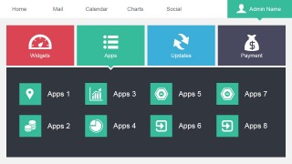
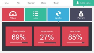
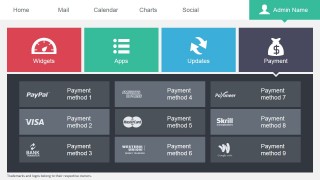
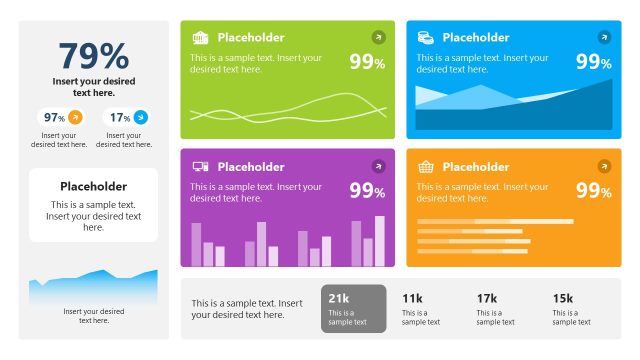
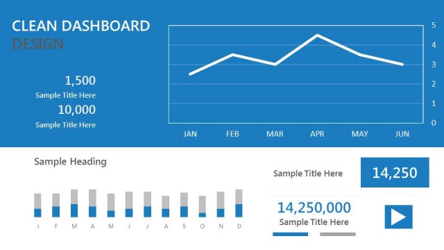
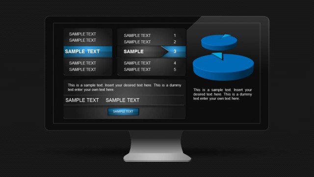
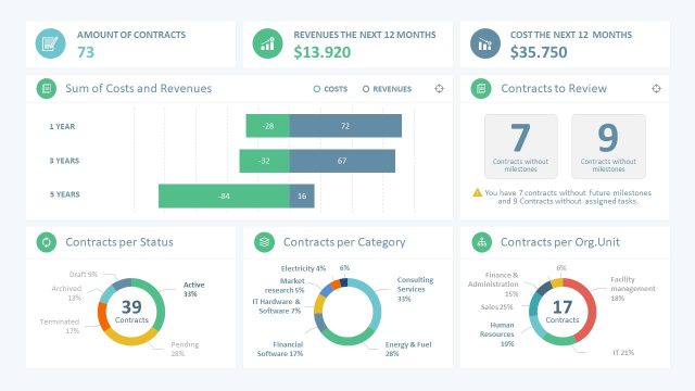
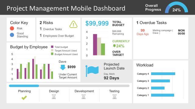
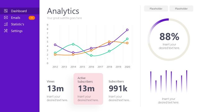
The Admin Dashboard PowerPoint Template provides an easy method of accessing several types of information at once. The PowerPoint Dashboard is designed with traditional publishing concepts, distributing the information along the slides with a predefined layout, proven to be effective for audience engagement. Create a fact-filled presentation that can cover a wide variety of key performance indicators.
The Admin Dashboard content is divided using a Tab concept. On the header of each slide, the highlighted tab references the topic of the agenda being discussed. This feature is a well known software metaphor. The audience can understand that the tabs are accessed sequentially from left to right, and the user can use these feature to progress over the presentation topics.
Each Tab provides a content design related to a software application layout:
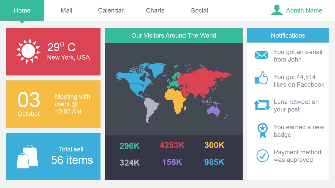
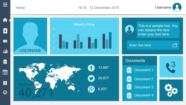
- Home Tab: The design is inspired in admin home pages or default views of analytics software. The main view has a world map reference (generally used for traffic or visits). In the left side bar 3 KPI’s are presented in a column style layout. Each KPI is identified with a PowerPoint Icon, that can be used later in the dashboard as a reference.
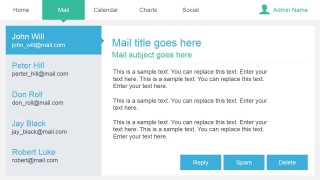
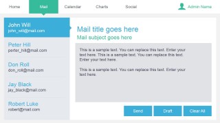
- Email Tab: Email is the main communication mean used in corporate environments. Employees are familiar with traditional Email clients layouts as Outlook; the slide is divided in two vertical tiles, where the left tile works as a tree browser and the right tile as a message container. The example layout provides a left side bar with different boxes resembling email threads, and a text placeholder in the right tile imitating an email message.
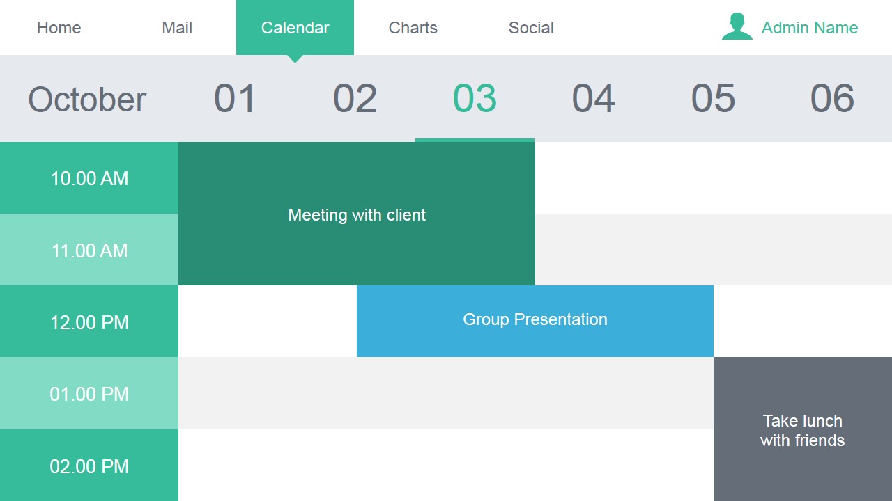
- Calendar Tab: Scheduling software has become the default tool for arranging meetings. The calendar Layout is a traditional matrix where each cell represents a day/time. Depending on the level of detail (month, week, day) the calendar layout might very. In the example a weekly layout is displayed, where each column represents a day and each cel a time of the day.
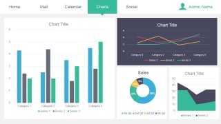
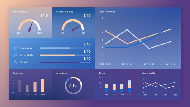
- Charts Tab: Infrastructure and Software provide several monitoring tools to check the health of their services. The Charts section of the dashboard allows the user to summarize Key Performance Indicators and their actual performance in a traditional scorecard layout, easily understood by executive audiences.
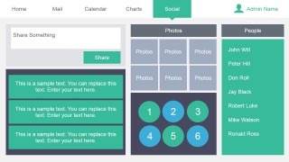
- Social Tab: Social media has reached the mainstream. For every organization the online reputation is an extremely valuable asset. Monitoring the social performance of an organization or brand is today a default activity within any marketing department. The social tab layout is designed to create presentations about social networks and their KPI’s.
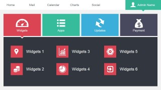
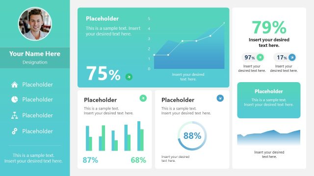
- Profile Tab: The profile tab resemble the “My Account” menu on any SaaS application. The presenter can use the different section icons to describe areas of interest.
The Admin Dashboard PowerPoint Template gives a modern, professional look and feel to KPI’s presentation. Every element of the dashboard is created as PowerPoint Shapes, allowing the user to fully customize their appearance according to the branding theme required. Any modification will not affect the image resolution of the design.
