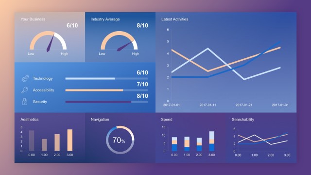
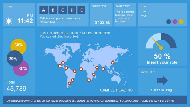
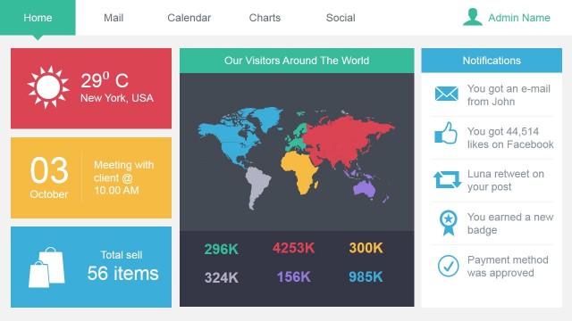
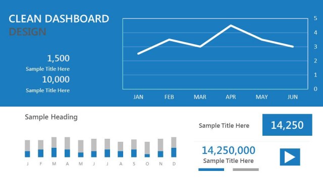
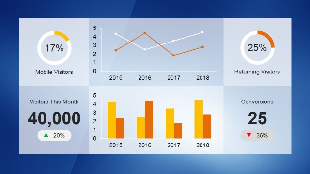
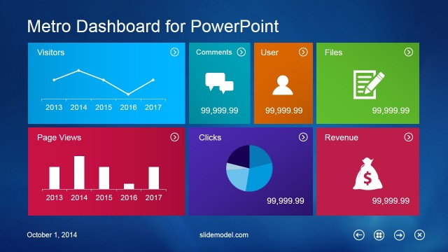
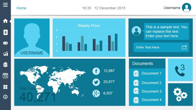
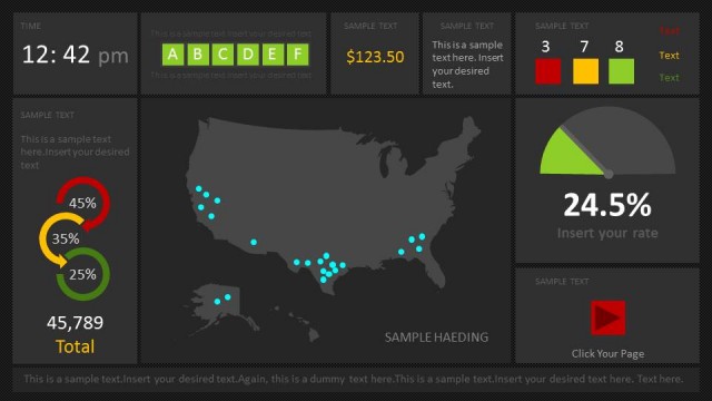
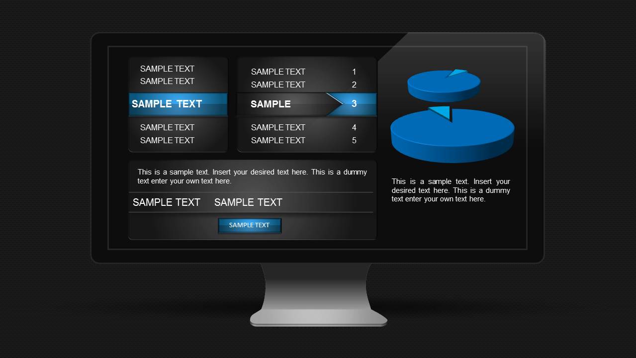
Monitor Dashboard Template for PowerPoint is a presentation design dashboard that you can use to present data to an audience using charts and gauges.
With this elegantly designed template you can create more meaningful slides by adding multiple sections with charts, text and tables in a visually appealing layout. This can help you make good use of slide space by presenting more information in fewer slides, within a layout that your audience can easily understand.
To create multiple dashboard slides, just duplicate the sample slide and customize it according to need.
What’s inside this template
Example presentation scenarios
- An operations manager can use the monitor dashboard to summarize current performance, highlight the pie chart, and point to the numbered KPI list during a leadership status meeting.
- A business analyst can present a quick metric snapshot by replacing the sample text panels with performance notes and using the chart area to compare a key data split.
- An IT or SaaS team lead can use the screen mockup to frame service monitoring results, with the menu panel acting as a status category list and the lower band as a summary callout.
- A project manager can adapt the dashboard for a steering committee update by turning the numbered list into priority issues and using the body text fields for next actions.
Features
- 100% editable presentation template
- Compatible with Microsoft PowerPoint and Google Slides
- 16:9 aspect ratio slides
- Scalable vector shapes, icons and illustrations
- AI-Ready for Microsoft Copilot and Claude
- Instant access and download
Frequently asked questions
Q: How should a presenter organize information on this single dashboard slide?
A: Start with the one message the audience must remember, then assign each visible area a role. Use the left panel for categories, the numbered list for ranked KPIs or exceptions, the pie chart for one simple proportion, and the lower text fields for interpretation. Avoid filling every sample label with equal weight.
Q: Who is this monitor dashboard layout best suited for?
A: This layout works best for presenters who need to report a snapshot rather than teach a full analysis. Operations managers, analysts, project leads, and IT teams can use it to show current status, quick comparisons, or issue priorities in a format that resembles a live monitoring screen.
Q: Why does the monitor metaphor help communicate dashboard information?
A: The monitor frame signals that the content is an active performance view, not a long report page. That metaphor helps audiences read the slide as a control panel: categories on the left, active metrics in the center, chart evidence on the right, and summary notes below for decisions.
Monitor Dashboard Template for PowerPoint
1-slide dashboard presentation template for KPI monitoring with screen mockup and pie chart
Monitor Dashboard Template for PowerPoint is a one-slide 16:9 dashboard template for presenting KPI status, performance notes, and summarized metrics. The visible layout includes a monitor screen mockup, pie chart, numbered list panel, text blocks, and button-style label areas for business reporting in Microsoft PowerPoint and Google Slides.
- Category
- Data & Charts
- Rating


 Loading...
- Aspect ratio
- 16:9
- Item ID
- 6002
- Colors
 Microsoft PowerPoint
  Microsoft Copilot
  Claude for PowerPoint
 Other formats supported
Subscribe today and get immediate
access to download our PowerPoint templates.