Seminar presentations serve as a critical platform for entrepreneurs, investors, and business leaders to communicate ideas, persuade stakeholders, and drive strategic outcomes. Whether pitching to secure funding, unveiling a new product, or sharing industry insights, the ability to deliver a compelling presentation can significantly influence business success.
A well-executed presentation informs decisions, builds credibility, and fosters trust, while a poorly designed one risks losing audience attention and undermining objectives. This article explores the art and science of crafting effective seminar presentations, offering strategic insights and practical guidance with real-life examples.
Table of Contents
- What is a Seminar Presentation?
- What are the Elements of a Seminar Presentation?
- Benefits of Seminar Presentations
- How to Create Content for a Seminar Presentation
- Advanced Techniques for Seminar Presentation Delivery
- Examples of Seminar Presentations
- Common Mistakes in Seminar Presentations
- FAQs
- Final Words
What is a Seminar Presentation?
A seminar presentation is a structured, formal delivery of information, ideas, or proposals to a targeted audience, typically in a professional or academic setting, with the intent to inform, persuade, or align stakeholders. Unlike casual talks or briefings, seminar presentations are characterized by their depth, organization, and focus on delivering actionable insights or driving specific outcomes, such as securing investment, sharing expertise, or aligning teams. In essence, they contrast with other structured presentation formats, like Pecha Kucha presentations, as the latter are fast-paced, idea-driven, whereas seminar presentations are strictly educational. They are commonly used in academic contexts, to share knowledge on latest developments, techniques, etc. Another side of seminar presentations lies in business contexts, such as conferences, board meetings, or pitch events, where entrepreneurs, investors, or business leaders communicate strategic plans, innovations, or market opportunities.
Seminar presentations blend verbal communication, visual aids (e.g., slide decks), and interactive elements (e.g., Q&A sessions) to convey complex information. They require a clear narrative arc, often following frameworks like Problem-Solution-Benefit, to guide the audience through a logical progression of ideas. The presenter’s delivery, tone, pacing, and confidence are critical in maintaining audience attention and reinforcing credibility. For example, an entrepreneur might use a seminar presentation at a tech conference to pitch a new software platform, combining market data, product demos, and customer testimonials to persuade investors.
Recommended lecture: Presentation skills
The duration of seminar presentations typically ranges from 15 to 60 minutes, depending on the context, with time allocated for audience interaction. They demand thorough preparation to ensure clarity and impact, including audience analysis, content structuring, and rehearsal. In business settings, the stakes are high: a well-executed seminar presentation can secure funding, build partnerships, or shape organizational strategy, while a poorly delivered one risks losing credibility or opportunities.
What are the Elements of a Seminar Presentation?
As in any other presentation type, the seminar presentation requires a specific structure for its performance success. This section will cover these slides individually and what’s required regarding content.
Title Slide
Whenever we plan on how to start a presentation, we need to consider the first visual impact. The title slide introduces the presentation, providing the topic (also known as the presentation title), the presenter’s name, the organization, and date. It sets a professional tone and frames the session’s purpose, ensuring the audience understands the educational or strategic focus.
Example: For a sustainability expert presenting at an environmental conference, the title slide might read: “Sustainable Business Practices for the Future – Dr. Maria Gomez, EcoConsult, July 15, 2025,” with a nature-inspired background and the organization’s logo.
Agenda Slide
The agenda slide outlines the presentation’s structure, listing key sections or topics to guide the audience through the content. It enhances comprehension by providing a roadmap for the session’s educational goals.
Example: A leadership coach presenting at a corporate training workshop might include an agenda slide with: “Leadership Challenges, Effective Strategies, Case Studies, Group Discussion,” displayed as a series of icons representing each section.
Context or Problem Statement Slide
This slide establishes the presentation’s background or challenge, using data or narratives to highlight its relevance. A problem statement slide aligns the audience with the topic’s importance and sets the stage for deeper exploration.
Example: A public health researcher at a global health summit might use a slide stating: “Non-communicable diseases account for 70% of global deaths,” with a world map highlighting affected regions to underscore the issue’s scope.
Key Insights or Solution Slide
This slide presents core findings, strategies, or solutions related to the topic, offering actionable or thought-provoking ideas. It may include frameworks, visuals, or examples to clarify complex concepts for the audience.
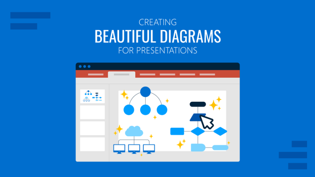
Example: An urban planner discussing smart cities at a municipal conference might show a slide with a diagram of IoT-enabled infrastructure and points like: “Real-time traffic management, 15% energy savings, community engagement tools.”
Industry Trends Slide
In a business context, this slide highlights relevant market, technological, or societal trends, using data to provide context and demonstrate the topic’s timeliness. It positions the presentation as forward-thinking and relevant.
Example: A retail analyst at a commerce expo might include a slide with a line graph showing a 20% rise in e-commerce adoption, noting: “Shift to omnichannel retailing drives consumer expectations.”
Comparative Analysis Slide
The comparative analysis slide evaluates different approaches, tools, or strategies related to the topic, highlighting strengths and trade-offs. It fosters critical thinking rather than promoting a single solution.
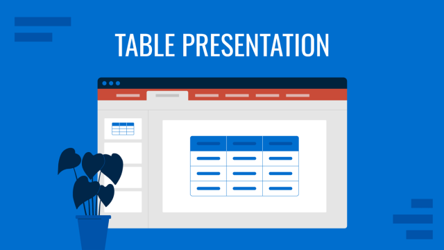
Example: An education consultant presenting on learning technologies might use a table comparing virtual classrooms, hybrid models, and in-person teaching, with columns for cost, accessibility, and engagement.
Impact Assessment Slide
This slide quantifies or qualifies the potential impact of the discussed strategies or trends, using data or projections to illustrate benefits or implications. It reinforces the topic’s significance.
Recommended lecture: Opportunity assessment presentation
Example: A renewable energy advocate might present a bar chart showing a projected 25% reduction in carbon emissions by 2030 through wind power adoption, based on industry forecasts.
Case Study or Example Slide
The case study slide provides real-world examples or success stories to ground the presentation in practical applications, making abstract concepts relatable and credible.
Example: A diversity trainer at a corporate summit might include a slide detailing a company’s inclusive hiring initiative: “Increased employee retention by 30%,” with a timeline of key actions and outcomes.
Challenges and Considerations Slide
This slide identifies potential obstacles or ethical considerations related to the topic and offers strategies to address them. It demonstrates thorough analysis and builds audience trust.
Example: A data privacy expert might list challenges like “Consumer distrust in data usage” with considerations like “Transparent consent protocols,” presented in a two-column layout.
Next Steps or Call-to-Action Slide
The next steps slide ends a presentation with recommendations for further exploration, collaboration, or action, encouraging the audience to apply the insights gained. It focuses on strategic or educational follow-through rather than immediate commitment.
Recommended lecture: Call-to-Action slide
Example: A fintech researcher at a banking conference might use a slide stating: “Engage with regulators to shape digital currency policies – join our working group,” with a QR code linking to a sign-up page.
Benefits of Seminar Presentations
Establishing Credibility and Authority
Seminar presentations offer a unique opportunity to position oneself or one’s organization as a thought leader. For entrepreneurs, a seminar presentation can showcase expertise, demonstrating deep market understanding to potential investors. It can reinforce organizational competence for business leaders, aligning stakeholders around a shared vision. The key lies in structuring content to balance authority with accessibility, ensuring the audience perceives the presenter as knowledgeable without feeling overwhelmed by complexity.

To achieve this, presenters should leverage the Ethos-Pathos-Logos framework from classical rhetoric. Ethos establishes credibility through credentials, experience, or endorsements; Pathos connects emotionally with the audience’s values or challenges; and Logos provides logical arguments backed by data. For example, an entrepreneur pitching a tech startup might open with a personal story of identifying a market gap (Pathos), cite their team’s expertise in the sector (Ethos), and present market analysis with revenue projections (Logos). This approach builds trust and primes the audience for persuasion.
Driving Decision-Making and Investment
Seminar presentations often aim to influence high-stakes decisions, such as securing funding or gaining board approval. Investors and business leaders prioritize clarity, evidence, and alignment with their goals. A presentation articulating a clear value proposition, supported by robust data, can tip the scales in favor of approval. For instance, a startup seeking venture capital might present a slide deck with a concise problem-solution framework, market size estimates, and a competitive analysis to demonstrate potential returns.
Presenters should adopt the Decision-Making Matrix to enhance decision-making. This tool organizes information into categories like risks, benefits, costs, and alternatives. Visualizing this matrix in a slide can help audiences weigh options systematically.
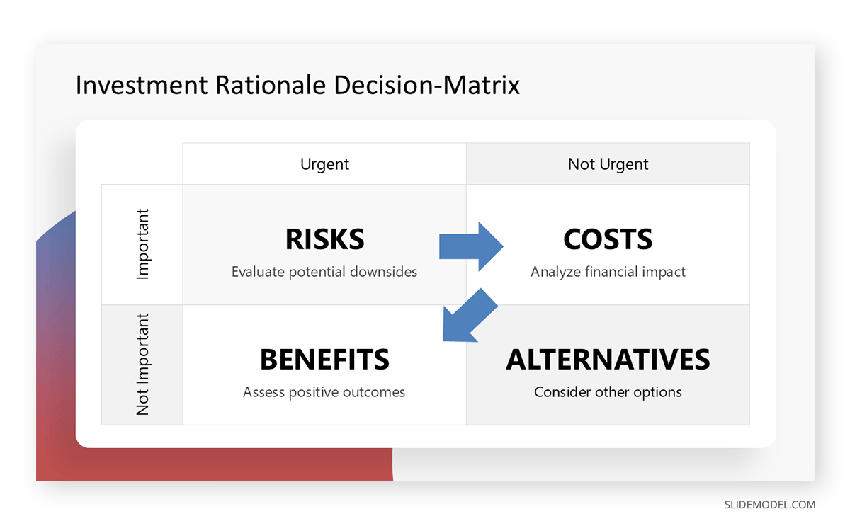
For example, a slide titled “Investment Rationale” could include a quadrant chart plotting risk versus reward, with data points illustrating the proposed venture’s position relative to competitors. Such visuals make complex information digestible, enabling stakeholders to make informed choices.
Recommended lecture: Data-driven decision making
Fostering Collaboration and Alignment
Beyond persuasion, presentations can unite diverse stakeholders around a common goal. For business leaders, seminars often serve as a forum to align teams, partners, or clients on strategic priorities. A clear, structured presentation ensures all parties understand the objectives, roles, and expected outcomes. This is particularly vital in cross-functional settings, where miscommunication can derail progress.
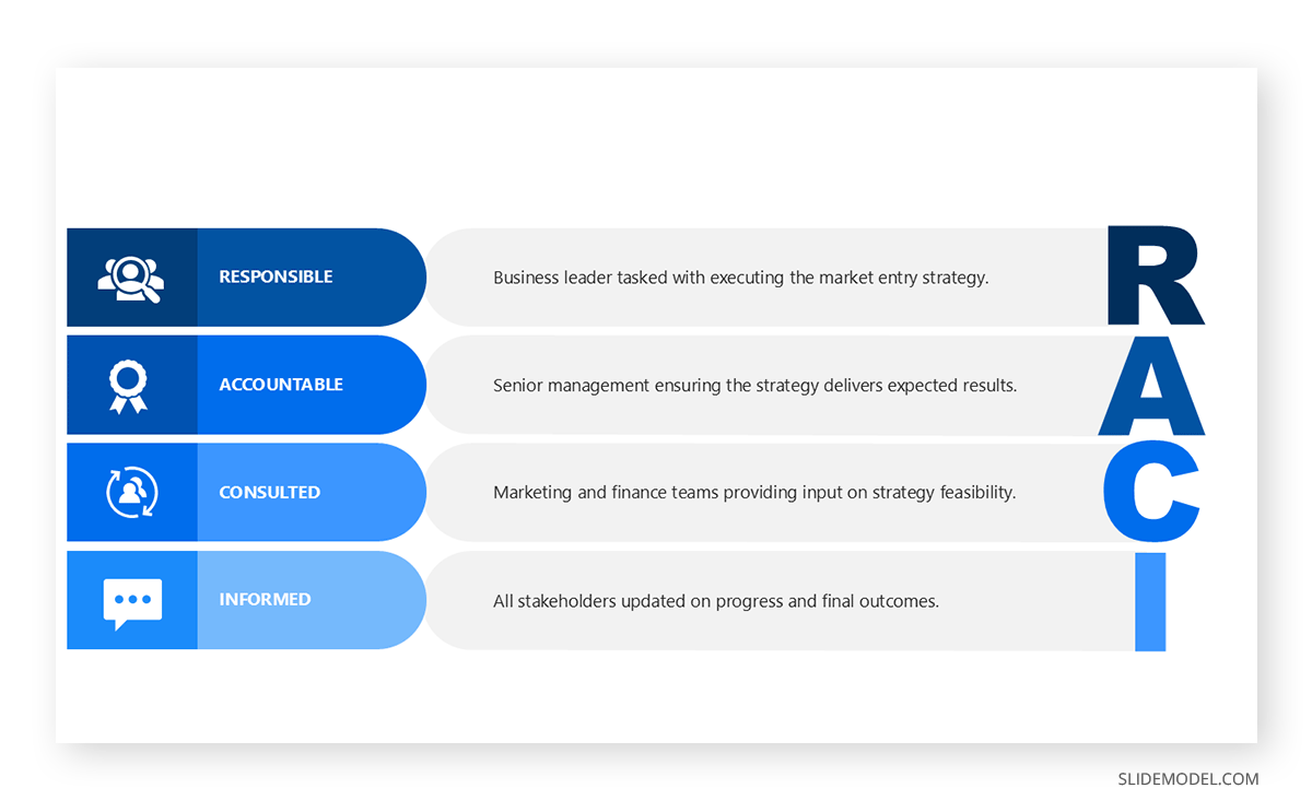
The RACI model (Responsible, Accountable, Consulted, Informed) can guide presenters in clarifying roles during a seminar. For instance, a business leader presenting a new market entry strategy might include a slide outlining who is responsible for execution, who is accountable for results, and who needs to be consulted or informed.
How to Create Content for a Seminar Presentation
Audience Analysis and Tailoring Content
Effective presentations begin with a deep understanding of the audience. Entrepreneurs pitching to venture capitalists must emphasize financial returns and scalability, while business leaders addressing employees might focus on operational impacts and team roles. Conducting audience analysis involves identifying their priorities, knowledge level, and decision-making criteria.
A practical approach is to use the Audience Persona Framework, which segments the audience into archetypes based on their goals, challenges, and influence. For example, an entrepreneur might create personas for “The Skeptical Investor” (who prioritizes risk mitigation) and “The Visionary Partner” (who values innovation). Tailoring content to these personas ensures relevance. A slide deck for the skeptical investor might include a detailed risk mitigation plan, while one for the visionary partner could highlight disruptive technology features.
Structuring for Clarity and Impact
A well-structured presentation guides the audience through a logical narrative, making complex ideas accessible. The Problem-Solution-Benefit (PSB) framework is particularly effective for business audiences. It begins by outlining a pressing problem, proposes a solution, and concludes with the benefits of adoption. This structure keeps the audience focused and builds a persuasive case.
For example, a business leader presenting a digital transformation strategy might structure their talk as follows:
- Problem: Legacy systems hinder operational efficiency and customer satisfaction.
- Solution: Implement a cloud-based platform with AI-driven analytics.
- Benefits: Reduced costs, improved customer retention, and scalable growth.
Each section should be supported by data or examples, such as a case study of a competitor who achieved a 20% cost reduction through similar technology. Visual aids, like a flowchart showing the transformation process, can enhance clarity.
Designing Effective Visuals
Visuals play a critical role in reinforcing key messages and maintaining audience attention. However, poorly designed slides can distract or confuse. The Signal-to-Noise Ratio principle emphasizes maximizing relevant information while minimizing clutter. This means using clean layouts, consistent fonts, and purposeful graphics.
Recommended lecture: Visual communication for presentations
Consider a slide presenting market growth projections. Instead of a dense table, a line graph with clear labels and a single color scheme can convey trends effectively. Annotations like arrows highlighting key inflection points draw attention to critical insights. For example, a graph showing a 15% year-over-year market growth rate might include a note: “Driven by rising demand in Asia-Pacific.” Tools like PowerPoint templates can help create professional visuals, but the focus should remain on simplicity and relevance.
Practicing Delivery and Timing
Even the best content can fall flat without confident delivery. Business audiences expect polish and precision, as hesitation or rambling can erode credibility. Practicing the presentation multiple times, ideally in front of a test audience, helps refine pacing and tone. Recording practice sessions allows presenters to identify filler words, awkward pauses, or unclear explanations.
Guy Kawasaki’s 10-20-30 rule offers a useful guideline for timing: a presentation should have 10 slides, last 20 minutes, and use 30-point font for readability. While not universal, this framework encourages brevity and focus. For a 30-minute seminar, allocate 20 minutes for the core presentation and 10 minutes for questions, ensuring ample time for discussion without rushing.
Advanced Techniques for Seminar Presentation Delivery
Leveraging Storytelling
Storytelling humanizes data and makes presentations memorable. Despite their analytical focus, business audiences respond to narratives that contextualize information. The Hero’s Journey framework, adapted for business, positions the audience or organization as the hero overcoming challenges through the presenter’s solution.
For instance, an entrepreneur might frame their startup’s journey as follows:
- Ordinary World: The market struggles with inefficient solutions.
- Call to Adventure: The startup develops a groundbreaking technology.
- Trials and Triumphs: Early pilots yield promising results despite setbacks.
- Return with Elixir: The technology scales, delivering transformative value.
A slide summarizing this narrative, with visuals like a timeline or customer testimonials, can make the story tangible. For example, a testimonial quote from a pilot customer, “This solution cut our processing time by 40%”, adds credibility and emotional resonance.
Incorporating Data and Evidence
Data is the backbone of any business presentation, but raw numbers alone can overwhelm. The Data-Insight-Action framework ensures that data serves a purpose. Start with the data (e.g., “Market size grew 12% in 2024”), derive an insight (e.g., “Driven by demand for sustainable products”), and propose an action (e.g., “Launch a green product line by Q3 2025”).
Visualizing data effectively is equally important. A bar chart comparing market growth across regions can highlight opportunities, while a pie chart showing revenue sources can clarify financial stability. Tools like Tableau or Excel can generate these visuals, but presenters should ensure they align with the narrative. For instance, a “Market Opportunity” slide might pair a growth chart with a bullet point: “Target 10% market share by 2026.”
Handling Questions and Objections
Anticipating and addressing audience questions strengthens credibility. Business audiences, particularly investors, often probe for weaknesses in a proposal. The STAR method (Situation, Task, Action, Result) can structure responses to tough questions. For example, if asked about competitive risks, an entrepreneur might respond:
- Situation: Competitors dominate the mid-tier market.
- Task: Differentiate our offering to capture share.
- Action: Develop a unique pricing model and superior customer support.
- Result: Early trials show 30% higher customer retention than competitors.
Practicing responses to common objections, such as concerns about scalability or ROI, prepares presenters to remain composed and authoritative. A slide summarizing key risks and mitigations can also preempt questions, demonstrating proactive thinking.
Examples of Seminar Presentations
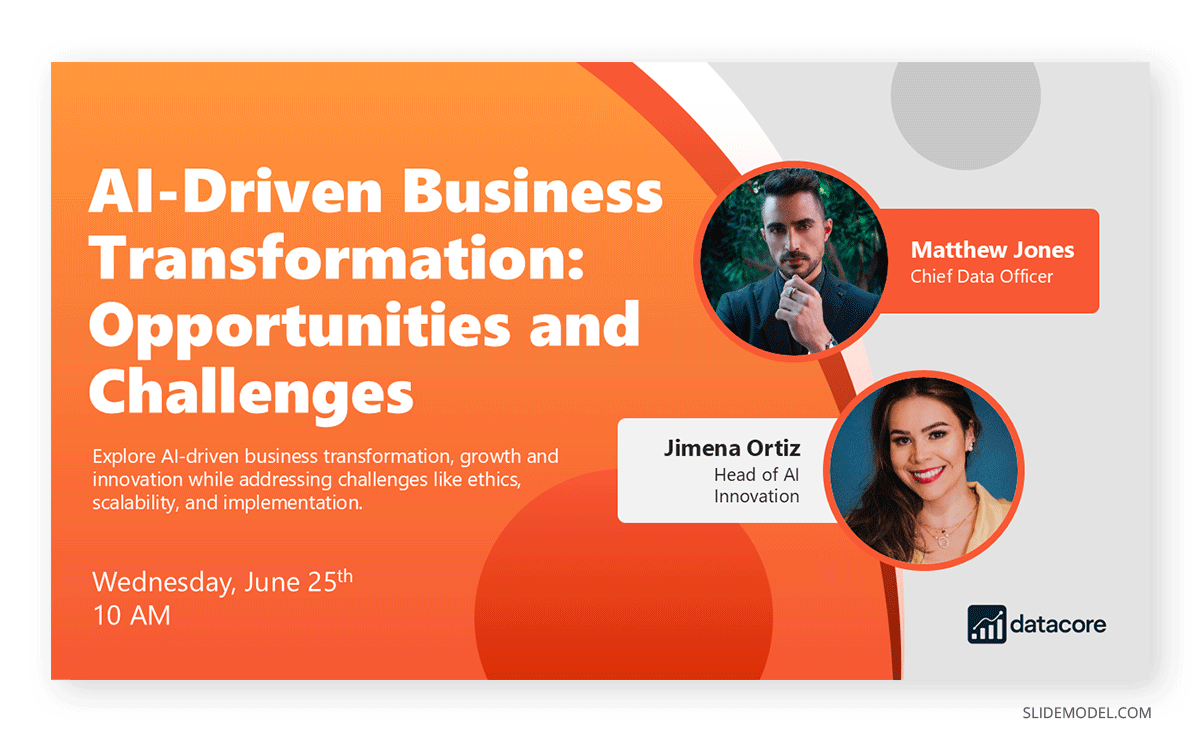
In order to learn more about the principles behind seminar presentations, we’ll explore a case study. A tech consultancy, DataCore Solutions, delivered a 30-minute seminar presentation at a global technology conference titled “AI-Driven Business Transformation: Opportunities and Challenges.” The presentation, aimed at entrepreneurs, investors, and business leaders, sought to educate attendees on leveraging AI for operational efficiency while addressing implementation hurdles. The presenter, DataCore’s Chief Innovation Officer, used a 16-slide deck structured around the Problem-Solution-Benefit framework to provide actionable insights and foster strategic discussions.
Context and Objective
The objective was to inform and inspire the audience to adopt AI strategies, highlighting practical applications and potential pitfalls, rather than pitching a specific product. The audience included tech entrepreneurs, corporate executives, and investors seeking to understand AI’s business impact. The conference setting encouraged thought leadership and knowledge-sharing, aligning with seminar presentation goals.
Slide Structure and Content
The title slide featured DataCore’s logo, the title “AI-Driven Business Transformation: Opportunities and Challenges,” and the presenter’s name, setting a professional tone. The agenda slide listed: “AI’s Business Potential, Implementation Strategies, Case Studies, Risks, Next Steps,” presented as a circular diagram for visual clarity.
The context slide outlined: “70% of businesses struggle with operational inefficiencies, costing $1.2 trillion annually,” supported by a bar chart comparing efficiency losses across industries. The key insights slide proposed AI-driven strategies, such as predictive analytics and automation, with a flowchart showing how AI integrates into supply chain processes. Key points included: “20% efficiency gains, real-time decision-making, scalable deployment.”
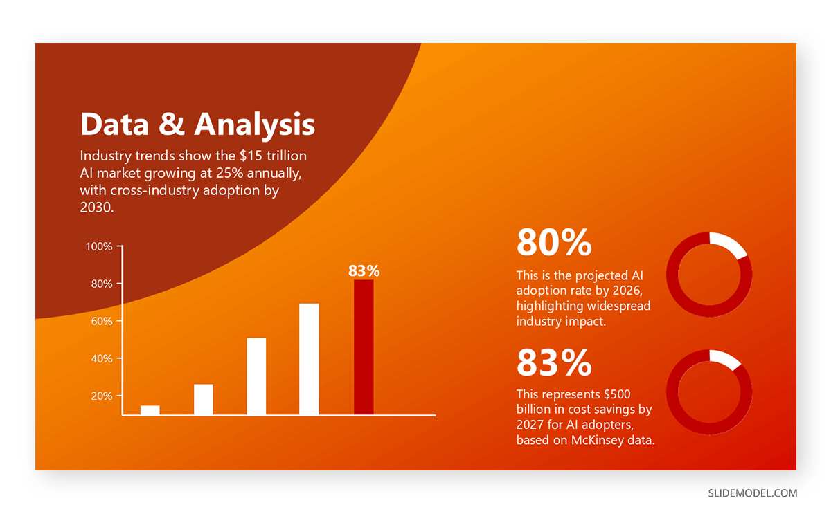
The industry trends slide used a line graph to show the $15 trillion AI market growing at 25% annually, noting: “Cross-industry adoption by 2030.” The comparative analysis slide featured a 2×2 matrix (x-axis: AI capability; y-axis: implementation cost), comparing AI providers like IBM and Google, with DataCore’s consulting approach in the high-capability, mid-cost quadrant to illustrate its advisory value. The impact assessment slide estimated industry-wide savings, projecting $500 billion in cost reductions by 2027 for AI adopters, based on McKinsey data, presented in a bar chart.
The case study slide highlighted a retail client: “Increased sales 15% using our AI recommendation engine,” with a before-and-after revenue graph and the client’s logo. The challenges and considerations slide addressed concerns like “Data bias” and “High upfront costs,” listing strategies such as “Ethical AI frameworks” and “Phased implementation plans” in a table. The next steps slide concluded with: “Explore AI adoption with DataCore – schedule a strategy workshop,” including a QR code linking to a consultation page.
Visuals and Delivery
Slides were designed in Canva with a sleek gray-blue scheme, adhering to the Signal-to-Noise Ratio principle. The matrix and financial charts used contrasting colors to emphasize key data, while a 45-second animated diagram on the key insights slide illustrated AI integration.
The presenter rehearsed 10 times, following the 10-20-30 rule (10 content slides, 20 minutes for core content, 30-point font), and delivered with clear pacing and audience engagement techniques, such as posing questions like “How many of you face data silos?” A 10-minute Q&A session addressed concerns, such as AI ethics, using the STAR method: “Bias in AI is a critical issue [Situation]. Our task is to ensure fairness [Task]. We’ve deployed bias-detection algorithms and third-party audits [Action], reducing error rates by 30% [Result].”
Outcome
The presentation was rated 4.8/5 by conference attendees, with 200 participants requesting follow-up workshops. Several entrepreneurs and executives initiated partnerships with DataCore, citing the presentation’s clear insights and practical strategies. The case study slide and challenges table were praised for grounding AI’s potential in real-world examples and addressing audience concerns.
Common Mistakes in Seminar Presentations
Avoiding Information Overload
Presenters often cram too much information into slides, overwhelming audiences. To avoid this, adhere to the One Idea Per Slide principle. Each slide should focus on a single concept, such as market opportunity or competitive advantage, supported by one key visual or data point. For example, a slide on customer acquisition might feature a single statistic, “80% of users convert within 30 days”, paired with a simple bar chart, rather than a dense metrics table.
Recommended lecture: Rules of PowerPoint presentations
Managing Time Constraints
Running out of time is frequent, particularly in seminars with strict schedules. To manage this, prioritize key messages and allocate time proportionally. The 80/20 rule applies: 80% of the impact comes from 20% of the content. Identify the core message (e.g., “Our solution delivers 15% higher ROI than competitors”) and build the presentation around it, relegating secondary details to an appendix or Q&A.
Adapting to Audience Feedback
Live seminars require flexibility. Presenters must adjust on the fly if the audience seems disconnected or confused. Techniques include pausing to ask for feedback, summarizing key points, or skipping less critical slides to focus on high-priority topics are good tactics to build an engaging presentation. For example, if investors signal interest in financials, the presenter might pivot to a detailed revenue model slide, using a prepared backup visual to maintain flow.
FAQs
Why are seminar presentations critical for business leaders?
Seminar presentations establish credibility, influence decisions, and foster alignment. They allow leaders to showcase expertise, shape perceptions, and drive strategic outcomes, such as partnerships or policy changes.
How many slides should a seminar presentation include?
Aim for 10–15 slides for a 20–30 minute presentation, following the 10-20-30 rule (10 slides, 20 minutes, 30-point font) for conciseness and readability. Each slide should convey one key idea, supported by visuals. For a 30-minute seminar, allocate 10 slides for content, 2 for introduction/conclusion, and reserve time for Q&A, ensuring focus without overwhelming the audience.
What types of visuals enhance seminar presentations?
Visuals like charts, diagrams, and infographics clarify complex ideas, adhering to the Signal-to-Noise Ratio principle (maximize content, minimize clutter). For example, a line graph showing market growth or a flowchart of a process effectively engages audiences.
How can I make my seminar slides visually effective without overwhelming the audience?
Use clean layouts, consistent fonts, and a limited color palette (3–4 colors). Apply the One Idea Per Slide principle, ensuring each slide focuses on a single concept, supported by one visual (e.g., a pie chart for market share).
What role does storytelling play in seminar presentations?
Storytelling humanizes data and makes insights memorable, using frameworks like the Hero’s Journey to frame the audience’s challenges and solutions.
What is the best way to open a seminar presentation?
Start with a compelling hook to capture attention, such as a statistic, question, or anecdote. For example, “Did you know 60% of businesses fail to leverage data effectively?” aligns the audience with the topic.
How do I conclude a seminar presentation effectively?
Summarize key insights and provide a clear next step, using a call to action like “Join our working group to explore these strategies” to reinforce the topic’s strategic importance.
Final Words
Seminar presentations are powerful tools for entrepreneurs, investors, and business leaders to communicate ideas, influence decisions, and drive strategic outcomes. Presenters can maximize impact by grounding presentations in audience analysis, clear structure, and persuasive techniques like storytelling and data visualization. Frameworks such as Ethos-Pathos-Logos, Problem-Solution-Benefit, and Data-Insight-Action provide a roadmap for crafting compelling content, while practical tools like the Competitive Landscape Matrix enhance clarity. Avoiding pitfalls like information overload and practicing delivery ensures polish and professionalism.
For business leaders, the stakes are high: a successful presentation can secure funding, align teams, or shape market perceptions. To elevate your next seminar, apply these principles by tailoring content to your audience, using purposeful visuals, and rehearsing rigorously. The result will be a presentation that informs and inspires action, delivering tangible value in today’s competitive business landscape.