A current state vs future state presentation is one of the most requested slide formats in corporate decks, and it earns that reputation for a practical reason. Executives rarely approve a plan because it sounds reasonable on a call. They approve it after seeing, on a single slide, where the business stands today and where it will stand once the plan runs its course.
This guide covers how to build that slide with the rigor a board, a client, or an academic committee expects: what belongs on the current state side, what belongs on the future state side, how to lay both out so the comparison reads within seconds, and which frameworks give the transition enough weight to survive follow-up questions. The focus stays on slide design as much as on argument, because a comparison this consequential gets judged on legibility and visual hierarchy just as much as on the underlying logic. Whether the presentation deck supports a transformation program or a client proposal, the same design discipline applies.
What a Current State vs Future State Presentation Communicates
At its core, this slide format answers two questions side by side: what is true about the business right now, and what will be true after a defined set of changes takes hold. The format borrows from change management theory, which treats movement between states as a project in itself rather than an automatic byproduct of a good decision. A strategic planning process typically produces this comparison as a central artifact, because leadership needs a shared reference point before committing budget or headcount to a shift in direction.
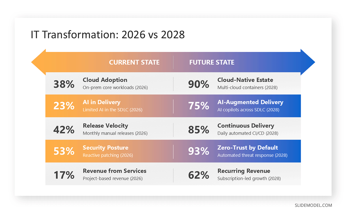
The format’s strength lies in its constraints. A current state vs future state slide forces the presenter to commit to specifics rather than aspirations. “Improve customer experience” is not a future state; “reduce average response time from 48 hours to 4 hours” is. That discipline is also why the slide works so well as a storytelling device inside a longer presentation: it gives the audience a clear before and a clear after, with the rest of the slide deck serving as the bridge between them. Readers do not need paragraphs of explanation to grasp the stakes; they need two columns that are honest about the gap and specific about what closes it.
Why This Format Matters in Corporate and Academic Settings
In corporate settings, this slide most often appears at the start of a digital transformation initiative or in a budget request, where sponsors need to see the gap size before funding the work to close it. It appears just as often as the forward-looking half of a post-mortem review, once a team has diagnosed what went wrong and needs to pivot toward what happens next.
Academic and research presentations lean on the format differently but no less heavily. A thesis defense or a case study might use it to frame a research problem: the current state of knowledge or practice in a field, contrasted with the state the research aims to establish. In both settings, the slide functions as an executive summary of the entire argument, compressed into a format that a reader skimming the slide deck can absorb without reading every supporting slide. That compression is why it carries so much weight, and why sloppy design on this slide costs more credibility than sloppy design elsewhere in the deck.
Framing the Current State Without Sounding Like a Complaint
The current state side of the slide is where most drafts go wrong. Written carelessly, it reads as a list of grievances about the team, the tools, or the leadership that came before. That tone puts the audience on the defensive before you even introduce the future state. The fix is to describe the current state in operational terms rather than evaluative ones: cycle times, error rates, cost per unit, adoption percentages, headcount allocation. These are facts about a system, not judgments about the people running it.
This distinction matters most when the presentation supports a change management initiative, where the audience often includes the people whose current work you’re describing. A current state built from measurable facts invites collaboration on the fix. A current state built from adjectives like “outdated” or “inefficient” invites defensiveness. It also helps to anchor the current state in a specific date or reporting period rather than a vague present tense, since specificity signals that the assessment came from data rather than impression. A well-framed current state section should feel like a diagnosis, not a verdict, and it should leave the audience curious about the future state rather than anxious about it.
Framing the Future State So It Feels Achievable
The future state side carries the opposite risk: it can drift into territory that sounds aspirational rather than planned. A future state described only in outcomes, such as “market leadership” or “best-in-class efficiency,” gives the audience nothing to evaluate. A stronger approach pairs each future-state claim with the mechanism that produces it and a rough timeframe for when it becomes true. If the current state showed a 48-hour response time, the future state should name the process change, staffing model, or system that gets response time to 4 hours, along with the quarter that milestone is expected.
This is where a roadmap presentation often sits directly behind the current state vs future state slide, providing the milestone detail that the comparison slide intentionally leaves out. Keeping that detail off the comparison slide is a deliberate design choice: the comparison slide should stay legible at a glance, while the roadmap slide carries the sequencing. A future state that names a mechanism and a date reads as planned. A future state that only names a destination reads as a wish, and audiences, particularly finance and academic reviewers, are quick to spot the difference.
Layout and Visual Design Choices That Make the Comparison Work
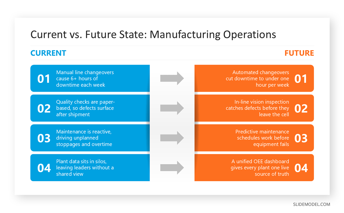
The most common layout for this slide places current state and future state in two vertical columns of equal width, divided by a visible line or arrow that reads as a boundary rather than a gutter. Equal width matters more than it seems: a current state column that is visually larger than the future state column subconsciously signals that the present carries more weight than the plan, which undermines the point of the slide. A well-built comparison slide treats both sides as equals in size and typography, using only color or iconography to distinguish them.
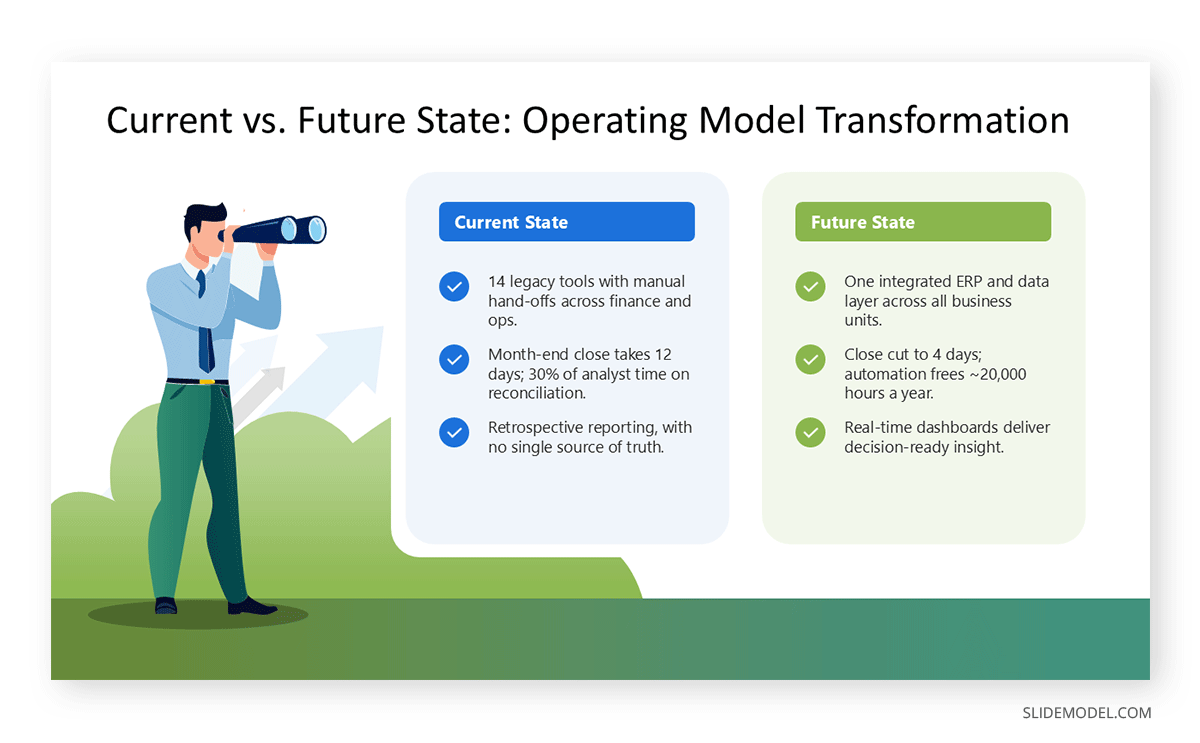
A horizontal arrow running from the current state column into the future state column is a common, effective device, since it reinforces direction without extra text. When the transition itself has more than one milestone, that arrow can extend into a PPT roadmap beneath or beside the two columns, rather than crowding milestone detail into the comparison itself. Spacing discipline follows the same logic that governs any dense business slide: consistent internal margins and aligned bullet or icon positions on each side. Enough white space between the two states lets the eye rest before it moves to the next comparison point. These are the same principles covered in general guidance on the laws of UX as they apply to presentation design, and they matter more here than usual because the slide is doing comparative work that depends on the audience reading both sides at a similar pace.
Color, Typography and Iconography for Clarity
Color carries real information on this slide type, so assign it with intent rather than as decoration. A muted or cooler tone for the current state column and a warmer or brighter tone for the future state column is a common convention, because it maps naturally onto how audiences already read before and after. Using the same accent color for both columns removes that visual cue and forces the audience to rely on text alone to track which side they are looking at, which slows comprehension at the exact moment the slide is supposed to speed it up. Review guidance on color theory for presentations before finalizing the palette, especially for decks that will be printed or viewed on a projector with limited color fidelity.
Typography should stay consistent across both columns, using the same font family throughout, since inconsistent typography reads as two different slides stitched together rather than one deliberate comparison. Header weight and body size should match as well; the only variation should be color or a light background tint. Icons help audiences scan each column quickly, but they only work when the icon set is uniform in style. Mixing flat icons on one side with outlined icons on the other undercuts the visual hierarchy the slide is trying to establish and pulls attention toward the inconsistency instead of the content.
Frameworks and Data That Strengthen the Narrative
A current state vs future state slide gains credibility when it is clearly the output of a structured assessment rather than an opinion formed the week before the presentation. A formal gap analysis is the most direct source for this content, since it already separates the current condition from the target condition across a defined set of criteria, whether those are process metrics, skill inventories, technology capabilities, or governance structures. Presenters who run this analysis before building the slide tend to produce tighter, more defensible comparisons than those who draft the columns from memory.
A related but more detailed method, fit-gap analysis, is particularly useful when the future state depends on a specific system or platform, since it scores how well that system fits each requirement and flags where custom work will be needed to close the remaining gap. Other frameworks can supply supporting data without becoming the spine of the slide itself: a SWOT assessment can explain why certain elements of the current state are hard to change quickly, and an OKR structure can translate the future state into measurable targets that later slides track over time. The goal is not to cram every framework onto one slide, but to ensure the comparison traces back to a real assessment the audience can ask to see in more detail.
Common Design and Structural Mistakes to Avoid
The most frequent mistake is asymmetry: one column stretches to five bullet points while the other holds two, which makes the slide look unfinished even when the underlying content is solid. Matching the number of comparison points on each side, even if that means combining smaller items on the sparser side, keeps the slide visually balanced and easier to present from. A second mistake is describing the future state in the same tense and specificity as the current state without marking the difference, so the audience cannot tell at a glance which column describes what already exists and which describes what is planned. Labels, color, or a small “as of” and “target” date under each header solve this quickly.
A third mistake is cramming the transition mechanism into the comparison slide itself, turning two clean columns into a dense block of implementation detail that belongs on a separate roadmap or workplan slide. Another common problem is neglecting the slide when it will be shared as a leave-behind document rather than presented live, since bullet points that made sense with narration often read as incomplete on their own. Reviewing the slide as a standalone image, without the presenter’s script, catches most of these problems before the room does.
Presenting and Defending the Slide in the Room
Once the slide is built, how you present it matters almost as much as the design. Most presenters make the mistake of spending equal time on both columns, when the current state should generally take less airtime than the future state, since the audience is there to hear about the plan, not to relive the diagnosis. A brief, confident pass through the current state, backed by the data behind it, followed by a longer walk through the future state and its supporting mechanism, keeps the room’s attention pointed forward.
This slide also tends to draw the sharpest questions in the slide deck, particularly from finance and operations stakeholders who want to know how the future state numbers were derived. Keeping the underlying quarterly business review data as a backup slide, rather than folding it into the main comparison, lets the presenter answer those questions without cluttering the primary slide. For change initiatives specifically, presenters should be ready to address how the transition affects the people in the room, not just the metrics; framing drawn from established organizational change management guidance tends to hold up better under scrutiny than an explanation improvised on the spot.
FAQs
How is a current state vs future state presentation different from a standard before-and-after slide?
The mechanics look similar, but the current state vs future state format is typically backed by a structured assessment such as a gap analysis, with specific metrics on both sides rather than a general impression of improvement. A before-and-after slide is often used for simpler comparisons, like a product redesign, where the change speaks for itself visually.
How many slides should the current state vs future state section take in a longer deck?
One slide for the comparison itself is standard, with supporting slides for the underlying data, the roadmap, and any framework used to build the assessment. Cramming milestone detail or full metrics into the comparison slide usually makes it harder to read, not more convincing.
Should current and future state appear on the same slide or on separate slides?
Side by side on one slide is the stronger choice for most corporate audiences, since the format is built around the immediacy of seeing both states at a glance. Separate slides work better only when either state requires enough supporting data that combining them would overcrowd the layout.
What’s the best layout for comparing current and future state side by side?
Two equal-width vertical columns divided by a visible boundary, whether that is a dividing line or an arrow, tend to outperform other layouts because they keep both states visually balanced. Uneven column widths quietly suggest that one state matters more than the other, which works against the point of the comparison.
How do you handle a future state that depends on multiple possible scenarios?
Rather than cramming several scenarios onto one slide, present the most likely future state as the primary comparison and reference the alternative scenarios in a follow-up slide or appendix. Trying to show every branch on the main slide usually dilutes the clarity that makes the format effective in the first place.
What data should back up the current state section?
Whatever data the organization already tracks for the process or system being described: cycle times, cost figures, error rates, survey scores, or adoption rates. The specific metric matters less than making sure it is measurable and drawn from an actual reporting period rather than estimated from memory.
How do you avoid making the current state sound like criticism of the team in the room?
Describe the current state in operational terms rather than evaluative language, and anchor it to a specific reporting period rather than a vague present tense. Framing it as a data-based diagnosis, rather than a judgment about performance, keeps the audience receptive instead of defensive.
What role does a transition or readiness state play between current and future?
A transition state names the intermediate milestones and conditions that need to be true before the future state is reachable, and it usually belongs on a separate roadmap slide rather than the comparison slide itself. Leaving transition detail off the main comparison keeps that slide legible while still giving the plan somewhere to live.
How do you scale this slide format for a board presentation versus a team meeting?
For a board audience, keep the metrics high-level and have a backup slide showing the underlying gap analysis, since board members tend to ask about methodology. For a team meeting, the same two-column structure works, but the metrics can go deeper into the operational detail the team already lives with day to day.
What’s a good color scheme for showing progression from current to future?
A cooler or more muted tone for the current-state column paired with a warmer or brighter tone for the future-state column is a reliable convention, since it maps onto how audiences already interpret before and after. Whatever palette you choose, keep it consistent with the rest of the slide deck’s color scheme rather than introducing a one-off treatment for this slide.
How long should the presenter spend on the current state before moving to the future state?
Less time than most presenters default to. A brief, data-backed pass through the current state, followed by a longer walk-through of the future state and how it gets reached, keeps the audience’s attention on the plan rather than the problem.
Can this format work for academic or research presentations, not just corporate ones?
Yes, and it is a common structure for thesis defenses and case studies, where the current state of knowledge or practice in a field is contrasted with the state the research aims to establish. The same design principles apply: specific claims on both sides, and a layout that keeps the comparison legible without narration.
What’s the biggest visual design mistake in these slides?
Asymmetry between the two columns, where one side carries far more content than the other, is the most common problem, since it makes the slide look unbalanced even when the underlying argument is sound. Matching the number of comparison points on each side keeps the layout even and easier to present.
How do you close a current state vs future state slide to move into next steps?
End on the future state column rather than looping back to the current state, and use the closing line to point directly at the roadmap or workplan slide that follows. That keeps the narrative moving forward instead of ending the comparison on the problem it opened with.
Should the future state slide include a timeline, or just an end-state description?
A short timeframe next to the future state header, such as a target quarter or year, adds credibility without requiring a full timeline on the comparison slide itself. The detailed timeline belongs on a dedicated roadmap slide, where it has room to show intermediate milestones properly.
Final Words
A current state vs future state presentation earns its place in corporate and academic decks because it does something few other slides can: it makes an argument for change legible in seconds. Getting there requires operational specificity on the current state side and a named mechanism with a timeframe on the future state side. It also requires a layout disciplined enough that the comparison reads clearly whether the audience is in the room or reading the slide deck afterward. The frameworks behind the slide, whether that is a formal gap analysis or a fit-gap assessment, give the comparison substance that survives questions from a skeptical stakeholder. Treated with that level of care, this single slide can do more to move a decision forward than the rest of the presentation deck combined.