Strategy presentations often share a common limitation: they communicate conclusions without showing the reasoning that produced them. Frameworks built around bullet points, financial projections, and static matrices tend to describe where a business stands but offer little visibility into the forces shaping that position. Wardley maps address this directly.
A Wardley map is a visual tool that represents the components a business depends on and how mature each is in the market. Business leaders, consultants, and product teams use wardley mapping to make the assumptions behind decisions visible and to expose competitive pressures that traditional formats tend to obscure. This article explains what a Wardley map is, how its components are identified and positioned, how the diagram is constructed, how to generate one using Mermaid.js, and how Wardley map presentations compare with other widely used business frameworks.
What Is a Wardley Map and Why Use It in Presentations
The Two Axes of Wardley Mapping
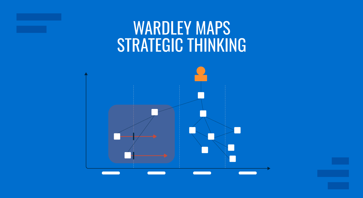
A Wardley map is built on two axes. The vertical axis represents the value chain: at the top sits the user’s need, with each layer below contributing to that outcome. A customer-facing application sits near the top; the database it queries appears lower; the cloud infrastructure hosting that database is lower still. Every component on the map exists because something above it depends on it.
The horizontal axis represents evolution, divided into four stages: Genesis, Custom Built, Product, and Commodity. Genesis components are new, poorly understood, and expensive to develop. Custom Built components are refined through experience but still require specialized knowledge. Product components are standardized and available from multiple vendors. Commodity components are fully industrialized and managed as utilities. As markets mature, components naturally drift from left to right across this axis.
The combination of both axes produces a representation of the strategic landscape at a specific point in time. The horizontal position indicates how to manage a component: Genesis components warrant experimentation and tolerance for uncertainty, while Commodity components should be purchased or outsourced rather than built internally. The vertical position reveals what would be disrupted if that component changed. Leadership teams using wardley mapping in board presentations can show not just where capabilities sit today but also where they are headed, making the reasoning behind strategic choices legible to everyone in the room.
Wardley Map Slides in Workshops and Strategy Sessions
Using Wardley map slides in a workshop setting changes how teams engage with strategy. Because the map is a shared visual artifact rather than a document read individually, participants can point to specific components, question their placement, and debate dependencies in real time. This is particularly valuable in cross-functional sessions where engineers, product managers, and executives often hold different assumptions about how mature a given capability actually is.
A Wardley map presentation typically begins with the user need at the top of the value chain and progressively reveals each underlying layer. This structure gives participants time to build a shared understanding before encountering more complex dependencies and creates natural moments for disagreements to surface. When a product leader believes a capability sits in the Product stage while an engineering lead considers it still Custom Built, the map makes that difference visible and forces a resolution before the strategy is confirmed. Sessions built around Wardley map slides tend to produce sharper alignment decisions than those that rely solely on verbal discussion or written summaries.
How to Map Components and Construct the Diagram
Identifying and Positioning Components
Building a Wardley map begins with listing every component that the business depends on to fulfill the user need at the top of the value chain. This usually starts with a facilitated session in which teams enumerate capabilities, services, data stores, integrations, and infrastructure elements without filtering. The goal at this stage is completeness rather than precision. Once a full list exists, each component is assessed on two dimensions that determine its position on the map.
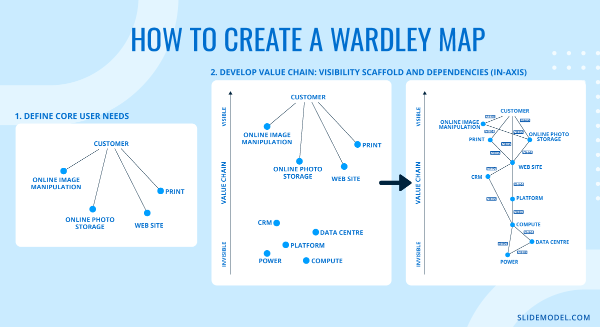
For the vertical axis, the question is how directly the component contributes to the user’s experience. Components the user interacts with directly, such as a web interface or a search bar, sit near the top. Components users never see but that the visible elements depend on, such as authentication services, message queues, or storage buckets, sit progressively lower. A useful test is to ask: if this component failed silently right now, how quickly would a user notice? Components that cause immediate visible disruption belong near the top; those that could fail without immediate user awareness sit lower.
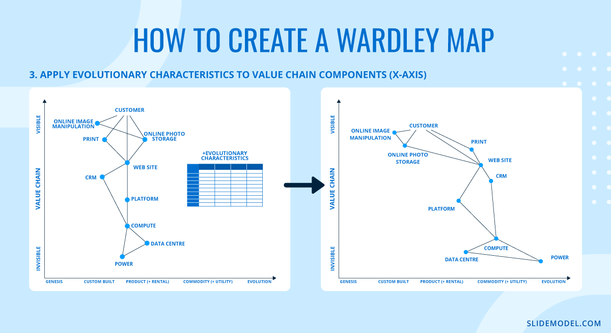
For the horizontal axis, four criteria help determine evolutionary stage. First, how well understood is the component? Genesis components are actively researched and poorly documented; Commodity components have extensive standards, certifications, and reference implementations. Second, how widely available is it? A Commodity component can be procured from many competing suppliers with minimal differentiation. Third, how predictable is its behavior? Commodity components behave consistently across contexts; Genesis components produce unexpected results. Fourth, how much custom work does it require? Custom Built components demand specialist engineering; Commodity components are configured rather than coded. Most components in a real organization sit in the Custom Built or Product range, which is precisely where the most consequential investment decisions tend to cluster.
Drawing Dependencies and Reading the Map
Once components are positioned on the axes, dependencies connect them. An arrow drawn from a higher component to a lower one indicates that the upper component depends on the lower. The connection should reflect a genuine operational dependency: if the lower component were removed, the upper one would fail or degrade. General relationships, shared ownership, or organizational proximity are not dependencies in this sense. Only include a connection if it represents a real functional requirement.
When the full diagram is drawn, strategic patterns emerge. Components that appear in the upper left of the map, high in the value chain and at the Genesis stage, represent areas where the organization can build genuine competitive advantage: these are rare, early-stage capabilities that users value directly and that competitors have not yet standardized. Components in the lower right, low visibility, and commodity represent areas where custom investment produces no return. A cluster of custom-built components sitting in the lower right is a reliable signal of technical debt: the organization is spending engineering effort building things that could already be purchased. A map that reveals this pattern gives leadership teams a concrete basis for redirecting investment toward higher-value work.
Wardley mapping also supports anticipation. Because components tend to move from left to right as industries mature, plotting the expected trajectory of a component over a two- to three-year horizon indicates where the competitive landscape is heading. A capability that is currently Custom Built and positioned mid-map may become a Product within two years, at which point building it internally becomes unnecessary. Presenting that trajectory in a strategy session provides decision-makers with a time-sensitive framework for investment decisions.
Creating a Wardley Map with Mermaid.js
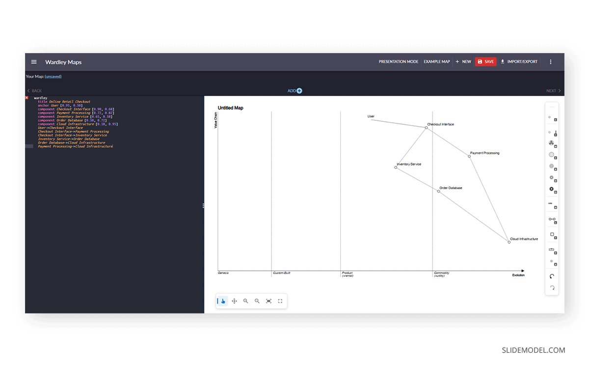
For teams that work in developer tooling, documentation platforms, or collaborative markdown environments, Mermaid.js offers a way to generate Wardley maps directly from code. Since version 9.4, Mermaid has supported a native wardley diagram type that renders in GitHub, GitLab, Notion, Obsidian, and other Mermaid-compatible surfaces. Because the map is defined as text rather than drawn by hand, updating a component’s position requires changing a single number rather than repositioning a shape.
A Mermaid Wardley map uses two decimal coordinates for each component. The first coordinate sets the vertical position in the value chain, where 1.0 places the component at the top (directly user-facing) and 0.0 at the bottom. The second coordinate sets the horizontal position on the evolution axis, where 0.0 is Genesis and 1.0 is Commodity. Dependencies are expressed using arrow notation. The following example maps a basic online retail checkout flow:
wardley
  title Online Retail Checkout
  anchor User [0.95, 0.50]
  component Checkout Interface [0.90, 0.68]
  component Payment Processing [0.72, 0.82]
  component Inventory Service [0.65, 0.58]
  component Order Database [0.50, 0.72]
  component Cloud Infrastructure [0.18, 0.95]
  User->Checkout Interface
  Checkout Interface->Payment Processing
  Checkout Interface->Inventory Service
  Inventory Service->Order Database
  Order Database->Cloud Infrastructure
  Payment Processing->Cloud Infrastructure
In this map, Payment Processing sits at a high evolution value (0.82) because payment APIs are a mature, commoditized category with dominant providers. Cloud Infrastructure sits even further to the right (0.95) and near the bottom of the value chain (0.18) because it is completely invisible to users and highly industrialized. The Checkout Interface sits high on both the value chain (0.90) and mid-evolution (0.68), reflecting that front-end checkout experiences are increasingly standardized but still involve product differentiation decisions.
The code-as-source approach offers a practical advantage in ongoing strategy work. When the competitive landscape shifts, updating the map requires editing coordinates or adding a new component line, rather than reopening a drawing tool and manually adjusting shapes. Teams that use version control can also track how their assessment of a component’s evolutionary position changes over time, creating an auditable record of strategic thinking. When using Mermaid wardley maps in presentations, the diagram can be exported as a high-resolution SVG or PNG and imported directly into the slide. Most Mermaid platforms produce clean vector output suitable for boardroom display.
Wardley Maps vs. Other Strategy Frameworks
Strategy teams work with a range of established frameworks. SWOT analysis is a common starting point: it captures strengths, weaknesses, opportunities, and threats in a grid that most business audiences can populate quickly. The Business Model Canvas maps customer segments, value propositions, and revenue streams onto a single page. The BCG Growth-Share Matrix helps organizations assess portfolios by comparing market growth rate against relative market share. These tools have earned their place because they are fast to complete and easy to present.
Each of them captures a useful cross-section of reality, but none accounts for movement. A SWOT analysis describes what assets you hold and what threats you face, but it offers no insight into whether those assets are becoming less relevant as their underlying components commoditize. The Strategy Diamond Model, which covers arenas, vehicles, differentiators, staging, and economic logic, comes closer to operational specificity but still does not show how market forces are shifting component maturity over time.
Wardley maps are most effective when the strategic question involves timing, competitive displacement, or investment across capabilities at different evolutionary stages. For teams building decision frameworks for senior leadership, combining a traditional framework with a Wardley map gives the audience both a snapshot of the current state and a view of the forces shaping it. Many practitioners run a SWOT analysis first to identify the right questions, then build a Wardley map to explore the dynamics those questions raise.
Building a Wardley Map Presentation
Choosing a Wardley Map Tool
Several dedicated Wardley map tools are available to practitioners who need to build maps efficiently. OnlineWardleyMaps is a browser-based environment that lets users plot components and define relationships using a scripting interface, with output exportable as an image for presentation decks. Miro and Mural support Wardley mapping through custom canvas setups, which works well for facilitated workshops where multiple contributors add components simultaneously. MermaidLive is another option that lets you export the result as an SVG or PNG. Additionally, there’s the option to generate it via Mermaid.js in LLM tools such as Claude or ChatGPT. You can learn more about this in our article on Mermaid diagrams for PowerPoint.
Some teams build their maps directly in PowerPoint or Google Slides using shapes, keeping everything integrated within a single deck, but this is time-consuming. SlideModel provides a range of business presentation templates that can be adapted to incorporate Wardley mapping layouts, competitive analysis, and roadmap slides. And if that weren’t enough, our Wardley Map Presentation Template – fully compatible with PowerPoint and Google Slides – easily helps to map out elements to recreate a Wardley map.
When selecting a Wardley map tool, the key considerations are whether the output integrates cleanly into the presentation environment, whether collaborators can edit in real time, and whether the tool supports version tracking as the strategy evolves. For teams that revisit their maps across multiple planning cycles, accessible export and sharing options directly affect how consistently those maps are maintained and used in ongoing decision-making.
Working with a Wardley Map Template
A Wardley map template provides a pre-formatted canvas with both axes in place, evolution-stage labels along the horizontal axis, and a basic structure that guides component placement from the first draft onward. These templates reduce setup time and help teams maintain consistent formatting across a multi-slide deck. A well-designed template also enforces a useful discipline: keeping the user need anchored at the top of the value chain and ensuring that every component below it has an explicit dependency relationship with something above it.
When building a multi-slide Wardley map presentation, a consistent narrative structure helps the audience follow the analysis from slide to slide. The opening slide should establish the user need and define the scope of the map. Subsequent slides can zoom into specific regions, highlight particular dependencies, or show how the map is expected to shift over a strategic horizon. Including wardley map examples from comparable organizations or from the company’s own history gives the audience a reference point for assessing whether the current map reflects realistic judgments.
Wardley Map Examples in Practice
Wardley mapping produces its clearest value when applied to decisions where the stakes justify building the map carefully. Consider a financial services organization evaluating whether to migrate its core transaction processing infrastructure to cloud-based services. In a traditional board presentation, this decision appears as a cost-benefit table or a risk register. Plotted on a Wardley map, the picture becomes more specific: core processing sits in the Custom Built or Product stage, the underlying compute infrastructure has already reached Commodity, and several competitors have completed similar migrations and redirected capital toward Genesis-stage capabilities in fraud detection and client analytics. The map communicates not just the migration argument but also the competitive cost of delay, framed in terms that the board can weigh against its own strategic priorities.
A second common application involves mapping the technology stack ahead of a product roadmap session. When product managers, engineers, and executives see the same map, conversations about build-versus-buy decisions and development sequencing become grounded in a shared view of the landscape rather than in competing assumptions. Teams that update the same wardley map across successive planning cycles also build a record of how their assessments have shifted over time, which improves future forecasts and provides context for explaining past decisions to new team members or incoming leadership.
Conclusion
Wardley maps give strategy presentations a dimension that most frameworks cannot offer: a visible account of how components are moving, not just where they stand at a single moment. By combining value chain analysis with evolutionary thinking, Wardley mapping equips leaders to present decisions with full context, run productive alignment workshops around shared visual reference, and communicate competitive dynamics to audiences who may not share the same technical perspective.
Whether building from a Wardley map template, generating diagrams with Mermaid.js, selecting a Wardley map tool for collaborative sessions, or constructing Wardley map slides from scratch, understanding how to build and present these maps is a practical capability for anyone whose work involves clearly communicating strategy to senior audiences.