A choropleth map is the chart type most likely to be built badly by someone who has never questioned it. It looks simple. Shade the regions, pick a color, done. Yet almost every design decision behind that shading is editorial, and each one changes what the audience concludes. The class breaks decide where the visual cliff falls. The denominator decides whether the map shows performance or population. The color ramp decides which end of the range feels alarming.
This guide works through those decisions in the order they matter, starting with what the format encodes and moving through normalization, classification, color, the build process, the alternatives, and the errors that survive into finished decks. It assumes a presenter with real numbers attached to real places who needs the slide to hold up under questioning.
What a Choropleth Map Encodes
A choropleth map is a thematic map in which predefined geographic areas are filled with color or shading proportional to a statistical value measured within each area. Sales by state, unemployment by county, churn rate by sales district, headcount by country: all standard choropleth material.
Two properties define the format and explain most of its behavior.
The geography is fixed, not derived. The boundaries come from an administrative or organizational unit that existed before the data. A country border, a postal code, a franchise territory. The map does not discover shapes in the data; it inherits them. Every conclusion the audience draws is therefore filtered through units that were drawn for reasons unrelated to the metric being shown.
Color carries the entire quantitative message. No axis, no bar length, no position along a scale. The reader compares one fill against another and against a legend. Human perception handles this reasonably well for ordering, poorly for magnitude. Someone can reliably tell that Texas is darker than Ohio. Almost nobody can tell that Texas is 2.4 times Ohio by looking at fill alone. That single perceptual fact drives most of the guidance that follows.
As a result, a choropleth map is a pattern instrument, not a measurement instrument. It answers “where is this concentrated” and “does this cluster geographically.” It does not answer “how much” with any precision, which is why the strongest slides pair the map with a small table or a ranked bar of the top and bottom performers.
The Denominator Problem
The most common failure in business choropleth maps has nothing to do with color. It is showing a raw count.
Map total revenue by US state, and California, Texas, Florida, and New York light up. Map total customers by country, and China and India dominate. Map incident reports by region and the largest region wins. In each case, the map has quietly plotted population, or market size, or headcount, and the metric of interest is buried underneath.
Choropleth maps require rate or intensity values because the areas being compared differ in size. The fix is normalization: divide by whatever underlying quantity drives the raw total.
Revenue per account, not revenue. This turns a market-size map into a performance map. Two territories with identical revenue but very different account bases separate immediately.
Rate per capita or per thousand employees. Standard for anything counted in people. Safety incidents per thousand FTE tells an operations audience something that total incidents never will.
Percentage of a defined base. Attach rate, adoption percentage, win rate, penetration against total addressable accounts. These are already normalized and drop straight into a choropleth without further work.
Index against a benchmark. Regional performance as a percentage of national average. This has the advantage of producing a natural midpoint at 100, which pairs well with a diverging color scheme.
There is a legitimate exception. If the audience genuinely needs absolute scale, and the units are roughly comparable in size, a count map can work. Sales by franchise territory, where territories were deliberately drawn to be similar in potential, is a fair example. Outside that narrow case, plot the rate on the map and put the absolute numbers in a supporting table.
A second issue rides alongside the first. Small denominators produce unstable rates. A district with 40 accounts will show extreme conversion percentages simply from small-sample noise, and it will be the most visually striking region on the map. Suppress or gray out units below a minimum base size, and state the threshold in a footnote.
Classification: The Decision Nobody Documents
Once the values are normalized, you have to group them into classes. Software does this by default, silently, and the default is rarely right. Classification is where a choropleth map becomes a point of contention.
Equal interval divides the range into bands of identical width. If values run from 2% to 42%, five classes each span eight percentage points. It is the easiest scheme to explain in a legend and the easiest for an audience to reason about. It falls apart on skewed data, where one outlier stretches the range and pushes almost every region into the lowest class.
Quantile places an equal number of regions in each class. Every class is populated, the map always looks balanced, and relative ranking is communicated cleanly. The cost is that break points can fall in arbitrary places, separating two nearly identical values into different colors while grouping widely separated values together. Use it when rank matters more than magnitude, and say so in the legend.
Natural breaks, or the Jenks method, searches for the grouping that minimizes variance within classes and maximizes it between them. It follows the actual shape of the distribution and is the strongest general default when the data has visible clusters. Its weakness is comparability: because the breaks derive from the data, two maps built the same way in consecutive quarters will have different class boundaries and cannot be compared side by side.
Standard deviation classes values by distance from the mean. This suits near-normal distributions and works well with a diverging palette, since above-average and below-average become visually distinct directions rather than points on a single ramp. It requires an audience comfortable with the concept, which rules it out for many general business settings.
Manual breaks are the underrated option in a corporate context. Business data usually comes with meaningful thresholds already attached: quota attainment above and below 100%, service levels against a contractual SLA, margin against a floor. Breaking classes at those thresholds makes the map interpretable without a legend lecture, and it keeps the classification stable across reporting periods.
On class count, four to six is the working range. Below four, the map oversimplifies and hides the pattern that justified making it. Above six, the audience cannot distinguish adjacent fills at projection distance, and the legend becomes a reference table nobody consults. Five is a safe default for a presentation, and slightly fewer classes than a printed report would use, because a slide is read in seconds from across a room.
One practice worth adopting: when a map will be repeated in a recurring deck, lock the class breaks once and reuse them. A map whose classification shifts each period looks like a trend when it is only a rescaling.
Color as the Data Channel
Because color carries the whole quantitative message, palette selection is not decoration. Three families cover the cases.
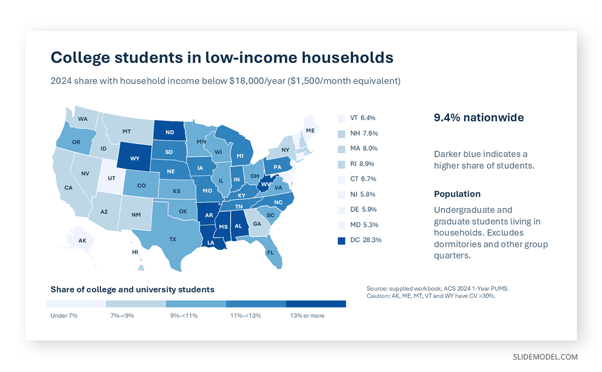
Sequential palettes run from light to dark within a single hue, or a closely related pair. They are correct for any metric with a natural low-to-high ordering and no meaningful midpoint. Revenue per account, adoption rate, cost per unit. Light should mean low. Reversing this, which happens more often than it should, inverts the reading for every viewer who does not stop to check the legend.
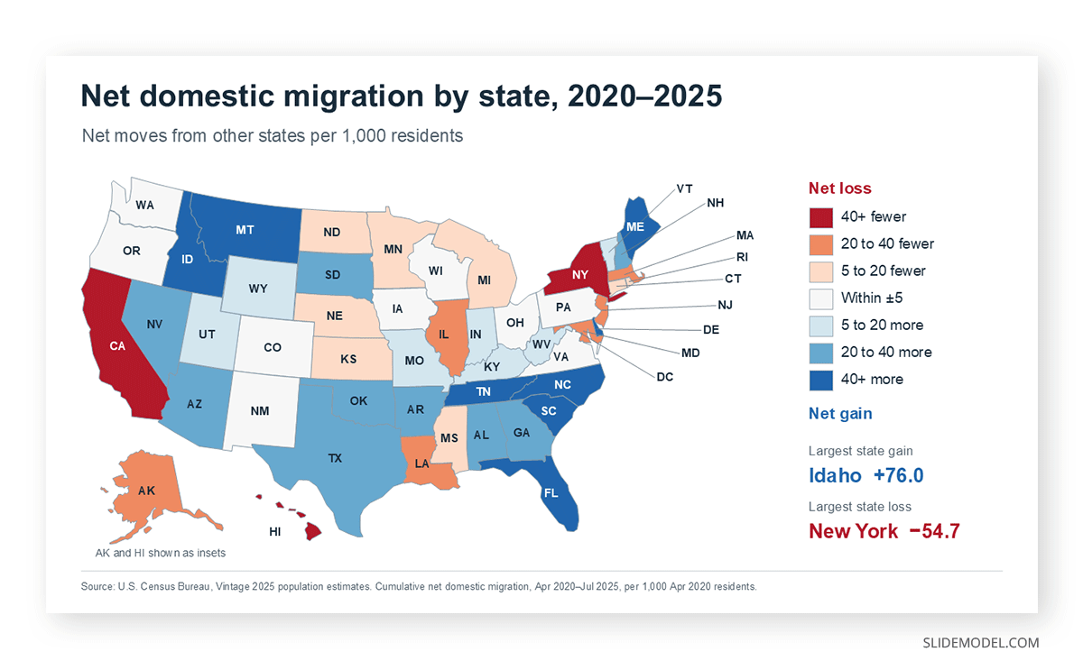
Diverging palettes run from one hue through a neutral center to a contrasting hue. They are correct when a midpoint carries meaning: growth versus decline, above or below quota, variance against budget, over or under an index of 100. The neutral center must sit exactly on the meaningful value, not wherever the software placed it. A diverging palette centered on the arithmetic mean when the audience is thinking about quota will mislead every person in the room.
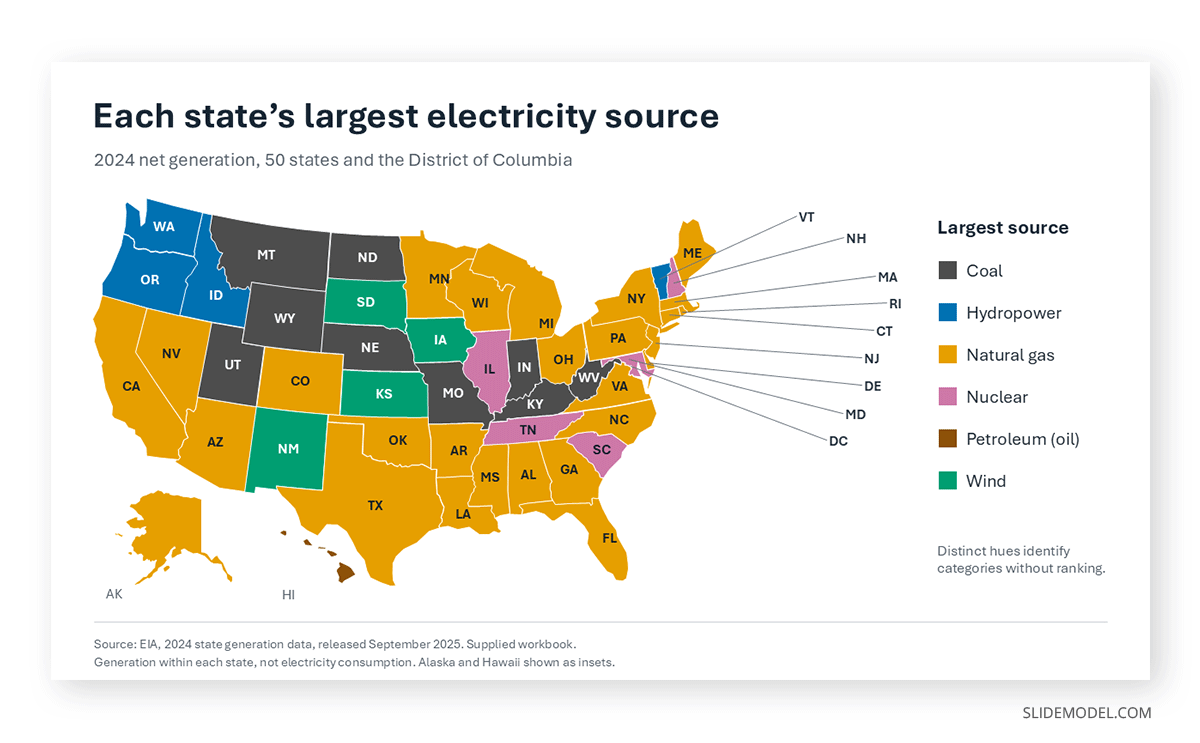
Categorical palettes assign unrelated hues to unordered groups. On a choropleth, these are appropriate only for nominal data such as dominant product line by region or assigned account team. Never apply them to a quantitative variable, because unrelated hues imply no order and the audience will invent one.
Practical constraints apply on top of the family choice. Roughly 8% of men have some form of color vision deficiency, which makes red-green diverging ramps a poor default; blue-orange and purple-green alternatives carry the same semantics without the accessibility cost. Projector gamut also compresses the light end of most ramps, so the two palest classes that separate cleanly on a monitor may merge on screen. Keeping the map’s palette aligned with the deck’s broader color theory helps it read as part of the argument rather than an import from another document.
Missing data deserves its own treatment: a distinct neutral, typically light gray with a hatch or outline, labeled explicitly in the legend. Leaving no-data regions white makes them read as the lowest class.
Where Choropleth Maps Earn a Slide
The format justifies itself when geography is a variable in the decision, not merely an attribute of the records.
Sales and territory performance. Attainment against quota by district, penetration by metro area, average deal size by region. This is the highest-frequency business application, and it works because the audience already thinks in those units. A choropleth built directly on the same boundaries used for territory planning in a sales plan lets a regional VP find their own area in under a second, which is most of the battle in a large review meeting.
Market entry and expansion analysis. Demand indicators, competitive density, regulatory friction scored by country. Mapping each factor separately in a small multiple, rather than compressing them into one composite score, keeps the reasoning visible and gives the audience something to argue with.
Workforce and organizational distribution. Headcount per site normalized by revenue, attrition rate by country, remote share by region. HR audiences respond well to these because the geographic clustering of a retention problem is often the finding itself.
Operations, risk and supply. On-time delivery by distribution zone, defect rates by plant catchment, exposure concentration by region. Insurance, logistics and manufacturing use choropleth maps as a standing part of reporting for the good reason that their risk really is spatially distributed.
Public sector, health and academic reporting. Prevalence rates, program uptake, funding per capita by administrative unit. This is the format’s original home, and the conventions are strictest here: normalized rates, documented class breaks, and a stated source and reporting period.
Across all of these, the map does narrative work more than analytical work. It establishes that a pattern is geographic, then hands off to the chart or table that quantifies it. Treating the map as the opening move rather than the conclusion is what separates a slide that supports data-driven decision making from one that only looks like it does.
Choropleth Maps Against the Alternatives
Against the proportional symbol map
A proportional symbol map places sized circles at region centroids. It handles raw counts correctly, since symbol area is independent of region area, and it is the right choice when absolute magnitude is the message. Its weakness is crowding: dense urban clusters overlap into unreadable stacks. A frequent and effective compromise is a choropleth for the rate plus proportional symbols for the underlying count on the same map.
Against the dot density map
Dot density scatters one dot per fixed quantity across each region, conveying concentration without the visual weight that large sparse regions carry on a choropleth. Because the dots are placed arbitrarily within boundaries, it invites precision that doesn’t exist, and it suits population studies more than corporate reporting.
Against the cartogram
A cartogram distorts region size to match the value, solving the case where geographic area misleads. It is unambiguous about magnitude and consistently confusing to a general audience. Reserve it for analysts already familiar with the technique, or when the point is precisely that area and economic weight diverge.
Against the heat map
The term causes constant confusion. A geographic heat map renders a continuous density surface from point data and ignores administrative boundaries entirely. A matrix heat map shades cells in a table. Neither is a choropleth, which shades predefined polygons. If the data arrives as individual points such as store locations or incidents, a density surface may serve better; if it arrives already aggregated by region, the choropleth is correct. The conventions behind heat map presentations overlap on color handling but not on data structure.
Against the hex bin map
Hex binning replaces irregular administrative shapes with equal-area hexagons, removing the distortion caused by size differences between units. It reads cleanly and is increasingly common in analytics tools. It also breaks recognition: an audience looking for their state or country will not find the familiar outline, which is a real cost in a stakeholder meeting.
Against non-geographic charts
The honest test is whether geography carries information. If the finding is simply that five regions outperform and five underperform, a sorted bar chart communicates it faster, more precisely, and in less space. If the finding is that the underperformers are contiguous, or share a border with a competitor’s stronghold, the map is doing work no bar chart can do. A ranked bar or a treemap is often the better answer, and choosing it deliberately shows judgment rather than a missed opportunity.
Quick reference
Choropleth: rates and percentages across predefined regions, pattern detection. Proportional symbol: absolute counts, magnitude comparison.
Dot density: concentration and distribution of point-level phenomena.
Cartogram: value weight where area misleads, technical audiences only.
Density heat map: continuous surfaces from raw point data.
Hex bin: equal-area comparison where recognition is not required.
Bar chart or table: precise values and ranking where geography is incidental.
Charts That Belong Alongside a Choropleth
A choropleth map rarely stands alone well. The pairings below cover the questions it provokes but cannot answer.
A ranked bar chart of top and bottom regions. This is the single most valuable companion. It supplies the precise values the map cannot, and it converts “the northeast looks dark” into a defensible list.
A trend line for selected regions. The map is a snapshot. A line chart showing three or four highlighted regions over time answers the immediate question of whether the pattern is new, and prevents a structural difference from being presented as a recent development.
A scatter or bubble view of the two variables behind the rate. A bubble chart plotting numerator against denominator exposes whether a high rate comes from strong performance or a small base. This is the chart that stops the small-denominator argument before it starts.
A small multiple of the same map across periods or metrics. Four small maps sharing one legend and one classification communicate change far better than one large map with a date in the corner.
A supporting table. When the audience will ask for numbers, and in a finance or operations review they will, a compact table beside the map beats an appendix. This is the standard structure in most dashboard layouts for good reason.
Building a Choropleth Map for a Presentation
Prepare and normalize the data first. One row per region, a region identifier that matches the map’s naming exactly, the numerator, the denominator, and the calculated rate. Name mismatches are the most common technical failure, and they show up as silently unshaded regions rather than errors.
Decide the classification before opening the design tool. Choose the scheme and the break values in the spreadsheet, where the distribution is visible. Sort the rate column and look at where the gaps fall. If the deck is recurring, record the breaks so the next edition reuses them.
Choose the build method. Excel and Microsoft 365 versions of PowerPoint include a Filled Map chart type that handles country, state, and county geographies automatically, and it is the fastest route when the geography is standard. Its limitations show quickly: class breaks are hard to control, it doesn’t support custom territories, and it produces a chart object rather than editable shapes. The alternative is a vector map made of individual shapes, one per region, which is fully controllable in PowerPoint and Google Slides. This is where editable vector map templates save the most time, since building national or regional outlines by hand is not a good use of an afternoon.
Apply the fills by class, not by region. Set up the palette as a small set of swatches and apply them, class by class. This keeps the map consistent, makes reclassification a five-minute job, and prevents the gradual drift that happens when you color regions one at a time.
Build the legend as a real legend. Ordered swatches, explicit numeric ranges, a stated unit, and a labeled entry for missing data. If you use a diverging scheme, place the midpoint label on the neutral swatch so its meaning is unmistakable.
Label directly, and selectively. Place values only on the regions the argument depends on, using leader lines for small areas rather than shrinking the type. A map with every region labeled has stopped being a map. The mechanics of positioning these elements are the same as inserting a map into a PowerPoint slide.
Write the headline as the finding. “Attainment below 85% concentrated in the Southeast” beats “Q3 Attainment by Region.” The map supports the sentence; the sentence does not describe the map.
Cite the source and period in a footnote. Metric definition, denominator, reporting period, classification method, and any suppression threshold. Four lines of small type that keep the discussion from stalling on a methodology question.
Mistakes That Undermine a Choropleth Map
Mapping counts instead of rates. Covered above, and worth repeating because it remains the single most frequent error. The resulting map shows where the people are.
Letting the software choose the class breaks
Defaults usually use equal intervals on a skewed distribution, which flattens the pattern into one dominant class. The classification is an editorial decision; make it deliberately.
Using too many classes
Eight or nine gradations look precise on a monitor and turn into an indistinguishable wash on a projector. Four to six.
Applying a diverging palette without a meaningful midpoint
Red-to-blue on a simple low-to-high metric invents a division that does not exist in the data, and the audience will look for the reason behind it.
Ignoring the area-versus-importance mismatch
Large sparsely populated regions dominate visually while representing a small share of the business. Adding proportional symbols or a companion bar chart corrects the impression.
Changing the classification between periods
Two maps with different breaks placed side by side create an apparent trend that is purely an artifact of rescaling. Lock the breaks for recurring reporting.
Leaving missing data white
Blank reads as zero, or as the lowest class. Use a distinct neutral fill and label it.
Choosing the format because it looks impressive
A map on a slide signals sophistication, which is exactly why it gets used when a bar chart would communicate better. If geography is not part of the finding, the map is decoration with a data source attached.
FAQs
Does a choropleth map require normalized data in every case?
Almost always, though the reasoning matters more than the rule. The problem is that fill covers area, so a physically larger region carries more visual weight regardless of its value. When the plotted number also scales with region size, as counts generally do, the two effects compound and the map shows size twice. Deliberately equalized units, such as territories drawn to have comparable potential, are the narrow exception.
How many classes should a choropleth map use?
Four to six, with five as a reasonable default for presentation work. Fewer hides the pattern; more exceeds what an audience can distinguish at projection distance.
What is the difference between a choropleth map and a heat map?
A choropleth map shades predefined administrative or organizational polygons using values aggregated to those units. A geographic heat map renders a continuous density surface from individual point locations and ignores boundaries. People often confuse the two because both use color intensity, but they use different input data and answer different questions.
Can PowerPoint create a choropleth map natively?
Microsoft 365 versions include a Filled Map chart type that shades standard geographies from a table of region names and values. It works well for quick country or state maps and offers limited control over class breaks and no support for custom territories. Editable shape-based maps remain the more flexible option for presentation work.
Which classification method should be the default?
Natural breaks for exploratory work, because it follows the shape of the distribution. Manual breaks aligned to business thresholds for recurring corporate reporting, because they are interpretable and stable across periods.
Is a choropleth map appropriate for financial reporting?
For rate-based measures such as margin percentage, growth rate, or attainment against plan, yes, with the numbers repeated in a table. For absolute currency amounts, it is a poor fit, since precise values cannot be read from fill and area distorts the comparison.
How should missing or suppressed data be shown?
With a distinct neutral fill, ideally hatched or outlined so it cannot be mistaken for a class, and an explicit legend entry. If values were suppressed because the base was too small, state the threshold in a footnote.
Can you compare two choropleth maps side by side?
Only if they share an identical classification, identical class breaks, and an identical palette. Otherwise, the comparison measures the classification, not the data. This is the strongest argument for fixing breaks once in any recurring deck.
What is the smallest geographic unit that still works on a slide?
Whatever remains visible from the back of the room. County or postal-code maps carry genuine detail and often lose it entirely at projection scale. If the finding lives at that level, zoom into the relevant area rather than showing the full national map.
What single change improves most choropleth maps?
Adding a ranked bar chart of the top and bottom regions beside the map. It supplies the precision the map structurally cannot, and it converts a visual impression into a list the audience can act on.
Final Thoughts
Choropleth maps fail so often because they are easy to produce and hard to produce honestly. Shading regions takes minutes. Choosing the right denominator, setting defensible class breaks, matching the palette to the metric’s structure, and admitting when a bar chart would serve better takes judgment no template supplies.
The compensation is that a well-built choropleth does something no other format on the slide can. It shows that a business pattern has a shape on the ground, and it does so instantly, before anyone has read a number. Used as an opening statement and backed by the charts that quantify it, the map earns its place in the deck. Used as the whole argument, it becomes another data presentation that looks more rigorous than it is.