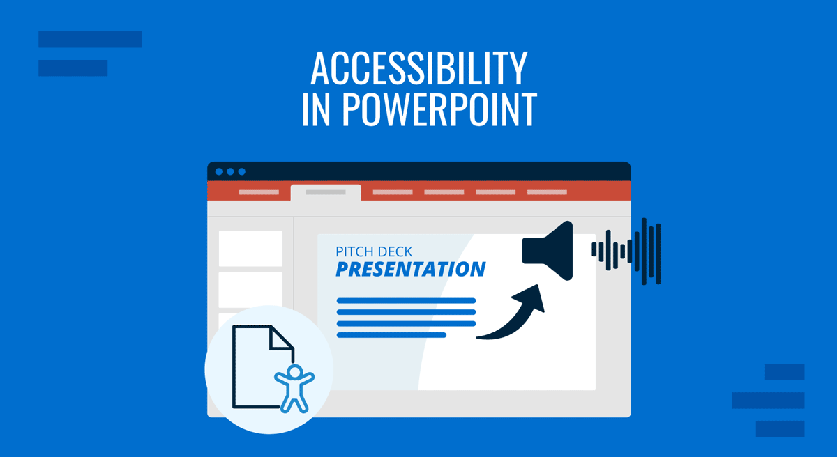
Creating a polished PowerPoint presentation is only half the work. A truly effective presentation must connect with all audiences, so accessibility is a must-check to allow those with auditory, visual, or cognitive impairments to understand and engage with your content. Think of it beyond compliance, but rather about inclusion. An accessible deck ensures your ideas reach the broadest possible audience without barriers.
If you’re looking for guidance on understanding core accessibility concepts for presentations, our guide on Accessibility in Presentations is a good place to start. This article focuses on the PowerPoint tools and elements you need to consider to comply with the current EAA (European Accessibility Act) standards for your presentations.
Table of Contents
- Why Accessibility in PowerPoint Matters
- EAA 2025 and What Changed Regarding Presentation Design
- EAA Accessibility Compliance Checklist for Presentations
- The Accessibility Checklist: 18 Questions to Guide You
- FAQs
- Final Words
Why Accessibility in PowerPoint Matters
When you prepare slides, you’re not just speaking to the people in the front row; you’re communicating to an entire audience that may include individuals using screen readers, relying on captions, or needing high-contrast visuals. Accessibility creates a fair experience for all and protects your work from being dismissed because it excludes some participants.
Accessible presentations offer:
- Clarity of message: Content is structured for better comprehension.
- Inclusive participation: Everyone, regardless of ability, can follow along.
- Professional credibility: You demonstrate awareness and responsibility.
EAA 2025 and What Changed Regarding Presentation Design
On 28 June 2025, the European Accessibility Act (EAA) officially entered into force, marking a new era of regulations for digital products and services. It’s a legal mandate requiring organizations that offer products or services to meet accessibility standards, to bridge the differences in how various EU states enforce accessibility. This affects both public and private industries, and failing to comply carries fines, reputational harm, and the potential for being blocked from procurement or public contracts.
Any new presentation materials distributed in the EU must meet the accessibility criteria, including captions or transcripts for audio content, compatibility with assistive technologies, keyboard navigation, strong contrast, a non-flashing design, proper metadata and structure, and descriptive alt text for visuals.
Pre-existing presentations, if still in use, may have transitional periods; however, the expectation is to audit and update slide decks, training materials, external webinars, marketing decks, and any other media formats to comply with the EAA’s accessibility framework.
EAA Accessibility Compliance Checklist for Presentations
Answer these 20 questions with YES/NO to determine if your slide deck meets the EAA requirements. If not, we invite you to review the section below, which covers all aspects in more detail.
- Did I use an accessibility-ready template with proper placeholders?
- Does every slide have a clear, descriptive title?
- Have I checked the reading order in the Selection Pane?
- Do all images, icons, and logos include meaningful alt text (or are marked decorative)?
- Do charts and graphs include text labels or summaries?
- Is the text and background contrast compliant (minimum 4.5:1 for normal text)?
- Did I avoid using color alone to convey meaning (e.g., added labels or symbols)?
- If audio is used, did I provide a transcript or captions?
- Are lists created with PowerPoint’s native list tools (not manual dashes)?
- Do hyperlinks use descriptive labels instead of “click here”?
- Are embedded videos captioned and, where needed, described?
- Did I avoid flashing or complex animations that may cause accessibility issues?
- Are tables simple, with defined headers and no merged/nested cells?
- Did I choose legible, sans-serif fonts at a minimum of 18pt size?
- Is the slide text concise, with no overcrowded paragraphs?
- Are linked external documents also accessible (PDFs tagged, spreadsheets structured)?
- Did I run PowerPoint’s Accessibility Checker and resolve flagged issues?
- Is my presentation exported in accessible formats (tagged PDF, HTML)?
- If something cannot be fully accessible, did I provide supplementary notes or transcripts?
- Can the presentation be navigated fully with a keyboard (no mouse needed)?
The Accessibility Checklist: 18 Questions to Guide You
In this section, we’ll learn through 18 questions how to fine-tune our slides using PowerPoint to design a 100% accessible deck, webinar presentation, video presentation, or any media format intended to deliver a speech in front of an audience.
Did You Start with a Template Designed for Accessibility?
Starting with a design that already has built-in accessibility features, such as proper slide layouts, placeholder text boxes labeled as titles, and suitable color contrast, saves you countless hours of fixes later. Random online templates often prioritize decorative elements over logical structure. This creates chaos for screen readers, which rely on the underlying code to determine the order of elements.
By contrast, a well-designed PowerPoint template establishes a predictable reading order and ensures consistency across slides. You also benefit from text boxes sized for legibility, fonts chosen for clarity, and a color palette that avoids low-contrast pairings. SlideModel, Microsoft, and other third-party professional template marketplaces comply with that aspect, but not all solutions are 100% tailored. This means that even when some elements are handed in a ready-made format, you still have to test the template and add any missing aspects according to accessibility standards.
Does Each Slide Include a Clear and Descriptive Title?
Slide titles are not just visual anchors for your audience; they’re essential markers for accessibility. People using screen readers navigate a presentation by jumping from title to title, much like scanning a document by its headings. If your slides don’t have titles, or if the titles are vague (“Overview,” “Details”), your audience loses the thread of your argument. Think of it as if you were trying to follow a book, but half the chapters are untitled. You’d quickly become disoriented.
Presentation titles should summarize the core idea of the slide in plain language. For example, instead of “Results,” use “Survey Results: Customer Satisfaction Improved by 30%.” This helps both sighted viewers and assistive technologies grasp the message instantly. Even if you don’t want a visible title for aesthetic reasons, PowerPoint allows you to add an off-screen title so that screen readers still recognize the presentation structure. Consistency also matters: every slide should have a title field populated, and it should match the logical flow of your talk.
Have You Verified the Logical Reading Order of Your Content?
Every PowerPoint slide has an underlying “stack” that dictates the reading order. To a sighted viewer, the slide appears fine: text on top, image on the side. However, a screen reader doesn’t recognize the position; it considers the order in which elements were added.
If you pasted the image last, a screen reader may describe it before the title, confusing the listener. Verifying reading order means checking the Selection Pane in PowerPoint and arranging elements so that titles come first, followed by body text, lists, and then visuals. This ensures that when someone listens to the slide, they hear the information in the same order you intended. Incorrect reading order is one of the most common accessibility problems in presentations because it’s invisible to the designer.
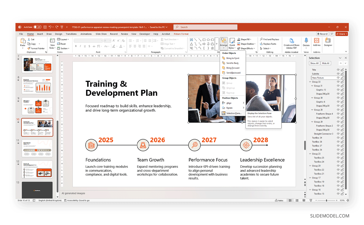
Best practice: titles first, main content second, supplemental visuals third. If you include captions, make sure they’re read immediately after the object they describe.
Are All Images Accompanied by Meaningful Alternative Text?
Alt text is the bridge between visuals and people who are visually impaired. It should describe the purpose of the image, not just its appearance. For example, instead of writing “photo of a bar chart,” use “bar chart showing 40% growth in Q2 sales.” The goal is to communicate the information or function of the visual, not to narrate every decorative detail.
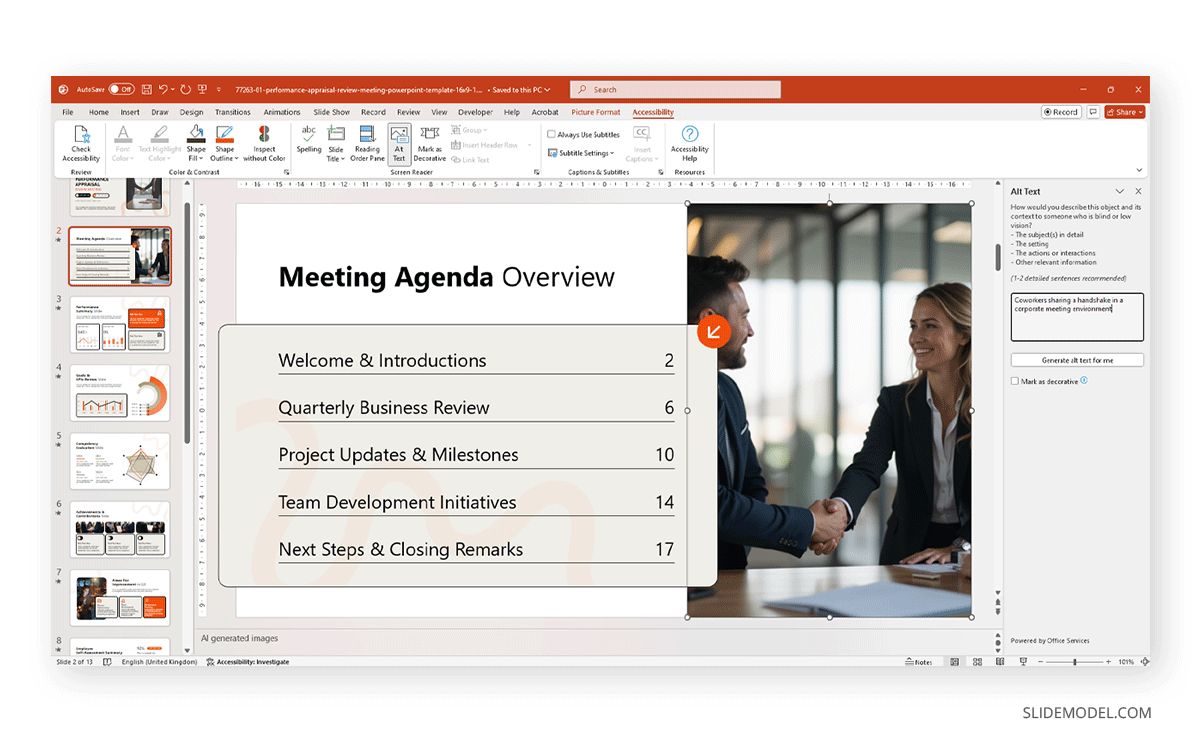
You can flag decorative images, such as backgrounds or separators, as decorative, which allows screen readers to skip them entirely. Alt text also applies to icons, logos, or shapes that convey meaning. A simple test is to ask yourself: if this visual were removed, what information would be lost? That’s the information your alt text should capture.
Avoid redundancy: don’t say “image of” or “picture of” because screen readers already announce it.
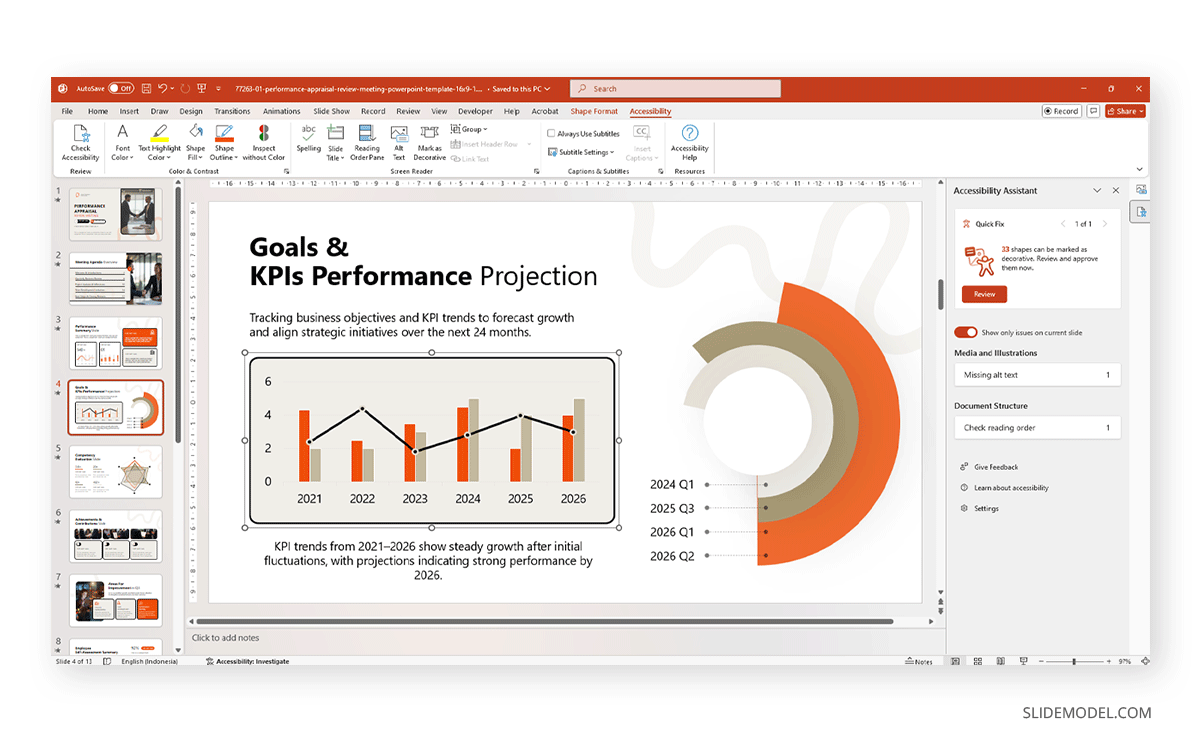
Do Charts and Graphs Have Text-Based Summaries or Labels?
Charts and graphs are powerful, but can be exclusionary if their message relies solely on visual interpretation. An audience member using a screen reader cannot “see” the chart, so they rely on either alt text or a text summary that explains what the chart shows. For example, if you present a line chart of sales growth, don’t just insert the graph; add a caption such as “Sales increased steadily from $1M in 2022 to $1.6M in 2023, with the sharpest rise in Q3.”
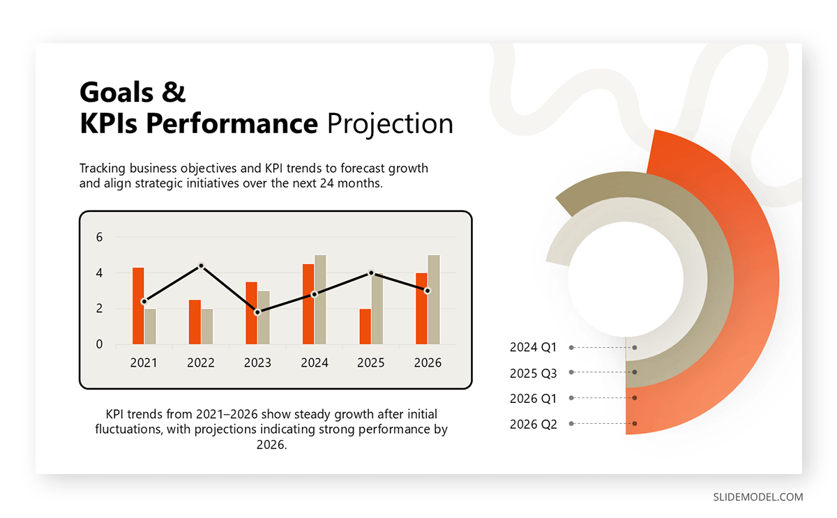
Labels on data points also help. Instead of color-coded lines without markers, use text labels or numeric annotations to make the trends explicit. Avoid charts that depend heavily on color differentiation: screen readers can’t interpret it, and colorblind users may misread it.
Another option is to provide a text-based table of the underlying data in the notes section or as a companion slide. Think of it this way: the chart is the picture, but the summary is the caption that ensures no one misses the meaning. By pairing visuals with text, you turn complex data into universally accessible knowledge.
Have You Checked that the Text and Background Colors Have a Strong Contrast?
Color contrast is one of the simplest but most critical aspects of accessibility. Low contrast, such as light gray text on a white background, may look stylish to some, but it’s unreadable to many, especially individuals with low vision or color perception issues. The Web Content Accessibility Guidelines (WCAG) recommend a minimum contrast ratio of 4.5:1 for normal text and 3:1 for large text. This ensures sufficient distinction between foreground and background.
PowerPoint offers tools to help you, such as Accessibility Checker, but you can also use free online checkers to test your hex color pairs. You can find the Accessibility Checker under Review > Check Accessibility.
A good rule of thumb is to pair dark text with light backgrounds or light text with dark backgrounds, avoiding mid-tone combinations. Remember that contrast is not just about text: icons, shapes, and chart elements also need to meet contrast standards. If you’re using brand colors, test them rigorously and consider creating an “accessible palette” that maintains brand identity while meeting readability requirements.
Recommended lecture: Color Theory for Presentations
Are You Relying on Color Alone to Highlight Information, or Did You Add Labels?
Using color as the sole means of communication is a common mistake. For example, saying “points in red are risks” excludes anyone who cannot distinguish red from other colors. Approximately 8% of men and 0.5% of women worldwide experience some form of color blindness, which can cause them to miss the distinction you intended. To fix this, always pair color with another identifier. Add text labels, icons, or patterns to highlight differences.
For instance, a bar chart comparing two groups can use not just blue and orange bars but also distinct labels or data values. Line graphs can use solid vs. dashed lines alongside color. Even in process diagrams, don’t just rely on green arrows for success and red arrows for failure; label them.
If Sound is Used, Is There a Transcript or Caption Available?
Audio can enrich a presentation, but without transcripts or captions, it excludes anyone who is deaf or has auditory impairments. If you embed a narration, music clip, or sound effect, always provide a written version of what is being said or what the sound represents. Captions are ideal for videos, and many tools, like PowerPoint itself, YouTube, or third-party software, can generate them automatically.
Recommended lecture: How to Add Audio to PowerPoint
For pure audio clips, a transcript in the notes section or on a companion slide ensures equal access for all users. Even people without hearing impairments benefit from transcripts: they make it easier to follow along in noisy environments or when the sound quality is poor. Captions also improve comprehension for non-native speakers who may struggle with accents or fast speech. If you’re using sound effects for emphasis (like a “ding” when an idea appears), include a text cue like “[bell sound]” to make sure the emphasis isn’t lost.
Are Your Bullet Points and Lists Structured for Clarity?
Lists are a core feature of PowerPoint, but if misused, they can become a nightmare for accessibility. Screen readers depend on proper list formatting to announce items in order. If you manually create lists with dashes or symbols instead of PowerPoint’s built-in list tools, assistive technologies won’t recognize them as structured lists. Always use the native list functions, bullets or numbered lists, so that screen readers can interpret them correctly. Beyond the technical aspect, lists should be concise and consistent. Long-winded list items or nested bullet points make comprehension difficult for everyone.
If hierarchy matters, use numbered lists instead of relying on indentation or font size. Limit the number of bullets per slide to five to six, which is usually a comfortable maximum.
Do Hyperlinks Use Descriptive Phrases Rather Than “Click Here”?
Hyperlinks are common in PowerPoint presentations, but poorly labeled links undermine accessibility. Screen readers can generate a list of all links in a document, and if every one of them says “click here” or “read more,” the listener gains no helpful information. Instead, hyperlinks should be descriptive of their destination. For example, instead of “Click here for survey results,” use “See the full customer survey results report.” This way, the link makes sense even out of context.
Avoid embedding entire URLs directly into your text unless absolutely necessary, as “http://www…” strings are complex to read aloud and clutter the slide. If you must include the complete link (for printed versions), pair it with a descriptive label above it. Think of hyperlinks as mini signposts: they should clearly indicate the path ahead, not force users to guess.
Are Embedded Videos or Audio Files Captioned or Described?
A video without captions excludes individuals who are deaf or have limited hearing. Similarly, a video with purely visual storytelling can leave blind or low-vision users without context. Captions ensure that spoken dialogue is available in text form, while audio descriptions provide narration of essential visual elements for visually impaired individuals.
PowerPoint allows you to embed videos with captions, and many platforms now automatically generate subtitles. However, you should always review them for accuracy since automated tools often misinterpret technical terms or names.
For audio-only files, provide a transcript on the slide itself, in the notes section, or as a handout. Even beyond accessibility, captions and transcripts help second-language learners, allow people to follow along in noisy environments, and improve searchability when presentations are shared digitally. The golden rule is this: if multimedia content is necessary for understanding, then it must be accessible. Don’t assume that everyone in your audience can perceive sound or visuals in the same way.
Did You Avoid Unnecessary Text Effects, Animations, or Flashing Content?
PowerPoint animations can bring energy to a presentation, but when overused or used carelessly, they create barriers. Flashing or rapidly blinking text can trigger seizures in photosensitive individuals. Overly complex animations can confuse screen readers or distract all viewers from your key message.
Accessibility guidelines recommend avoiding content that flashes more than three times per second. Instead of relying on effects to create impact, use clear design and strong content. When you do employ animations, keep them subtle: simple fades or wipes are usually safe. Avoid “fly-in” or “spiral” effects, which can disorient users.
For text, resist the temptation to add shadows, glowing edges, or outlines that reduce clarity. Decorative effects may look appealing on your screen, but they often render poorly on projectors or other devices, reducing legibility.
Are Tables Structured With Headers and Simple Layouts?
Tables can either clarify or complicate. For accessibility, structure is everything. A screen reader navigates a table by referencing headers, so if you don’t define column and row headers correctly, the data becomes incomprehensible. In PowerPoint, always use the built-in table tools rather than manually creating grids with shapes. Assign header rows so that assistive technologies can announce, for example, “Revenue-Q1: $2M” instead of simply “$2M.” Keep layouts simple: avoid merged cells, nested tables, or excessive formatting.
If your table includes large datasets, consider summarizing key points in text or providing the data as a separate accessible spreadsheet. Remember: tables should support, not replace, your narrative.
Is Your Font Choice Legible, Large Enough, and Free of Decorative Extremes?
Appropriate typography selection is a deal breaker for accessibility. Fonts should be chosen primarily for clarity. Sans serif options like Arial, Calibri, or Verdana are widely recommended because their clean lines are easier to read on screens. Decorative fonts, script, ornate, or heavily stylized designs may look creative, but they create barriers for people with dyslexia or low vision.
Font size is equally critical: PowerPoint slides projected in a room should use no less than 18pt, with 24pt or larger preferred for body text. Headings should be significantly larger to provide a clear hierarchy. Consistency matters too, as we explained in our article on Best PowerPoint Fonts for Presentations, as switching fonts constantly can distract or confuse, not to mention make your slides look unprofessional.
Line spacing should also support readability, ideally 1.15 to 1.5. Don’t rely solely on bold or italics for emphasis; use them sparingly alongside clear headings.
Have You Avoided Cramming Too Much Text Into One Slide?
People with cognitive impairments or attention difficulties may struggle to parse dense blocks of text. Screen readers also become overwhelming when forced to read through long paragraphs in one go. The purpose of a slide is to highlight key points, not to replicate an essay. Aim for brevity: one core idea per slide, supported by concise text. If you need to convey more information, consider splitting it across multiple slides or providing detailed notes in the presenter view or as a presentation handout.
White space is your best friend here: it gives the eye room to rest and enhances comprehension. Overstuffing also harms design; text shrinks to unreadable sizes, and your audience becomes disengaged. Accessibility-friendly slides often follow the principle of simplicity, featuring short phrases, clear bullets, or visuals accompanied by spoken explanations. Your audience should be able to grasp the essence of a slide in just a few seconds. In our article on how to make a presentation, we explain how to approach the concept of “one idea per slide”.
If Linking to External Documents, Are Those Also Accessible?
Accessibility doesn’t stop at your PowerPoint deck. If you’re linking to a PDF, spreadsheet, or web page, you’re extending responsibility to ensure that the material is also inclusive. Imagine a presentation with carefully structured slides but hyperlinks leading to scanned PDFs with no text recognition, or spreadsheets with unlabeled headers. For someone using a screen reader, those links are dead ends. To avoid this, always test the resources you link to.
PDFs should be appropriately tagged with headings, alternative text for images, and logical reading order. Spreadsheets should have named headers, no blank rows at the top, and consistent formatting. Web pages should meet the basic WCAG guidelines, including those related to contrast and keyboard navigation. If the external source is not under your control, consider providing a summarized accessible version within your presentation or as a handout.
Is Your Presentation Saved in Alternative Formats (Such as PDF With Tags) For Web Sharing?
Accessibility extends to how you distribute your presentation. A live slideshow is one experience, but once you share the deck online, your audience may interact with it in a different way. Saving in alternative formats ensures broader access to information. For example, exporting to a tagged PDF retains reading order, alt text, and bookmarks, allowing screen readers to interpret the file correctly. A plain PDF without tags, on the other hand, becomes almost useless for non-visual users. HTML exports can also enhance accessibility, particularly for web-hosted content, as they are more compatible with screen readers and mobile devices.
Recommended lecture: How to Export a PowerPoint Presentation to PDF
Would A Person Using Only a Keyboard (No Mouse) Still Be Able to Navigate Your Slides?
Not everyone navigates with a mouse. People with motor impairments, repetitive strain injuries, or vision impairments often rely on keyboards or assistive switches. PowerPoint presentations should be fully operable using only the keyboard. This means ensuring that slide content is organized in a logical tab order and that all interactive elements (like hyperlinks or embedded media controls) can be reached with keystrokes.
Test it yourself: open your presentation and try navigating solely with the Tab and arrow keys. Can you reach every link, activate every video, and move through every list in the correct order? If not, adjustments are necessary.
FAQs
Do I need to add alt text to decorative images?
No. Decorative shapes or images can be marked as decorative so screen readers skip them. Alt text should only describe meaningful visuals.
What font size should I use for accessibility?
As a general rule, never go below 18pt. Larger is better, especially for projected presentations.
How do I check color contrast in PowerPoint?
You can use built-in contrast tools in newer versions or rely on free web checkers to verify WCAG standards.
Should I always provide captions for videos?
Yes. Captions ensure inclusivity and are often legally required in educational or corporate contexts.
Is running the Accessibility Checker enough?
It’s a strong start, but not the full solution. Human judgment is still required for tasks such as creating meaningful alt text or ensuring logical flow.
Can I use complex tables in my slides?
Keep tables simple. Complex, nested tables are difficult for assistive technologies to interpret.
How does accessibility affect animations and transitions?
Too many effects can disorient users or trigger issues like seizures in sensitive individuals. Keep them minimal and purposeful.
What file format is best for accessible sharing?
Tagged PDFs or HTML versions often work better for web-based access, but always retain your PowerPoint source file.
What about accessibility for live presentations?
Always verbalize what appears on screen, avoid pointing without context, and provide transcripts when possible.
Can accessibility slow down my design process?
Not if you plan for it from the start. Accessibility becomes second nature once you practice it regularly.
Final Words
Accessibility is a crucial aspect of presentation design. By reviewing your slides with an accessibility checklist, you ensure that no audience member is left behind. Therefore, don’t see it as extra time invested in slide deck design, but how much value you’re delivering on each slide created under this framework. It signals respect for your audience and responsibility as a communicator.