Wave Curves for PowerPoint is a PowerPoint template containing several waves created with shapes in PowerPoint. You can use this template for Microsoft PowerPoint to make presentations with engineering models and sinusoidal graphs in PowerPoint.
Everything happening in the world is a mixture of many continuous processes simultaneously. Many waves travel around the globe carrying messages, notices, calls, and many other waves, such as sound waves. Waves travel in different shapes and at different speeds. Almost every activity, be it small or big, involves wave propagation. These waves are used for prototypes and to show the behavior of some phenomena, too. So, waves are a vital part of world systems and technology.
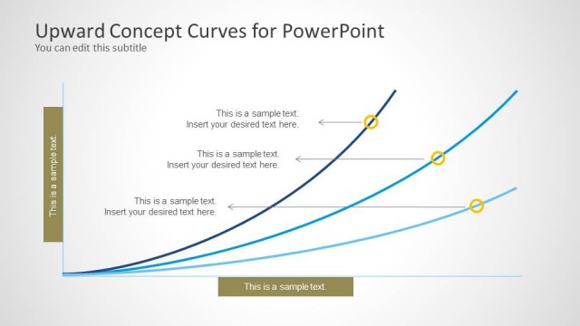
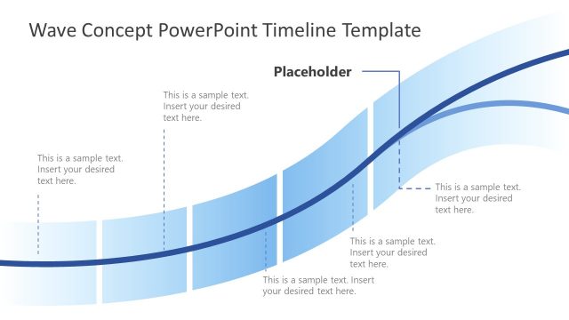
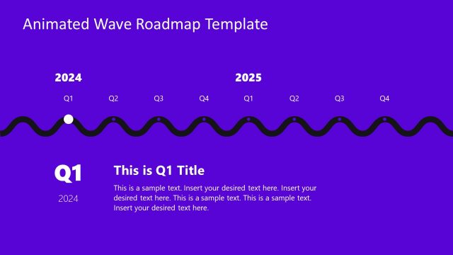
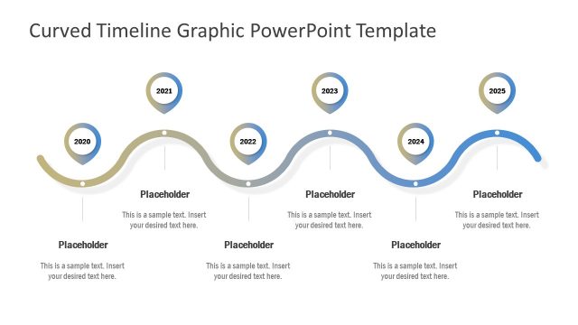
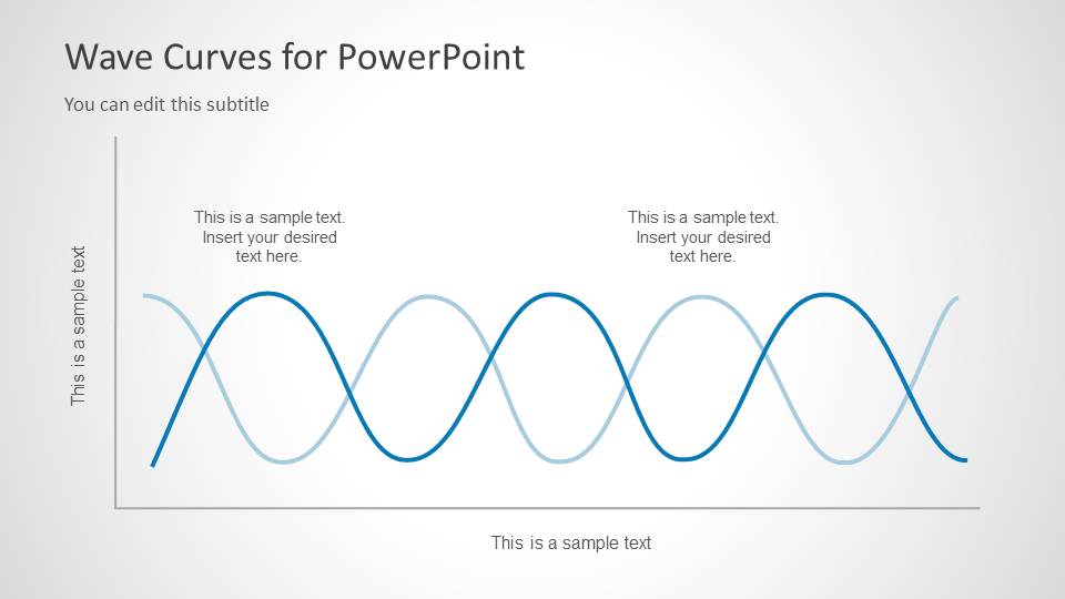
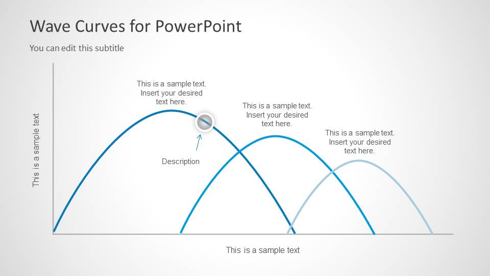
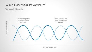
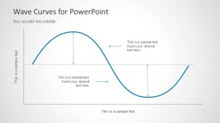
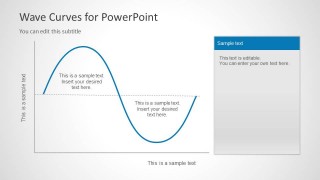
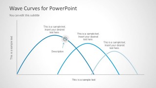
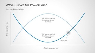
The Wave Curves for PowerPoint have different wave structures and simple curves that serve many purposes. This curve chart design with wavy lines in PowerPoint can help teachers and students in academics and when designing research presentations in PowerPoint, to understand and present the ideas related to statistics. Different possible circumstances at a simple level of wave motion are highlighted in the layout. It ranges from a single wave with different wavelengths and amplitudes to two waves in constructive or destructive interference, and up to 3 curves that can be used to compare different activities. This comparison feature makes it a good choice for anyone looking for a good competitive analysis template.
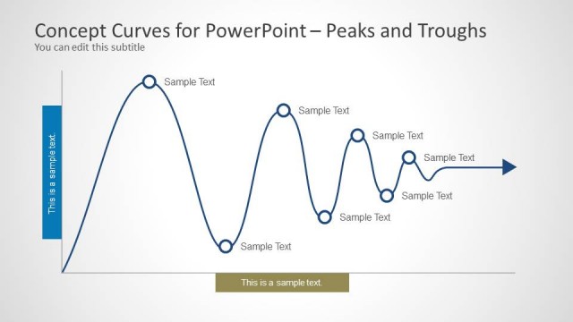
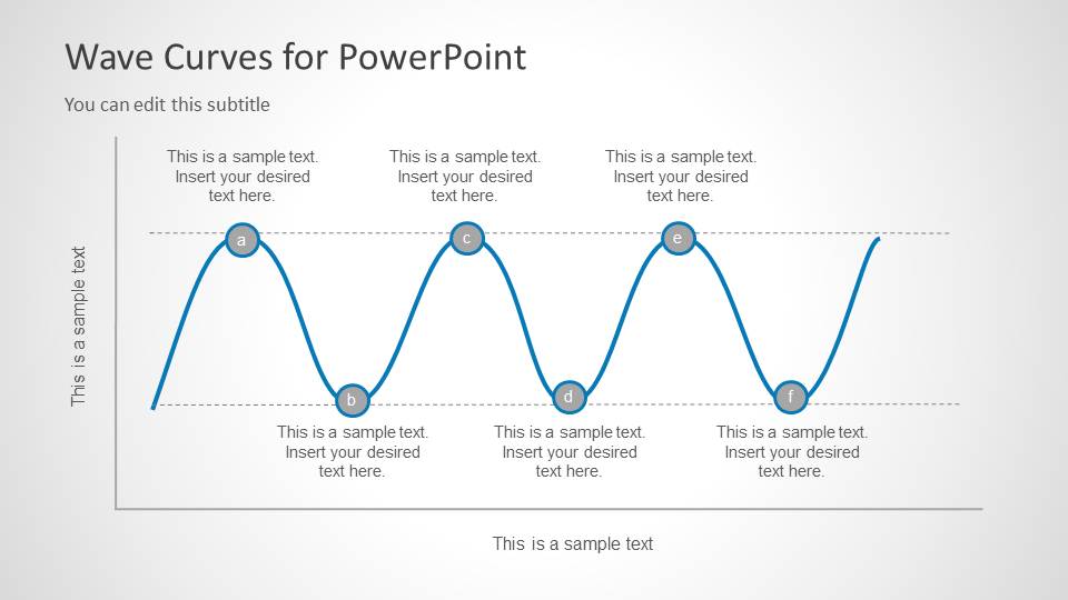
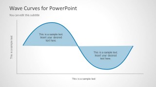
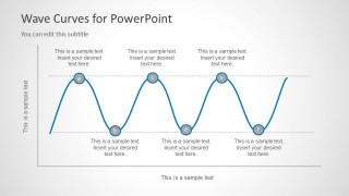
There are marking point clipart available on the waves, that can be relocated to the desired position on the wave border. Text placeholders can be edited to explain the wave instant to the audience. Waves can be either of positive amplitude or with alternating amplitude (positive and negative). Both these waves are available in the PowerPoint template and can be altered in size to the desired shape without losing resolution. If there is statistical data to be compared, curve help the presenter to visually show patterns and relationships, without the need for tables with numbers. This academic PowerPoint template can be downloaded and color scheme can be changed to make it even more appealing template for your presentation.
Alternatively to these wave shapes for presentations you can download other slide designs with infographics for PPT presentations, compatible with Google Slides & PowerPoint, including good PowerPoint templates.
What’s inside this template
Example presentation scenarios
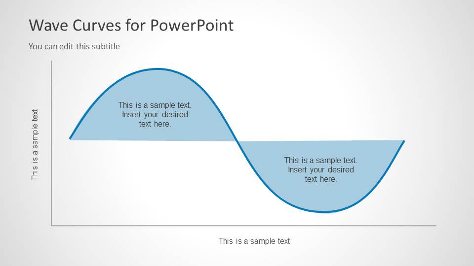
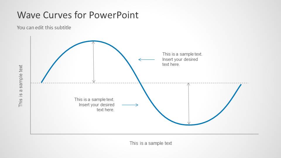
- A physics instructor can use the filled sine curve and amplitude measurement slide to teach positive and negative displacement during a lesson on oscillation.
- An engineering presenter can use the dual-wave comparison and crossing curve slides to explain phase differences or interacting signals in a technical briefing.
- A student can use the marked peak and trough slide to present frequency, wavelength, and labeled wave positions in a classroom assignment.
- A signal processing analyst can use the side note panel layout to connect a waveform pattern with a short interpretation or observation for stakeholders.
Features
- 100% editable presentation template
- Compatible with Microsoft PowerPoint and Google Slides
- 16:9 aspect ratio slides
- Scalable vector shapes, icons and illustrations
- AI-Ready for Microsoft Copilot and Claude
- Instant access and download
Frequently asked questions
Q: How should a presenter explain wave behavior clearly with this template?
A: Start with one simple sine curve before showing overlapping waves. Use the axis labels to define the frame of reference, then add callout text at peaks, troughs, or crossing points. The amplitude measurement slide is best for defining terms, while the dual-wave slides should be saved for comparison after the audience understands the baseline curve.
Q: Who is this template best suited for, and when is it a good choice?
A: This template is best for instructors, students, engineers, and researchers who need to explain periodic motion or signal patterns visually. It works well in lectures, thesis defenses, technical briefings, and short research updates where wave shape, phase, amplitude, or interference matters more than large tables of numerical data.
Q: Why do the repeated curve variations improve the explanation?
A: The slides use the wave itself as the main visual metaphor for motion, repetition, and signal change. Single curves establish the concept, marker slides isolate key moments, and overlapping curves show relationships between signals. This progression reduces cognitive load because each layout adds one visual idea instead of changing the diagram language completely.


Wave Curves for PowerPoint
8-slide presentation template for wave curves, sinusoidal diagrams, amplitude, and interference concepts
Wave Curves for PowerPoint is an 8-slide presentation template with editable sinusoidal wave diagrams for physics, engineering, and signal processing explanations. Visible layouts include a filled sine curve, peak and trough markers, dual-wave interference comparisons, amplitude measurement arrows, and a side note panel for annotated interpretation in Microsoft PowerPoint and Google Slides.
- Category
- Curves & Lines
- Rating


 Loading...
- Aspect ratio
- 16:9
- Item ID
- 6072-03
- Colors
 Microsoft PowerPoint
  Microsoft Copilot
  Claude for PowerPoint
 Other formats supported
Subscribe today and get immediate
access to download our PowerPoint templates.