Slide 6 of 7 from Wave Curves for PowerPoint
6072-03-concept-curves-waves-6
Wave Curve Diagram for Presentations
- Diagram
- Other
- Concept Explanation Slide
- 16:9
- 100% Editable
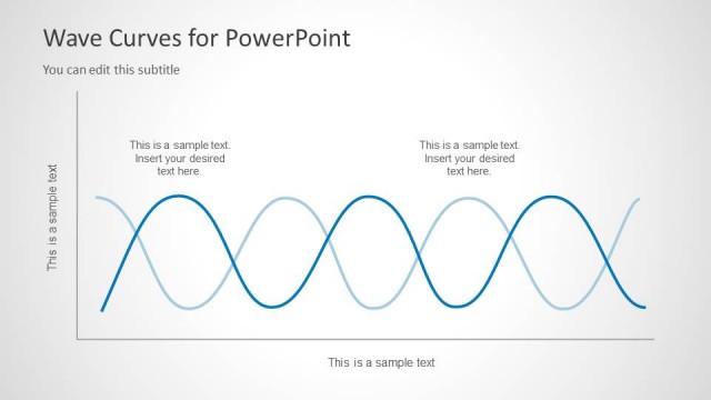
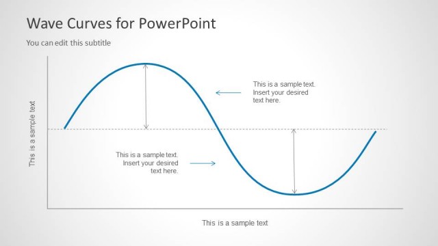
The Wave Curve Diagram with Annotations slide from the Wave Curves for PowerPoint template offers a clear visual tool for illustrating wave patterns and frequency concepts. This slide layout is ideal for technical and scientific business presentations, providing editable shapes and vector icons to effectively demonstrate signal processing and mathematical relationships within a professional slide deck.
What’s on This Slide
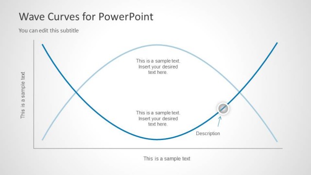
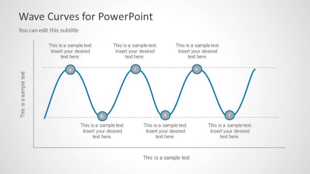
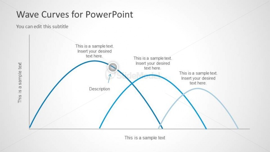
The layout features a wave curve diagram positioned centrally, with peaks and troughs represented in blue and light blue lines. Text placeholders are located at each peak and trough, aligned horizontally, indicating where to insert content. A circular node is placed on the curve, with an arrow pointing to a text placeholder labeled 'Description.' The title is positioned at the top, with a subtitle directly beneath it. The background is light, creating a clear contrast with the blue lines. Overall, the elements are organized to emphasize the wave structure.
How to Use It
This layout serves to illustrate wave patterns, making it suitable for presentations in physics, engineering, or signal processing. It can be used to explain concepts such as amplitude and frequency. This slide fits well after a problem slide, helping to visualize data or theories. It is effective for demonstrating relationships or changes over time, particularly in scientific or technical contexts. The structure allows for clear communication of complex ideas through visual representation.
Text Placeholders & Capacity
Keep your copy within these limits so it fits without resizing. Text slots are moderate, roughly 5-10 words each.
| Placeholder | Count | Max characters (approx.) |
|---|---|---|
| Slide title | 1 | 30 |
| Subtitle | 1 | 50 |
| Item heading | 4 | 40 |
| Item body | 1 | 50 |
| Callout | 1 | 30 |
Slide Keywords
Download unlimited PowerPoint templates, charts and graphics for your presentations with our annual plan.
DOWNLOADReturn to Wave Curves for PowerPoint.