The Virtual Diagram PowerPoint Template is a visually engaging presentation design tailored for business, marketing, and virtual meeting scenarios. This template contains multiple layouts and diagrams that helps presenters communicate complex ideas with clarity using professionally crafted diagrams and data-driven graphics.
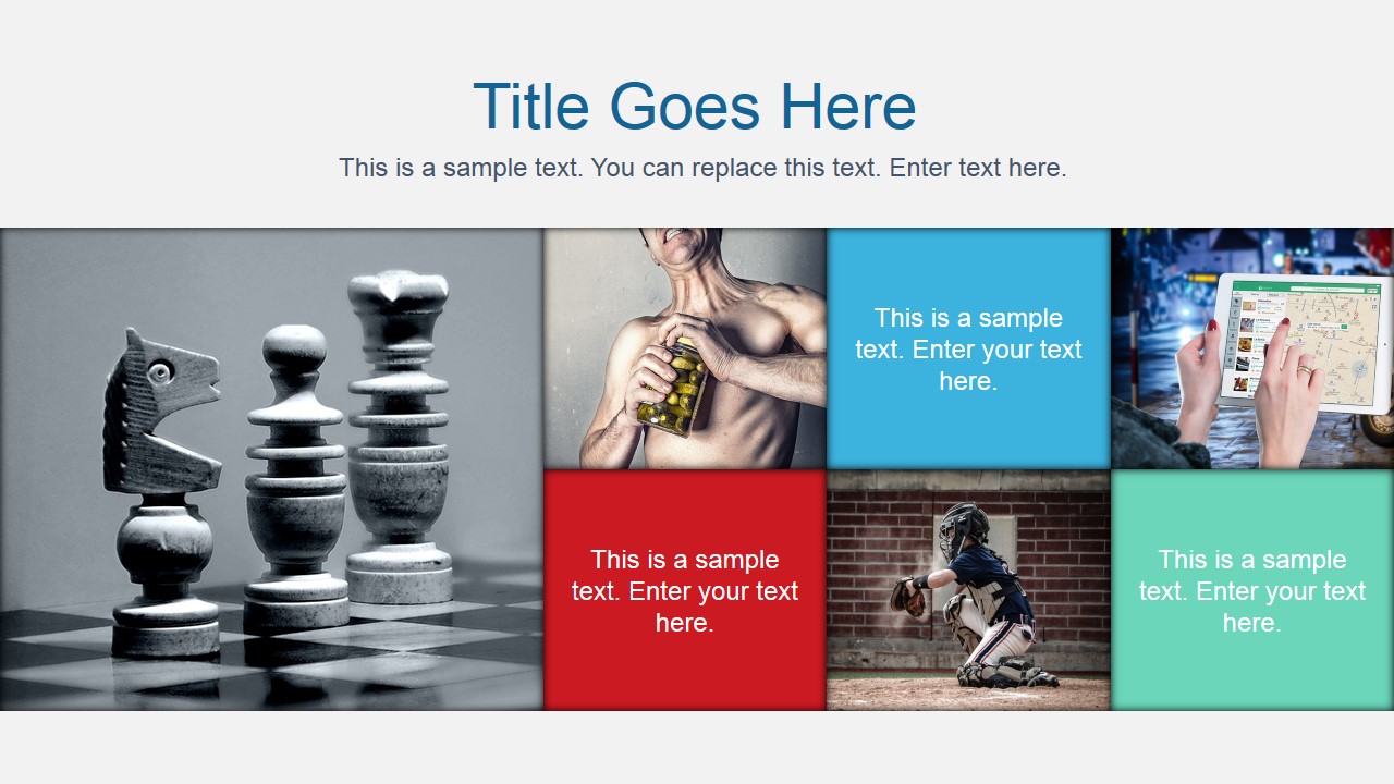
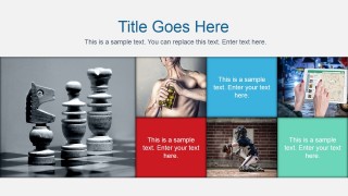
The first slide features a dynamic mosaic layout combining images and color blocks, perfect for use as a cover slide or to introduce key themes of your presentation. This eye-catching design immediately sets a professional tone and provides space to highlight strategic messages or topic areas.
Following the cover, the template includes a collection of fully editable business diagrams:
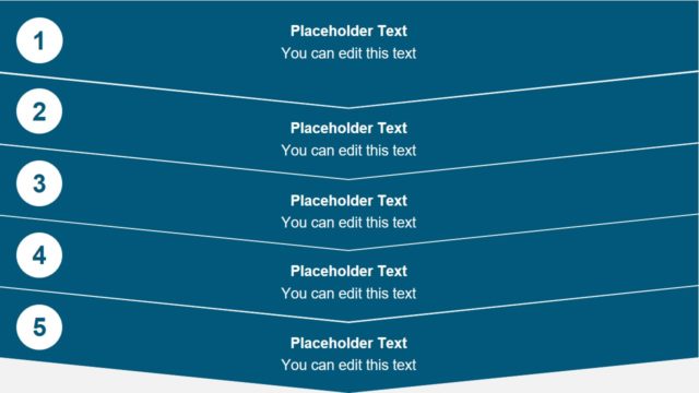
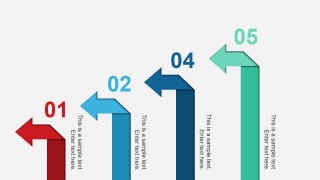
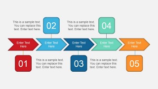
- Multi-step arrow process diagrams (3, 4, and 5 steps)
- Chevron-style flowcharts to outline sequential processes
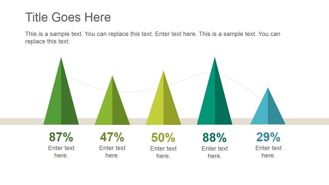
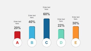
- Creative bar chart slide using shape elements for a modern visual appeal
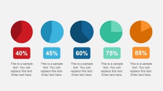
- KPI dashboard slide with segmented pie charts to highlight performance data
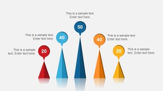
- Cone diagram slides for hierarchical or comparative analysis
- This PowerPoint template is ideal for use in virtual presentations, webinars, and online business meetings. Each slide is designed to keep remote audiences engaged through visual storytelling and structured content.
These slide layouts contains arrows with different number of steps, a process flow with chevron arrows, creative bar chart concept with shapes, a data chart containing small pie charts that you can use to present KPIs and cone charts slide.
Alternatively, you can download other presentation templates fully compatible with PowerPoint, Google Slides and Canva presentations for any ocassion.
What’s inside this template
Example presentation scenarios
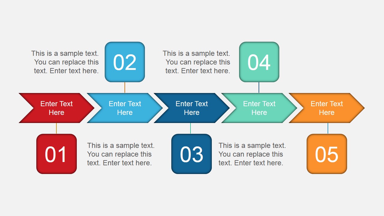
- A project manager can use the chevron process flow to explain a five-step workflow during an online status meeting.
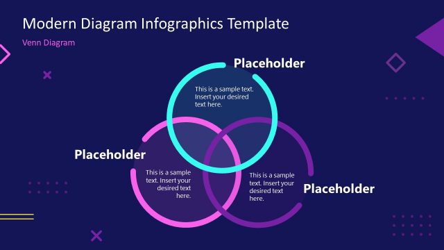
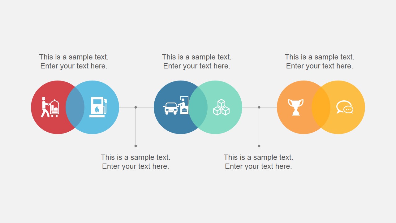
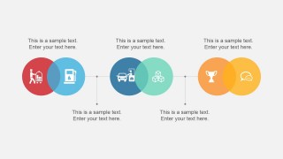
- A marketing manager can use the overlapping-circle diagram to show related campaign themes, audience segments, or service groupings in a webinar.
- A consultant can use the bar chart and KPI pie indicator layouts to compare performance levels and summarize priorities for a client review.
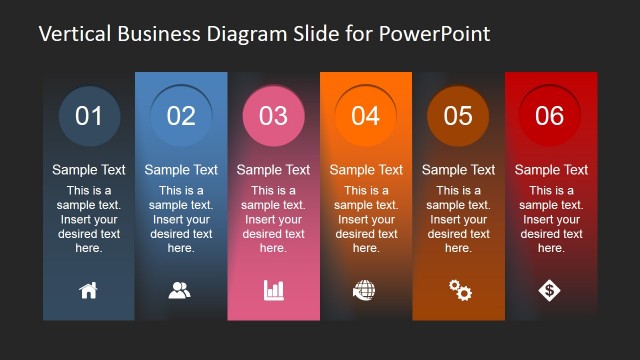
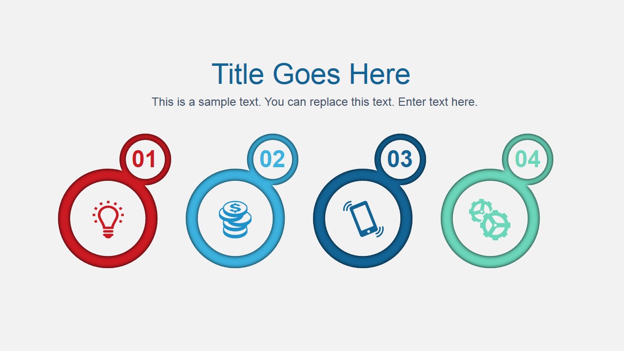
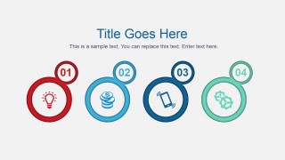
- A team lead can use the circular step icons and vertical arrow process to organize training points for a remote onboarding session.
Features
- 100% editable presentation template
- Compatible with Microsoft PowerPoint and Google Slides
- 16:9 aspect ratio slides
- Scalable vector shapes, icons and illustrations
- AI-Ready for Microsoft Copilot and Claude
- Instant access and download
Frequently asked questions
Q: How should a presenter turn these diagrams into a clear virtual meeting story?
A: Start with the mosaic cover to frame the topic, then move from explanation to evidence. Use the overlapping circles for related concepts, the chevron flow for ordered actions, and the KPI pie indicators or bar chart for measurable status. Keep each slide to one decision point so remote viewers do not split attention.
Q: Who is this template best suited for in a business presentation?
A: This template fits managers, consultants, marketers, and team leads who need to explain process steps, metric comparisons, or structured options in a short online session. It is strongest when the topic benefits from visual grouping, sequence, and percentage-based summaries rather than long narrative text or spreadsheet-style detail.
Q: Why do the arrow, chevron, and cone metaphors work for this type of content?
A: The arrow and chevron layouts make direction and sequence obvious, which reduces the explanation burden in a remote meeting. The cone chart creates a hierarchy or comparison metaphor, while circular KPI visuals give percentages a quick read. These shapes help the audience see movement, priority, and magnitude before reading the captions.




Virtual Diagram PowerPoint Template
8-slide presentation template with virtual process flows, chevrons, KPI charts, and cone diagrams
Virtual Diagram PowerPoint Template is an 8-slide 16:9 presentation template for business and virtual meeting visuals. It includes a mosaic cover, overlapping-circle diagram, arrow process, chevron flow, bar chart, KPI pie indicators, and cone chart layouts for presenters using Microsoft PowerPoint or Google Slides.
- Category
- Template Backgrounds
- Rating


 Loading...
- Aspect ratio
- 16:9
- Item ID
- 4090-01
- Colors
 Microsoft PowerPoint
  Microsoft Copilot
  Claude for PowerPoint
 Other formats supported
Subscribe today and get immediate
access to download our PowerPoint templates.