Production Possibilities Curve PowerPoint Template
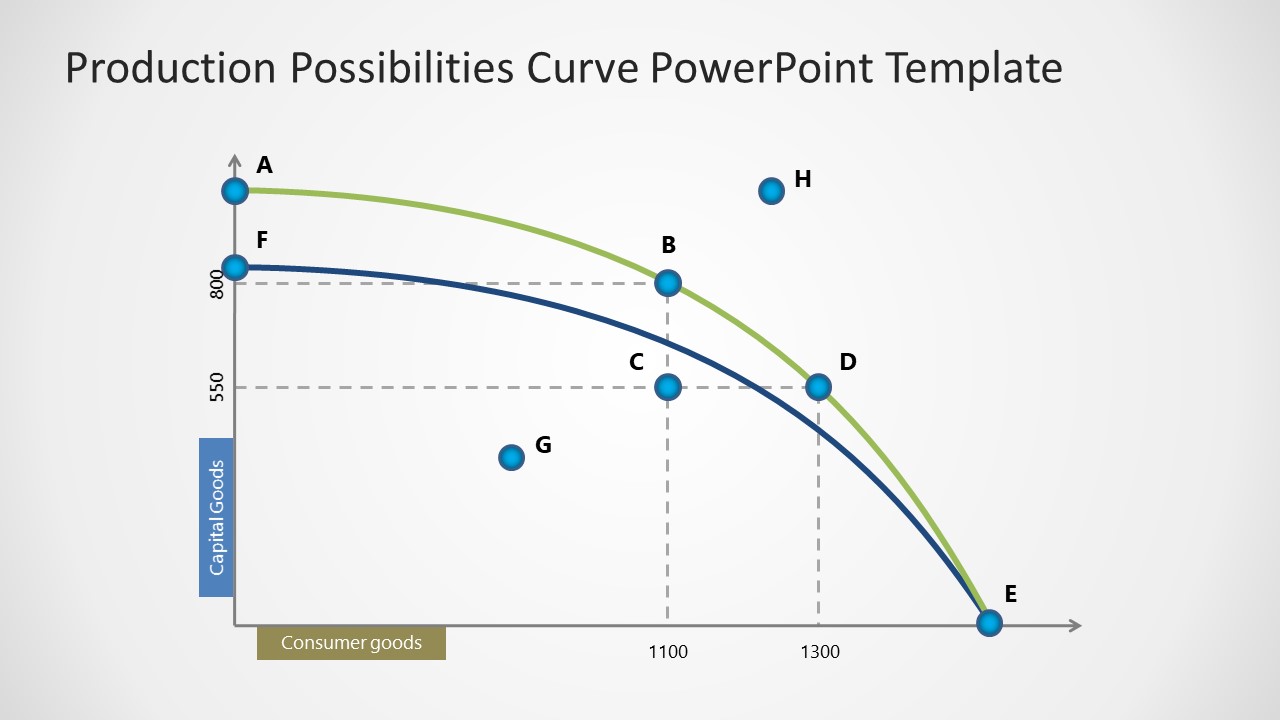
Showcase all the different combinations of output that you can get from fixed resources with our Production Possibilities Curve PowerPoint Template. The PPC (Production Possibilities Curve) is a graphical model that shows the possible outcomes that can be obtained when the resources are complete and most efficient. You can also display the concepts like scarcity, opportunity cost, and efficiency using various points on the chart. We have created this template to help data analysts, business analysts, and other professionals explain complex concepts in a structured way. This template is designed using 100% editable PPT elements. Furthermore, you can check our collection of PPT curve templates and choose the design that best fits your presentation needs. Professionals can also change the PowerPoint features of the template based on their requirements, such as shapes, colors, lines, labels, etc.
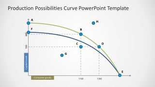
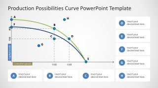
The Production Possibilities Curve PowerPoint Template has two slides with the same data visualizations but with some differences. The first slide shows a graph showing the capital goods and consumer goods on the y-axis and x-axis, respectively. The chart has a bowed-out curve on which data experts can present different data points and explain the related information in the business meetings. The blue and green curves indicate two different production possibilities. In the second slide, the same chart is present but in a smaller size and shows about eight editable text sections with a title and description placeholder text. These boxes have alphabet labels from A to H. Download this simple and engaging production possibility curve template for presentation and personalize it for executive sessions!

You must be logged in to download this file.
DOWNLOAD- Category
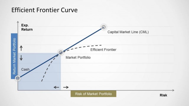
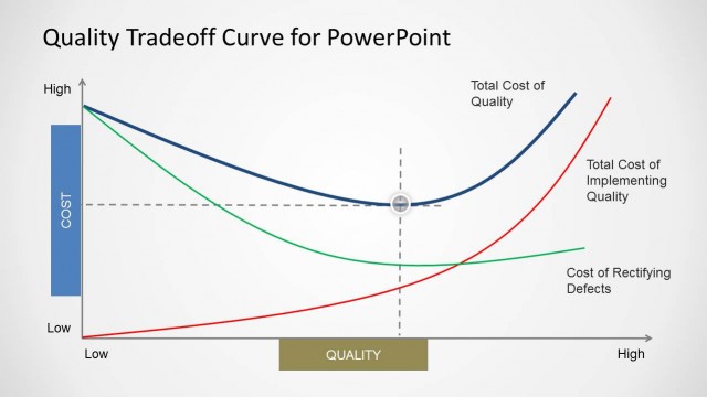
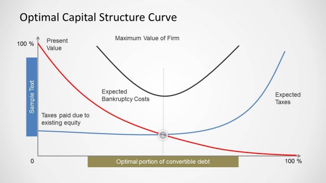
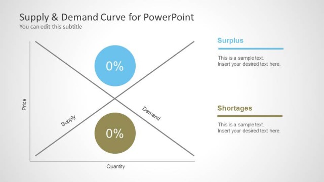
- Curves & Lines
- Rating

 Loading...
- Size
- 16x9
- Item ID
- 22804-01
- Colors
Subscribe today and get immediate
access to download our PowerPoint templates.