44+ Sales Graphs and Charts Templates for PowerPoint
Our Sales Graph Template is a powerful tool designed to enhance data visualization in PowerPoint presentations. It allows you to display and analyze large sets of sales data effectively. Like other charts and graphs in PowerPoint, our template enables you to present facts, statistics, and trends.
For you to deliver an accurate business, marketing, or finance presentation, our template provides various chart options, such as bar charts, comparison charts, pie charts, and more.
These templates simplify the communication of complex data and numbers. Elevate the visual impact of your presentations by incorporating our Sales Graph Template into your slide decks and make your data more engaging.
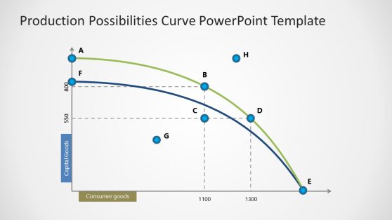
Production Possibilities Curve PowerPoint Template
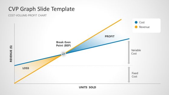
CVP Graph PowerPoint Template

Sales Contest PowerPoint Template
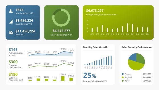
Sales Performance Dashboard PowerPoint Template
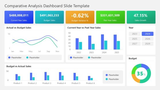
Comparative Analysis Dashboard PowerPoint Template
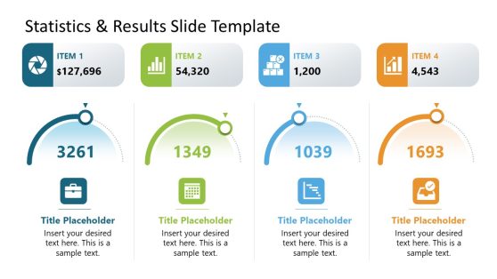
Statistics & Results PowerPoint Template

Project Summary PowerPoint Template
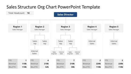
Sales Structure Org Chart PowerPoint Template
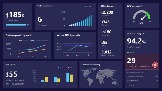
SaaS Performance PowerPoint Dashboard
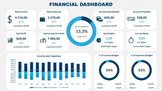
Financial Dashboard PowerPoint Template
Animated PowerPoint Charts Collection Template
Financial Chart Slides PowerPoint Template
The Sales Graph Template is a visual tool designed to represent and track the sales performance of a business or organization. It provides an overview of sales data over a specific period, allowing you to analyze trends, identify patterns, and make informed decisions. They include axes representing time and sales figures, with time intervals displayed along the horizontal axis and sales values along the vertical axis.
Depending on the desired visualization, sales data can be presented using various graphs, such as line graphs, bar graphs, or pie charts.
Our Sales Graph Template enables stakeholders to quickly grasp the overall sales performance and identify areas of success or concern. It also allows for easy comparison between different periods, products, regions, or relevant categories, facilitating data-driven decision-making.
It is an indispensable tool for sales teams, managers, and executives, empowering them to monitor progress, communicate findings, and drive organizational success.
What Is A Sales Graph?
A Sales Graph Template represents sales data displayed as a graph or chart. It helps to analyze and understand the trends, patterns, and fluctuations in sales over a specific period.
What Graph Is Used For Sales?
Various graphs can represent sales data, depending on the specific information you want to convey. Some common types of graphs used for sales include:
1. Line Graph: A line graph is commonly used to show the trend of sales over time. It uses a line to connect data points representing sales figures at different time intervals, such as months or years.
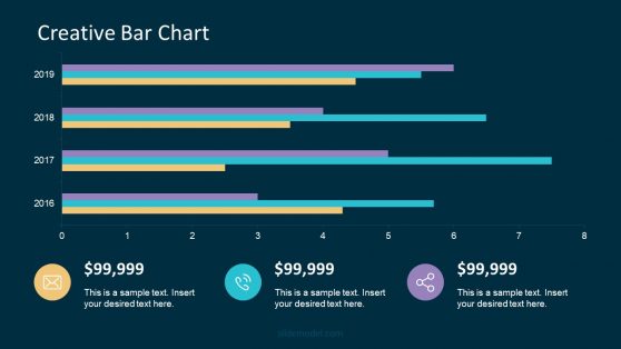
2. Bar Graph: A bar graph compares sales data across different categories or periods. Each category or period is represented by a separate bar, with the height of the bar indicating the sales value. Bar graphs are suitable for comparing monthly sales figures for different products, regions, or channels.
3. Pie Chart: A pie chart represents the proportion or percentage distribution of sales within a specific time frame. It divides the sales data into slices, each representing a different category or product. The size of each slice is proportional to the sales value or percentage it represents.
What Is The Best Graph To Show Monthly Sales?
The best graph to show monthly sales depends on the specific information you want to convey. If you want to analyze the overall trend and changes in sales over time, a line graph would be suitable. A bar graph is more appropriate for comparing monthly sales figures for different categories.
How Can I Create A Sales Graph?
Creating a Sales Graph is a breeze with the wide range of software tools available. You have options like Microsoft Excel, Google Sheets, Microsoft PowerPoint, or specialized data visualization software. These tools offer intuitive features that allow you to input your sales data, choose the desired graph type, and personalize the appearance of your graph. Rather than starting from scratch, you can save time by downloading a fitting Sales Chart Template from our professionally designed Sales Chart Templates collection.
Can I Use A Different Graph Type For Monthly Sales Data?
While line and bar graphs are commonly used for monthly sales data, you can explore other graph types depending on your needs. For example, an area graph can show cumulative sales over time, and a scatter plot can display the relationship between sales and other variables, such as marketing expenditure.