Download this template to create Optimal Capital Structure Curve for PowerPoint presentations.
Making an Optimal Capital Structure Curve was never easier, as the sample diagrams n this template can be edited right down to basic objects; with the utility to rearrange lines and curves to create custom diagrams with ease.
What’s inside this template
Example presentation scenarios
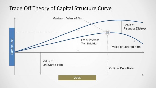
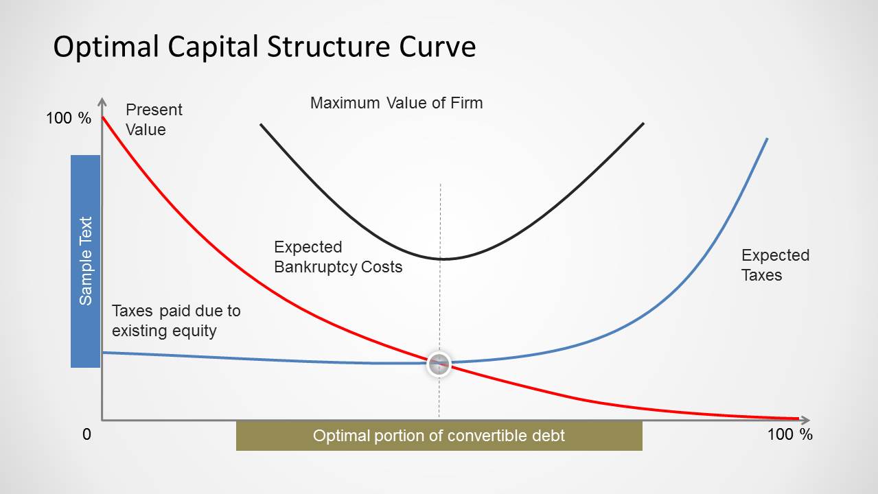
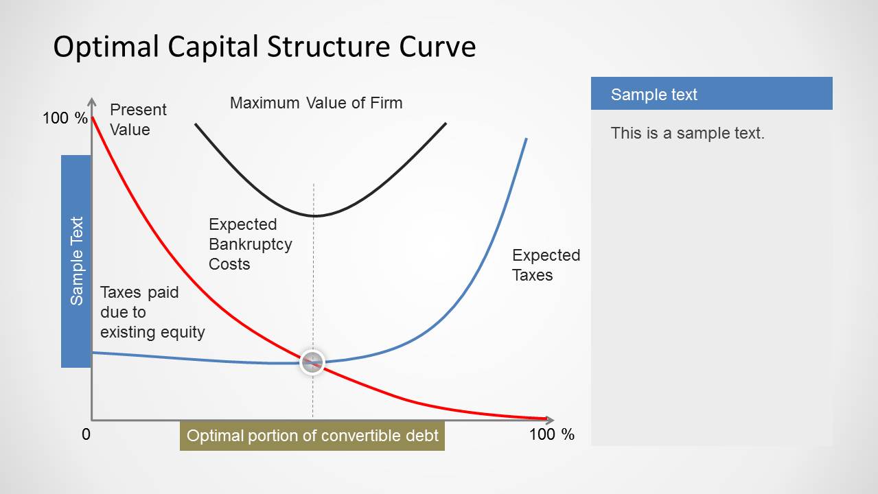
- A CFO can use the annotated curve diagram to brief executives on how the optimal portion of convertible debt relates to taxes paid, present value, and expected bankruptcy costs.
- A financial analyst can use the curve-plus-notes layout to explain assumptions behind a capital structure recommendation while keeping the main diagram visible.
- A business school instructor can use the labeled curves and percentage axes to teach the trade-off theory of capital structure in a finance lecture.
- A consultant can use the diagram to frame a client discussion about borrowing, lending, risk management, and debt policy before moving into detailed financial modeling.
Features
- 100% editable presentation template
- Compatible with Microsoft PowerPoint and Google Slides
- Scalable vector shapes, icons and illustrations
- AI-Ready for Microsoft Copilot and Claude
- Instant access and download
Frequently asked questions
Q: How should a presenter explain the curve without making the finance concept feel too abstract?
A: Start with the axes and define what the 0 to 100 percent range represents, then introduce one curve at a time. Explain the red present value line, blue expected taxes line, and black bankruptcy cost curve before pointing to the center marker. This sequence helps the audience see why the optimum appears at the intersection area.
Q: Who is this template best suited for in a business presentation?
A: This template fits finance presenters who need to explain a conceptual model rather than report a full dataset. It is useful for CFOs, treasury teams, financial analysts, consultants, and educators discussing debt policy, tax impact, lending decisions, or capital structure theory with an audience that already understands basic finance terms.
Q: Why does the curve design work better than a text-only explanation?
A: The visual metaphor of crossing cost and value curves makes the trade-off easier to read. The audience can see taxes, bankruptcy costs, and debt portion as interacting forces, not isolated bullet points. The highlighted center marker and bottom bar turn the abstract optimum into a concrete decision zone.
Optimal Capital Structure Curve for PowerPoint
2-slide PowerPoint presentation template for optimal capital structure curves, debt mix, and tax cost analysis
Optimal Capital Structure Curve for PowerPoint is a 2-slide finance diagram template for explaining capital mix, firm value, bankruptcy costs, and taxes. It includes an annotated curve diagram and a curve-plus-notes layout for analysts, finance leaders, and educators. The visual uses editable PowerPoint shapes and vector graphics.

 Loading...
 Microsoft PowerPoint
  Microsoft Copilot
  Claude for PowerPoint
 Other formats supported
Subscribe today and get immediate
access to download our PowerPoint templates.