Polygonal Venn Diagram
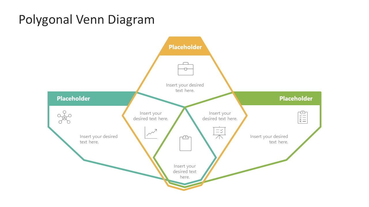
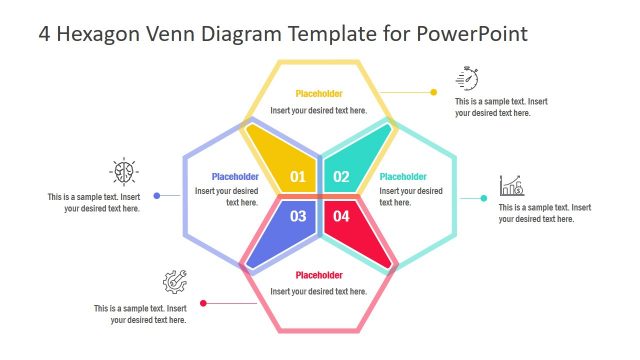
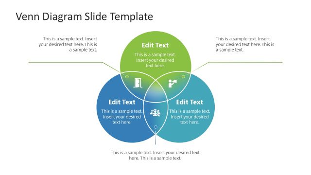
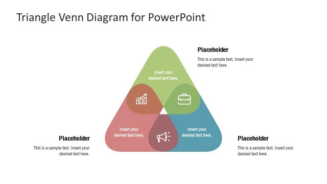
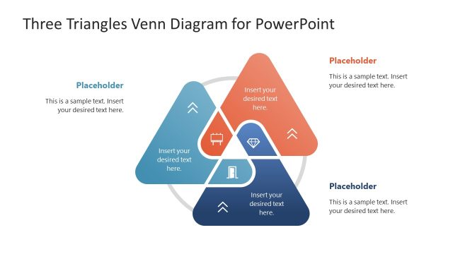
Present the relationship between different variables in business data sets using our Polygonal Venn Diagram. Venn diagram has overlapping circles or other shapes that manifest the intersection between two sets of items. For instance, a Venn diagram in mathematics shows the union or intersection of numbers between two elementary sets. In organizations, one performance parameter depends on the other, contributing to a project’s overall development or success. Thus, our Venn diagram template is an engaging way to showcase the task dependencies of various groups. Professionals, project managers, data analysts, and experts can use our polygonal Venn diagram template to demonstrate the connection between different operations or metrics. The polygonal shape refers to a shape having multiple unequal sides.
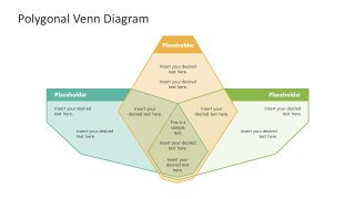
Our Polygonal Venn Diagram has a central diagram in vertical format, while two more polygon shapes are placed horizontally on the slide. These three polygons intersect in the slide center to form four segments due to the polygon overlapping. In the first slide, each segment of the three shapes has an infographic icon that enhances the visual impact of the presentation. The icon is relevant to the point under discussion and helps users communicate the message effectively. In the second slide, all the diagram parts are color-filled, have only placeholder text, and no graphical icons are provided. Also, presenters can quickly customize the template, i.e., change the colors, fonts, shapes, or graphical items used to craft their unique three groups Venn diagrams. Additionally, they can repurpose the template in whatever way they require. So, download our interactive template and use it in your business concept or data presentations!
Alternatively, if you are interested in more information about this topic, we recommend our articles about how to make a Venn diagram in PowerPoint, Venn diagram ideas and how to create a Venn diagram in Google Slides. Also check our collection of Venn diagram PowerPoint templates.
