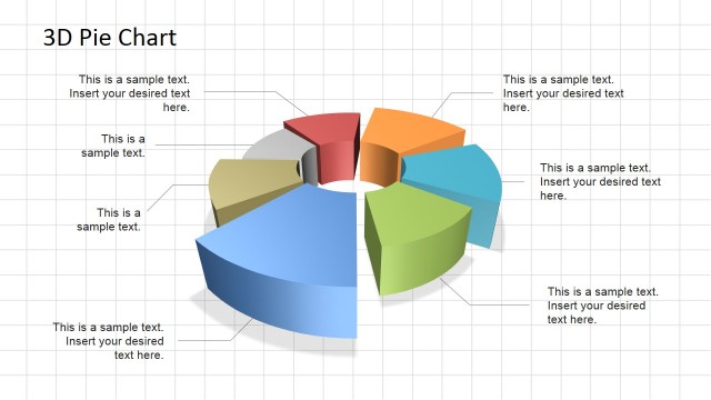
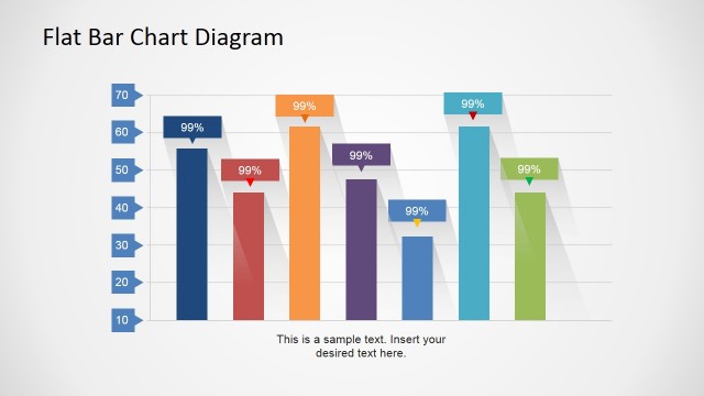
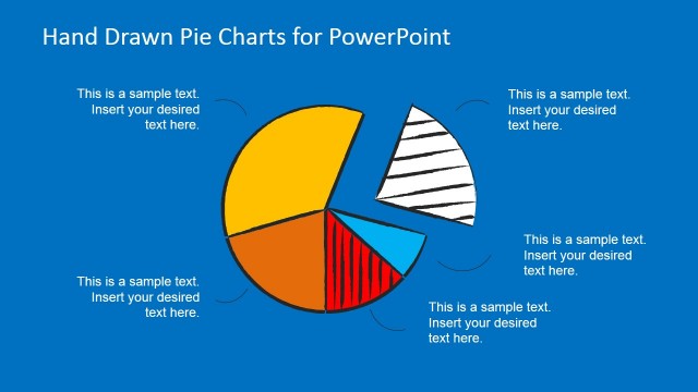
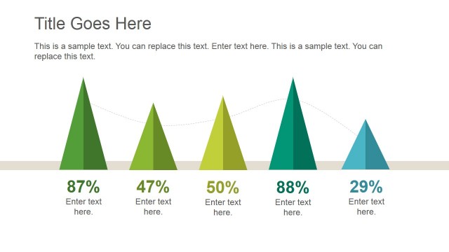
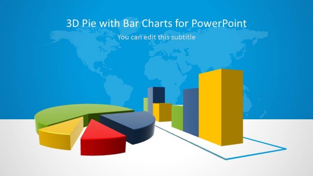
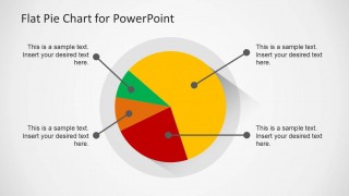
Flat Pie Chart Template for PowerPoint is a fresh flat pie chart diagram design that you can use in your PowerPoint presentations. Flat Pie Chart Template for PowerPoint has a flat style and it is a data-driven chart so you can easily edit the data in PowerPoint by opening the Excel spreadsheet and updating the entries.
In order to edit the pie chart template you just need to right click over the chart and then click Edit Data.
What’s inside this template
Example presentation scenarios
- A marketing manager can use the labeled pie chart to present campaign channel share and explain the largest segment with the right-side text notes.
- A finance analyst can use the callout pie chart to summarize budget allocation for executives and connect each slice to a short spending explanation.
- A consultant can use the monitor mockup slide to introduce a client dashboard topic before moving into the detailed percentage chart.
- A project manager can use the large pie chart infographic to show team workload distribution and attach action-oriented notes to each category.
Features
- 100% editable presentation template
- Compatible with Microsoft PowerPoint and Google Slides
- Scalable vector shapes, icons and illustrations
- Data-driven charts, editable in Microsoft Excel
- AI-Ready for Microsoft Copilot and Claude
- Instant access and download
Frequently asked questions
Q: How should I present the pie chart so the audience understands the main point quickly?
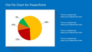
A: Start by naming the dominant slice before discussing smaller segments. Slide 2 works well for this because the pie chart has percentage labels and a side column for interpretation. Use the text blocks to explain what the split means, not to restate every number already printed around the chart.
Q: Who is this template best suited for?
A: This template is best for analysts, managers, and consultants who need to report a simple part-to-whole relationship. It fits market share, budget allocation, survey response, or portfolio mix topics. If the audience needs one clear distribution rather than a full performance dashboard, these three pie chart layouts keep the message focused.
Q: Why do the callouts and monitor frame help the presentation?
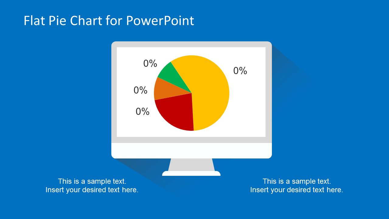
A: The monitor frame on Slide 1 signals a dashboard or reporting context, which is useful for opening a data discussion. The connector callouts on Slide 3 reduce legend-hunting by placing explanations near the slices. This design helps the audience connect each color segment with its meaning faster.


Flat Pie Chart Template for PowerPoint
3-slide pie chart presentation template with flat infographic layouts and percentage callouts
Flat Pie Chart Template for PowerPoint is a 3-slide chart template for presenting percentage breakdowns. It includes a monitor mockup pie chart, a labeled pie chart with side text notes, and a large pie chart infographic with connector callouts. It is built for business presenters who need concise share, mix, or category comparisons.


 Loading...
 Microsoft PowerPoint
  Microsoft Copilot
  Claude for PowerPoint
 Other formats supported
Subscribe today and get immediate
access to download our PowerPoint templates.