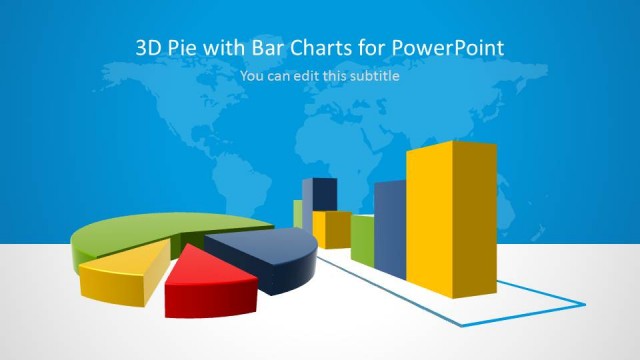
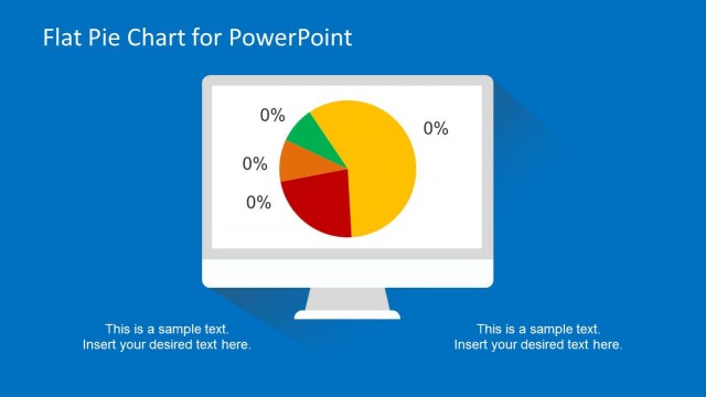
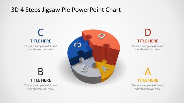
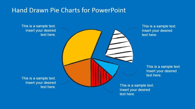
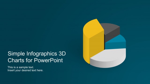
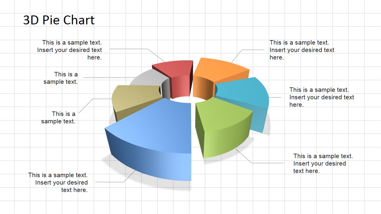
3D Pie Chart Diagram for PowerPoint is a professional chart built using PowerPoint Shapes. The user can customize each shapes properties as color, size and effects.
Ideal for accounting presentations or financial slide decks, give your presentation a professional look & feel with the 3D Pie Chart Diagram for PowerPoint.
What’s inside this template
Example presentation scenarios
- A finance manager can use the exploded 3D donut pie chart to show budget distribution and label each major cost category with the surrounding callouts.
- A consultant can present market share composition by replacing the sample labels with segment names and using the leader lines to connect each note to the correct slice.
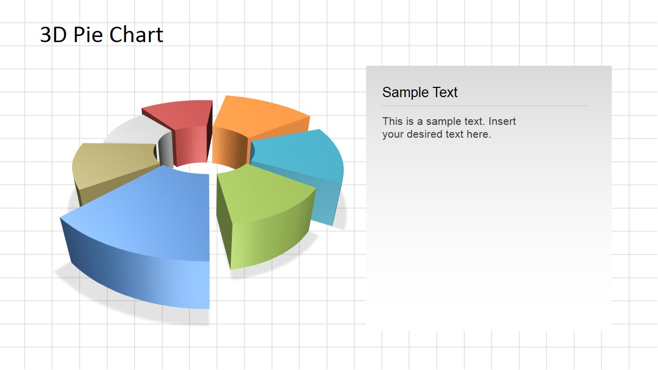
- An accounting presenter can use the right-side text panel layout to explain a revenue mix chart while keeping the main pie diagram visible.
- A sales leader can compare contribution by product group using the colored pie slices and reserve the large note panel for the main commercial takeaway.
Features
- 100% editable presentation template
- Compatible with Microsoft PowerPoint
- 16:9 aspect ratio slides
- Scalable vector shapes, icons and illustrations
- AI-Ready for Microsoft Copilot and Claude
- Instant access and download
Frequently asked questions
Q: How should a presenter explain the 3D pie chart without overloading the audience?
A: Start with the total that the pie represents, then identify the largest slice and one or two meaningful contrasts. On Slide 1, use the leader-line callouts only for the categories that need explanation. If every slice needs a sentence, use Slide 2 and place the interpretation in the right-side panel.
Q: Who is this pie chart template best suited for?
A: This template fits finance, accounting, sales, and consulting presenters who need to explain allocation or composition data in a short business review. It works best when the audience needs a quick visual sense of proportion, such as budget share, revenue mix, market share, or portfolio distribution.
Q: Why use an exploded 3D donut pie instead of a flat pie chart?
A: The exploded 3D donut design separates the slices enough to make each segment feel distinct, while the center opening keeps the chart from becoming a solid visual mass. The callouts and side panel support interpretation, so the presenter can connect a proportional view with the business meaning behind each segment.
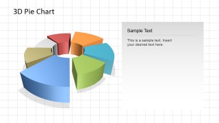
3D Pie Chart Diagram for PowerPoint
2-slide presentation template with 3D pie chart, donut chart segments, and editable callouts
3D Pie Chart Diagram for PowerPoint is a 2-slide chart template for showing part-to-whole comparisons in Microsoft PowerPoint. It includes an exploded 3D donut pie chart with leader-line callouts and a second layout with the same chart plus a right-side text panel for commentary.
- Category
- Pie Charts
- Rating


 Loading...
- Aspect ratio
- 16:9, 4:3
- Item ID
- 6565-01
- Colors
 Microsoft PowerPoint
  Microsoft Copilot
  Claude for PowerPoint
 Other formats supported
Subscribe today and get immediate
access to download our PowerPoint templates.